Z-Shape
Z-shape infographic with characters. Ideal for landing pages, modern websites. AI-ready template.
Use case: Landing pages, Modern websites
Historical Context
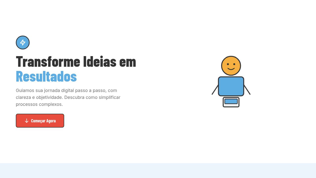
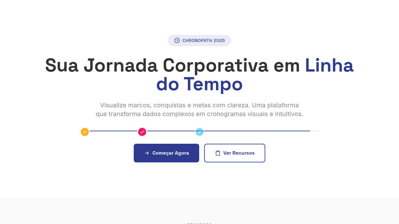
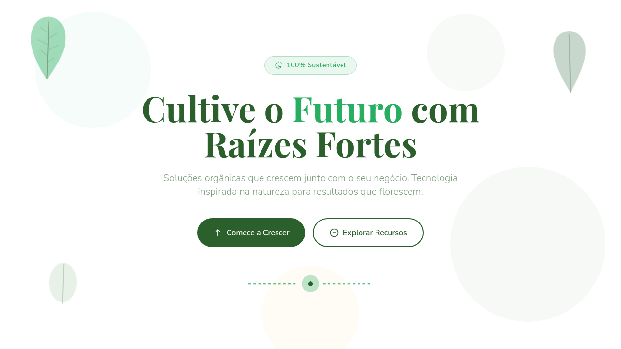
The Z-pattern isn't some trendy discovery — it's rooted in the Gutenberg diagram, a model of how Western readers scan pages that dates back to print layout theory. Eyes sweep top-left to top-right, then diagonal down to bottom-left, finishing bottom-right. Newspapers knew this. Magazine designers exploited it for decades before the web existed. What changed is density tolerance. Somewhere around 2012, the startup landing page killed the paragraph. Teams realized users wouldn't read five sentences explaining a feature — but they'd absorb three icons with one-line captions in under four seconds. Icon-based storytelling became the default because it respects scanning behavior instead of fighting it. Flat vector illustrations with thick outlines emerged as the visual language of choice: friendly, scalable, brand-flexible. The 'how it works in 3 steps' pattern is now so embedded in product marketing that its absence feels like a gap. It works because it maps perfectly onto the Z-shape: step one top-left, step two center, step three bottom-right. The eye does the sequencing for free.
When to Use
Reach for Z-shape infographics when you need to compress a multi-step process into a single viewport. Explainer pages, onboarding flows, how-it-works sections — anywhere the user needs sequential understanding without scrolling commitment. They're particularly effective for marketing pages where bounce rates punish complexity. Skip them for non-linear information or when steps exceed five — the pattern breaks down and becomes a wall of icons that communicates nothing.
Design Principles
- Anchor each node with a single icon — one concept per illustration, no hybrid metaphors that require interpretation.
- Maintain consistent stroke weight across all vectors; mixed weights create unintentional visual hierarchy where none belongs.
- Use connectors (lines, arrows, numbered badges) to make the reading sequence explicit — don't rely on spatial position alone.
- Limit color palette to 2-3 brand colors plus a neutral; flat illustration loses clarity when oversaturated.
- Size icons identically to signal equal importance — the Z-pattern provides sequence, not hierarchy.
Technical Specs
Colors
Primary
Secondary
Effects
Uniform flat lighting, minimal drop shadows, character entrance animations, zig-zag scroll reveal, alternating band color transitions, icon pop-in effects
Light/Dark
✓ Full / ✓ Full
Related
Last synced: 4/1/2026