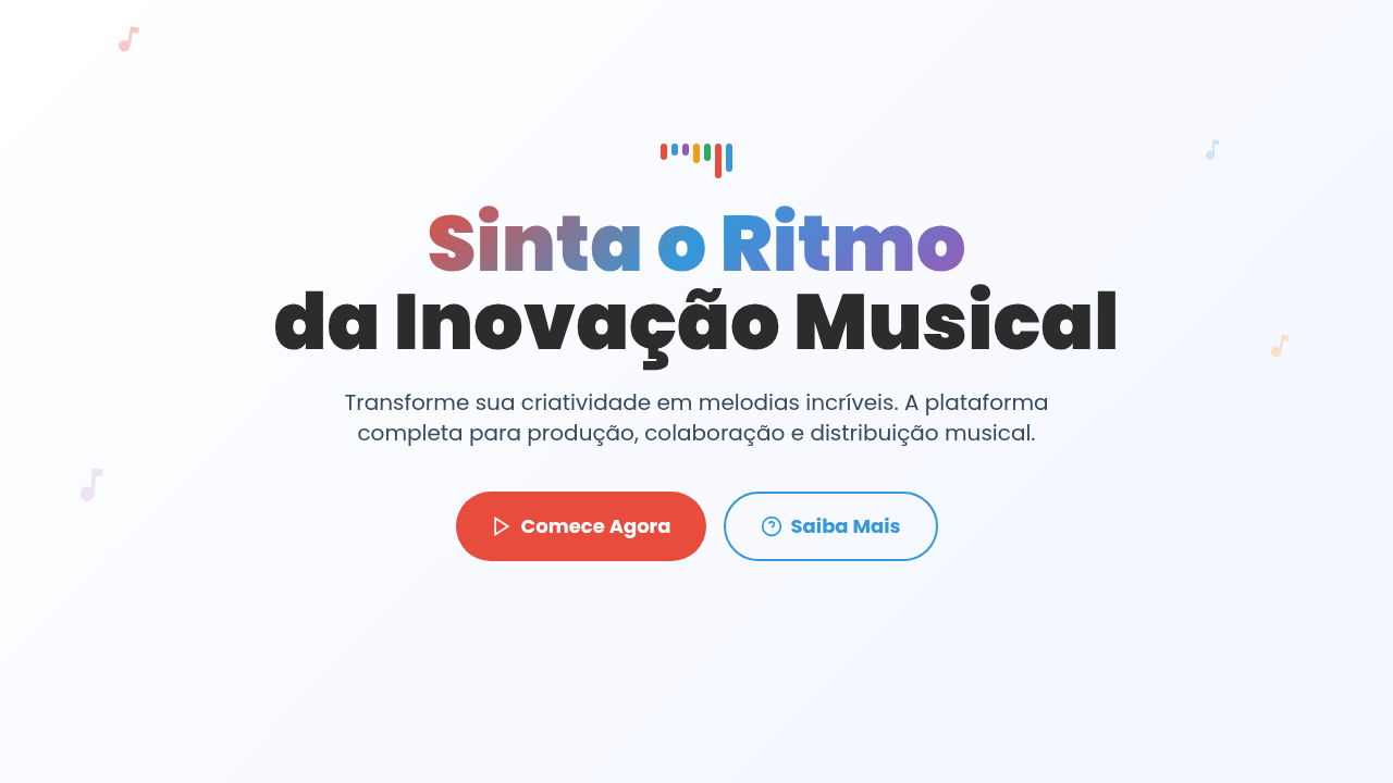
Elementos Musicais
Musical elements infographic. Ideal for landing pages, modern websites. AI-ready template.
Use case: Landing pages, Modern websites
Historical Context
SoundCloud changed everything. Before 2008, audio on the web was a play button and a progress bar — maybe a spinning disc if you were lucky. Then those orange waveforms appeared, and suddenly you could *see* where the drop hits, where the quiet part lives, where someone left a comment at 2:34. It was metadata made tangible. Spotify took a different route. Less literal, more atmospheric — color extraction from album art, those behind-the-lyrics animations, the year-wrapped visualizations that turned listening habits into shareable identity. The insight was sharp: people don't just want to hear music, they want to see themselves in it. The fundamental tension hasn't changed though. Sound is temporal. It exists in time, not space. Every audio visualization is a translation — frequency to height, amplitude to brightness, tempo to motion. The best ones don't try to be accurate representations. They're interpretations. They give you a feeling that matches what your ears already know. The worst ones look like screensavers from 2003.
When to Use
Reach for musical infographic elements when your interface needs to communicate audio data without requiring the user to press play. Streaming dashboards showing listening patterns. Podcast apps displaying episode structure at a glance. Music production tools where waveform editing is the core interaction. Audio accessibility features that give deaf users visual rhythm cues. Also strong for marketing pages in the music/audio space — they immediately signal domain expertise and set the right emotional tone.
Design Principles
- Rhythm over decoration — visual elements should mirror actual audio properties (tempo, dynamics, frequency) rather than generic 'music-themed' clip art
- Respect the timeline — audio is inherently linear and temporal; your layout should honor left-to-right progression and give users spatial anchors for temporal data
- Amplitude needs breathing room — waveforms and frequency visualizations collapse into noise at small sizes; give them generous vertical space or don't use them at all
- Color carries genre — warm saturated tones read as energetic/pop, cool muted palettes feel ambient/electronic; be intentional about the sonic mood your palette implies
- Static should hint at motion — even in a frozen infographic, use tapered edges, asymmetric peaks, and slight rotation to suggest that this data was alive a moment ago
Technical Specs
Colors
Primary
Secondary
Effects
Vibrant energetic illumination, sound wave animations, note floating effects, rhythm-based transitions, frequency visualization, beat-synced reveals
Light/Dark
✓ Full / ✓ Full
Related
Last synced: 4/1/2026