Grade School Color Palette
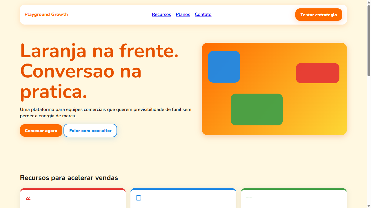
Landing page using grade school primary colors — the kind you remember from crayons and traffic signs. Ideal for startups consumer, apps educacionais, ecommerce jovem, plataformas de comunidade, marketing de produto, food delivery. AI-ready template.
Use case: Startups consumer, Apps educacionais, Ecommerce jovem, Platforms de comunidade, Marketing de produto, Food delivery
Historical Context
The grade school palette isn't arbitrary — it's the direct descendant of Bauhaus color theory filtered through mid-century American manufacturing constraints. When Binney & Smith reformulated Crayola's core box in 1958, they weren't just picking cheerful hues. They were codifying what decades of child psychology research suggested: saturated, unambiguous primaries reduce cognitive load for developing minds. Red is RED. Blue is BLUE. No subtlety, no apology. What's fascinating is how this palette became cultural shorthand. The specific warmth of that yellow, the slightly orange-leaning red, the blue that sits between royal and cobalt — these aren't pure primaries in any color science sense. They're *remembered* primaries. The colors we collectively hallucinate when someone says "elementary school." They carry the waxy smell of a 64-count box and the specific friction of construction paper. The retro revival of these tones in contemporary design isn't nostalgia for nostalgia's sake. It's designers recognizing that maximum saturation plus maximum simplicity creates instant emotional access. No onboarding required.
When to Use
Reach for this palette when your audience needs zero interpretation time. Children's educational products, obviously — but also any brand that wants to signal approachability without condescension. Toy packaging, learning platforms, playful SaaS onboarding flows, elementary school communications. It works when you need immediate warmth and trust. Kill it with fire if you're designing for teenagers (they'll read it as juvenile) or anything requiring sophistication. This palette has one gear: joyful directness.
Design Principles
- Maximum saturation, minimum ambiguity — every color should be nameable by a six-year-old without hesitation
- Generous white space between color blocks; these hues fight each other at close range and need breathing room to coexist
- Pair with rounded, chunky typography — geometric sans-serifs or hand-drawn letterforms; never pair with thin, elegant type that contradicts the palette's energy
- Use black sparingly and only for outlines or text; gray has no place here — commit to the boldness or pick a different palette entirely
- Hierarchy through scale, not through color value shifts — when every color screams equally, size becomes your only reliable tool for directing attention
DESIGN.md
---
version: "alpha"
name: "Grade School Color Palette"
description: "Landing page using grade school primary colors — the kind you remember from crayons and traffic signs. Ideal for startups consumer, apps educacionais, ecommerce jovem, plataformas de comunidade, marketing de produto, food delivery. AI-ready template."
colors:
  primary: "#FF6B00"
  secondary: "#E53935"
  tertiary: "#1E88E5"
  neutral: "#FDD835"
  surface: "#43A047"
  accent: "#E65100"
typography:
  h1:
    fontFamily: Nunito
    fontSize: 2.5rem
    fontWeight: 700
  body-md:
    fontFamily: Nunito
    fontSize: 1rem
    fontWeight: 400
rounded:
  sm: 16px
  md: 32px
  lg: 48px
components:
  button-primary:
    backgroundColor: "{colors.primary}"
    textColor: "{colors.neutral}"
    rounded: "{rounded.sm}"
    padding: 12px
---

## Overview

Landing page using grade school primary colors — the kind you remember from crayons and traffic signs. Ideal for startups consumer, apps educacionais, ecommerce jovem, plataformas de comunidade, marketing de produto, food delivery. AI-ready template. The grade school palette isn't arbitrary — it's the direct descendant of Bauhaus color theory filtered through mid-century American manufacturing constraints. When Binney & Smith reformulated Crayola's core box in 1958, they weren't just picking cheerful hues. They were codifying what decades of child psychology research suggested: saturated, unambiguous primaries reduce cognitive load for developing minds. Red is RED. Blue is BLUE. No subtlety, no apology.

What's fascinating is how this palette became cultural shorthand. The specific warmth of that yellow, the slightly orange-leaning red, the blue that sits between royal and cobalt — these aren't pure primaries in any color science sense. They're *remembered* primaries. The colors we collectively hallucinate when someone says "elementary school." They carry the waxy smell of a 64-count box and the specific friction of construction paper.

The retro revival of these tones in contemporary design isn't nostalgia for nostalgia's sake. It's designers recognizing that maximum saturation plus maximum simplicity creates instant emotional access. No onboarding required.

- Density: 5/10 — Balanced
- Variance: 7/10 — Dynamic
- Motion: 4/10 — Subtle

- **Style:** Nostalgic, Primary Colors, Crayola-Inspired, Orange-Dominant, Warm
- **Keywords:** grade school, primary colors, crayola, crayon, nostalgic, orange dominant, warm, traffic sign colors, red, blue, yellow, green, tints and shades, childlike sophistication, 2026 color trend
- **Era:** 2026 Nostalgic Modern
- **Light/Dark:** ✓ Full / ◐ Partial

## Colors

- **Laranja Dominante** (#FF6B00) — Warm accent, call-to-action secondary
- **Vermelho Vivo** (#E53935) — Error states, destructive actions
- **Azul Puro** (#1E88E5) — Accent highlight, links and focus states
- **Amarelo Vibrante** (#FDD835) — Warning states, attention indicators
- **Verde Folha** (#43A047) — Success states, positive indicators
- **Laranja Escuro** (#E65100) — Deep contrast surface
- **Creme Quente** (#FFF8E1) — Extended palette, decorative use
- **Cinza Suave** (#F5F5F5) — Secondary text, borders, muted elements


## Typography

- **Display / Hero:** Nunito — Weight 700, tight tracking, used for headline impact
- **Accent:** Poppins — Used for decorative or emphasis text
- **Body:** Nunito — Weight 400, 16px/1.6 line-height, max 72ch per line
- **UI Labels / Captions:** Nunito — 0.875rem, weight 500, slight letter-spacing
- **Monospace:** JetBrains Mono — Used for code, metadata, and technical values

Scale:
- Hero: clamp(2.5rem, 5vw, 4rem)
- H1: 2.25rem
- H2: 1.5rem
- Body: 1rem / 1.6
- Small: 0.875rem


## Layout

- **Grid:** CSS Grid primary. Max-width containment: 1280px centered with 1.5rem side padding.
- **Spacing rhythm:** Balanced. Base unit: 0.5rem (8px).
- **Section vertical gaps:** clamp(4rem, 8vw, 8rem).
- **Hero layout:** Asymmetric composition.
- **Feature sections:** Asymmetric grid with varied card sizes. No 3-equal-columns.
- **Mobile collapse:** All multi-column layouts collapse below 768px. No horizontal overflow.
- **z-index contract:** base (0) / sticky-nav (100) / overlay (200) / modal (300) / toast (500).


## Elevation & Depth

Cores primarias com sombreamento moderno (tints/shades sutis), bordas arredondadas generosas (12-20px), sombras suaves coloridas (box-shadow com cor do elemento), transicoes quentes 250ms, hover com saturacao aumentada, backgrounds com blocos de cor solida, tipografia bold e amigavel

- **Physics:** Ease-out curves, 200-300ms duration. Smooth and predictable.
- **Entry animations:** Fade + translate-Y (16px → 0) over 420ms ease-out. Staggered cascades for lists: 80ms between items.
- **Hover states:** Subtle color shift + shadow adjustment over 200ms.
- **Page transitions:** Fade only (200ms).
- **Performance:** Only transform and opacity animated. No layout-triggering properties.


## Shapes

Base corner radius: 16px. See rounded tokens in front matter for the full scale.


## Components

- **Primary Button:** Rounded (16px) shape. Accent color fill. Hover: 8% darken + subtle lift shadow. Active: -1px translate tactile press. Font weight 600. No outer glows.
- **Secondary / Ghost Button:** Outline variant. 1.5px border in muted color. Text in primary color. Hover: subtle background fill.
- **Cards:** Rounded (16px) corners. Surface background. Subtle shadow (0 2px 12px rgba(0,0,0,0.06)). 1px border stroke.
- **Inputs:** Label above input. 1px border stroke. Focus ring: 2px accent color offset 2px. Error text below in semantic red. No floating labels.
- **Navigation:** Primary surface background. Active item: accent color indicator. Font weight 500 when active.
- **Skeletons:** Shimmer animation matching component dimensions. No circular spinners.
- **Empty States:** Icon-based composition with descriptive text and action button.


## Do's and Don'ts

- No emojis in UI — use icon system only (Lucide, Heroicons)
- No pure black (#000000) — use off-black or charcoal variants
- No oversaturated accent colors (saturation cap: 80%)
- No 3-column equal-width feature layouts — use zig-zag or asymmetric grid
- No `h-screen` — use `min-h-[100dvh]`
- No AI copywriting clichés: "Elevate", "Seamless", "Unleash", "Next-Gen"
- No broken external image links — use picsum.photos or inline SVG
- No generic lorem ipsum in demos

- Do Laranja como cor primaria dominante
- Do Cores primarias puras (vermelho
- Do azul
- Do amarelo
- Do verde)
- Do Sombreamento moderno (tints/shades)
- Do Border-radius generoso 12-20px
- Do Sombras coloridas suaves
- Do Tipografia bold e amigavel
- Do Base creme quente
- Do Hover com saturacao aumentada
- Do Visual quente e energetico sem parecer infantil


## Use Case

Startups consumer, Apps educacionais, Ecommerce jovem, Platforms de comunidade, Marketing de produto, Food delivery
Technical Specs
CSS
font-family: 'Nunito', 'Poppins', sans-serif; font-weight: 600-800; border-radius: 12-20px; box-shadow: 0 4px 20px rgba(color, 0.2); background: solid color blocks; color: #1A1A1A on light, #FFFFFF on dark; transition: all 250ms ease; filter: saturate(1.1) on hover; padding: 2rem 3rem on buttons
Variables
--color-primary: #FF6B00; --color-red: #E53935; --color-blue: #1E88E5; --color-yellow: #FDD835; --color-green: #43A047; --color-orange-dark: #E65100; --color-cream: #FFF8E1; --color-surface: #F5F5F5; --border-radius: 16px; --shadow-colored: 0 4px 20px; --font-primary: 'Nunito', sans-serif; --font-weight-bold: 700; --transition: 250ms ease
Checklist
☐ Laranja como cor primaria dominante, ☐ Cores primarias puras (vermelho, azul, amarelo, verde), ☐ Sombreamento moderno (tints/shades), ☐ Border-radius generoso 12-20px, ☐ Sombras coloridas suaves, ☐ Tipografia bold e amigavel, ☐ Base creme quente, ☐ Hover com saturacao aumentada, ☐ Visual quente e energetico sem parecer infantil
Colors
Primary
Secondary
Effects
Cores primarias com sombreamento moderno (tints/shades sutis), bordas arredondadas generosas (12-20px), sombras suaves coloridas (box-shadow com cor do elemento), transicoes quentes 250ms, hover com saturacao aumentada, backgrounds com blocos de cor solida, tipografia bold e amigavel
Light/Dark
✓ Full / ◐ Partial
AI Prompt
Act as a Senior Frontend Engineer and Expert UI Designer.
Your task is to code a complete Landing Page on the first attempt.
- Landing Page Theme: <INSERT THEME>
- Sections to add: <INSERT SECTIONS>

Generate the final code immediately following these definitions:

## Style

- **Name:** Grade School Color Palette
- **Type:** Nostalgic, Primary Colors, Crayola-Inspired, Orange-Dominant, Warm
- **Keywords:** grade school, primary colors, crayola, crayon, nostalgic, orange dominant, warm, traffic sign colors, red, blue, yellow, green, tints and shades, childlike sophistication, 2026 color trend
- **Era:** 2026 Nostalgic Modern
- **Light/Dark:** ✓ Full / ◐ Partial

## Color Palette

- **Primary:** Laranja Dominante #FF6B00, Vermelho Vivo #E53935, Azul Puro #1E88E5, Amarelo Vibrante #FDD835
- **Secondary:** Verde Folha #43A047, Laranja Escuro #E65100, Creme Quente #FFF8E1, Cinza Suave #F5F5F5

## Visual Effects

Cores primarias com sombreamento moderno (tints/shades sutis), bordas arredondadas generosas (12-20px), sombras suaves coloridas (box-shadow com cor do elemento), transicoes quentes 250ms, hover com saturacao aumentada, backgrounds com blocos de cor solida, tipografia bold e amigavel

## AI Visual Direction

Design a landing page using grade school primary colors — the kind you remember from crayons and traffic signs. ORANGE is the DOMINANT color replacing traditional corporate blue as the primary action color. Use pure red #E53935, blue #1E88E5, yellow #FDD835, green #43A047 as supporting colors. Apply modern tints and shades to prevent childish appearance — subtle saturation adjustments, soft colored shadows. Generous border-radius (12-20px). Bold friendly typography (rounded sans-serif like Nunito or Poppins). Large solid color blocks as section backgrounds. Warm cream #FFF8E1 as base. Colored box-shadows matching element colors at 20% opacity. Hover states increase saturation. The overall feel should be warm, energetic, and action-oriented — NOT childish.

## CSS Technical

```css
font-family: 'Nunito', 'Poppins', sans-serif; font-weight: 600-800; border-radius: 12-20px; box-shadow: 0 4px 20px rgba(color, 0.2); background: solid color blocks; color: #1A1A1A on light, #FFFFFF on dark; transition: all 250ms ease; filter: saturate(1.1) on hover; padding: 2rem 3rem on buttons
```

## Design System Variables

```css
--color-primary: #FF6B00; --color-red: #E53935; --color-blue: #1E88E5; --color-yellow: #FDD835; --color-green: #43A047; --color-orange-dark: #E65100; --color-cream: #FFF8E1; --color-surface: #F5F5F5; --border-radius: 16px; --shadow-colored: 0 4px 20px; --font-primary: 'Nunito', sans-serif; --font-weight-bold: 700; --transition: 250ms ease
```

## Implementation Checklist

- ☐ Laranja como cor primaria dominante
- ☐ Cores primarias puras (vermelho
- azul
- amarelo
- verde)
- ☐ Sombreamento moderno (tints/shades)
- ☐ Border-radius generoso 12-20px
- ☐ Sombras coloridas suaves
- ☐ Tipografia bold e amigavel
- ☐ Base creme quente
- ☐ Hover com saturacao aumentada
- ☐ Visual quente e energetico sem parecer infantil

## Execution Rules

1. Strictly follow the defined visual style.
2. Use high-quality inline SVG icons (Heroicons or Lucide style) — NEVER use emojis as icons.
3. Add `cursor-pointer` and smooth `hover` states (transition-all) on all interactive elements.
4. Required Page Structure:
   - Navbar (Logo + Links + CTA)
   - Hero Section (Impactful Headline + Subtitle + 2 buttons + 3D/Abstract visual element via CSS)
   - Features (3 cards with icons)
   - Testimonials (3 cards)
   - Pricing (3 tiers, highlight the middle one)
   - Final CTA
   - Full Footer with social links, privacy policy, terms of use, contact and SEO links.
5. All text content must be in English.
6. The visual must be CLEARLY distinct — do not create a "default Bootstrap" design. Force the use of the provided design system variables.
7. Use `<style>` tags in the head for custom classes (especially for complex backdrop-filter effects and animations) that Tailwind CDN doesn't cover.
8. Full Responsiveness: Layout must adapt perfectly to Mobile, Tablet and Desktop (vertical stack on mobile).
9. Include basic SEO, Viewport and Open Graph meta tags in `<head>`.
10. Footer must contain: Copyright 2026, Secondary navigation links and Social media icons.
11. Make the creative decisions needed to deliver the complete, functional result now.
Related
Last synced: 4/1/2026