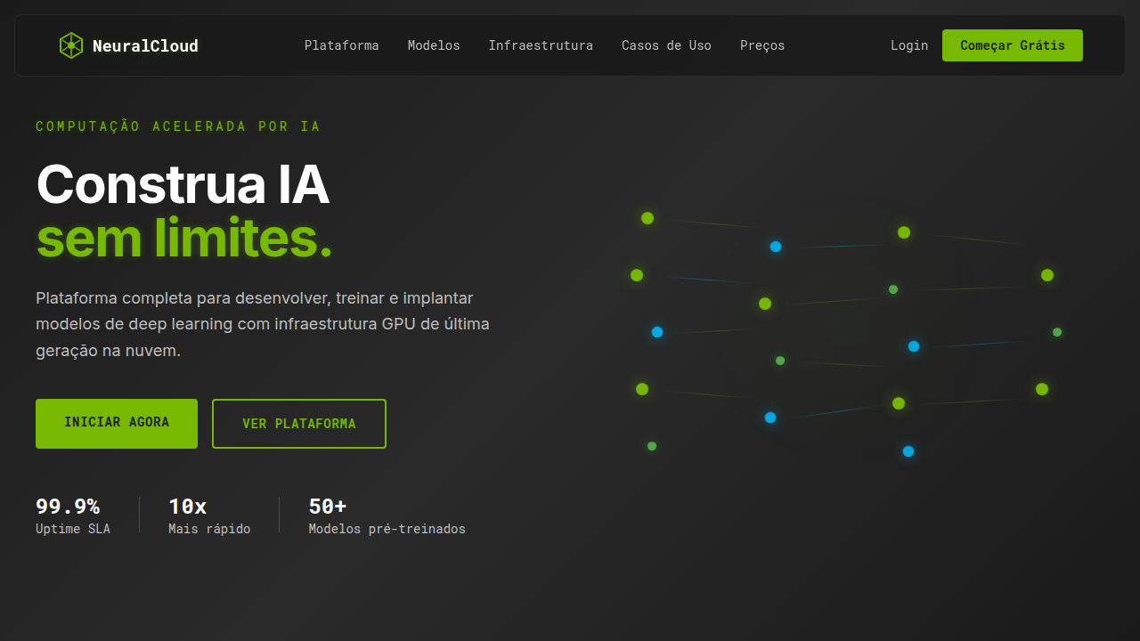
Estilo Deep Learning High-Tech
High-tech AI platform landing page. Ideal for landing pages, modern websites. AI-ready template.
Use case: Landing pages, Modern websites
Historical Context
The visual language of AI didn't emerge from design studios. It came from research papers. NVIDIA's green-black palette and angular geometry became shorthand for 'computational power' long before anyone thought to codify it. DeepMind went the other direction — clean, almost clinical whites with those signature node-and-edge diagrams that made neural architectures feel tangible. Both approaches worked because they solved the same problem: how do you make invisible intelligence visible? Neural network diagrams crossed over from technical documentation into brand identity somewhere around 2016. Suddenly every ML startup had interconnected nodes in their hero section. The good ones abstracted it — subtle, geometric, suggestive of complexity without being literal. The bad ones looked like textbook figures with a gradient slapped on. What solidified was an 'intelligence aesthetic': dark backgrounds suggesting depth, accent colors that pulse or glow (implying activity), and typography that leans monospace or geometric sans. It's a language that says 'something is thinking here.' The best implementations feel alive without being noisy — restrained motion, data-driven animation, interfaces that breathe.
When to Use
Reach for this when your product genuinely operates in the AI/ML space — training platforms, inference dashboards, GPU cluster management, research tooling. It works for data science environments where users expect information density and technical credibility. Don't use it as decoration. If your product isn't actually doing compute-heavy work, this aesthetic will feel like cosplay. It pairs well with real-time data visualization, model monitoring interfaces, and anything where the user needs to feel confident that serious computation is happening behind the glass.
Design Principles
- Dark-first environments with strategic luminance — light elements should feel like signals emerging from depth, not decorations on a surface
- Node-edge geometry as structural language, never as clip art — abstract the network topology into layout grids, connection lines, and spatial relationships
- Motion implies computation — subtle, continuous animation suggests active processing; static screens feel dead in this context
- Monospace and geometric sans typography signal precision — mix them for hierarchy, but never introduce humanist or serif faces that break the technical register
- Color as data, not as brand — accent hues should map to states (active, training, error, idle) rather than existing purely for visual interest
DESIGN.md
---
version: "alpha"
name: "Estilo Deep Learning High-Tech"
description: "High-tech AI platform landing page. Ideal for landing pages, modern websites. AI-ready template."
colors:
  primary: "#76B900"
  secondary: "#2A2A2A"
  tertiary: "#FFFFFF"
  neutral: "#4A4A4A"
  surface: "#00BFFF"
  accent: "#BDBDBD"
typography:
  h1:
    fontFamily: Roboto Mono
    fontSize: 2.5rem
    fontWeight: 700
  body-md:
    fontFamily: Roboto Mono
    fontSize: 1rem
    fontWeight: 400
components:
  button-primary:
    backgroundColor: "{colors.primary}"
    textColor: "{colors.neutral}"
    padding: 12px
---

## Overview

High-tech AI platform landing page. Ideal for landing pages, modern websites. AI-ready template. The visual language of AI didn't emerge from design studios. It came from research papers. NVIDIA's green-black palette and angular geometry became shorthand for 'computational power' long before anyone thought to codify it. DeepMind went the other direction — clean, almost clinical whites with those signature node-and-edge diagrams that made neural architectures feel tangible. Both approaches worked because they solved the same problem: how do you make invisible intelligence visible?

Neural network diagrams crossed over from technical documentation into brand identity somewhere around 2016. Suddenly every ML startup had interconnected nodes in their hero section. The good ones abstracted it — subtle, geometric, suggestive of complexity without being literal. The bad ones looked like textbook figures with a gradient slapped on.

What solidified was an 'intelligence aesthetic': dark backgrounds suggesting depth, accent colors that pulse or glow (implying activity), and typography that leans monospace or geometric sans. It's a language that says 'something is thinking here.' The best implementations feel alive without being noisy — restrained motion, data-driven animation, interfaces that breathe.

- Density: 5/10 — Balanced
- Variance: 4/10 — Moderate
- Motion: 8/10 — Cinematic

- **Style:** High-Tech, Dark, Professional
- **Keywords:** AI, deep learning, accelerated computing, neural networks, data science, futuristic, powerful, precise, dark mode
- **Era:** 2026+ AI Dominance
- **Light/Dark:** ✗ No / ✓ Full

## Colors

- **Verde Vibrante** (#76B900) — Primary surface or dominant color
- **Carvão** (#2A2A2A) — Secondary surface or text color
- **Branco Puro** (#FFFFFF) — Light surface, card backgrounds
- **Cinza Frio** (#4A4A4A) — Secondary text, borders, muted elements
- **Azul Elétrico** (#00BFFF) — Secondary accent
- **Cinza Claro** (#BDBDBD) — Secondary text, borders, muted elements
- **Preto Profundo** (#1A1A1A) — Primary background surface
- **Verde Circuito** (#6EFA5F) — Success states, positive indicators


## Typography

- **Display / Hero:** Roboto Mono — Weight 700, tight tracking, used for headline impact
- **Body:** Roboto Mono — Weight 400, 16px/1.6 line-height, max 72ch per line
- **UI Labels / Captions:** Roboto Mono — 0.875rem, weight 500, slight letter-spacing
- **Monospace:** Roboto Mono — Used for code, metadata, and technical values

Scale:
- Hero: clamp(2.5rem, 5vw, 4rem)
- H1: 2.25rem
- H2: 1.5rem
- Body: 1rem / 1.6
- Small: 0.875rem


## Layout

- **Grid:** CSS Grid primary. Max-width containment: 1280px centered with 1.5rem side padding.
- **Spacing rhythm:** Balanced. Base unit: 0.5rem (8px).
- **Section vertical gaps:** clamp(4rem, 8vw, 8rem).
- **Hero layout:** Split-screen (text left, visual right).
- **Feature sections:** Zig-zag alternating text+image rows. No 3-equal-columns.
- **Mobile collapse:** All multi-column layouts collapse below 768px. No horizontal overflow.
- **z-index contract:** base (0) / sticky-nav (100) / overlay (200) / modal (300) / toast (500).


## Elevation & Depth

Animações de redes neurais, visualização de fluxo de dados, brilhos sutis, gradientes suaves, tipografia técnica, elementos 3D interativos (WebGL), micro-interações precisas.

- **Physics:** Spring — stiffness 120, damping 20. Confident, weighted transitions.
- **Entry animations:** Fade + translate-Y (16px → 0) over 540ms ease-out. Staggered cascades for lists: 120ms between items.
- **Hover states:** Scale(1.03) + shadow lift over 200ms.
- **Page transitions:** Fade + slide (300ms).
- **Performance:** Only transform and opacity animated. No layout-triggering properties.


## Shapes

Base corner radius: 8px. See rounded tokens in front matter for the full scale.


## Components

- **Primary Button:** Subtly rounded (0.5rem) shape. Accent color fill. Hover: 8% darken + subtle lift shadow. Active: -1px translate tactile press. Font weight 600. No outer glows.
- **Secondary / Ghost Button:** Outline variant. 1.5px border in muted color. Text in primary color. Hover: subtle background fill.
- **Cards:** Subtly rounded (0.5rem) corners. Surface background. Subtle shadow (0 2px 12px rgba(0,0,0,0.06)). 1px border stroke.
- **Inputs:** Label above input. 1px border stroke. Focus ring: 2px accent color offset 2px. Error text below in semantic red. No floating labels.
- **Navigation:** Primary surface background. Active item: accent color indicator. Font weight 500 when active.
- **Skeletons:** Shimmer animation matching component dimensions. No circular spinners.
- **Empty States:** Icon-based composition with descriptive text and action button.


## Do's and Don'ts

- No emojis in UI — use icon system only (Lucide, Heroicons)
- No pure white (#FFFFFF) backgrounds — use off-white or dark surfaces
- No oversaturated accent colors (saturation cap: 80%)
- No 3-column equal-width feature layouts — use zig-zag or asymmetric grid
- No `h-screen` — use `min-h-[100dvh]`
- No AI copywriting clichés: "Elevate", "Seamless", "Unleash", "Next-Gen"
- No broken external image links — use picsum.photos or inline SVG
- No generic lorem ipsum in demos

- Do Animações de rede neural
- Do Brilho verde sutil
- Do Layout escuro e profissional
- Do Tipografia técnica
- Do Elementos 3D
- Do Foco em IA e dados.


## Use Case

Landing pages, Modern websites
Technical Specs
CSS
background: #2A2A2A, color: #FFFFFF, text-shadow: 0 0 8px rgba(118, 185, 0, 0.3), box-shadow: inset 0 0 15px rgba(0,0,0,0.5), border-left: 3px solid #76B900, font-family: 'Roboto Mono', monospace, animation: data-flow 10s linear infinite, perspective: 1500px, WebGL for neural network graph.
Variables
--accent-green: #76B900, --charcoal-bg: #2A2A2A, --cool-grey: #4A4A4A, --glow-intensity: 0.3, --border-accent: 3px solid #76B900, --font-tech: 'Roboto Mono', monospace.
Checklist
☐ Animações de rede neural, ☐ Brilho verde sutil, ☐ Layout escuro e profissional, ☐ Tipografia técnica, ☐ Elementos 3D, ☐ Foco em IA e dados.
Colors
Primary
Secondary
Effects
Animações de redes neurais, visualização de fluxo de dados, brilhos sutis, gradientes suaves, tipografia técnica, elementos 3D interativos (WebGL), micro-interações precisas.
Light/Dark
✗ No / ✓ Full
AI Prompt
Act as a Senior Frontend Engineer and Expert UI Designer.
Your task is to code a complete Landing Page on the first attempt.
- Landing Page Theme: <INSERT THEME>
- Sections to add: <INSERT SECTIONS>

Generate the final code immediately following these definitions:

## Style

- **Name:** Estilo Deep Learning High-Tech
- **Type:** High-Tech, Dark, Professional
- **Keywords:** AI, deep learning, accelerated computing, neural networks, data science, futuristic, powerful, precise, dark mode
- **Era:** 2026+ AI Dominance
- **Light/Dark:** ✗ No / ✓ Full

## Color Palette

- **Primary:** Verde Vibrante #76B900, Carvão #2A2A2A, Branco Puro #FFFFFF, Cinza Frio #4A4A4A
- **Secondary:** Azul Elétrico #00BFFF, Cinza Claro #BDBDBD, Preto Profundo #1A1A1A, Verde Circuito #6EFA5F

## Visual Effects

Animações de redes neurais, visualização de fluxo de dados, brilhos sutis, gradientes suaves, tipografia técnica, elementos 3D interativos (WebGL), micro-interações precisas.

## AI Visual Direction

Design a high-tech AI platform landing page. Use: Vibrant green accents, dark charcoal background, neural network animations, data flow visualizations, subtle glows, precise typography, interactive 3D elements, professional and powerful feel.

## CSS Technical

```css
background: #2A2A2A, color: #FFFFFF, text-shadow: 0 0 8px rgba(118, 185, 0, 0.3), box-shadow: inset 0 0 15px rgba(0,0,0,0.5), border-left: 3px solid #76B900, font-family: 'Roboto Mono', monospace, animation: data-flow 10s linear infinite, perspective: 1500px, WebGL for neural network graph.
```

## Design System Variables

```css
--accent-green: #76B900, --charcoal-bg: #2A2A2A, --cool-grey: #4A4A4A, --glow-intensity: 0.3, --border-accent: 3px solid #76B900, --font-tech: 'Roboto Mono', monospace.
```

## Implementation Checklist

- ☐ Animações de rede neural
- ☐ Brilho verde sutil
- ☐ Layout escuro e profissional
- ☐ Tipografia técnica
- ☐ Elementos 3D
- ☐ Foco em IA e dados.

## Execution Rules

1. Strictly follow the defined visual style.
2. Use high-quality inline SVG icons (Heroicons or Lucide style) — NEVER use emojis as icons.
3. Add `cursor-pointer` and smooth `hover` states (transition-all) on all interactive elements.
4. Required Page Structure:
   - Navbar (Logo + Links + CTA)
   - Hero Section (Impactful Headline + Subtitle + 2 buttons + 3D/Abstract visual element via CSS)
   - Features (3 cards with icons)
   - Testimonials (3 cards)
   - Pricing (3 tiers, highlight the middle one)
   - Final CTA
   - Full Footer with social links, privacy policy, terms of use, contact and SEO links.
5. All text content must be in English.
6. The visual must be CLEARLY distinct — do not create a "default Bootstrap" design. Force the use of the provided design system variables.
7. Use `<style>` tags in the head for custom classes (especially for complex backdrop-filter effects and animations) that Tailwind CDN doesn't cover.
8. Full Responsiveness: Layout must adapt perfectly to Mobile, Tablet and Desktop (vertical stack on mobile).
9. Include basic SEO, Viewport and Open Graph meta tags in `<head>`.
10. Footer must contain: Copyright 2026, Secondary navigation links and Social media icons.
11. Make the creative decisions needed to deliver the complete, functional result now.
Related
Last synced: 4/1/2026