Corporate Memphis
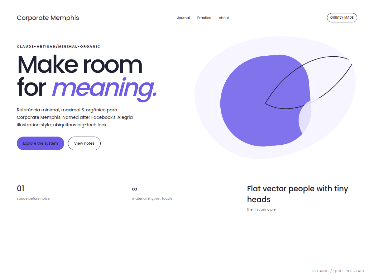
Reference for minimal, maximal & orgânico Corporate Memphis. Named after Facebook's 'Alegria' illustration style; ubiquitous big-tech look.
Use case: hero, superfície, conteúdo e grade responsiva; Flat vector people with tiny heads, long bendy limbs; Simple geometric bodies, bold flat colors
Historical Context
Named after Facebook's 'Alegria' illustration style; ubiquitous big-tech look. Example: Facebook 'Alegria'; Google/Slack/startup illustrations..
Source & Provenance
Imported from ara-mkr/claude-artisan · MIT · commit ae6d3ad · 2026-08-30
DESIGN.md
---
version: "alpha"
name: "Corporate Memphis"
description: "Corporate Memphis visual system, translated from the Claude Artisan catalog for use in digital products. Flat vector people with tiny heads, long bendy limbs; Simple geometric bodies, bold flat colors"
colors:
  primary: "#6c5ce7"
  background: "#ffffff"
  surface: "#f7f5ff"
  text: "#1f2233"
  accent: "#ff7a8a"
  on-primary: "#FFFFFF"
  on-surface: "#000000"
  on-accent: "#000000"
typography:
  h1:
    fontFamily: "'Poppins', system-ui, sans-serif"
    fontSize: "4rem"
    fontWeight: "700"
    lineHeight: "1.05"
  body-md:
    fontFamily: "'Poppins', 'Circular', system-ui, sans-serif"
    fontSize: "1rem"
    fontWeight: "400"
    lineHeight: "1.6"
  label-caps:
    fontFamily: "'Poppins', 'Circular', system-ui, sans-serif"
    fontSize: "0.75rem"
    fontWeight: "600"
    letterSpacing: "0.06em"
rounded:
  sm: "8px"
  md: "16px"
  lg: "24px"
spacing:
  sm: "8px"
  md: "16px"
  lg: "32px"
components:
  button-primary:
    backgroundColor: "{colors.primary}"
    textColor: "{colors.on-primary}"
    rounded: "{rounded.md}"
    padding: "16px"
  button-secondary:
    backgroundColor: "{colors.accent}"
    textColor: "{colors.on-accent}"
    rounded: "{rounded.md}"
    padding: "16px"
  card:
    backgroundColor: "{colors.surface}"
    textColor: "{colors.on-surface}"
    rounded: "{rounded.lg}"
    padding: "24px"
  page:
    backgroundColor: "{colors.background}"
    textColor: "{colors.text}"
    padding: "16px"
---
## Overview

Corporate Memphis visual system, translated from the Claude Artisan catalog for use in digital products. Flat vector people with tiny heads, long bendy limbs; Simple geometric bodies, bold flat colors

- **Category:** minimal-organic
- **Era:** 2017–present
- **Origin:** Named after Facebook's 'Alegria' illustration style; ubiquitous big-tech look.
- **Reference:** Facebook 'Alegria'; Google/Slack/startup illustrations.
- **Structural base:** hero, superfície, conteúdo e grade responsiva

**Defining traits:**
- Flat vector people with tiny heads, long bendy limbs
- Simple geometric bodies, bold flat colors
- Friendly, inclusive, generic illustration
- Soft rounded UI around it

## Colors

- **bg** — #ffffff
- **surface** — #f7f5ff
- **surface-2** — #eef0ff
- **text** — #1f2233
- **text-muted** — #5b607a
- **primary** — #6c5ce7
- **accent** — #ff7a8a
- **secondary** — #00b894
- **yellow** — #ffd166

## Typography

- Display: 'Poppins', system-ui, sans-serif
- Body: 'Poppins', 'Circular', system-ui, sans-serif
- Mono: ui-monospace, monospace

## Layout

- hero, superfície, conteúdo e grade responsiva
- Use a responsive grid and preserve content hierarchy.
- Collapse columns below 768px without horizontal overflow.

## Elevation & Depth

- Flat vector people with tiny heads, long bendy limbs; Simple geometric bodies, bold flat colors; Friendly, inclusive, generic illustration; Soft rounded UI around it; sombras e elevação; transparência e blur

## Shapes

- Radius scale: 8px, 16px, 24px.

## Components

- Buttons keep visible focus and predictable hover/pressed states.
- Cards use the surface and radius scale from the tokens.
- Forms expose persistent labels, textual errors, and keyboard focus.

## Do's and Don'ts

- Do: follow the tokens and the structural composition.
- Do: maintain WCAG AA contrast and `prefers-reduced-motion`.
- Avoid: using the style as decoration without functional hierarchy.
Technical Specs
CSS
/* Corporate Memphis — design tokens (generated from style_catalog.json) */
/* 2017–present | Named after Facebook's 'Alegria' illustration style; ubiquitous big-tech look. */
:root {
  /* color */
  --color-bg: #ffffff;
  --color-surface: #f7f5ff;
  --color-surface-2: #eef0ff;
  --color-text: #1f2233;
  --color-text-muted: #5b607a;
  --color-primary: #6c5ce7;
  --color-accent: #ff7a8a;
  --color-secondary: #00b894;
  --color-yellow: #ffd166;
  /* radius */
  --radius-sm: 8px;
  --radius-md: 16px;
  --radius-lg: 24px;
  --radius-pill: 999px;
  /* shadow */
  --shadow-sm: 0 4px 12px rgba(108,92,231,0.10);
  --shadow-md: 0 10px 30px rgba(108,92,231,0.14);
  /* font */
  --font-sans: 'Poppins', 'Circular', system-ui, sans-serif;
  --font-display: 'Poppins', system-ui, sans-serif;
  --font-mono: ui-monospace, monospace;
  /* text */
  --text-xs: 0.75rem;
  --text-sm: 0.875rem;
  --text-base: 1rem;
  --text-lg: 1.125rem;
  --text-xl: 1.375rem;
  --text-2xl: 1.75rem;
  --text-3xl: 2.25rem;
  --text-4xl: 3rem;
  --text-5xl: 4rem;
  /* space */
  --space-1: 4px;
  --space-2: 8px;
  --space-3: 12px;
  --space-4: 16px;
  --space-6: 24px;
  --space-8: 32px;
  --space-12: 48px;
  --space-16: 64px;
  --space-24: 96px;
  /* ease */
  --ease-standard: cubic-bezier(0.4, 0, 0.2, 1);
  /* extra (signature gradients, composite borders, filters) */
  --blob: radial-gradient(circle at 30% 30%, #ff7a8a, #6c5ce7);
}

/* ============================================================
   Base component classes — Corporate Memphis (token-driven).
   Signature move lives in references/00-flagship-implementation-specs/corporate-memphis.md;
   these are accessible, token-wired starting points. */
body { margin: 0; background: var(--color-bg); color: var(--color-text); font-family: var(--font-sans); }
.card { background: var(--color-surface, var(--color-bg)); color: var(--color-text);
  border-radius: var(--radius-md); box-shadow: var(--shadow-md);
  padding: var(--space-6, 24px); border: 1px solid var(--color-border, transparent); }
.nav { display: flex; gap: var(--space-4, 16px); align-items: center;
  padding: var(--space-3, 12px) var(--space-6, 24px); background: var(--color-surface, var(--color-bg));
  box-shadow: var(--shadow-md); }
.btn { font: 700 var(--text-base, 1rem)/1 var(--font-display, var(--font-sans)); color: var(--color-text);
  background: var(--color-surface, var(--color-bg)); border-radius: var(--radius-md);
  padding: var(--space-3, 12px) var(--space-6, 24px); box-shadow: var(--shadow-md); cursor: pointer; border: 1px solid var(--color-border, transparent);
  transition: transform .12s var(--ease-standard, ease), box-shadow .12s var(--ease-standard, ease), filter .12s; }
.btn:hover { transform: translateY(-1px); filter: brightness(0.96); }
.btn:active { transform: translateY(0); }
.btn:focus-visible { outline: 2px solid var(--color-accent, var(--color-primary)); outline-offset: 2px; }
.btn[disabled] { opacity: .5; cursor: not-allowed; transform: none; }
.btn--primary { background: var(--color-primary); color: #ffffff; border-color: transparent; }
.input { width: 100%; box-sizing: border-box; font: var(--text-base, 1rem) var(--font-sans); color: var(--color-text);
  background: var(--color-surface, #fff); border-radius: var(--radius-sm);
  padding: var(--space-3, 12px) var(--space-4, 16px); border: 1px solid var(--color-border, transparent); }
.input:focus { outline: 2px solid var(--color-primary); outline-offset: 2px; }
.input::placeholder { color: var(--color-text-muted, currentColor); opacity: .7; }
.badge { display: inline-flex; align-items: center; gap: .4em; font: 700 var(--text-xs, .75rem) var(--font-sans);
  color: #ffffff; background: var(--color-primary); border-radius: var(--radius-pill, 999px); padding: .3em .8em; }
@media (prefers-reduced-motion: reduce) { .btn { transition: none; } .btn:hover, .btn:active { transform: none; } }


/* Especificação de referência: references/00-flagship-implementation-specs/corporate-memphis.md */
Variables
--bg: #ffffff, --fg: #1f2233, --accent: #6c5ce7, --surface: #f7f5ff, --radius: 16px, --spacing: 16px, --font-display: 'Poppins', system-ui, sans-serif, --font-body: 'Poppins', 'Circular', system-ui, sans-serif
Checklist
Contraste WCAG AA; foco visível; navegação por teclado; estados hover/pressed; responsividade; prefers-reduced-motion; Tailwind v4 via @theme.
Colors
Primary
Secondary
Effects
Flat vector people with tiny heads, long bendy limbs, Simple geometric bodies, bold flat colors, Friendly, inclusive, generic illustration, Soft rounded UI around it, shadow, blur
Light/Dark
Fonte não declara modos; validar em light e dark antes de publicar
AI Prompt
Act as a Senior Frontend Engineer and Expert UI Designer.
Your task is to code a complete Landing Page on the first attempt.
- Landing Page Theme: <INSERT THEME>
- Sections to add: <INSERT SECTIONS>

Generate the final code immediately following these definitions:

## Style

- **Name:** Corporate Memphis
- **Type:** claude-artisan/minimal-organic
- **Keywords:** Corporate Memphis, Alegria, big tech illustration, flat humano, Flat vector people with tiny heads, long bendy limbs, Simple geometric bodies, bold flat colors, Friendly, inclusive, generic illustration, Soft rounded UI around it, minimal-organic
- **Era:** 2017–present
- **Light/Dark:** Fonte não declara modos; validar em light e dark antes de publicar

## Color Palette

- **Primary:** bg: #ffffff, surface: #f7f5ff, surface-2: #eef0ff, text: #1f2233
- **Secondary:** text-muted: #5b607a, primary: #6c5ce7, accent: #ff7a8a, secondary: #00b894, yellow: #ffd166

## Visual Effects

Flat vector people with tiny heads, long bendy limbs, Simple geometric bodies, bold flat colors, Friendly, inclusive, generic illustration, Soft rounded UI around it, shadow, blur

## AI Visual Direction

Corporate Memphis, Flat vector people with tiny heads, long bendy limbs, Simple geometric bodies, bold flat colors, Friendly, inclusive, generic illustration, Soft rounded UI around it, Facebook 'Alegria'; Google/Slack/startup illustrations.

## CSS Technical

```css
/* Corporate Memphis — design tokens (generated from style_catalog.json) */
/* 2017–present | Named after Facebook's 'Alegria' illustration style; ubiquitous big-tech look. */
:root {
  /* color */
  --color-bg: #ffffff;
  --color-surface: #f7f5ff;
  --color-surface-2: #eef0ff;
  --color-text: #1f2233;
  --color-text-muted: #5b607a;
  --color-primary: #6c5ce7;
  --color-accent: #ff7a8a;
  --color-secondary: #00b894;
  --color-yellow: #ffd166;
  /* radius */
  --radius-sm: 8px;
  --radius-md: 16px;
  --radius-lg: 24px;
  --radius-pill: 999px;
  /* shadow */
  --shadow-sm: 0 4px 12px rgba(108,92,231,0.10);
  --shadow-md: 0 10px 30px rgba(108,92,231,0.14);
  /* font */
  --font-sans: 'Poppins', 'Circular', system-ui, sans-serif;
  --font-display: 'Poppins', system-ui, sans-serif;
  --font-mono: ui-monospace, monospace;
  /* text */
  --text-xs: 0.75rem;
  --text-sm: 0.875rem;
  --text-base: 1rem;
  --text-lg: 1.125rem;
  --text-xl: 1.375rem;
  --text-2xl: 1.75rem;
  --text-3xl: 2.25rem;
  --text-4xl: 3rem;
  --text-5xl: 4rem;
  /* space */
  --space-1: 4px;
  --space-2: 8px;
  --space-3: 12px;
  --space-4: 16px;
  --space-6: 24px;
  --space-8: 32px;
  --space-12: 48px;
  --space-16: 64px;
  --space-24: 96px;
  /* ease */
  --ease-standard: cubic-bezier(0.4, 0, 0.2, 1);
  /* extra (signature gradients, composite borders, filters) */
  --blob: radial-gradient(circle at 30% 30%, #ff7a8a, #6c5ce7);
}

/* ============================================================
   Base component classes — Corporate Memphis (token-driven).
   Signature move lives in references/00-flagship-implementation-specs/corporate-memphis.md;
   these are accessible, token-wired starting points. */
body { margin: 0; background: var(--color-bg); color: var(--color-text); font-family: var(--font-sans); }
.card { background: var(--color-surface, var(--color-bg)); color: var(--color-text);
  border-radius: var(--radius-md); box-shadow: var(--shadow-md);
  padding: var(--space-6, 24px); border: 1px solid var(--color-border, transparent); }
.nav { display: flex; gap: var(--space-4, 16px); align-items: center;
  padding: var(--space-3, 12px) var(--space-6, 24px); background: var(--color-surface, var(--color-bg));
  box-shadow: var(--shadow-md); }
.btn { font: 700 var(--text-base, 1rem)/1 var(--font-display, var(--font-sans)); color: var(--color-text);
  background: var(--color-surface, var(--color-bg)); border-radius: var(--radius-md);
  padding: var(--space-3, 12px) var(--space-6, 24px); box-shadow: var(--shadow-md); cursor: pointer; border: 1px solid var(--color-border, transparent);
  transition: transform .12s var(--ease-standard, ease), box-shadow .12s var(--ease-standard, ease), filter .12s; }
.btn:hover { transform: translateY(-1px); filter: brightness(0.96); }
.btn:active { transform: translateY(0); }
.btn:focus-visible { outline: 2px solid var(--color-accent, var(--color-primary)); outline-offset: 2px; }
.btn[disabled] { opacity: .5; cursor: not-allowed; transform: none; }
.btn--primary { background: var(--color-primary); color: #ffffff; border-color: transparent; }
.input { width: 100%; box-sizing: border-box; font: var(--text-base, 1rem) var(--font-sans); color: var(--color-text);
  background: var(--color-surface, #fff); border-radius: var(--radius-sm);
  padding: var(--space-3, 12px) var(--space-4, 16px); border: 1px solid var(--color-border, transparent); }
.input:focus { outline: 2px solid var(--color-primary); outline-offset: 2px; }
.input::placeholder { color: var(--color-text-muted, currentColor); opacity: .7; }
.badge { display: inline-flex; align-items: center; gap: .4em; font: 700 var(--text-xs, .75rem) var(--font-sans);
  color: #ffffff; background: var(--color-primary); border-radius: var(--radius-pill, 999px); padding: .3em .8em; }
@media (prefers-reduced-motion: reduce) { .btn { transition: none; } .btn:hover, .btn:active { transform: none; } }


/* Especificação de referência: references/00-flagship-implementation-specs/corporate-memphis.md */
```

## Design System Variables

```css
--bg: #ffffff, --fg: #1f2233, --accent: #6c5ce7, --surface: #f7f5ff, --radius: 16px, --spacing: 16px, --font-display: 'Poppins', system-ui, sans-serif, --font-body: 'Poppins', 'Circular', system-ui, sans-serif
```

## Implementation Checklist

- Contraste WCAG AA; foco visível; navegação por teclado; estados hover/pressed; responsividade; prefers-reduced-motion; Tailwind v4 via @theme.

## Execution Rules

1. Strictly follow the defined visual style.
2. Use high-quality inline SVG icons (Heroicons or Lucide style) — NEVER use emojis as icons.
3. Add `cursor-pointer` and smooth `hover` states (transition-all) on all interactive elements.
4. Required Page Structure:
   - Navbar (Logo + Links + CTA)
   - Hero Section (Impactful Headline + Subtitle + 2 buttons + 3D/Abstract visual element via CSS)
   - Features (3 cards with icons)
   - Testimonials (3 cards)
   - Pricing (3 tiers, highlight the middle one)
   - Final CTA
   - Full Footer with social links, privacy policy, terms of use, contact and SEO links.
5. All text content must be in English.
6. The visual must be CLEARLY distinct — do not create a "default Bootstrap" design. Force the use of the provided design system variables.
7. Use `<style>` tags in the head for custom classes (especially for complex backdrop-filter effects and animations) that Tailwind CDN doesn't cover.
8. Full Responsiveness: Layout must adapt perfectly to Mobile, Tablet and Desktop (vertical stack on mobile).
9. Include basic SEO, Viewport and Open Graph meta tags in `<head>`.
10. Footer must contain: Copyright 2026, Secondary navigation links and Social media icons.
11. Make the creative decisions needed to deliver the complete, functional result now.Related
Last synced: 8/30/2026