Coastal Commerce
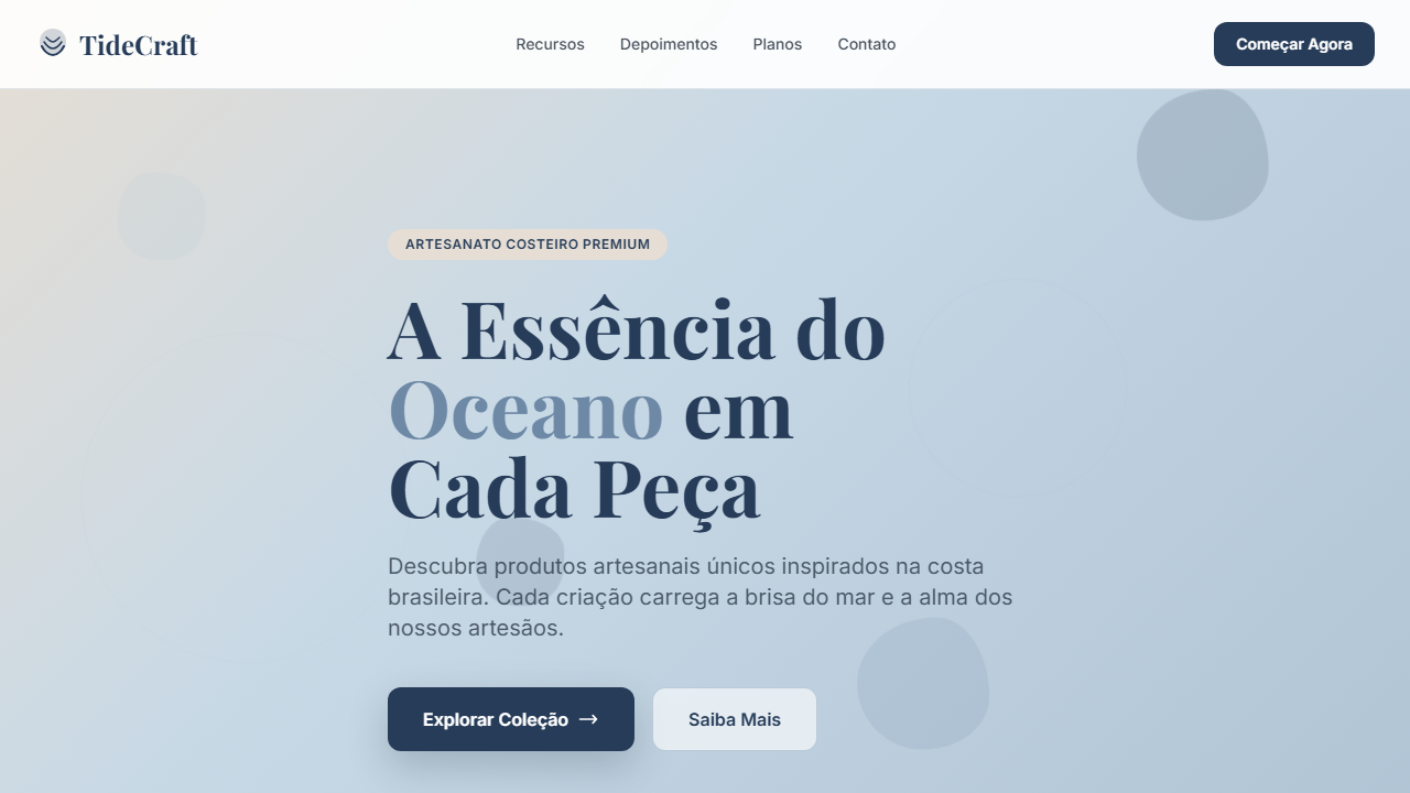
Coastal-inspired e-commerce UI using navy, driftwood beige, and pale ocean blues. Ideal for e-commerce de moda praia, lojas de surf e lifestyle, produtos artesanais costeiros, decoração náutica. AI-ready template.
Use case: Beachwear e-commerce, Surf and lifestyle stores, Coastal artisan products, Nautical decor
Historical Context
Coastal commerce design didn't emerge from fashion or tech — it came from surf shop culture and the mail-order catalogs of the late '80s. Patagonia, Billabong, and Rip Curl built visual languages around horizontal imagery long before e-commerce existed. Wide landscape photography, minimal text overlays, and that specific ratio of whitespace to product that makes everything feel unhurried. The digital translation happened awkwardly at first. Early coastal e-commerce sites crammed products into grids that killed the vibe entirely. The breakthrough was horizontal scrolling blocks — borrowed from editorial magazine layouts — that finally let product photography breathe the way it does in a physical lookbook. Brands like Saturdays NYC and Outerknown proved you could sell online without sacrificing the spatial generosity that coastal aesthetics demand. What we're seeing now is the maturation of that language. The horizontal block isn't decorative anymore — it's structural. It creates rhythm, controls pacing, and gives the customer permission to browse slowly. That's the whole point of coastal commerce: you're not rushing anyone.
When to Use
When the brand lives outdoors and the product photographs wide. Coastal Commerce works for surf, sailing, beach lifestyle, and premium outdoor brands where horizontal imagery is the natural format. Deploy it when your product catalog is small-to-medium and each item deserves cinematic presentation rather than grid compression. Skip it entirely if you're selling 500+ SKUs or anything that needs rapid comparison shopping — this layout rewards browsing, not efficiency.
Design Principles
- Horizontal blocks as primary rhythm — stack wide containers that scroll the eye laterally before moving down, mimicking the horizon line itself
- Restrained palette pulled from sand, salt, and shadow — two neutrals, one accent max, let photography carry the color load
- Generous negative space as brand signal — tight layouts read as discount; breathing room reads as premium and intentional
- Typography stays dry and functional — one sans-serif, medium weight, no decorative faces competing with landscape imagery
- Product density stays low per viewport — three items maximum visible at once, forcing deliberate attention on each piece
DESIGN.md
---
version: "alpha"
name: "Coastal Commerce"
description: "Coastal-inspired e-commerce UI using navy, driftwood beige, and pale ocean blues. Ideal for e-commerce de moda praia, lojas de surf e lifestyle, produtos artesanais costeiros, decoração náutica. AI-ready template."
colors:
  primary: "#263C59"
  secondary: "#E6DED4"
  tertiary: "#AFC3D4"
  neutral: "#C8D9E6"
  surface: "#6D89A6"
  accent: "#1B2735"
typography:
  h1:
    fontFamily: System UI stack
    fontSize: 2.25rem
    fontWeight: 700
  body-md:
    fontFamily: System UI stack
    fontSize: 1rem
    fontWeight: 400
  label-caps:
    fontFamily: System UI stack
    fontSize: 0.75rem
    fontWeight: 500
rounded:
  sm: 12px
  md: 24px
  lg: 36px
components:
  button-primary:
    backgroundColor: "{colors.primary}"
    textColor: "{colors.neutral}"
    rounded: "{rounded.sm}"
    padding: 12px
---

## Overview

Coastal-inspired e-commerce UI using navy, driftwood beige, and pale ocean blues. Ideal for e-commerce de moda praia, lojas de surf e lifestyle, produtos artesanais costeiros, decoração náutica. AI-ready template. Coastal commerce design didn't emerge from fashion or tech — it came from surf shop culture and the mail-order catalogs of the late '80s. Patagonia, Billabong, and Rip Curl built visual languages around horizontal imagery long before e-commerce existed. Wide landscape photography, minimal text overlays, and that specific ratio of whitespace to product that makes everything feel unhurried.

The digital translation happened awkwardly at first. Early coastal e-commerce sites crammed products into grids that killed the vibe entirely. The breakthrough was horizontal scrolling blocks — borrowed from editorial magazine layouts — that finally let product photography breathe the way it does in a physical lookbook. Brands like Saturdays NYC and Outerknown proved you could sell online without sacrificing the spatial generosity that coastal aesthetics demand.

What we're seeing now is the maturation of that language. The horizontal block isn't decorative anymore — it's structural. It creates rhythm, controls pacing, and gives the customer permission to browse slowly. That's the whole point of coastal commerce: you're not rushing anyone.

- Density: 3/10 — Airy
- Variance: 3/10 — Restrained
- Motion: 4/10 — Subtle

- **Style:** General
- **Keywords:** costeiro premium, e-commerce clean, blocos horizontais, contraste controlado, fotografia de produtos em ambiente de praia
- **Era:** Modern Coastal Retail
- **Light/Dark:** ✓ Full / ◐ Partial

## Colors

- **Deep Current** (#263C59) — Primary surface or dominant color
- **Driftwood Pale** (#E6DED4) — Secondary surface or text color
- **Ocean Pearl** (#AFC3D4) — Supporting palette color
- **Seafoam Cloud** (#C8D9E6) — Extended palette, decorative use
- **Coastal Slate** (#6D89A6) — Extended palette, decorative use
- **Detalhes escuros** (#1B2735) — Deep contrast surface


## Typography

- **Display / Hero:** System UI stack (-apple-system, sans-serif) — Weight 700, tight tracking, used for headline impact
- **Body:** System UI stack (-apple-system, sans-serif) — Weight 400, 16px/1.6 line-height, max 72ch per line
- **UI Labels / Captions:** System UI stack (-apple-system, sans-serif) — 0.875rem, weight 500, slight letter-spacing
- **Monospace:** JetBrains Mono — Used for code, metadata, and technical values

Scale:
- Hero: clamp(2.5rem, 5vw, 4rem)
- H1: 2.25rem
- H2: 1.5rem
- Body: 1rem / 1.6
- Small: 0.875rem


## Layout

- **Grid:** CSS Grid primary. Max-width containment: 1280px centered with 1.5rem side padding.
- **Spacing rhythm:** Balanced. Base unit: 0.5rem (8px).
- **Section vertical gaps:** clamp(4rem, 8vw, 8rem).
- **Hero layout:** Split-screen (text left, visual right).
- **Feature sections:** Zig-zag alternating text+image rows. No 3-equal-columns.
- **Mobile collapse:** All multi-column layouts collapse below 768px. No horizontal overflow.
- **z-index contract:** base (0) / sticky-nav (100) / overlay (200) / modal (300) / toast (500).


## Elevation & Depth

Cards horizontais de produto, linhas finas em Coastal Slate, sombras em soft drop, botões com Deep Current sólido, tags e badges em Driftwood Pale

- **Physics:** Ease-out curves, 200-300ms duration. Smooth and predictable.
- **Entry animations:** Fade + translate-Y (16px → 0) over 420ms ease-out. Staggered cascades for lists: 80ms between items.
- **Hover states:** Subtle color shift + shadow adjustment over 200ms.
- **Page transitions:** Fade only (200ms).
- **Performance:** Only transform and opacity animated. No layout-triggering properties.


## Shapes

Base corner radius: 12px. See rounded tokens in front matter for the full scale.


## Components

- **Primary Button:** Rounded (12px) shape. Accent color fill. Hover: 8% darken + subtle lift shadow. Active: -1px translate tactile press. Font weight 600. No outer glows.
- **Secondary / Ghost Button:** Outline variant. 1.5px border in muted color. Text in primary color. Hover: subtle background fill.
- **Cards:** Rounded (12px) corners. Surface background. Subtle shadow (0 2px 12px rgba(0,0,0,0.06)). 1px border stroke.
- **Inputs:** Label above input. 1px border stroke. Focus ring: 2px accent color offset 2px. Error text below in semantic red. No floating labels.
- **Navigation:** Primary surface background. Active item: accent color indicator. Font weight 500 when active.
- **Skeletons:** Shimmer animation matching component dimensions. No circular spinners.
- **Empty States:** Icon-based composition with descriptive text and action button.


## Do's and Don'ts

- No emojis in UI — use icon system only (Lucide, Heroicons)
- No pure black (#000000) — use off-black or charcoal variants
- No oversaturated accent colors (saturation cap: 80%)
- No 3-column equal-width feature layouts — use zig-zag or asymmetric grid
- No `h-screen` — use `min-h-[100dvh]`
- No AI copywriting clichés: "Elevate", "Seamless", "Unleash", "Next-Gen"
- No broken external image links — use picsum.photos or inline SVG
- No generic lorem ipsum in demos

- Do Cards de produto horizontais com foto + info
- Do Uso de Driftwood Pale como fundo de seções claras
- Do Botões principais em Deep Current com texto branco
- Do Linhas divisórias finas em Coastal Slate
- Do Destaques de preço ou selo em Ocean Pearl


## Use Case

Beachwear e-commerce, Surf and lifestyle stores, Coastal artisan products, Nautical decor
Technical Specs
CSS
border-radius: 12px; box-shadow: 0 14px 36px rgba(27,39,53,0.22); background: linear-gradient(135deg, #E6DED4 0%, #C8D9E6 40%, #AFC3D4 100%); border: 1px solid rgba(109,137,166,0.35);
Variables
--radius-card: 12px; --color-primary: #263C59; --color-accent-light: #E6DED4; --color-divider: #6D89A6; --shadow-card: 0 14px 36px rgba(27,39,53,0.22);
Checklist
☐ Cards de produto horizontais com foto + info, ☐ Uso de Driftwood Pale como fundo de seções claras, ☐ Botões principais em Deep Current com texto branco, ☐ Linhas divisórias finas em Coastal Slate, ☐ Destaques de preço ou selo em Ocean Pearl
Colors
Primary
Secondary
Effects
Cards horizontais de produto, linhas finas em Coastal Slate, sombras em soft drop, botões com Deep Current sólido, tags e badges em Driftwood Pale
Light/Dark
✓ Full / ◐ Partial
AI Prompt
Act as a Senior Frontend Engineer and Expert UI Designer.
Your task is to code a complete Landing Page on the first attempt.
- Landing Page Theme: <INSERT THEME>
- Sections to add: <INSERT SECTIONS>

Generate the final code immediately following these definitions:

## Style

- **Name:** Coastal Commerce
- **Type:** General
- **Keywords:** costeiro premium, e-commerce clean, blocos horizontais, contraste controlado, fotografia de produtos em ambiente de praia
- **Era:** Modern Coastal Retail
- **Light/Dark:** ✓ Full / ◐ Partial

## Color Palette

- **Primary:** Deep Current #263C59, Driftwood Pale #E6DED4, Ocean Pearl #AFC3D4
- **Secondary:** Seafoam Cloud #C8D9E6, Coastal Slate #6D89A6, Detalhes escuros #1B2735

## Visual Effects

Cards horizontais de produto, linhas finas em Coastal Slate, sombras em soft drop, botões com Deep Current sólido, tags e badges em Driftwood Pale

## AI Visual Direction

Create a coastal-inspired e-commerce UI using navy, driftwood beige, and pale ocean blues. Use horizontal product cards, thin slate dividers, and soft shadows for a premium seaside shop.

## CSS Technical

```css
border-radius: 12px; box-shadow: 0 14px 36px rgba(27,39,53,0.22); background: linear-gradient(135deg, #E6DED4 0%, #C8D9E6 40%, #AFC3D4 100%); border: 1px solid rgba(109,137,166,0.35);
```

## Design System Variables

```css
--radius-card: 12px; --color-primary: #263C59; --color-accent-light: #E6DED4; --color-divider: #6D89A6; --shadow-card: 0 14px 36px rgba(27,39,53,0.22);
```

## Implementation Checklist

- ☐ Cards de produto horizontais com foto + info
- ☐ Uso de Driftwood Pale como fundo de seções claras
- ☐ Botões principais em Deep Current com texto branco
- ☐ Linhas divisórias finas em Coastal Slate
- ☐ Destaques de preço ou selo em Ocean Pearl

## Execution Rules

1. Strictly follow the defined visual style.
2. Use high-quality inline SVG icons (Heroicons or Lucide style) — NEVER use emojis as icons.
3. Add `cursor-pointer` and smooth `hover` states (transition-all) on all interactive elements.
4. Required Page Structure:
   - Navbar (Logo + Links + CTA)
   - Hero Section (Impactful Headline + Subtitle + 2 buttons + 3D/Abstract visual element via CSS)
   - Features (3 cards with icons)
   - Testimonials (3 cards)
   - Pricing (3 tiers, highlight the middle one)
   - Final CTA
   - Full Footer with social links, privacy policy, terms of use, contact and SEO links.
5. All text content must be in English.
6. The visual must be CLEARLY distinct — do not create a "default Bootstrap" design. Force the use of the provided design system variables.
7. Use `<style>` tags in the head for custom classes (especially for complex backdrop-filter effects and animations) that Tailwind CDN doesn't cover.
8. Full Responsiveness: Layout must adapt perfectly to Mobile, Tablet and Desktop (vertical stack on mobile).
9. Include basic SEO, Viewport and Open Graph meta tags in `<head>`.
10. Footer must contain: Copyright 2026, Secondary navigation links and Social media icons.
11. Make the creative decisions needed to deliver the complete, functional result now.
Related
Last synced: 4/1/2026