Clay Artisanal Swatch
Clay-inspired artisanal landing page. Ideal for b2b criativo, agências, plataformas de dados, ferramentas de enriquecimento. AI-ready template.
Use case: B2B criativo, Agencies, Platforms de dados, Tools de enriquecimento
Historical Context
Clay has been humanity's first design medium since before we had the word 'design.' Mesopotamian potters weren't thinking about brand palettes — they were pulling ochres, terracottas, and slate grays directly from the earth beneath their feet. The colors weren't chosen; they were discovered. Every kiln firing was a collaboration between intention and accident, producing tones that no Pantone book could standardize. The artisanal swatch tradition emerged properly in 18th-century European ceramics workshops, where master potters kept physical clay tiles — test swatches — mounted on workshop walls. These weren't decorative. They were functional references, each one fired at different temperatures, recording how raw earth transformed under heat. The imperfection was the point. What makes clay palettes endure in contemporary design is their refusal to be synthetic. When digital interfaces flatten everything into uniform hex codes, a clay-derived palette carries geological memory. The warmth isn't manufactured — it's inherited from millennia of hands shaping earth into meaning.
When to Use
Reach for clay swatches when your project needs to feel touched by human hands. Artisan brands, ceramics studios, natural skincare lines, handmade goods marketplaces — anywhere the audience values imperfection as proof of authenticity. These palettes work hardest when you need warmth without sweetness, earthiness without dullness. They're wrong for tech products chasing clinical precision. They're right when the brand story involves process, craft, and material honesty.
Design Principles
- Let value contrast do the work — clay tones cluster in similar saturation ranges, so lean on light-to-dark relationships rather than hue shifts to create hierarchy.
- Embrace uneven texture. Flat-fill clay colors look dead on screen. Introduce subtle grain, noise, or paper texture to restore the tactile quality these swatches reference.
- Pair with generous whitespace. Earth tones absorb visual energy — they need breathing room or your layout will feel heavy and airless.
- Restrict your accent to one warm punctuation — a terracotta or burnt sienna — and let the muted tones recede. Clay palettes collapse when every color competes.
- Test on warm-toned paper stocks if going to print. Cool-white substrates fight these colors and make them look muddy rather than rich.
DESIGN.md
---
version: "alpha"
name: "Clay Artisanal Swatch"
description: "Clay-inspired artisanal landing page. Ideal for b2b criativo, agências, plataformas de dados, ferramentas de enriquecimento. AI-ready template."
colors:
  primary: "#faf9f7"
  secondary: "#000000"
  tertiary: "#ffffff"
  neutral: "#dad4c8"
  surface: "#84e7a5"
  accent: "#3bd3fd"
typography:
  h1:
    fontFamily: system-ui
    fontSize: 2.25rem
    fontWeight: 700
  body-md:
    fontFamily: system-ui
    fontSize: 1rem
    fontWeight: 400
  label-caps:
    fontFamily: system-ui
    fontSize: 0.75rem
    fontWeight: 500
rounded:
  sm: 24px
  md: 48px
  lg: 72px
components:
  button-primary:
    backgroundColor: "{colors.primary}"
    textColor: "{colors.neutral}"
    rounded: "{rounded.sm}"
    padding: 12px
---

## Overview

Clay-inspired artisanal landing page. Ideal for b2b criativo, agências, plataformas de dados, ferramentas de enriquecimento. AI-ready template. Clay has been humanity's first design medium since before we had the word 'design.' Mesopotamian potters weren't thinking about brand palettes — they were pulling ochres, terracottas, and slate grays directly from the earth beneath their feet. The colors weren't chosen; they were discovered. Every kiln firing was a collaboration between intention and accident, producing tones that no Pantone book could standardize.

The artisanal swatch tradition emerged properly in 18th-century European ceramics workshops, where master potters kept physical clay tiles — test swatches — mounted on workshop walls. These weren't decorative. They were functional references, each one fired at different temperatures, recording how raw earth transformed under heat. The imperfection was the point.

What makes clay palettes endure in contemporary design is their refusal to be synthetic. When digital interfaces flatten everything into uniform hex codes, a clay-derived palette carries geological memory. The warmth isn't manufactured — it's inherited from millennia of hands shaping earth into meaning.

- Density: 5/10 — Balanced
- Variance: 4/10 — Moderate
- Motion: 4/10 — Subtle

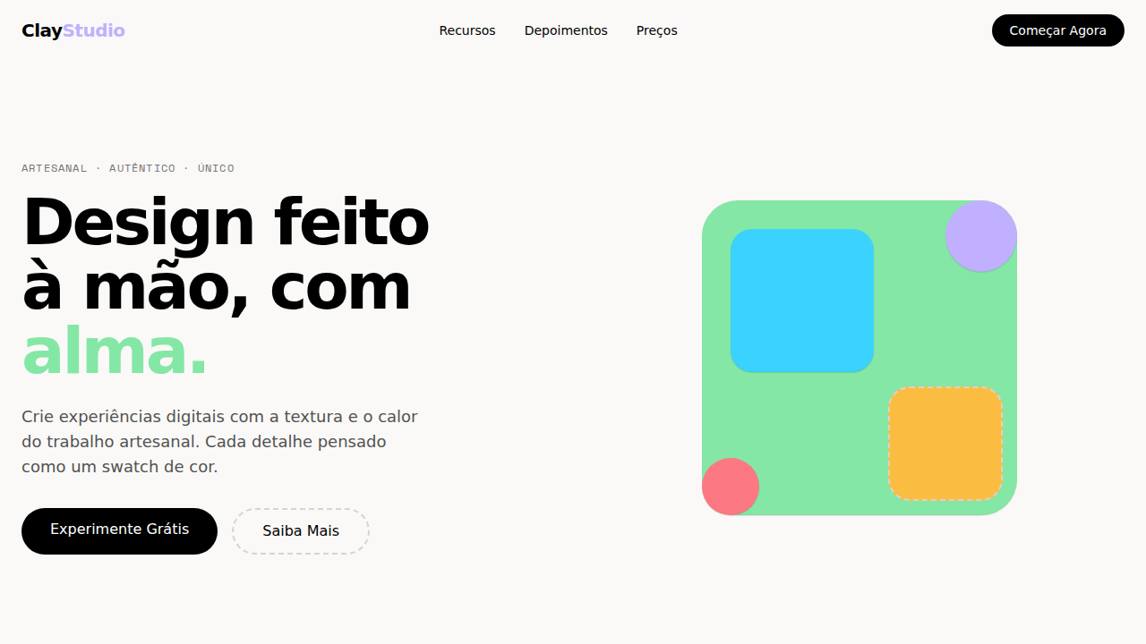
- **Style:** Warm Cream Canvas, Named Swatch Palette, Playful Hover Animations, Roobert Font, Dashed Borders
- **Keywords:** clay, artisanal, swatch palette, warm cream, Roobert, OpenType ss01 ss03, playful hover, rotateZ, hard offset shadow, dashed borders, Space Mono
- **Era:** 2024-2026 Artisanal B2B
- **Light/Dark:** ✓ Full / ✗ Not Recommended

## Colors

- **Creme Quente** (#faf9f7) — Primary surface or dominant color
- **Preto** (#000000) — Dark surface, primary background
- **Branco** (#ffffff) — Light surface, card backgrounds
- **Borda Oat** (#dad4c8) — Supporting palette color
- **Matcha** (#84e7a5) — Extended palette, decorative use
- **Slushie** (#3bd3fd) — Extended palette, decorative use
- **Lemon** (#fbbd41) — Extended palette, decorative use
- **Ube** (#c1b0ff) — Extended palette, decorative use


## Typography

- **Display / Hero:** system-ui — Weight 700, tight tracking, used for headline impact
- **Body:** system-ui — Weight 400, 16px/1.6 line-height, max 72ch per line
- **UI Labels / Captions:** system-ui — 0.875rem, weight 500, slight letter-spacing
- **Monospace:** JetBrains Mono — Used for code, metadata, and technical values

Scale:
- Hero: clamp(2.5rem, 5vw, 4rem)
- H1: 2.25rem
- H2: 1.5rem
- Body: 1rem / 1.6
- Small: 0.875rem


## Layout

- **Grid:** CSS Grid primary. Max-width containment: 1280px centered with 1.5rem side padding.
- **Spacing rhythm:** Balanced. Base unit: 0.5rem (8px).
- **Section vertical gaps:** clamp(4rem, 8vw, 8rem).
- **Hero layout:** Split-screen (text left, visual right).
- **Feature sections:** Zig-zag alternating text+image rows. No 3-equal-columns.
- **Mobile collapse:** All multi-column layouts collapse below 768px. No horizontal overflow.
- **z-index contract:** base (0) / sticky-nav (100) / overlay (200) / modal (300) / toast (500).


## Elevation & Depth

Canvas creme quente (#faf9f7) como papel artesanal. Paleta de swatches nomeados como sabores: Matcha verde, Slushie cyan, Lemon dourado, Ube roxo, Pomegranate rosa. Roobert com 5 OpenType stylistic sets (ss01, ss03, ss10, ss11, ss12). Hover playful: rotateZ(-8deg) + translateY(-80%) + hard offset shadow (-7px 7px). Bordas oat quentes (#dad4c8) + bordas dashed misturadas. Radius generoso: 24px cards, 40px seções, 1584px pills. Sombra multi-camada com inset highlight. Space Mono para labels técnicos.

- **Physics:** Ease-out curves, 200-300ms duration. Smooth and predictable.
- **Entry animations:** Fade + translate-Y (16px → 0) over 420ms ease-out. Staggered cascades for lists: 80ms between items.
- **Hover states:** Subtle color shift + shadow adjustment over 200ms.
- **Page transitions:** Fade only (200ms).
- **Performance:** Only transform and opacity animated. No layout-triggering properties.


## Shapes

Base corner radius: 24px. See rounded tokens in front matter for the full scale.


## Components

- **Primary Button:** Pill-shaped (9999px) shape. Accent color fill. Hover: 8% darken + subtle lift shadow. Active: -1px translate tactile press. Font weight 600. No outer glows.
- **Secondary / Ghost Button:** Outline variant. 1.5px border in muted color. Text in primary color. Hover: subtle background fill.
- **Cards:** Pill-shaped (9999px) corners. Surface background. Subtle shadow (0 2px 12px rgba(0,0,0,0.06)). 1px border stroke.
- **Inputs:** Label above input. 1px border stroke. Focus ring: 2px accent color offset 2px. Error text below in semantic red. No floating labels.
- **Navigation:** Primary surface background. Active item: accent color indicator. Font weight 500 when active.
- **Skeletons:** Shimmer animation matching component dimensions. No circular spinners.
- **Empty States:** Icon-based composition with descriptive text and action button.


## Do's and Don'ts

- No emojis in UI — use icon system only (Lucide, Heroicons)
- No pure black (#000000) — use off-black or charcoal variants
- No oversaturated accent colors (saturation cap: 80%)
- No 3-column equal-width feature layouts — use zig-zag or asymmetric grid
- No `h-screen` — use `min-h-[100dvh]`
- No AI copywriting clichés: "Elevate", "Seamless", "Unleash", "Next-Gen"
- No broken external image links — use picsum.photos or inline SVG
- No generic lorem ipsum in demos

- Do Canvas creme #faf9f7
- Do Swatch palette nomeado
- Do Roobert com 5 OpenType sets
- Do Hover rotateZ(-8deg) + hard shadow
- Do Bordas oat + dashed
- Do Radius generoso 24-40px
- Do Space Mono labels
- Do Responsivo


## Use Case

B2B criativo, Agencies, Platforms de dados, Tools de enriquecimento
Technical Specs
CSS
background:#faf9f7;color:#000000;border:1px solid #dad4c8;box-shadow:rgba(0,0,0,0.1) 0px 1px 1px,rgba(0,0,0,0.04) 0px -1px 1px inset;font-family:system-ui;font-feature-settings:'ss01','ss03','ss10','ss11','ss12';border-radius:24px cards,40px sections,1584px pills;hover:rotateZ(-8deg) translateY(-80%)
Variables
--bg:#faf9f7;--text:#000000;--border-oat:#dad4c8;--matcha:#84e7a5;--slushie:#3bd3fd;--lemon:#fbbd41;--ube:#c1b0ff;--pomegranate:#fc7981;--radius-card:24px;--radius-section:40px;--radius-pill:1584px
Checklist
☐ Canvas creme #faf9f7, ☐ Swatch palette nomeado, ☐ Roobert com 5 OpenType sets, ☐ Hover rotateZ(-8deg) + hard shadow, ☐ Bordas oat + dashed, ☐ Radius generoso 24-40px, ☐ Space Mono labels, ☐ Responsivo
Colors
Primary
Secondary
Effects
Canvas creme quente (#faf9f7) como papel artesanal. Paleta de swatches nomeados como sabores: Matcha verde, Slushie cyan, Lemon dourado, Ube roxo, Pomegranate rosa. Roobert com 5 OpenType stylistic sets (ss01, ss03, ss10, ss11, ss12). Hover playful: rotateZ(-8deg) + translateY(-80%) + hard offset shadow (-7px 7px). Bordas oat quentes (#dad4c8) + bordas dashed misturadas. Radius generoso: 24px cards, 40px seções, 1584px pills. Sombra multi-camada com inset highlight. Space Mono para labels técnicos.
Light/Dark
✓ Full / ✗ Not Recommended
AI Prompt
Act as a Senior Frontend Engineer and Expert UI Designer.
Your task is to code a complete Landing Page on the first attempt.
- Landing Page Theme: <INSERT THEME>
- Sections to add: <INSERT SECTIONS>

Generate the final code immediately following these definitions:

## Style

- **Name:** Clay Artisanal Swatch
- **Type:** Warm Cream Canvas, Named Swatch Palette, Playful Hover Animations, Roobert Font, Dashed Borders
- **Keywords:** clay, artisanal, swatch palette, warm cream, Roobert, OpenType ss01 ss03, playful hover, rotateZ, hard offset shadow, dashed borders, Space Mono
- **Era:** 2024-2026 Artisanal B2B
- **Light/Dark:** ✓ Full / ✗ Not Recommended

## Color Palette

- **Primary:** Creme Quente #faf9f7, Preto #000000, Branco #ffffff, Borda Oat #dad4c8
- **Secondary:** Matcha #84e7a5, Slushie #3bd3fd, Lemon #fbbd41, Ube #c1b0ff

## Visual Effects

Canvas creme quente (#faf9f7) como papel artesanal. Paleta de swatches nomeados como sabores: Matcha verde, Slushie cyan, Lemon dourado, Ube roxo, Pomegranate rosa. Roobert com 5 OpenType stylistic sets (ss01, ss03, ss10, ss11, ss12). Hover playful: rotateZ(-8deg) + translateY(-80%) + hard offset shadow (-7px 7px). Bordas oat quentes (#dad4c8) + bordas dashed misturadas. Radius generoso: 24px cards, 40px seções, 1584px pills. Sombra multi-camada com inset highlight. Space Mono para labels técnicos.

## AI Visual Direction

Design a Clay-inspired artisanal landing page. Warm cream canvas (#faf9f7) like handmade paper. Named swatch palette sections: Matcha green (#84e7a5), Slushie cyan (#3bd3fd), Lemon gold (#fbbd41), Ube purple (#c1b0ff). Roobert font with OpenType ss01, ss03, ss10, ss11, ss12 at 80px weight 600, letter-spacing -3.2px. Playful hover: rotateZ(-8deg), translateY(-80%), hard shadow rgb(0,0,0) -7px 7px. Warm oat borders (#dad4c8) mixed with dashed borders. Generous radius: 24px cards, 40px sections, 1584px pills. Space Mono for technical labels.

## CSS Technical

```css
background:#faf9f7;color:#000000;border:1px solid #dad4c8;box-shadow:rgba(0,0,0,0.1) 0px 1px 1px,rgba(0,0,0,0.04) 0px -1px 1px inset;font-family:system-ui;font-feature-settings:'ss01','ss03','ss10','ss11','ss12';border-radius:24px cards,40px sections,1584px pills;hover:rotateZ(-8deg) translateY(-80%)
```

## Design System Variables

```css
--bg:#faf9f7;--text:#000000;--border-oat:#dad4c8;--matcha:#84e7a5;--slushie:#3bd3fd;--lemon:#fbbd41;--ube:#c1b0ff;--pomegranate:#fc7981;--radius-card:24px;--radius-section:40px;--radius-pill:1584px
```

## Implementation Checklist

- ☐ Canvas creme #faf9f7
- ☐ Swatch palette nomeado
- ☐ Roobert com 5 OpenType sets
- ☐ Hover rotateZ(-8deg) + hard shadow
- ☐ Bordas oat + dashed
- ☐ Radius generoso 24-40px
- ☐ Space Mono labels
- ☐ Responsivo

## Execution Rules

1. Strictly follow the defined visual style.
2. Use high-quality inline SVG icons (Heroicons or Lucide style) — NEVER use emojis as icons.
3. Add `cursor-pointer` and smooth `hover` states (transition-all) on all interactive elements.
4. Required Page Structure:
   - Navbar (Logo + Links + CTA)
   - Hero Section (Impactful Headline + Subtitle + 2 buttons + 3D/Abstract visual element via CSS)
   - Features (3 cards with icons)
   - Testimonials (3 cards)
   - Pricing (3 tiers, highlight the middle one)
   - Final CTA
   - Full Footer with social links, privacy policy, terms of use, contact and SEO links.
5. All text content must be in English.
6. The visual must be CLEARLY distinct — do not create a "default Bootstrap" design. Force the use of the provided design system variables.
7. Use `<style>` tags in the head for custom classes (especially for complex backdrop-filter effects and animations) that Tailwind CDN doesn't cover.
8. Full Responsiveness: Layout must adapt perfectly to Mobile, Tablet and Desktop (vertical stack on mobile).
9. Include basic SEO, Viewport and Open Graph meta tags in `<head>`.
10. Footer must contain: Copyright 2026, Secondary navigation links and Social media icons.
11. Make the creative decisions needed to deliver the complete, functional result now.
Related
Last synced: 4/1/2026