Cerâmica Wabi-Sabi
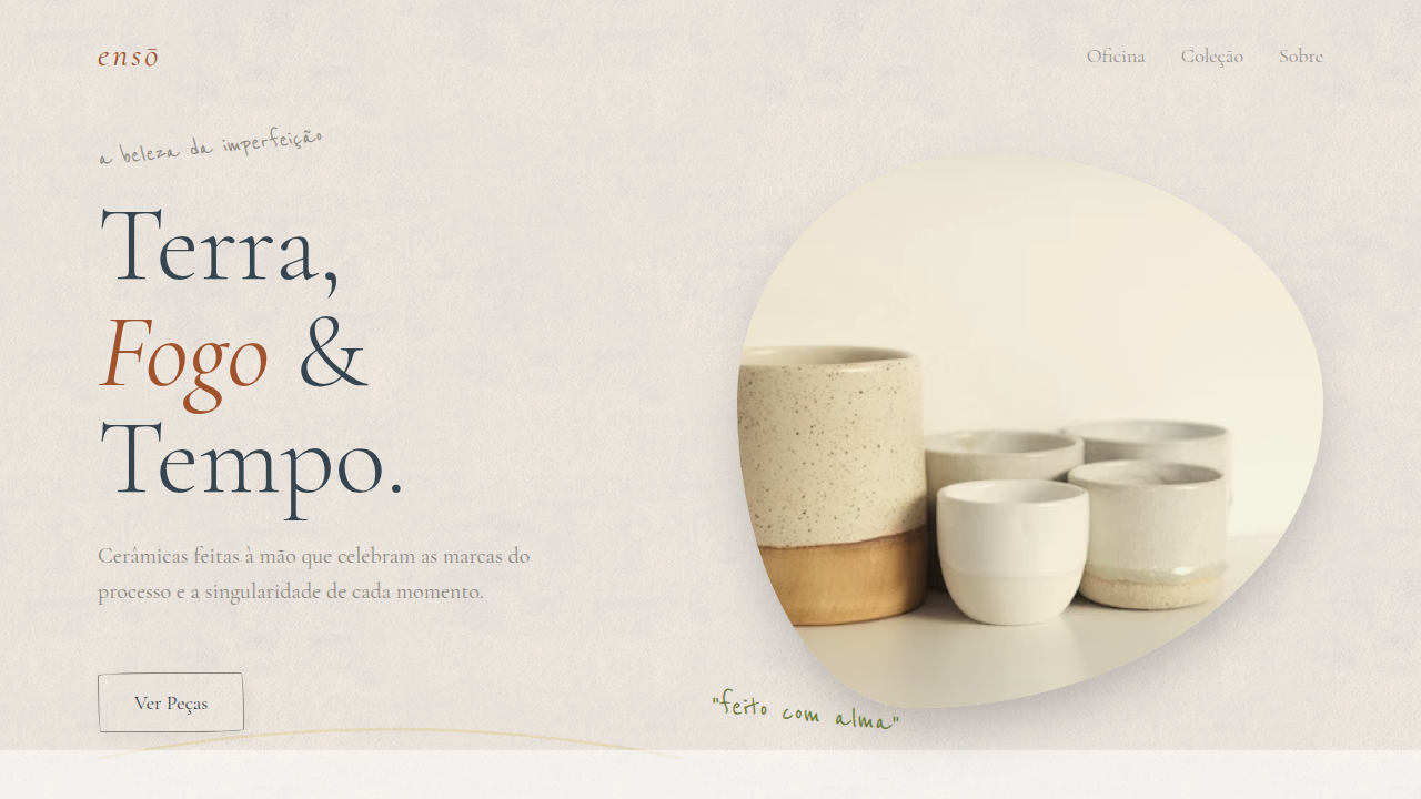
Wabi-Sabi ceramic landing page. Ideal for landing pages, saas. AI-ready template.
Use case: Landing pages, SaaS
Historical Context
Wabi-sabi isn't a trend. It's a worldview that predates every design system you've ever used. Rooted in Zen Buddhism and the Japanese tea ceremony tradition of the 15th century, it finds beauty in what's incomplete, impermanent, and imperfect. Sen no Rikyū chose rough, asymmetric tea bowls over polished Chinese porcelain — a radical act. He was saying: the crack is the point. Kintsugi extends this. You break a bowl, you repair it with gold. The fracture becomes the most beautiful part. It's not restoration — it's transformation through damage. Every scar is elevated, not hidden. That philosophy hits different when you apply it to interfaces. We spend so much energy making things pixel-perfect, mathematically precise, clinically smooth. Wabi-sabi asks: what if the wobble is the design? Translating transience into digital space means embracing texture over flatness, organic rhythm over rigid grids, and surfaces that feel touched by hands rather than rendered by machines. It's design that breathes. That ages. That doesn't pretend to be eternal.
When to Use
Reach for this when the brand needs to feel human above all else. Pottery studios, artisan ceramics, wellness spaces rooted in Japanese philosophy, handmade goods — anywhere the product itself carries imperfection as a feature. It works beautifully for brands that reject mass-production aesthetics. Less effective for fintech or enterprise SaaS. If your client says "organic" and actually means it — not the sanitized startup version — this is your palette.
Design Principles
- Asymmetry over symmetry — let layouts breathe unevenly, resist the urge to center everything
- Texture as content — rough surfaces, grain, visible material quality replace flat minimalism
- Restrained palette with warmth — earth tones, kiln-fired neutrals, nothing that screams for attention
- Imperfect geometry — hand-drawn edges, organic shapes, borders that don't snap to grid
- Negative space as presence — emptiness isn't empty, it's the pause between brushstrokes
DESIGN.md
---
version: "alpha"
name: "Cerâmica Wabi-Sabi"
description: "Wabi-Sabi ceramic landing page. Ideal for landing pages, saas. AI-ready template."
colors:
  primary: "#A0522D"
  secondary: "#8B8680"
  tertiary: "#FAF0E6"
  neutral: "#36454F"
  surface: "#6B7B3A"
  accent: "#3F51B5"
typography:
  h1:
    fontFamily: Cormorant Garamond
    fontSize: 2.5rem
    fontWeight: 700
  body-md:
    fontFamily: Cormorant Garamond
    fontSize: 1rem
    fontWeight: 400
components:
  button-primary:
    backgroundColor: "{colors.primary}"
    textColor: "{colors.neutral}"
    padding: 12px
---

## Overview

Wabi-Sabi ceramic landing page. Ideal for landing pages, saas. AI-ready template. Wabi-sabi isn't a trend. It's a worldview that predates every design system you've ever used. Rooted in Zen Buddhism and the Japanese tea ceremony tradition of the 15th century, it finds beauty in what's incomplete, impermanent, and imperfect. Sen no Rikyū chose rough, asymmetric tea bowls over polished Chinese porcelain — a radical act. He was saying: the crack is the point.

Kintsugi extends this. You break a bowl, you repair it with gold. The fracture becomes the most beautiful part. It's not restoration — it's transformation through damage. Every scar is elevated, not hidden. That philosophy hits different when you apply it to interfaces. We spend so much energy making things pixel-perfect, mathematically precise, clinically smooth. Wabi-sabi asks: what if the wobble is the design?

Translating transience into digital space means embracing texture over flatness, organic rhythm over rigid grids, and surfaces that feel touched by hands rather than rendered by machines. It's design that breathes. That ages. That doesn't pretend to be eternal.

- Density: 3/10 — Airy
- Variance: 8/10 — Expressive
- Motion: 4/10 — Subtle

- **Style:** Imperfect, Natural, Contemplative
- **Keywords:** wabi-sabi, ceramic, imperfect beauty, natural, contemplative, earth tones, handcrafted, organic textures, kintsugi, minimalist
- **Era:** Timeless Japanese Aesthetic
- **Light/Dark:** ✓ Full / ✗ No

## Colors

- **Clay Brown** (#A0522D) — Primary surface or dominant color
- **Stone Grey** (#8B8680) — Secondary text, borders, muted elements
- **Cream** (#FAF0E6) — Light surface, card backgrounds
- **Charcoal** (#36454F) — Dark surface, primary background
- **Matcha Green** (#6B7B3A) — Success states, positive indicators
- **Indigo** (#3F51B5) — Accent color, emphasis elements
- **Gold Repair** (#D4AF37) — Premium accent, decorative highlights
- **Soft Blush** (#E8C4B8) — Extended palette, decorative use


## Typography

- **Display / Hero:** Cormorant Garamond — Weight 700, tight tracking, used for headline impact
- **Body:** Cormorant Garamond — Weight 400, 16px/1.6 line-height, max 72ch per line
- **UI Labels / Captions:** Cormorant Garamond — 0.875rem, weight 500, slight letter-spacing
- **Monospace:** JetBrains Mono — Used for code, metadata, and technical values

Scale:
- Hero: clamp(2.5rem, 5vw, 4rem)
- H1: 2.25rem
- H2: 1.5rem
- Body: 1rem / 1.6
- Small: 0.875rem


## Layout

- **Grid:** CSS Grid primary. Max-width containment: 1280px centered with 1.5rem side padding.
- **Spacing rhythm:** Balanced. Base unit: 0.5rem (8px).
- **Section vertical gaps:** clamp(4rem, 8vw, 8rem).
- **Hero layout:** Asymmetric composition.
- **Feature sections:** Asymmetric grid with varied card sizes. No 3-equal-columns.
- **Mobile collapse:** All multi-column layouts collapse below 768px. No horizontal overflow.
- **z-index contract:** base (0) / sticky-nav (100) / overlay (200) / modal (300) / toast (500).


## Elevation & Depth

Crackle textures, gold kintsugi lines, organic asymmetric shapes, earth-tone gradients, handwritten annotations, imperfect borders, soft shadow layering, matte finishes

- **Physics:** Ease-out curves, 200-300ms duration. Smooth and predictable.
- **Entry animations:** Fade + translate-Y (16px → 0) over 420ms ease-out. Staggered cascades for lists: 80ms between items.
- **Hover states:** Subtle color shift + shadow adjustment over 200ms.
- **Page transitions:** Fade only (200ms).
- **Performance:** Only transform and opacity animated. No layout-triggering properties.


## Shapes

Base corner radius: 0px. See rounded tokens in front matter for the full scale.


## Components

- **Primary Button:** Sharp edges (0px) shape. Accent color fill. Hover: 8% darken + subtle lift shadow. Active: -1px translate tactile press. Font weight 600. No outer glows.
- **Secondary / Ghost Button:** Outline variant. 1.5px border in muted color. Text in primary color. Hover: subtle background fill.
- **Cards:** Sharp edges (0px) corners. Surface background. Subtle shadow (0 2px 12px rgba(0,0,0,0.06)). 1px border stroke.
- **Inputs:** Label above input. 1px border stroke. Focus ring: 2px accent color offset 2px. Error text below in semantic red. No floating labels.
- **Navigation:** Primary surface background. Active item: accent color indicator. Font weight 500 when active.
- **Skeletons:** Shimmer animation matching component dimensions. No circular spinners.
- **Empty States:** Icon-based composition with descriptive text and action button.


## Do's and Don'ts

- No emojis in UI — use icon system only (Lucide, Heroicons)
- No decorative gradients — flat color only
- No shadows heavier than 0 2px 8px rgba(0,0,0,0.08)
- No pure black (#000000) — use off-black or charcoal variants
- No oversaturated accent colors (saturation cap: 80%)
- No 3-column equal-width feature layouts — use zig-zag or asymmetric grid
- No `h-screen` — use `min-h-[100dvh]`
- No AI copywriting clichés: "Elevate", "Seamless", "Unleash", "Next-Gen"
- No broken external image links — use picsum.photos or inline SVG
- No generic lorem ipsum in demos

- Do Crackle textures
- Do Gold kintsugi lines
- Do Organic asymmetric shapes
- Do Earth-tone gradients
- Do Handwritten annotations
- Do Imperfect borders


## Use Case

Landing pages, SaaS
Technical Specs
CSS
background: #FAF0E6, color: #36454F, font-family: 'Cormorant Garamond', serif, border: 1px solid #8B8680, box-shadow: 2px 4px 12px rgba(54,69,79,0.1), border-radius: 0 12px 0 12px, animation: crack-reveal 2s ease-out, background-image: url('clay-texture.png'), background-blend-mode: multiply, opacity: 0.95Variables
--clay-brown-wabi: #A0522D, --stone-grey-wabi: #8B8680, --cream-wabi: #FAF0E6, --charcoal-wabi: #36454F, --kintsugi-gold: #D4AF37, --font-wabi: 'Cormorant Garamond', serif
Checklist
☐ Crackle textures, ☐ Gold kintsugi lines, ☐ Organic asymmetric shapes, ☐ Earth-tone gradients, ☐ Handwritten annotations, ☐ Imperfect borders
Colors
Primary
Secondary
Effects
Crackle textures, gold kintsugi lines, organic asymmetric shapes, earth-tone gradients, handwritten annotations, imperfect borders, soft shadow layering, matte finishes
Light/Dark
✓ Full / ✗ No
AI Prompt
Act as a Senior Frontend Engineer and Expert UI Designer.
Your task is to code a complete Landing Page on the first attempt.
- Landing Page Theme: <INSERT THEME>
- Sections to add: <INSERT SECTIONS>

Generate the final code immediately following these definitions:

## Style

- **Name:** Cerâmica Wabi-Sabi
- **Type:** Imperfect, Natural, Contemplative
- **Keywords:** wabi-sabi, ceramic, imperfect beauty, natural, contemplative, earth tones, handcrafted, organic textures, kintsugi, minimalist
- **Era:** Timeless Japanese Aesthetic
- **Light/Dark:** ✓ Full / ✗ No

## Color Palette

- **Primary:** Clay Brown #A0522D, Stone Grey #8B8680, Cream #FAF0E6, Charcoal #36454F
- **Secondary:** Matcha Green #6B7B3A, Indigo #3F51B5, Gold Repair #D4AF37, Soft Blush #E8C4B8

## Visual Effects

Crackle textures, gold kintsugi lines, organic asymmetric shapes, earth-tone gradients, handwritten annotations, imperfect borders, soft shadow layering, matte finishes

## AI Visual Direction

Design a Wabi-Sabi ceramic landing page. Use: clay brown and stone grey, crackle textures, gold kintsugi lines, organic asymmetric shapes, earth-tone gradients, handwritten annotations, imperfect borders, matte finishes.

## CSS Technical

```css
background: #FAF0E6, color: #36454F, font-family: 'Cormorant Garamond', serif, border: 1px solid #8B8680, box-shadow: 2px 4px 12px rgba(54,69,79,0.1), border-radius: 0 12px 0 12px, animation: crack-reveal 2s ease-out, background-image: url('clay-texture.png'), background-blend-mode: multiply, opacity: 0.95
```

## Design System Variables

```css
--clay-brown-wabi: #A0522D, --stone-grey-wabi: #8B8680, --cream-wabi: #FAF0E6, --charcoal-wabi: #36454F, --kintsugi-gold: #D4AF37, --font-wabi: 'Cormorant Garamond', serif
```

## Implementation Checklist

- ☐ Crackle textures
- ☐ Gold kintsugi lines
- ☐ Organic asymmetric shapes
- ☐ Earth-tone gradients
- ☐ Handwritten annotations
- ☐ Imperfect borders

## Execution Rules

1. Strictly follow the defined visual style.
2. Use high-quality inline SVG icons (Heroicons or Lucide style) — NEVER use emojis as icons.
3. Add `cursor-pointer` and smooth `hover` states (transition-all) on all interactive elements.
4. Required Page Structure:
   - Navbar (Logo + Links + CTA)
   - Hero Section (Impactful Headline + Subtitle + 2 buttons + 3D/Abstract visual element via CSS)
   - Features (3 cards with icons)
   - Testimonials (3 cards)
   - Pricing (3 tiers, highlight the middle one)
   - Final CTA
   - Full Footer with social links, privacy policy, terms of use, contact and SEO links.
5. All text content must be in English.
6. The visual must be CLEARLY distinct — do not create a "default Bootstrap" design. Force the use of the provided design system variables.
7. Use `<style>` tags in the head for custom classes (especially for complex backdrop-filter effects and animations) that Tailwind CDN doesn't cover.
8. Full Responsiveness: Layout must adapt perfectly to Mobile, Tablet and Desktop (vertical stack on mobile).
9. Include basic SEO, Viewport and Open Graph meta tags in `<head>`.
10. Footer must contain: Copyright 2026, Secondary navigation links and Social media icons.
11. Make the creative decisions needed to deliver the complete, functional result now.Related
Last synced: 4/1/2026