Cartesian
Cartesian — Quiet warm-neutral palette with classical Playfair serifs; tasteful and unhurried. Playfair Display typography. warm bone and stone neutrals only. Best for investment thesis, white paper, advisory deliverable. AI-ready design system.
Use case: investment thesis, white paper, advisory deliverable, research report, book / longform pitch, gallery / cultural
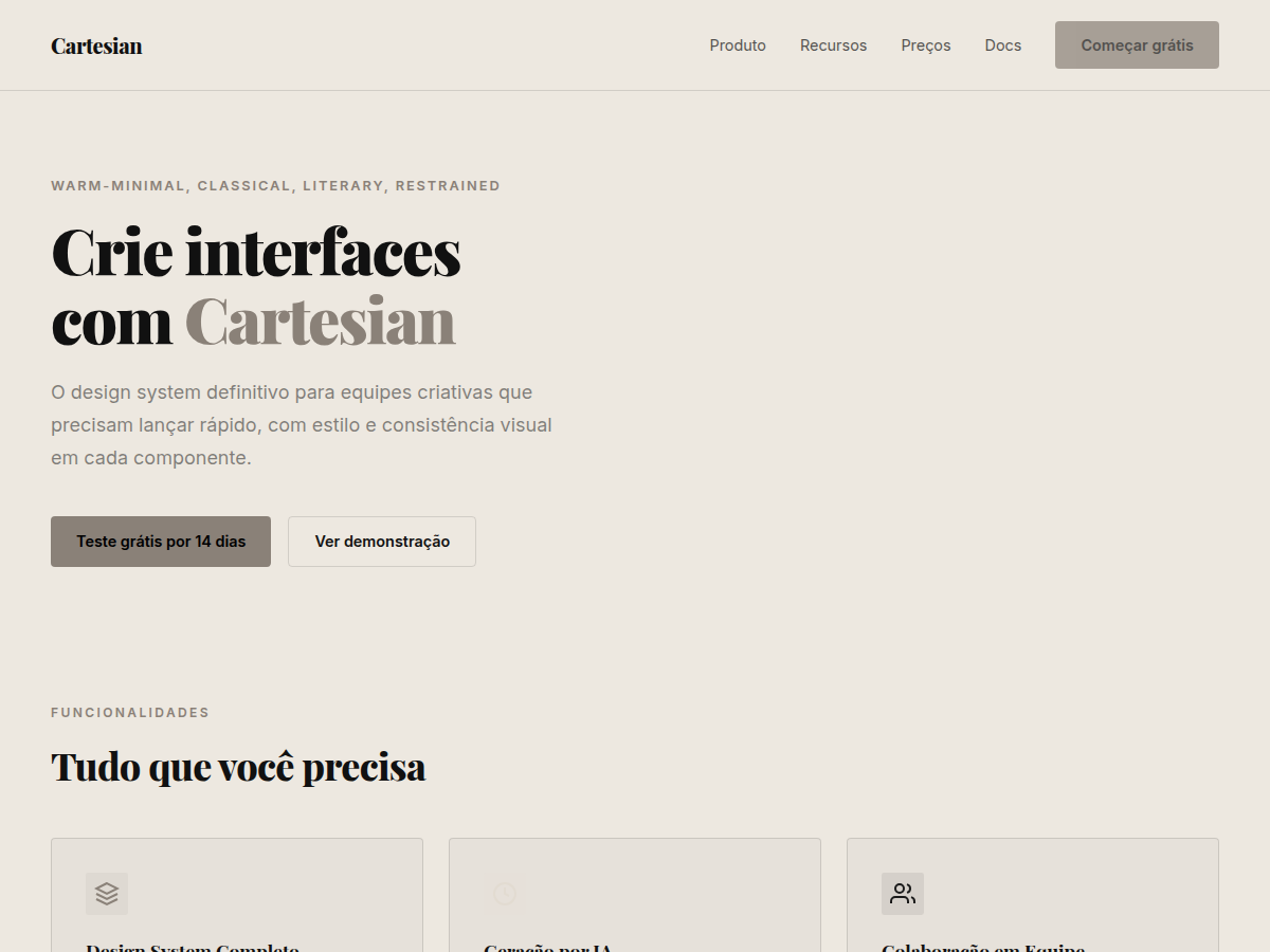
Historical Context
The Cartesian system draws its name from René Descartes' pursuit of clarity through reduction — the idea that truth emerges when you strip away ornament until only structure remains. This is Swiss design filtered through the lens of quiet luxury: the grid is sacred, but the palette refuses the clinical coldness that plagued mid-century rationalism. Where Müller-Brockmann reached for Akzidenz-Grotesk and stark black-on-white, Cartesian introduces warmth through material restraint. Playfair Display carries the weight of editorial tradition — its high contrast and refined hairlines speak to an era when typography was carved, not rendered. The warm neutrals (stone, sand, parchment) reject both the sterile whites of tech minimalism and the saturated palettes of consumer brands. This is the design language of spaces that don't need to shout. Think Aesop storefronts, Kinfolk editorial spreads, the quiet confidence of a well-bound book. It acknowledges that true minimalism isn't absence — it's the discipline of choosing exactly what earns its place on the page.
When to Use
Deploy Cartesian when your brand needs to communicate substance without spectacle. It works for luxury services where trust is built through restraint — private banking, architectural studios, high-end hospitality, curated retail. Choose this when your audience reads silence as confidence, not emptiness. Avoid it for anything requiring urgency, youth energy, or mass-market appeal. This system rewards patience and assumes a viewer who appreciates craft over stimulation.
Design Principles
- Warm restraint over cold minimalism — every neutral carries undertone, never pure gray or clinical white
- Typography as architecture — Playfair Display sets the structural rhythm; weight and scale do the work that color refuses to
- Negative space is compositional, not decorative — whitespace earns its proportion through grid logic, not aesthetic laziness
- Zero saturated color — if it wouldn't exist in sandstone, linen, or aged paper, it doesn't belong in the palette
- Every element justifies its existence — if removing it changes nothing, it was never needed
DESIGN.md
---
version: "alpha"
name: "Cartesian"
description: "Cartesian — Quiet warm-neutral palette with classical Playfair serifs; tasteful and unhurried. Playfair Display typography. warm bone and stone neutrals only. Best for investment thesis, white paper, advisory deliverable. AI-ready design system."
colors:
  primary: "#EDE8E0"
  secondary: "#E2DBD1"
  tertiary: "#1A1A1A"
  neutral: "#5A5A5A"
  surface: "#8A8178"
  accent: "#B8B0A4"
typography:
  h1:
    fontFamily: Playfair Display
    fontSize: 2.25rem
    fontWeight: 700
  body-md:
    fontFamily: Inter
    fontSize: 1rem
    fontWeight: 400
  label-caps:
    fontFamily: Inter
    fontSize: 0.75rem
    fontWeight: 500
spacing:
  sm: 2.0rem
  md: 4.0rem
  lg: 8.0rem
components:
  button-primary:
    backgroundColor: "{colors.primary}"
    textColor: "{colors.neutral}"
    padding: 12px
---

## Overview

Cartesian — Quiet warm-neutral palette with classical Playfair serifs; tasteful and unhurried. Playfair Display typography. warm bone and stone neutrals only. Best for investment thesis, white paper, advisory deliverable. AI-ready design system. The Cartesian system draws its name from René Descartes' pursuit of clarity through reduction — the idea that truth emerges when you strip away ornament until only structure remains. This is Swiss design filtered through the lens of quiet luxury: the grid is sacred, but the palette refuses the clinical coldness that plagued mid-century rationalism.

Where Müller-Brockmann reached for Akzidenz-Grotesk and stark black-on-white, Cartesian introduces warmth through material restraint. Playfair Display carries the weight of editorial tradition — its high contrast and refined hairlines speak to an era when typography was carved, not rendered. The warm neutrals (stone, sand, parchment) reject both the sterile whites of tech minimalism and the saturated palettes of consumer brands.

This is the design language of spaces that don't need to shout. Think Aesop storefronts, Kinfolk editorial spreads, the quiet confidence of a well-bound book. It acknowledges that true minimalism isn't absence — it's the discipline of choosing exactly what earns its place on the page.

- Density: 2/10 — Airy
- Variance: 8/10 — Complex
- Motion: 2/10 — Minimal

- **Style:** Warm-Minimal, Classical, Literary, Restrained
- **Keywords:** Warm neutrals, no saturated color, Playfair Display, classical, literary, restrained, tonal contrast, quiet
- **Era:** Timeless Classic
- **Light/Dark:** ✓ Full / ✗ None

## Colors

- **Bg Primary** (#EDE8E0) — Primary surface or dominant color
- **Bg Secondary** (#E2DBD1) — Accent highlight, links and focus states
- **Text Primary** (#1A1A1A) — Secondary accent
- **Text Secondary** (#5A5A5A) — Accent color, emphasis elements
- **Accent** (#8A8178) — Extended palette, decorative use
- **Line** (#B8B0A4) — Background alternate


## Typography

- **Display / Hero:** Playfair Display — Weight 700, tight tracking, used for headline impact
- **Body:** Inter — Weight 400, 16px/1.6 line-height, max 72ch per line
- **UI Labels / Captions:** Inter — 0.875rem, weight 500, slight letter-spacing
- **Monospace:** JetBrains Mono — Used for code, metadata, and technical values

Scale:
- Hero: clamp(2.5rem, 5vw, 4rem)
- H1: 2.25rem
- H2: 1.5rem
- Body: 1rem / 1.6
- Small: 0.875rem


## Layout

- **Grid:** CSS Grid primary. Max-width containment: 1280px centered with 1.5rem side padding.
- **Spacing rhythm:** Balanced. Base unit: 0.5rem (8px).
- **Section vertical gaps:** clamp(4rem, 8vw, 8rem).
- **Hero layout:** Split-screen (text left, visual right).
- **Feature sections:** Zig-zag alternating text+image rows. No 3-equal-columns.
- **Mobile collapse:** All multi-column layouts collapse below 768px. No horizontal overflow.
- **z-index contract:** base (0) / sticky-nav (100) / overlay (200) / modal (300) / toast (500).


## Elevation & Depth

display font Playfair Display for hero headlines, subtle hover (opacity 0.8, 200ms), refined focus rings, warm bone/stone neutrals, zero saturated color, classical Playfair contrast, generous whitespace, clamp(4rem,8vw,8rem) section gaps

- **Physics:** Ease-out curves, 200-300ms duration. Smooth and predictable.
- **Entry animations:** Fade + translate-Y (16px → 0) over 420ms ease-out. Staggered cascades for lists: 80ms between items.
- **Hover states:** Subtle color shift + shadow adjustment over 200ms.
- **Page transitions:** Fade only (200ms).
- **Performance:** Only transform and opacity animated. No layout-triggering properties.


## Shapes

Base corner radius: 4px. See rounded tokens in front matter for the full scale.


## Components

- **Primary Button:** 4px border-radius. Accent color fill. Hover: 8% darken + subtle lift shadow. Active: -1px translate tactile press. Font weight 600. No outer glows.
- **Secondary / Ghost Button:** Outline variant. 1.5px border in muted color. Text in primary color. Hover: subtle background fill.
- **Cards:** 4px corners. Surface background. Subtle shadow (0 2px 12px rgba(0,0,0,0.06)). 1px border stroke.
- **Inputs:** Label above input. 1px border stroke. Focus ring: 2px accent color offset 2px. Error text below in semantic red. No floating labels.
- **Navigation:** Primary surface background. Active item: accent color indicator. Font weight 500 when active.
- **Skeletons:** Shimmer animation matching component dimensions. No circular spinners.
- **Empty States:** Icon-based composition with descriptive text and action button.


## Do's and Don'ts

- No emojis in UI — use icon system only (Lucide, Heroicons)
- No pure black (#000000) — use off-black or charcoal variants
- No oversaturated accent colors (saturation cap: 80%)
- No 3-column equal-width feature layouts — use zig-zag or asymmetric grid
- No `h-screen` — use `min-h-[100dvh]`
- No AI copywriting clichés: "Elevate", "Seamless", "Unleash", "Next-Gen"
- No broken external image links — use picsum.photos or inline SVG
- No generic lorem ipsum in demos

- Do Playfair Display display font loaded via Google Fonts
- Do Color palette variables applied consistently
- Do Typography scale: hero clamp(2.5rem,5vw,4rem)
- Do H1 2.25rem
- Do body 1rem/1.6
- Do WCAG AA contrast ratio verified (4.5:1 body text)
- Do Serif typography hierarchy clear (display vs body)
- Do Whitespace generous — section gaps ≥ 5rem
- Do Mobile responsive layout (stack below 768px)


## Use Case

investment thesis, white paper, advisory deliverable, research report, book / longform pitch, gallery / cultural
Technical Specs
CSS
font-family: 'Playfair Display', serif; background: #EDE8E0; color: #1A1A1A; --accent: #8A8178; border: 1px solid #B8B0A4; font-weight: 400
Variables
--bg: #EDE8E0, --fg: #111111, --accent: #8A8178, --font-display: 'Playfair Display', --font-body: 'Inter', --radius: 4px, --spacing: 2rem
Checklist
☐ Playfair Display display font loaded via Google Fonts, ☐ Color palette variables applied consistently, ☐ Typography scale: hero clamp(2.5rem,5vw,4rem), H1 2.25rem, body 1rem/1.6, ☐ WCAG AA contrast ratio verified (4.5:1 body text), ☐ Serif typography hierarchy clear (display vs body), ☐ Whitespace generous — section gaps ≥ 5rem, ☐ Mobile responsive layout (stack below 768px)
Colors
Primary
Secondary
Effects
display font Playfair Display for hero headlines, subtle hover (opacity 0.8, 200ms), refined focus rings, warm bone/stone neutrals, zero saturated color, classical Playfair contrast, generous whitespace, clamp(4rem,8vw,8rem) section gaps
Light/Dark
✓ Full / ✗ None
AI Prompt
Act as a Senior Frontend Engineer and Expert UI Designer.
Your task is to code a complete Landing Page on the first attempt.
- Landing Page Theme: <INSERT THEME>
- Sections to add: <INSERT SECTIONS>

Generate the final code immediately following these definitions:

## Style

- **Name:** Cartesian
- **Type:** Warm-Minimal, Classical, Literary, Restrained
- **Keywords:** Warm neutrals, no saturated color, Playfair Display, classical, literary, restrained, tonal contrast, quiet
- **Era:** Timeless Classic
- **Light/Dark:** ✓ Full / ✗ None

## Color Palette

- **Primary:** Bg Primary #EDE8E0, Bg Secondary #E2DBD1, Text Primary #1A1A1A
- **Secondary:** Text Secondary #5A5A5A, Accent #8A8178, Line #B8B0A4

## Visual Effects

display font Playfair Display for hero headlines, subtle hover (opacity 0.8, 200ms), refined focus rings, warm bone/stone neutrals, zero saturated color, classical Playfair contrast, generous whitespace, clamp(4rem,8vw,8rem) section gaps

## AI Visual Direction

Design a quiet warm-neutral layout using ONLY tonal contrast — no saturated color. Use: warm bone (#EDE8E0), stone (#E2DBD1), text charcoal (#1A1A1A), muted taupe accent (#8A8178), hairline rules (#B8B0A4). Playfair Display for headers, Inter for body. Maximum whitespace.

## CSS Technical

```css
font-family: 'Playfair Display', serif; background: #EDE8E0; color: #1A1A1A; --accent: #8A8178; border: 1px solid #B8B0A4; font-weight: 400
```

## Design System Variables

```css
--bg: #EDE8E0, --fg: #111111, --accent: #8A8178, --font-display: 'Playfair Display', --font-body: 'Inter', --radius: 4px, --spacing: 2rem
```

## Implementation Checklist

- ☐ Playfair Display display font loaded via Google Fonts
- ☐ Color palette variables applied consistently
- ☐ Typography scale: hero clamp(2.5rem,5vw,4rem)
- H1 2.25rem
- body 1rem/1.6
- ☐ WCAG AA contrast ratio verified (4.5:1 body text)
- ☐ Serif typography hierarchy clear (display vs body)
- ☐ Whitespace generous — section gaps ≥ 5rem
- ☐ Mobile responsive layout (stack below 768px)

## Execution Rules

1. Strictly follow the defined visual style.
2. Use high-quality inline SVG icons (Heroicons or Lucide style) — NEVER use emojis as icons.
3. Add `cursor-pointer` and smooth `hover` states (transition-all) on all interactive elements.
4. Required Page Structure:
   - Navbar (Logo + Links + CTA)
   - Hero Section (Impactful Headline + Subtitle + 2 buttons + 3D/Abstract visual element via CSS)
   - Features (3 cards with icons)
   - Testimonials (3 cards)
   - Pricing (3 tiers, highlight the middle one)
   - Final CTA
   - Full Footer with social links, privacy policy, terms of use, contact and SEO links.
5. All text content must be in English.
6. The visual must be CLEARLY distinct — do not create a "default Bootstrap" design. Force the use of the provided design system variables.
7. Use `<style>` tags in the head for custom classes (especially for complex backdrop-filter effects and animations) that Tailwind CDN doesn't cover.
8. Full Responsiveness: Layout must adapt perfectly to Mobile, Tablet and Desktop (vertical stack on mobile).
9. Include basic SEO, Viewport and Open Graph meta tags in `<head>`.
10. Footer must contain: Copyright 2026, Secondary navigation links and Social media icons.
11. Make the creative decisions needed to deliver the complete, functional result now.
Related
Last synced: 5/6/2026