Dimensional Layering
Design with dimensional layering. Ideal for landing pages, saas. AI-ready template.
Use case: Landing pages, SaaS

Historical Context
Screens are flat. Two dimensions. That's the constraint we've been fighting since the first pixel lit up. Early web design accepted this limitation — everything sat on the same plane, politely stacked in document flow. Then CSS got z-index, and suddenly we could cheat. Layers existed. Things could overlap, occlude, create the illusion that some elements lived closer to you than others. The real shift came with CSS transforms and GPU-accelerated compositing. translate3d wasn't just a performance hack — it gave us a genuine z-axis to play with. Elements could now move independently through space. Parallax scrolling exploited this ruthlessly, sometimes beautifully, sometimes to the point of nausea. But the principle stuck: depth communicates hierarchy better than size alone. Material Design formalized this intuition in 2014 with its elevation system — discrete shadow levels mapping to semantic importance. A FAB floats above a card, which floats above the surface. It was opinionated and rigid, but it proved something: users intuitively read layered interfaces as having spatial meaning. The 2020s took that foundation and broke it open — overlapping elements, stacked cards with peek-through edges, parallax layers that respond to scroll or cursor. Depth became expressive, not just functional.
When to Use
Dimensional layering works when you need to communicate complexity without overwhelming. Creative portfolios benefit from stacked project cards that hint at depth of work. Product showcases use overlapping layers to create visual drama around a hero object. Interactive experiences — configurators, storytelling sites, immersive landing pages — gain spatial richness that flat layouts simply cannot achieve. Reach for this pattern when static feels dead, but full 3D feels excessive. It's the sweet spot between flat design and WebGL overkill.
Design Principles
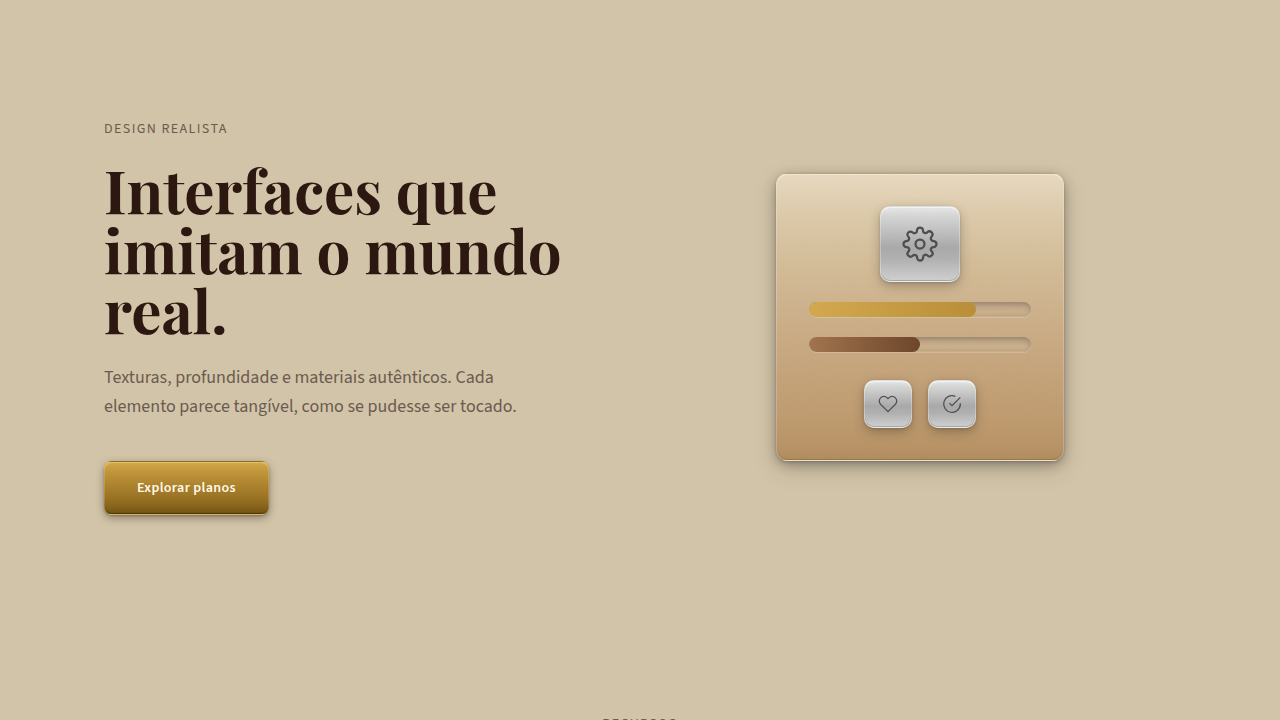
- Establish a clear z-axis hierarchy — every layer needs a reason to exist at its depth, not just decorative stacking
- Use shadows and blur progressively to reinforce spatial distance; a card at z-20 should feel measurably further from the background than one at z-10
- Limit active parallax layers to 3-4 maximum — beyond that, the eye loses its anchor point and motion becomes noise
- Overlapping elements must maintain readable content boundaries; depth is not an excuse to sacrifice legibility or tap targets
- Performance is non-negotiable — composite layers with will-change and transform, never trigger layout recalculations on scroll
Technical Specs
Colors
Primary
Effects
z-index stacking, box-shadow elevation (4 levels), transform: translateZ(), backdrop-filter, parallax
Light/Dark
✓ Full / ✓ Full
Related


Last synced: 4/1/2026