Aura Premium WebGL & Iconify
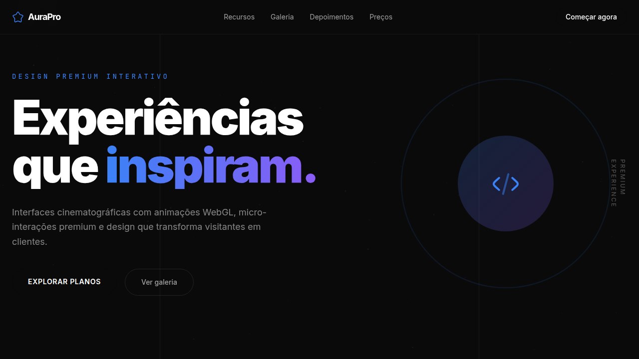
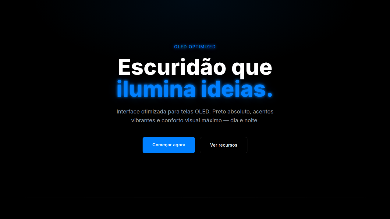
Premium dark-themed landing page with advanced animations and interactions. Ideal for portfolios de luxo, estúdios de arquitetura, marcas premium, móveis de alto padrão, wellness premium, creative agencies. AI-ready template.
Use case: Luxury portfolios, Architecture studios, Premium brands, High-end furniture, Premium wellness, Creative agencies
Historical Context
Stripe changed the game around 2019. Not with flashy WebGL demos—with restraint. A subtle gradient orb floating behind a pricing card. A mesh that responded to scroll position so gently you almost missed it. That was the signal: premium software doesn't scream, it hums. Vercel picked up the thread. Linear refined it. The border-beam trend emerged from this lineage—a single animated gradient tracing a card's perimeter, suggesting energy contained within structure. It's theatrical lighting for UI. The glow isn't decoration; it's hierarchy. Your eye goes where the light moves. What makes this generation different from the WebGL experiments of 2015 is intentionality. Nobody's rendering particle systems for the sake of it anymore. The best implementations use fragment shaders as atmosphere—depth cues that make flat interfaces feel spatial without demanding attention. Combined with crisp Iconify icons and deliberate typography, you get pages that feel engineered rather than designed. That distinction matters to the audience buying $200/month developer tools.
When to Use
When your product costs enough to justify the performance budget. Premium SaaS landing pages, AI product marketing sites, developer tool homepages where the audience notices craft. Works when you need to signal technical sophistication without a demo—the animations themselves become proof of engineering quality. Skip it for dashboards, documentation, or anything users visit daily. This is a first-impression system, not a living-with-it system.
Design Principles
- WebGL as atmosphere, never as content—shaders create depth and mood behind your message, they don't replace it
- Border beam animations follow a single rule: one moving element per viewport. Two competing glows cancel each other out
- Iconify icons stay monochrome and optically aligned to text weight—the moment icons feel decorative, the premium illusion breaks
- Performance is non-negotiable: if the WebGL layer drops below 60fps on a MacBook Air, remove it entirely rather than shipping jank
- Dark themes earn the glow. Light themes earn the shadow. Don't force luminous effects onto surfaces that can't contain them
DESIGN.md
---
version: "alpha"
name: "Aura Premium WebGL & Iconify"
description: "Premium dark-themed landing page with advanced animations and interactions. Ideal for portfolios de luxo, estúdios de arquitetura, marcas premium, móveis de alto padrão, wellness premium, creative agencies. AI-ready template."
colors:
  primary: "#0A0A0A"
  secondary: "#FFFFFF"
  tertiary: "#1A1A2E"
  neutral: "#3B82F6"
  surface: "#8B5CF6"
  accent: "#F59E0B"
typography:
  h1:
    fontFamily: Inter
    fontSize: 2.5rem
    fontWeight: 700
  body-md:
    fontFamily: Inter
    fontSize: 1rem
    fontWeight: 400
components:
  button-primary:
    backgroundColor: "{colors.primary}"
    textColor: "{colors.neutral}"
    padding: 12px
---

## Overview

Premium dark-themed landing page with advanced animations and interactions. Ideal for portfolios de luxo, estúdios de arquitetura, marcas premium, móveis de alto padrão, wellness premium, creative agencies. AI-ready template. Stripe changed the game around 2019. Not with flashy WebGL demos—with restraint. A subtle gradient orb floating behind a pricing card. A mesh that responded to scroll position so gently you almost missed it. That was the signal: premium software doesn't scream, it hums.

Vercel picked up the thread. Linear refined it. The border-beam trend emerged from this lineage—a single animated gradient tracing a card's perimeter, suggesting energy contained within structure. It's theatrical lighting for UI. The glow isn't decoration; it's hierarchy. Your eye goes where the light moves.

What makes this generation different from the WebGL experiments of 2015 is intentionality. Nobody's rendering particle systems for the sake of it anymore. The best implementations use fragment shaders as atmosphere—depth cues that make flat interfaces feel spatial without demanding attention. Combined with crisp Iconify icons and deliberate typography, you get pages that feel engineered rather than designed. That distinction matters to the audience buying $200/month developer tools.

- Density: 5/10 — Balanced
- Variance: 4/10 — Moderate
- Motion: 6/10 — Expressive

- **Style:** Premium, Animated, Interactive, Cinematic
- **Keywords:** Iconify icons, WebGL animations, border beam, sonar animation, flashlight hover, marquee infinite, clip animation, lettermark logo, vertical text, staggered scroll, motion blur, premium dark, luxury UI, interactive cards
- **Era:** 2025-2026 Premium Interactive
- **Light/Dark:** ✗ No / ✓ Full

## Colors

- **Preto Profundo** (#0A0A0A) — Primary background surface
- **Branco Puro** (#FFFFFF) — Light surface, card backgrounds
- **Cinza Escuro** (#1A1A2E) — Dark surface, primary background
- **Azul Elétrico** (#3B82F6) — Secondary accent
- **Violeta Neon** (#8B5CF6) — Accent color, emphasis elements
- **Âmbar Quente** (#F59E0B) — Extended palette, decorative use
- **Esmeralda** (#10B981) — Extended palette, decorative use
- **Rosa Vibrante** (#EC4899) — Decorative accent, highlight elements


## Typography

- **Display / Hero:** Inter — Weight 700, tight tracking, used for headline impact
- **Body:** Inter — Weight 400, 16px/1.6 line-height, max 72ch per line
- **UI Labels / Captions:** Inter — 0.875rem, weight 500, slight letter-spacing
- **Monospace:** JetBrains Mono — Used for code, metadata, and technical values

Scale:
- Hero: clamp(2.5rem, 5vw, 4rem)
- H1: 2.25rem
- H2: 1.5rem
- Body: 1rem / 1.6
- Small: 0.875rem


## Layout

- **Grid:** CSS Grid primary. Max-width containment: 1280px centered with 1.5rem side padding.
- **Spacing rhythm:** Balanced. Base unit: 0.5rem (8px).
- **Section vertical gaps:** clamp(4rem, 8vw, 8rem).
- **Hero layout:** Split-screen (text left, visual right).
- **Feature sections:** Zig-zag alternating text+image rows. No 3-equal-columns.
- **Mobile collapse:** All multi-column layouts collapse below 768px. No horizontal overflow.
- **z-index contract:** base (0) / sticky-nav (100) / overlay (200) / modal (300) / toast (500).


## Elevation & Depth

WebGL 4-column clip slide down para imagens, border beam animation 1px em botões pill-shaped no hover, vertical text clip slide down letter by letter, sonar animation em elementos decorativos, flashlight effect sutil no hover/posição do mouse em background e border dos cards, marquee infinito com alpha mask, motion blur em scroll staggered, container-size lines verticais, numeração 01 02 03 em detalhes de seção.

- **Physics:** Spring — stiffness 120, damping 20. Confident, weighted transitions.
- **Entry animations:** Fade + translate-Y (16px → 0) over 480ms ease-out. Staggered cascades for lists: 100ms between items.
- **Hover states:** Scale(1.03) + shadow lift over 200ms.
- **Page transitions:** Fade + slide (300ms).
- **Performance:** Only transform and opacity animated. No layout-triggering properties.


## Shapes

Base corner radius: 9999px. See rounded tokens in front matter for the full scale.


## Components

- **Primary Button:** Pill-shaped (9999px) shape. Accent color fill. Hover: 8% darken + subtle lift shadow. Active: -1px translate tactile press. Font weight 600. No outer glows.
- **Secondary / Ghost Button:** Outline variant. 1.5px border in muted color. Text in primary color. Hover: subtle background fill.
- **Cards:** Pill-shaped (9999px) corners. Surface background. Subtle shadow (0 2px 12px rgba(0,0,0,0.06)). 1px border stroke.
- **Inputs:** Label above input. 1px border stroke. Focus ring: 2px accent color offset 2px. Error text below in semantic red. No floating labels.
- **Navigation:** Primary surface background. Active item: accent color indicator. Font weight 500 when active.
- **Skeletons:** Shimmer animation matching component dimensions. No circular spinners.
- **Empty States:** Icon-based composition with descriptive text and action button.


## Do's and Don'ts

- No emojis in UI — use icon system only (Lucide, Heroicons)
- No pure white (#FFFFFF) backgrounds — use off-white or dark surfaces
- No oversaturated accent colors (saturation cap: 80%)
- No 3-column equal-width feature layouts — use zig-zag or asymmetric grid
- No `h-screen` — use `min-h-[100dvh]`
- No AI copywriting clichés: "Elevate", "Seamless", "Unleash", "Next-Gen"
- No broken external image links — use picsum.photos or inline SVG
- No generic lorem ipsum in demos

- Do Iconify Solar Duotone Bold icons carregados via CDN
- Do <iconify-icon> tag usada (não SVG inline)
- Do Logo com Solar Linear + lettermark tracking-tighter
- Do Simple Icons para logos de empresas 64x64
- Do Fotos reais de headshot nos testimonials
- Do Linhas verticais container-size decorativas
- Do Numeração 01 02 03 nas seções
- Do Border beam 1px animado em botões pill hover
- Do Vertical text clip slide down letter by letter
- Do Sonar animation em decorações
- Do Flashlight hover effect nos cards (background + border)
- Do Marquee infinito com alpha mask
- Do WebGL canvas para animações de imagem
- Do 4-column clip staggered scroll com motion blur
- Do Dark mode consistente
- Do Responsivo mobile/tablet/desktop


## Use Case

Luxury portfolios, Architecture studios, Premium brands, High-end furniture, Premium wellness, Creative agencies
Technical Specs
CSS
background: #0A0A0A, color: #FFFFFF, font-family: 'Inter, system-ui, sans-serif', iconify-icon { font-size: 24px }, .border-beam { animation: beam-rotate 3s linear infinite; border: 1px solid transparent; background-clip: padding-box; position: relative }, .border-beam::after { content: ''; position: absolute; inset: -1px; border-radius: inherit; background: conic-gradient(from var(--angle), transparent 70%, #3B82F6, #8B5CF6, transparent 100%); animation: rotate 3s linear infinite; z-index: -1 }, .sonar { animation: sonar-pulse 2s ease-out infinite }, @keyframes sonar-pulse { 0% { transform: scale(1); opacity: 0.8 } 100% { transform: scale(2.5); opacity: 0 } }, .flashlight-card { background: radial-gradient(circle at var(--mouse-x) var(--mouse-y), rgba(59,130,246,0.15), transparent 50%) }, .marquee { animation: marquee-scroll 30s linear infinite; mask-image: linear-gradient(to right, transparent, black 10%, black 90%, transparent) }, .vertical-text { writing-mode: vertical-rl; animation: clip-slide-down 1.5s ease forwards }, .section-number { font-size: 5rem; font-weight: 800; opacity: 0.08; position: absolute; top: 0; left: 2rem }, canvas { position: fixed; top: 0; left: 0; z-index: -1 }Variables
--bg-primary: #0A0A0A, --bg-secondary: #1A1A2E, --text-primary: #FFFFFF, --text-muted: rgba(255,255,255,0.6), --accent-blue: #3B82F6, --accent-violet: #8B5CF6, --accent-amber: #F59E0B, --accent-emerald: #10B981, --accent-pink: #EC4899, --border-radius-pill: 9999px, --border-radius-card: 16px, --beam-speed: 3s, --sonar-speed: 2s, --marquee-speed: 30s, --flashlight-size: 50%, --icon-size: 24px, --logo-icon-size: 64px, --section-number-size: 5rem, --font-primary: 'Inter, system-ui, sans-serif', --font-mono: 'JetBrains Mono, monospace', --tracking-tighter: -0.05em, --container-line-color: rgba(255,255,255,0.06)
Checklist
☐ Iconify Solar Duotone Bold icons carregados via CDN, ☐ <iconify-icon> tag usada (não SVG inline), ☐ Logo com Solar Linear + lettermark tracking-tighter, ☐ Simple Icons para logos de empresas 64x64, ☐ Fotos reais de headshot nos testimonials, ☐ Linhas verticais container-size decorativas, ☐ Numeração 01 02 03 nas seções, ☐ Border beam 1px animado em botões pill hover, ☐ Vertical text clip slide down letter by letter, ☐ Sonar animation em decorações, ☐ Flashlight hover effect nos cards (background + border), ☐ Marquee infinito com alpha mask, ☐ WebGL canvas para animações de imagem, ☐ 4-column clip staggered scroll com motion blur, ☐ Dark mode consistente, ☐ Responsivo mobile/tablet/desktop
Colors
Primary
Secondary
Effects
WebGL 4-column clip slide down para imagens, border beam animation 1px em botões pill-shaped no hover, vertical text clip slide down letter by letter, sonar animation em elementos decorativos, flashlight effect sutil no hover/posição do mouse em background e border dos cards, marquee infinito com alpha mask, motion blur em scroll staggered, container-size lines verticais, numeração 01 02 03 em detalhes de seção.
Light/Dark
✗ No / ✓ Full
AI Prompt
Act as a Senior Frontend Engineer and Expert UI Designer.
Your task is to code a complete Landing Page on the first attempt.
- Landing Page Theme: <INSERT THEME>
- Sections to add: <INSERT SECTIONS>

Generate the final code immediately following these definitions:

## Style

- **Name:** Aura Premium WebGL & Iconify
- **Type:** Premium, Animated, Interactive, Cinematic
- **Keywords:** Iconify icons, WebGL animations, border beam, sonar animation, flashlight hover, marquee infinite, clip animation, lettermark logo, vertical text, staggered scroll, motion blur, premium dark, luxury UI, interactive cards
- **Era:** 2025-2026 Premium Interactive
- **Light/Dark:** ✗ No / ✓ Full

## Color Palette

- **Primary:** Preto Profundo #0A0A0A, Branco Puro #FFFFFF, Cinza Escuro #1A1A2E
- **Secondary:** Azul Elétrico #3B82F6, Violeta Neon #8B5CF6, Âmbar Quente #F59E0B, Esmeralda #10B981, Rosa Vibrante #EC4899

## Visual Effects

WebGL 4-column clip slide down para imagens, border beam animation 1px em botões pill-shaped no hover, vertical text clip slide down letter by letter, sonar animation em elementos decorativos, flashlight effect sutil no hover/posição do mouse em background e border dos cards, marquee infinito com alpha mask, motion blur em scroll staggered, container-size lines verticais, numeração 01 02 03 em detalhes de seção.

## AI Visual Direction

Design a premium dark-themed landing page with advanced animations and interactions. Use Iconify Solar Duotone Bold icons throughout. For the site logo, use Iconify Solar Linear plus lettermark with tracking-tighter text. Use Iconify Simple Icons for company logos (Nasa, SpaceX, Uber, Visa, Grab, Bose, Discover, DJI, Nikon, Craftsman, Sony) at 64x64 instead of text logos. Use <iconify-icon> instead of full SVG code. For avatars and testimonials, use headshot photos instead of placeholder letters. Add vertical container-size lines as decorative elements. Add 01 02 03 number details on sections. Add a 1px border beam animation around pill-shaped buttons on hover. Add vertical text clip slide down animation letter by letter. Add sonar animation and decorations. Add a subtle flashlight effect on hover/mouse position to both background and border of cards. Animate marquee in infinite loop with alpha mask slowly. Add 4-column clip animate sliding down for all images using WebGL. Full-screen images sliced into 4 vertical columns with staggered scroll speeds and motion blur trails that snap to alignment when scroll stops.

## CSS Technical

```css
background: #0A0A0A, color: #FFFFFF, font-family: 'Inter, system-ui, sans-serif', iconify-icon { font-size: 24px }, .border-beam { animation: beam-rotate 3s linear infinite; border: 1px solid transparent; background-clip: padding-box; position: relative }, .border-beam::after { content: ''; position: absolute; inset: -1px; border-radius: inherit; background: conic-gradient(from var(--angle), transparent 70%, #3B82F6, #8B5CF6, transparent 100%); animation: rotate 3s linear infinite; z-index: -1 }, .sonar { animation: sonar-pulse 2s ease-out infinite }, @keyframes sonar-pulse { 0% { transform: scale(1); opacity: 0.8 } 100% { transform: scale(2.5); opacity: 0 } }, .flashlight-card { background: radial-gradient(circle at var(--mouse-x) var(--mouse-y), rgba(59,130,246,0.15), transparent 50%) }, .marquee { animation: marquee-scroll 30s linear infinite; mask-image: linear-gradient(to right, transparent, black 10%, black 90%, transparent) }, .vertical-text { writing-mode: vertical-rl; animation: clip-slide-down 1.5s ease forwards }, .section-number { font-size: 5rem; font-weight: 800; opacity: 0.08; position: absolute; top: 0; left: 2rem }, canvas { position: fixed; top: 0; left: 0; z-index: -1 }
```

## Design System Variables

```css
--bg-primary: #0A0A0A, --bg-secondary: #1A1A2E, --text-primary: #FFFFFF, --text-muted: rgba(255,255,255,0.6), --accent-blue: #3B82F6, --accent-violet: #8B5CF6, --accent-amber: #F59E0B, --accent-emerald: #10B981, --accent-pink: #EC4899, --border-radius-pill: 9999px, --border-radius-card: 16px, --beam-speed: 3s, --sonar-speed: 2s, --marquee-speed: 30s, --flashlight-size: 50%, --icon-size: 24px, --logo-icon-size: 64px, --section-number-size: 5rem, --font-primary: 'Inter, system-ui, sans-serif', --font-mono: 'JetBrains Mono, monospace', --tracking-tighter: -0.05em, --container-line-color: rgba(255,255,255,0.06)
```

## Implementation Checklist

- ☐ Iconify Solar Duotone Bold icons carregados via CDN
- ☐ <iconify-icon> tag usada (não SVG inline)
- ☐ Logo com Solar Linear + lettermark tracking-tighter
- ☐ Simple Icons para logos de empresas 64x64
- ☐ Fotos reais de headshot nos testimonials
- ☐ Linhas verticais container-size decorativas
- ☐ Numeração 01 02 03 nas seções
- ☐ Border beam 1px animado em botões pill hover
- ☐ Vertical text clip slide down letter by letter
- ☐ Sonar animation em decorações
- ☐ Flashlight hover effect nos cards (background + border)
- ☐ Marquee infinito com alpha mask
- ☐ WebGL canvas para animações de imagem
- ☐ 4-column clip staggered scroll com motion blur
- ☐ Dark mode consistente
- ☐ Responsivo mobile/tablet/desktop

## Execution Rules

1. Strictly follow the defined visual style.
2. Use high-quality inline SVG icons (Heroicons or Lucide style) — NEVER use emojis as icons.
3. Add `cursor-pointer` and smooth `hover` states (transition-all) on all interactive elements.
4. Required Page Structure:
   - Navbar (Logo + Links + CTA)
   - Hero Section (Impactful Headline + Subtitle + 2 buttons + 3D/Abstract visual element via CSS)
   - Features (3 cards with icons)
   - Testimonials (3 cards)
   - Pricing (3 tiers, highlight the middle one)
   - Final CTA
   - Full Footer with social links, privacy policy, terms of use, contact and SEO links.
5. All text content must be in English.
6. The visual must be CLEARLY distinct — do not create a "default Bootstrap" design. Force the use of the provided design system variables.
7. Use `<style>` tags in the head for custom classes (especially for complex backdrop-filter effects and animations) that Tailwind CDN doesn't cover.
8. Full Responsiveness: Layout must adapt perfectly to Mobile, Tablet and Desktop (vertical stack on mobile).
9. Include basic SEO, Viewport and Open Graph meta tags in `<head>`.
10. Footer must contain: Copyright 2026, Secondary navigation links and Social media icons.
11. Make the creative decisions needed to deliver the complete, functional result now.Related
Last synced: 4/1/2026