Astryx Gothic
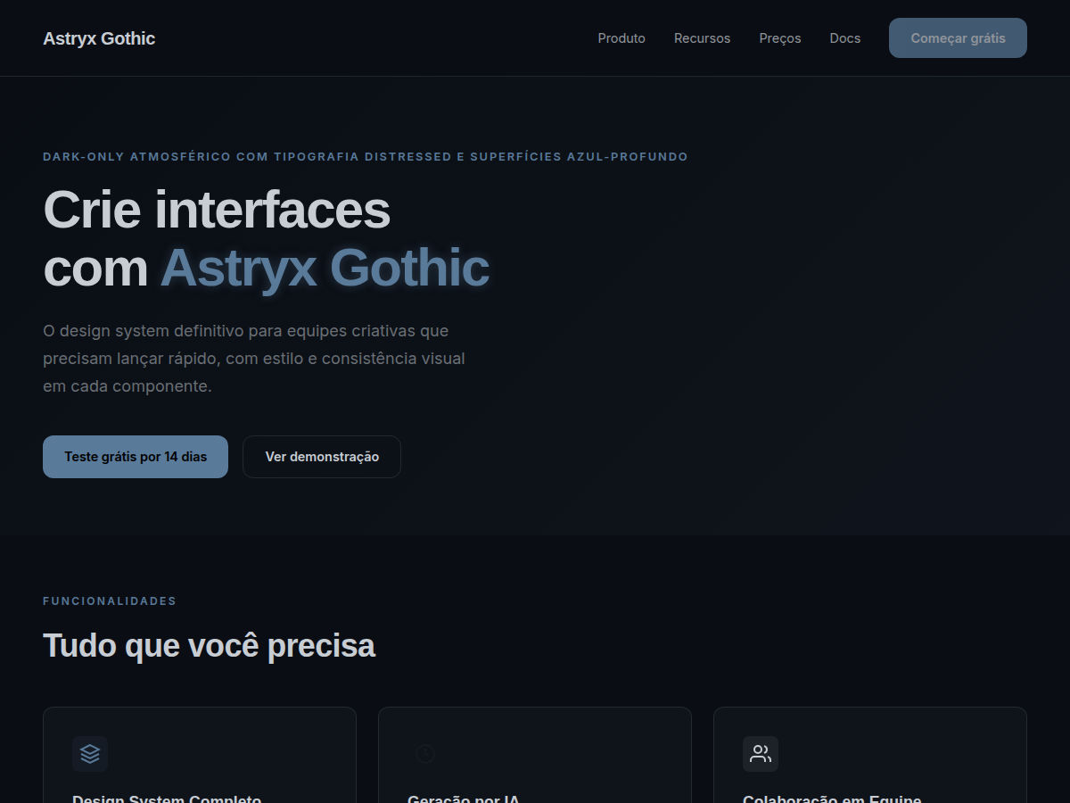
Dark-only atmospheric theme from Meta Astryx Design System. Deep blue-gray surfaces with distressed display typography.
Use case: Gaming platforms, music apps, dark-mode-first products, creative tools, nightlife brands, and atmospheric interfaces.
Historical Context
Astryx Gothic is the only dark-only theme in the system. Its deep blue-gray palette and distressed type create an atmospheric, editorial mood for products that reject conventional light-mode design.
When to Use
Apply to projects that exist exclusively in the dark and need dense atmosphere. Games, dark entertainment, alternative creative portfolios, music apps, and horror sites demand deep dark-blue surfaces that create immersion. Distressed typography breaks typical UI cleanliness and delivers raw identity. Choose this theme when the audience seeks emotional intensity and light mode simply makes no sense for the brand.
Design Principles
- Use dark mode only — no light variant exists in this theme
- Limit distressed typography to impact headlines; functional text stays clean
- Build hierarchy with opacity variations over dark blue, not with new colors
- Reserve light accents for critical interactive elements and feedback
- Maintain minimum WCAG AA contrast even on deep dark surfaces
DESIGN.md
---
version: "alpha"
name: "Astryx Gothic"
description: "Dark-only atmospheric theme from Meta Astryx Design System. Deep blue-gray surfaces with distressed display typography."
colors:
  primary: "#5A7A9A"
  secondary: "#3A4A5C"
  tertiary: "#1E2830"
  neutral: "#C8CDD3"
  surface: "#141A22"
typography:
  h1:
    fontFamily: Gothic Display
    fontSize: 2.25rem
    fontWeight: 700
  body-md:
    fontFamily: Inter
    fontSize: 1rem
    fontWeight: 400
  label-caps:
    fontFamily: Inter
    fontSize: 0.75rem
    fontWeight: 500
rounded:
  sm: 8px
  md: 12px
  lg: 16px
spacing:
  sm: 1.0rem
  md: 1.5rem
  lg: 2.0rem
components:
  button-primary:
    backgroundColor: "{colors.primary}"
    textColor: "{colors.neutral}"
    rounded: "{rounded.md}"
    padding: 12px
---

## Overview

Dark-only atmospheric theme from Meta Astryx Design System. Deep blue-gray surfaces with distressed display typography. Astryx Gothic is the only dark-only theme in the system. Its deep blue-gray palette and distressed type create an atmospheric, editorial mood for products that reject conventional light-mode design.


## Colors
- **Background:** #0A0E14 (deep navy-black)
- **Surface:** #141A22 (raised dark)
- **Text:** #C8CDD3 (muted white)
- **Accent:** #5A7A9A (steel blue)
- **Secondary:** #3A4A5C (muted blue-gray)
- **Border:** #1E2830


## Typography
- **Display:** Tipografia distressed/gótica para impacto
- **Body:** Sans-serif limpa para legibilidade
- **Code:** SF Mono
- **Scale:** base 14px (0.875rem), ratio 1.2


## Layout
- **Spacing scale:** 0/2/4/6/8/12/16/20/24/28/32/36/40/44/48 px
- **Radius:** inner 8px, element 12px, container 16px, page 32px
- **Element sizes:** sm 28px, md 32px, lg 36px


## Elevation & Depth
- Gradientes escuros sutis para separação de camadas.
- Glow mínimo em elementos interativos.
- Sem sombras tradicionais — usar diferença de luminosidade.


## Shapes

Base corner radius: 8px. See rounded tokens in front matter for the full scale.


## Components
- Buttons com accent steel blue e texto claro
- Cards com surface #141A22 e border #1E2830
- Display text com tratamento distressed


## Do's and Don'ts
- ✓ Mantenha contraste suficiente para acessibilidade
- ✓ Use tipografia distressed com moderação (apenas display)
- ✗ Não implemente modo light
- ✗ Não use cores saturadas brilhantes


## Use Case

Gaming platforms, music apps, dark-mode-first products, creative tools, nightlife brands, and atmospheric interfaces.
Technical Specs
CSS
border-radius: 12px; transition: all 410ms cubic-bezier(0.24, 1, 0.4, 1); background: #0A0E14; color: #C8CDD3; --surface: #141A22;
Variables
--bg: #0A0E14, --fg: #C8CDD3, --accent: #5A7A9A, --radius: 12px, --spacing: 1.5rem, --font-display: 'Gothic Display', --font-body: 'Inter'
Checklist
1. Configurar tema dark-only (sem modo light) 2. Configurar escala tipográfica base 14px ratio 1.2 3. Aplicar radius scale (8/12/16/32px) 4. Implementar tokens de spacing (0-48px) 5. Configurar motion tokens (175ms/410ms/975ms) 6. Testar contraste em fundos muito escuros 7. Usar tipografia distressed apenas para display 8. Aplicar gradientes escuros sutis para profundidade
Colors
Primary
Secondary
Effects
Transições com cubic-bezier(0.24, 1, 0.4, 1), motion fast 175ms, medium 410ms. Atmosfera com gradientes escuros sutis e glow mínimo.
Light/Dark
✗ / ✓ Full
AI Prompt
Act as a Senior Frontend Engineer and Expert UI Designer.
Your task is to code a complete Landing Page on the first attempt.
- Landing Page Theme: <INSERT THEME>
- Sections to add: <INSERT SECTIONS>

Generate the final code immediately following these definitions:

## Style

- **Name:** Astryx Gothic
- **Type:** Dark-only atmosférico com tipografia distressed e superfícies azul-profundo
- **Keywords:** gothic, dark, atmospheric, blue-gray, distressed, moody, cinematic, deep, meta, astryx
- **Era:** 2026 Meta
- **Light/Dark:** ✗ / ✓ Full

## Color Palette

- **Primary:** Deep BG #0A0E14, Surface #141A22, Text #C8CDD3
- **Secondary:** Muted blue-gray #3A4A5C, Subtle accent #5A7A9A, Border #1E2830

## Visual Effects

Transições com cubic-bezier(0.24, 1, 0.4, 1), motion fast 175ms, medium 410ms. Atmosfera com gradientes escuros sutis e glow mínimo.

## AI Visual Direction

gothic dark UI, deep blue-gray interface, atmospheric dark theme, distressed typography, moody cinematic design, dark-only dashboard, industrial gothic aesthetic

## CSS Technical

```css
border-radius: 12px; transition: all 410ms cubic-bezier(0.24, 1, 0.4, 1); background: #0A0E14; color: #C8CDD3; --surface: #141A22;
```

## Design System Variables

```css
--bg: #0A0E14, --fg: #C8CDD3, --accent: #5A7A9A, --radius: 12px, --spacing: 1.5rem, --font-display: 'Gothic Display', --font-body: 'Inter'
```

## Implementation Checklist

- 1. Configurar tema dark-only (sem modo light) 2. Configurar escala tipográfica base 14px ratio 1.2 3. Aplicar radius scale (8/12/16/32px) 4. Implementar tokens de spacing (0-48px) 5. Configurar motion tokens (175ms/410ms/975ms) 6. Testar contraste em fundos muito escuros 7. Usar tipografia distressed apenas para display 8. Aplicar gradientes escuros sutis para profundidade

## Execution Rules

1. Strictly follow the defined visual style.
2. Use high-quality inline SVG icons (Heroicons or Lucide style) — NEVER use emojis as icons.
3. Add `cursor-pointer` and smooth `hover` states (transition-all) on all interactive elements.
4. Required Page Structure:
   - Navbar (Logo + Links + CTA)
   - Hero Section (Impactful Headline + Subtitle + 2 buttons + 3D/Abstract visual element via CSS)
   - Features (3 cards with icons)
   - Testimonials (3 cards)
   - Pricing (3 tiers, highlight the middle one)
   - Final CTA
   - Full Footer with social links, privacy policy, terms of use, contact and SEO links.
5. All text content must be in English.
6. The visual must be CLEARLY distinct — do not create a "default Bootstrap" design. Force the use of the provided design system variables.
7. Use `<style>` tags in the head for custom classes (especially for complex backdrop-filter effects and animations) that Tailwind CDN doesn't cover.
8. Full Responsiveness: Layout must adapt perfectly to Mobile, Tablet and Desktop (vertical stack on mobile).
9. Include basic SEO, Viewport and Open Graph meta tags in `<head>`.
10. Footer must contain: Copyright 2026, Secondary navigation links and Social media icons.
11. Make the creative decisions needed to deliver the complete, functional result now.
Related
Last synced: 6/26/2026