Architectural Portfolio Cinematic
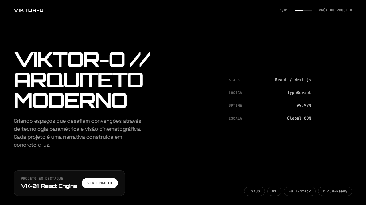
High-end cinematic 2-page architectural portfolio. Ideal for portfolios de arquitetura, estúdios de design, creative agencies, portfolios pessoais premium, showcases de projetos tech. AI-ready template.
Use case: Portfolios de arquitetura, Design studios, Creative agencies, Portfolios personal premium, Showcases de projects tech
Historical Context
The cinematic architectural portfolio owes its existence to the collision of two worlds: the film industry's obsession with atmosphere and the architectural visualization boom of the 2010s. When studios like MIR and Luxigon started treating renders less like technical documents and more like movie stills, everything shifted. Suddenly, architects realized their work could be presented with the same emotional weight as a Villeneuve film — moody lighting, shallow depth of field, fog rolling through unbuilt spaces. This wasn't just aesthetic posturing. The dark theme emerged because architects were tired of the sterile white-background portfolio that dominated for decades. Black backgrounds do what white never could: they make light the protagonist. Every render becomes a scene, every material catches exactly the illumination you intended. The format borrows heavily from cinematography — aspect ratios stretch wider, typography retreats to the margins, and negative space becomes structural rather than decorative. What we're looking at now is the mature form of this language. The early experiments were heavy-handed — too much lens flare, too much post-processing. The best contemporary examples show restraint. They trust the architecture to carry the frame.
When to Use
Deploy this when the work itself is visually commanding and needs zero explanation. Architecture firms with strong render pipelines, interior designers working in luxury residential, real estate developers marketing high-end projects before ground breaks. It fails completely for firms doing community housing or public infrastructure — the cinematic treatment reads as exclusionary there. Best when you have 15-30 hero images maximum. More than that and the drama dilutes. The client needs to understand this is a mood-first portfolio, not a project documentation tool.
Design Principles
- Light as narrative device — every image needs a clear light source that tells you the time of day, the mood, the intent. No flat ambient lighting ever.
- Cinematic aspect ratios (2.35:1 or 16:9) enforced consistently — portrait crops break the entire spatial rhythm of the page.
- Typography at whisper volume — thin weights, small sizes, high contrast against dark surfaces. The text supports; it never competes with imagery.
- Transitions between sections should feel like cuts in a film — hard when changing projects, slow dissolves within a single project sequence.
- Material honesty in the dark palette — use true blacks (#000) sparingly, prefer deep warm grays or cool near-blacks that feel like shadow rather than void.
DESIGN.md
---
version: "alpha"
name: "Architectural Portfolio Cinematic"
description: "High-end cinematic 2-page architectural portfolio. Ideal for portfolios de arquitetura, estúdios de design, creative agencies, portfolios pessoais premium, showcases de projetos tech. AI-ready template."
colors:
  primary: "#000000"
  secondary: "#FFFFFF"
typography:
  h1:
    fontFamily: Space Grotesk
    fontSize: 2.5rem
    fontWeight: 700
  body-md:
    fontFamily: Space Grotesk
    fontSize: 1rem
    fontWeight: 400
rounded:
  sm: 9999px
  md: 19998px
  lg: 29997px
components:
  button-primary:
    backgroundColor: "{colors.primary}"
    rounded: "{rounded.sm}"
    padding: 12px
---

## Overview

High-end cinematic 2-page architectural portfolio. Ideal for portfolios de arquitetura, estúdios de design, creative agencies, portfolios pessoais premium, showcases de projetos tech. AI-ready template. The cinematic architectural portfolio owes its existence to the collision of two worlds: the film industry's obsession with atmosphere and the architectural visualization boom of the 2010s. When studios like MIR and Luxigon started treating renders less like technical documents and more like movie stills, everything shifted. Suddenly, architects realized their work could be presented with the same emotional weight as a Villeneuve film — moody lighting, shallow depth of field, fog rolling through unbuilt spaces.

This wasn't just aesthetic posturing. The dark theme emerged because architects were tired of the sterile white-background portfolio that dominated for decades. Black backgrounds do what white never could: they make light the protagonist. Every render becomes a scene, every material catches exactly the illumination you intended. The format borrows heavily from cinematography — aspect ratios stretch wider, typography retreats to the margins, and negative space becomes structural rather than decorative.

What we're looking at now is the mature form of this language. The early experiments were heavy-handed — too much lens flare, too much post-processing. The best contemporary examples show restraint. They trust the architecture to carry the frame.

- Density: 3/10 — Airy
- Variance: 3/10 — Restrained
- Motion: 8/10 — Cinematic

- **Style:** Cinematic Dark, Minimalist Portfolio, Orbitron Display, Glass Cards, Two-Page Navigation
- **Keywords:** architectural portfolio, cinematic, dark theme, minimalist, Orbitron, Space Grotesk, JetBrains Mono, glass morphism, video background, vignette, two-page, project showcase, technical specs, pill tags
- **Era:** 2025-2026 Portfolio/Creative
- **Light/Dark:** ✗ None / ✓ Full

## Colors

- **Preto Fundo** (#000000) — Primary background surface
- **Branco Texto** (#FFFFFF) — Light surface, card backgrounds
- **20 bordas** (rgba(255,255,255,0.2)) — Supporting palette color
- **5 cards** (rgba(255,255,255,0.05)) — Extended palette, decorative use
- **10 hover** (rgba(255,255,255,0.1)) — Extended palette, decorative use
- **60 texto secundário** (rgba(255,255,255,0.6)) — Primary text color
- **40 labels** (rgba(255,255,255,0.4)) — Extended palette, decorative use


## Typography

- **Display / Hero:** Space Grotesk — Weight 700, tight tracking, used for headline impact
- **Accent:** Orbitron — Used for decorative or emphasis text
- **Body:** Space Grotesk — Weight 400, 16px/1.6 line-height, max 72ch per line
- **UI Labels / Captions:** Space Grotesk — 0.875rem, weight 500, slight letter-spacing
- **Monospace:** JetBrains Mono — Used for code, metadata, and technical values

Scale:
- Hero: clamp(2.5rem, 5vw, 4rem)
- H1: 2.25rem
- H2: 1.5rem
- Body: 1rem / 1.6
- Small: 0.875rem


## Layout

- **Grid:** CSS Grid primary. Max-width containment: 1280px centered with 1.5rem side padding.
- **Spacing rhythm:** Balanced. Base unit: 0.5rem (8px).
- **Section vertical gaps:** clamp(4rem, 8vw, 8rem).
- **Hero layout:** Split-screen (text left, visual right).
- **Feature sections:** Zig-zag alternating text+image rows. No 3-equal-columns.
- **Mobile collapse:** All multi-column layouts collapse below 768px. No horizontal overflow.
- **z-index contract:** base (0) / sticky-nav (100) / overlay (200) / modal (300) / toast (500).


## Elevation & Depth

Vídeo background full-screen com vignette radial (70% transparente centro para 70% preto bordas) no desktop e gradient bottom-fade no mobile, glassmorphism cards (bg-white/5 backdrop-blur-xl), navegação entre duas páginas com transições de opacidade e offset Y, tipografia hierárquica com 3 fontes (Orbitron display, Space Grotesk body, JetBrains Mono technical), pill tags com borda white/20, specs técnicas com separadores thin border, counter 1/01 com linha de progresso

- **Physics:** Spring — stiffness 120, damping 20. Confident, weighted transitions.
- **Entry animations:** Fade + translate-Y (16px → 0) over 540ms ease-out. Staggered cascades for lists: 120ms between items.
- **Hover states:** Scale(1.03) + shadow lift over 200ms.
- **Page transitions:** Fade + slide (300ms).
- **Performance:** Only transform and opacity animated. No layout-triggering properties.


## Shapes

Base corner radius: 9999px. See rounded tokens in front matter for the full scale.


## Components

- **Primary Button:** Pill-shaped (9999px) shape. Accent color fill. Hover: 8% darken + subtle lift shadow. Active: -1px translate tactile press. Font weight 600. No outer glows.
- **Secondary / Ghost Button:** Outline variant. 1.5px border in muted color. Text in primary color. Hover: subtle background fill.
- **Cards:** Pill-shaped (9999px) corners. Surface background. Subtle shadow (0 2px 12px rgba(0,0,0,0.06)). 1px border stroke.
- **Inputs:** Label above input. 1px border stroke. Focus ring: 2px accent color offset 2px. Error text below in semantic red. No floating labels.
- **Navigation:** Primary surface background. Active item: accent color indicator. Font weight 500 when active.
- **Skeletons:** Shimmer animation matching component dimensions. No circular spinners.
- **Empty States:** Icon-based composition with descriptive text and action button.


## Do's and Don'ts

- No emojis in UI — use icon system only (Lucide, Heroicons)
- No decorative gradients — flat color only
- No shadows heavier than 0 2px 8px rgba(0,0,0,0.08)
- No pure white (#FFFFFF) backgrounds — use off-white or dark surfaces
- No oversaturated accent colors (saturation cap: 80%)
- No 3-column equal-width feature layouts — use zig-zag or asymmetric grid
- No `h-screen` — use `min-h-[100dvh]`
- No AI copywriting clichés: "Elevate", "Seamless", "Unleash", "Next-Gen"
- No broken external image links — use picsum.photos or inline SVG
- No generic lorem ipsum in demos

- Do Fundo preto puro #000000 com texto branco
- Do Vídeo background full-screen com vignette radial
- Do Três fontes carregadas (Orbitron + Space Grotesk + JetBrains Mono)
- Do Hierarquia tipográfica clara entre display/body/mono
- Do Glass card com backdrop-blur-xl
- Do Navegação entre duas páginas com transição suave
- Do Specs técnicas com separadores thin border
- Do Pill tags com borda white/20
- Do Counter 1/01 com linha de progresso
- Do Mobile: vídeo 50vh com gradient fade
- Do Custom selection color branco/preto


## Use Case

Portfolios de arquitetura, Design studios, Creative agencies, Portfolios personal premium, Showcases de projects tech
Technical Specs
CSS
background: #000000; color: #FFFFFF; font-family: 'Space Grotesk', sans-serif; .font-display { font-family: 'Orbitron', sans-serif; } .font-mono { font-family: 'JetBrains Mono', monospace; } ::selection { background: white; color: black; } .vignette { background: radial-gradient(ellipse at center, transparent 30%, rgba(0,0,0,0.7) 100%); } .glass-card { background: rgba(255,255,255,0.05); backdrop-filter: blur(24px); -webkit-backdrop-filter: blur(24px); } .pill-tag { border: 1px solid rgba(255,255,255,0.2); border-radius: 9999px; } .page-transition { transition: opacity 0.6s ease, transform 0.6s ease; } @media (max-width: 768px) { .hero-video { height: 50vh; } }Variables
--bg: #000000; --text: #FFFFFF; --text-60: rgba(255,255,255,0.6); --text-40: rgba(255,255,255,0.4); --border: rgba(255,255,255,0.2); --glass-bg: rgba(255,255,255,0.05); --glass-blur: 24px; --hover-bg: rgba(255,255,255,0.1); --font-display: 'Orbitron', sans-serif; --font-body: 'Space Grotesk', sans-serif; --font-mono: 'JetBrains Mono', monospace
Checklist
☐ Fundo preto puro #000000 com texto branco, ☐ Vídeo background full-screen com vignette radial, ☐ Três fontes carregadas (Orbitron + Space Grotesk + JetBrains Mono), ☐ Hierarquia tipográfica clara entre display/body/mono, ☐ Glass card com backdrop-blur-xl, ☐ Navegação entre duas páginas com transição suave, ☐ Specs técnicas com separadores thin border, ☐ Pill tags com borda white/20, ☐ Counter 1/01 com linha de progresso, ☐ Mobile: vídeo 50vh com gradient fade, ☐ Custom selection color branco/preto
Colors
Primary
Effects
Vídeo background full-screen com vignette radial (70% transparente centro para 70% preto bordas) no desktop e gradient bottom-fade no mobile, glassmorphism cards (bg-white/5 backdrop-blur-xl), navegação entre duas páginas com transições de opacidade e offset Y, tipografia hierárquica com 3 fontes (Orbitron display, Space Grotesk body, JetBrains Mono technical), pill tags com borda white/20, specs técnicas com separadores thin border, counter 1/01 com linha de progresso
Light/Dark
✗ None / ✓ Full
AI Prompt
Act as a Senior Frontend Engineer and Expert UI Designer.
Your task is to code a complete Landing Page on the first attempt.
- Landing Page Theme: <INSERT THEME>
- Sections to add: <INSERT SECTIONS>

Generate the final code immediately following these definitions:

## Style

- **Name:** Architectural Portfolio Cinematic
- **Type:** Cinematic Dark, Minimalist Portfolio, Orbitron Display, Glass Cards, Two-Page Navigation
- **Keywords:** architectural portfolio, cinematic, dark theme, minimalist, Orbitron, Space Grotesk, JetBrains Mono, glass morphism, video background, vignette, two-page, project showcase, technical specs, pill tags
- **Era:** 2025-2026 Portfolio/Creative
- **Light/Dark:** ✗ None / ✓ Full

## Color Palette

- **Primary:** Preto Fundo #000000, Branco Texto #FFFFFF, Branco/20 bordas rgba(255,255,255,0.2)
- **Secondary:** Branco/5 cards rgba(255,255,255,0.05), Branco/10 hover rgba(255,255,255,0.1), Branco/60 texto secundário rgba(255,255,255,0.6), Branco/40 labels rgba(255,255,255,0.4)

## Visual Effects

Vídeo background full-screen com vignette radial (70% transparente centro para 70% preto bordas) no desktop e gradient bottom-fade no mobile, glassmorphism cards (bg-white/5 backdrop-blur-xl), navegação entre duas páginas com transições de opacidade e offset Y, tipografia hierárquica com 3 fontes (Orbitron display, Space Grotesk body, JetBrains Mono technical), pill tags com borda white/20, specs técnicas com separadores thin border, counter 1/01 com linha de progresso

## AI Visual Direction

Build a high-end cinematic 2-page architectural portfolio. Aesthetic: minimalist, dark-themed (black background #000000, white text #FFFFFF), sophisticated typographic hierarchy. Fonts: Orbitron for display headings, Space Grotesk for body text, JetBrains Mono for technical/mono elements. Custom selection color (white bg, black text). Page 1 Hero: Full-screen looping background video of futuristic architecture (use stock video URL). Video: muted, playsInline, loop, preload auto. Overlays: radial vignette on desktop (70% transparent center to 70% black edges), bottom-fade gradient on mobile. Top nav: right-aligned 1/01 counter with progress line and Next Project button in mono font. Main content: large title 'VIKTOR-O // MODERN ARCHITECT' (Orbitron uppercase tracking-tighter), description in Space Grotesk light with max-w-450px. Right column: technical specs list (Stack, Logic, Uptime, Scale) with labels and values separated by thin border-white/20. Bottom: glass-morphism card (bg-white/5 backdrop-blur-xl) with project title 'VK-01: React Engine' and View Project button. Row of pill-shaped tags (TS/JS, V1, Full-Stack, Cloud-Ready) at bottom right. Page 2 Project: Back Home button with arrow icon. Massive display title 'PROJECT ENGINE' (Orbitron leading-0.85 uppercase). Right-aligned description about flagship React engine with Read More link. Two structured info blocks 01 CORE ARCHITECTURE and 02 PERFORMANCE METRICS with uppercase mono subtext. Navigation arrows in circular borders and meta-info block. Implement page transitions with opacity/y-offset animations. On mobile: video occupies top half h-50vh with smooth gradient to content below.

## CSS Technical

```css
background: #000000; color: #FFFFFF; font-family: 'Space Grotesk', sans-serif; .font-display { font-family: 'Orbitron', sans-serif; } .font-mono { font-family: 'JetBrains Mono', monospace; } ::selection { background: white; color: black; } .vignette { background: radial-gradient(ellipse at center, transparent 30%, rgba(0,0,0,0.7) 100%); } .glass-card { background: rgba(255,255,255,0.05); backdrop-filter: blur(24px); -webkit-backdrop-filter: blur(24px); } .pill-tag { border: 1px solid rgba(255,255,255,0.2); border-radius: 9999px; } .page-transition { transition: opacity 0.6s ease, transform 0.6s ease; } @media (max-width: 768px) { .hero-video { height: 50vh; } }
```

## Design System Variables

```css
--bg: #000000; --text: #FFFFFF; --text-60: rgba(255,255,255,0.6); --text-40: rgba(255,255,255,0.4); --border: rgba(255,255,255,0.2); --glass-bg: rgba(255,255,255,0.05); --glass-blur: 24px; --hover-bg: rgba(255,255,255,0.1); --font-display: 'Orbitron', sans-serif; --font-body: 'Space Grotesk', sans-serif; --font-mono: 'JetBrains Mono', monospace
```

## Implementation Checklist

- ☐ Fundo preto puro #000000 com texto branco
- ☐ Vídeo background full-screen com vignette radial
- ☐ Três fontes carregadas (Orbitron + Space Grotesk + JetBrains Mono)
- ☐ Hierarquia tipográfica clara entre display/body/mono
- ☐ Glass card com backdrop-blur-xl
- ☐ Navegação entre duas páginas com transição suave
- ☐ Specs técnicas com separadores thin border
- ☐ Pill tags com borda white/20
- ☐ Counter 1/01 com linha de progresso
- ☐ Mobile: vídeo 50vh com gradient fade
- ☐ Custom selection color branco/preto

## Execution Rules

1. Strictly follow the defined visual style.
2. Use high-quality inline SVG icons (Heroicons or Lucide style) — NEVER use emojis as icons.
3. Add `cursor-pointer` and smooth `hover` states (transition-all) on all interactive elements.
4. Required Page Structure:
   - Navbar (Logo + Links + CTA)
   - Hero Section (Impactful Headline + Subtitle + 2 buttons + 3D/Abstract visual element via CSS)
   - Features (3 cards with icons)
   - Testimonials (3 cards)
   - Pricing (3 tiers, highlight the middle one)
   - Final CTA
   - Full Footer with social links, privacy policy, terms of use, contact and SEO links.
5. All text content must be in English.
6. The visual must be CLEARLY distinct — do not create a "default Bootstrap" design. Force the use of the provided design system variables.
7. Use `<style>` tags in the head for custom classes (especially for complex backdrop-filter effects and animations) that Tailwind CDN doesn't cover.
8. Full Responsiveness: Layout must adapt perfectly to Mobile, Tablet and Desktop (vertical stack on mobile).
9. Include basic SEO, Viewport and Open Graph meta tags in `<head>`.
10. Footer must contain: Copyright 2026, Secondary navigation links and Social media icons.
11. Make the creative decisions needed to deliver the complete, functional result now.Related
Last synced: 4/1/2026