Aprendizado Criativo Artesanal
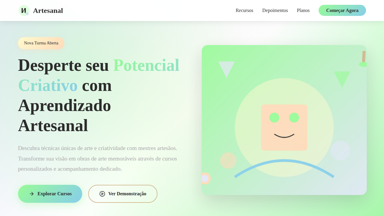
Creative and engaging hand-drawn landing page for an online art and creativity course platform. Ideal for landing pages, modern websites. AI-ready template.
Use case: Landing pages, Modern websites
Historical Context
Creative learning platforms faced a peculiar design tension from the start: how do you sell creativity without looking like a corporate training portal? Skillshare cracked it early — dark backgrounds, generous whitespace, student work front and center. The platform itself receded. Domestika pushed further into editorial territory, treating each course page like a magazine spread. Cinematic thumbnails. Instructor portraits shot with intention. Typography that breathed. The shift mattered. Earlier online education design borrowed from academia — structured, grid-heavy, information-dense. Coursera and Udemy optimized for catalog browsing, not inspiration. Creative platforms rejected that. They understood their audience wasn't shopping for credentials. They were shopping for transformation. The design had to feel like possibility, not obligation. What emerged was a visual language where student outcomes became the hero content, instructors were positioned as working artists rather than teachers, and the interface stayed deliberately minimal — almost gallery-like. The message was clear: this space belongs to makers, not institutions.
When to Use
When designing platforms where the learning itself is expressive — art courses, illustration workshops, craft skill-sharing. Applies to any context where student work deserves more visual weight than course metadata. Use this system when your users identify as creators first and students second, when inspiration drives enrollment more than syllabus details, and when the platform needs to feel like a creative community rather than a classroom.
Design Principles
- Student work as hero — showcase outcomes over curriculum. The portfolio grid IS the marketing.
- Instructor-as-artist positioning — portrait photography, studio context, process shots. Never stock-photo energy.
- Dark, recessive chrome — the interface disappears so creative content pops. Think gallery walls, not spreadsheet rows.
- Editorial pacing over information density — let pages breathe. One compelling image beats six thumbnails crammed into a row.
- Warmth through materiality — subtle paper textures, hand-drawn accents, imperfect edges. Signal craft, not corporate polish.
DESIGN.md
---
version: "alpha"
name: "Aprendizado Criativo Artesanal"
description: "Creative and engaging hand-drawn landing page for an online art and creativity course platform. Ideal for landing pages, modern websites. AI-ready template."
colors:
  primary: "#98FB98"
  secondary: "#E6E6FA"
  tertiary: "#FFFACD"
  neutral: "#FFFFFF"
  surface: "#87CEEB"
  accent: "#FFDAB9"
typography:
  h1:
    fontFamily: Gochi Hand
    fontSize: 2.5rem
    fontWeight: 700
  body-md:
    fontFamily: Gochi Hand
    fontSize: 1rem
    fontWeight: 400
components:
  button-primary:
    backgroundColor: "{colors.primary}"
    textColor: "{colors.neutral}"
    padding: 12px
---

## Overview

Creative and engaging hand-drawn landing page for an online art and creativity course platform. Ideal for landing pages, modern websites. AI-ready template. Creative learning platforms faced a peculiar design tension from the start: how do you sell creativity without looking like a corporate training portal? Skillshare cracked it early — dark backgrounds, generous whitespace, student work front and center. The platform itself receded. Domestika pushed further into editorial territory, treating each course page like a magazine spread. Cinematic thumbnails. Instructor portraits shot with intention. Typography that breathed.

The shift mattered. Earlier online education design borrowed from academia — structured, grid-heavy, information-dense. Coursera and Udemy optimized for catalog browsing, not inspiration. Creative platforms rejected that. They understood their audience wasn't shopping for credentials. They were shopping for transformation. The design had to feel like possibility, not obligation.

What emerged was a visual language where student outcomes became the hero content, instructors were positioned as working artists rather than teachers, and the interface stayed deliberately minimal — almost gallery-like. The message was clear: this space belongs to makers, not institutions.

- Density: 5/10 — Balanced
- Variance: 8/10 — Expressive
- Motion: 4/10 — Subtle

- **Style:** Creative, Engaging, Educational
- **Keywords:** art courses, creativity, learning, hand-drawn, engaging, educational, artistic, inspiring, community, expressive
- **Era:** 2026+ Inspiração Digital
- **Light/Dark:** ✓ Full / ✗ No

## Colors

- **Verde Menta** (#98FB98) — Primary surface or dominant color
- **Roxo Lavanda** (#E6E6FA) — Accent color, emphasis elements
- **Amarelo Pastel** (#FFFACD) — Warning states, attention indicators
- **Branco** (#FFFFFF) — Light surface, card backgrounds
- **Azul Céu** (#87CEEB) — Secondary accent
- **Rosa Pêssego** (#FFDAB9) — Decorative accent, highlight elements
- **Marrom Claro** (#D2B48C) — Extended palette, decorative use
- **Cinza Lápis** (#A9A9A9) — Secondary text, borders, muted elements


## Typography

- **Display / Hero:** Gochi Hand — Weight 700, tight tracking, used for headline impact
- **Body:** Gochi Hand — Weight 400, 16px/1.6 line-height, max 72ch per line
- **UI Labels / Captions:** Gochi Hand — 0.875rem, weight 500, slight letter-spacing
- **Monospace:** JetBrains Mono — Used for code, metadata, and technical values

Scale:
- Hero: clamp(2.5rem, 5vw, 4rem)
- H1: 2.25rem
- H2: 1.5rem
- Body: 1rem / 1.6
- Small: 0.875rem


## Layout

- **Grid:** CSS Grid primary. Max-width containment: 1280px centered with 1.5rem side padding.
- **Spacing rhythm:** Balanced. Base unit: 0.5rem (8px).
- **Section vertical gaps:** clamp(4rem, 8vw, 8rem).
- **Hero layout:** Asymmetric composition.
- **Feature sections:** Asymmetric grid with varied card sizes. No 3-equal-columns.
- **Mobile collapse:** All multi-column layouts collapse below 768px. No horizontal overflow.
- **z-index contract:** base (0) / sticky-nav (100) / overlay (200) / modal (300) / toast (500).


## Elevation & Depth

Ilustrações de elementos de arte (pincéis, tintas) desenhadas à mão, tipografia que simula escrita artística, texturas de tela e aquarela, bordas com efeito de pincelada, micro-interações de hover com animações de "esboço", transições de seção com efeito de "tela em branco".

- **Physics:** Ease-out curves, 200-300ms duration. Smooth and predictable.
- **Entry animations:** Fade + translate-Y (16px → 0) over 420ms ease-out. Staggered cascades for lists: 80ms between items.
- **Hover states:** Subtle color shift + shadow adjustment over 200ms.
- **Page transitions:** Fade only (200ms).
- **Performance:** Only transform and opacity animated. No layout-triggering properties.


## Shapes

Base corner radius: 8px. See rounded tokens in front matter for the full scale.


## Components

- **Primary Button:** Subtly rounded (0.5rem) shape. Accent color fill. Hover: 8% darken + subtle lift shadow. Active: -1px translate tactile press. Font weight 600. No outer glows.
- **Secondary / Ghost Button:** Outline variant. 1.5px border in muted color. Text in primary color. Hover: subtle background fill.
- **Cards:** Subtly rounded (0.5rem) corners. Surface background. Subtle shadow (0 2px 12px rgba(0,0,0,0.06)). 1px border stroke.
- **Inputs:** Label above input. 1px border stroke. Focus ring: 2px accent color offset 2px. Error text below in semantic red. No floating labels.
- **Navigation:** Primary surface background. Active item: accent color indicator. Font weight 500 when active.
- **Skeletons:** Shimmer animation matching component dimensions. No circular spinners.
- **Empty States:** Icon-based composition with descriptive text and action button.


## Do's and Don'ts

- No emojis in UI — use icon system only (Lucide, Heroicons)
- No pure black (#000000) — use off-black or charcoal variants
- No oversaturated accent colors (saturation cap: 80%)
- No 3-column equal-width feature layouts — use zig-zag or asymmetric grid
- No `h-screen` — use `min-h-[100dvh]`
- No AI copywriting clichés: "Elevate", "Seamless", "Unleash", "Next-Gen"
- No broken external image links — use picsum.photos or inline SVG
- No generic lorem ipsum in demos

- Do Ilustrações de elementos de arte
- Do Tipografia artística
- Do Texturas de tela/aquarela
- Do Bordas com efeito de pincelada
- Do Micro-interações de "esboço"
- Do Transições de "tela em branco".


## Use Case

Landing pages, Modern websites
Technical Specs
CSS
background: #FFFFFF, color: #333333, border: 1px solid #E0E0E0, font-family: "Gochi Hand, cursive", transition: all 0.7s ease-in-out, .art-element-illustration, .brushstroke-border, .canvas-texture-bg.
Variables
--mint-green: #98FB98, --lavender-purple: #E6E6FA, --pastel-yellow: #FFFACD, --white-bg: #FFFFFF, --font-artistic: "Gochi Hand, cursive", --canvas-texture-bg: url('canvas-texture.png'), --brushstroke-border: 1px solid #E0E0E0.Checklist
☐ Ilustrações de elementos de arte, ☐ Tipografia artística, ☐ Texturas de tela/aquarela, ☐ Bordas com efeito de pincelada, ☐ Micro-interações de "esboço", ☐ Transições de "tela em branco".
Colors
Primary
Secondary
Effects
Ilustrações de elementos de arte (pincéis, tintas) desenhadas à mão, tipografia que simula escrita artística, texturas de tela e aquarela, bordas com efeito de pincelada, micro-interações de hover com animações de "esboço", transições de seção com efeito de "tela em branco".
Light/Dark
✓ Full / ✗ No
AI Prompt
Act as a Senior Frontend Engineer and Expert UI Designer.
Your task is to code a complete Landing Page on the first attempt.
- Landing Page Theme: <INSERT THEME>
- Sections to add: <INSERT SECTIONS>

Generate the final code immediately following these definitions:

## Style

- **Name:** Aprendizado Criativo Artesanal
- **Type:** Creative, Engaging, Educational
- **Keywords:** art courses, creativity, learning, hand-drawn, engaging, educational, artistic, inspiring, community, expressive
- **Era:** 2026+ Inspiração Digital
- **Light/Dark:** ✓ Full / ✗ No

## Color Palette

- **Primary:** Verde Menta #98FB98, Roxo Lavanda #E6E6FA, Amarelo Pastel #FFFACD, Branco #FFFFFF
- **Secondary:** Azul Céu #87CEEB, Rosa Pêssego #FFDAB9, Marrom Claro #D2B48C, Cinza Lápis #A9A9A9

## Visual Effects

Ilustrações de elementos de arte (pincéis, tintas) desenhadas à mão, tipografia que simula escrita artística, texturas de tela e aquarela, bordas com efeito de pincelada, micro-interações de hover com animações de "esboço", transições de seção com efeito de "tela em branco".

## AI Visual Direction

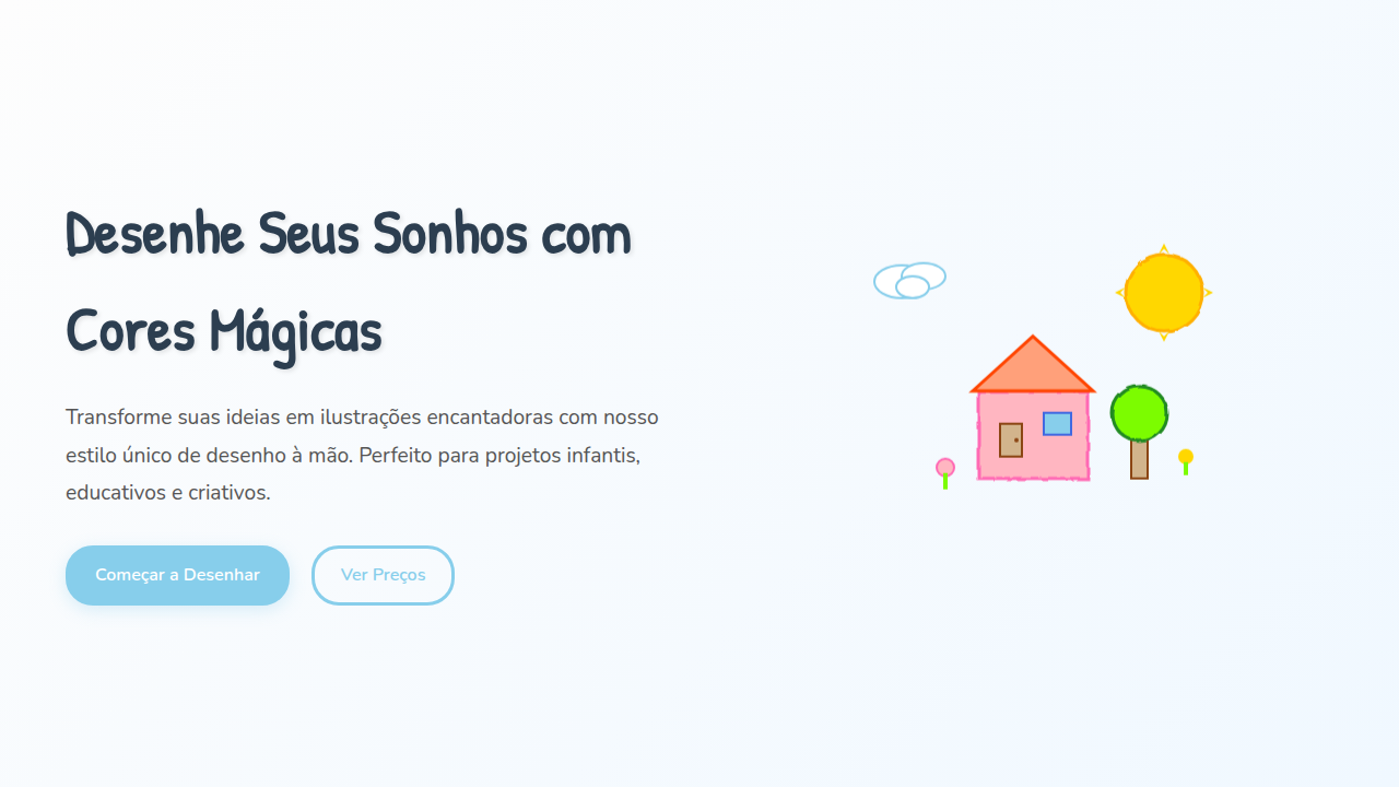
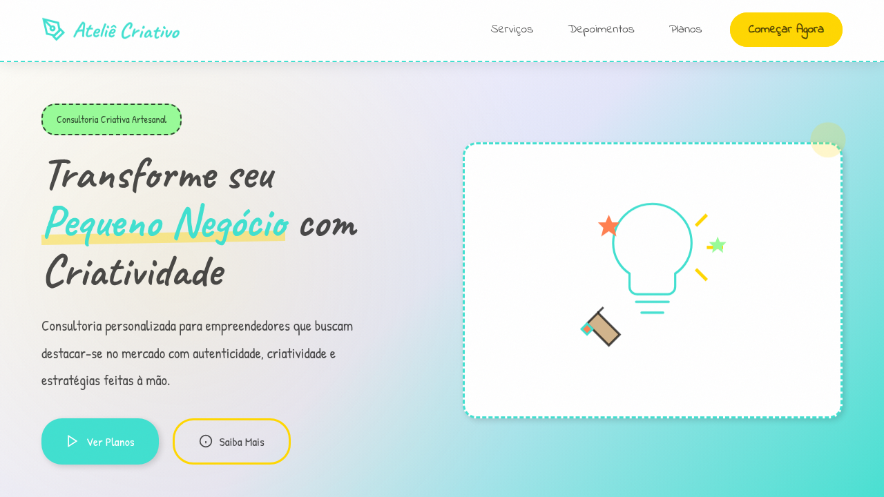
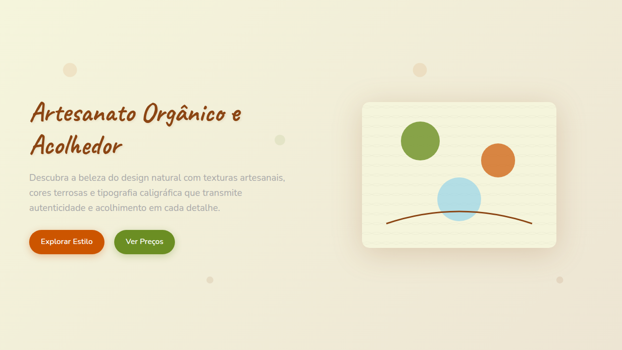
Design a creative and engaging hand-drawn landing page for an online art and creativity course platform. Use: hand-drawn art element illustrations (brushes, paints), artistic handwritten-style typography, canvas and watercolor textures, brushstroke-effect borders, "sketch" animation hover micro-interactions, "blank canvas" section transitions, mint green and lavender accents, inspiring and expressive feel.

## CSS Technical

```css
background: #FFFFFF, color: #333333, border: 1px solid #E0E0E0, font-family: "Gochi Hand, cursive", transition: all 0.7s ease-in-out, .art-element-illustration, .brushstroke-border, .canvas-texture-bg.
```

## Design System Variables

```css
--mint-green: #98FB98, --lavender-purple: #E6E6FA, --pastel-yellow: #FFFACD, --white-bg: #FFFFFF, --font-artistic: "Gochi Hand, cursive", --canvas-texture-bg: url('canvas-texture.png'), --brushstroke-border: 1px solid #E0E0E0.
```

## Implementation Checklist

- ☐ Ilustrações de elementos de arte
- ☐ Tipografia artística
- ☐ Texturas de tela/aquarela
- ☐ Bordas com efeito de pincelada
- ☐ Micro-interações de "esboço"
- ☐ Transições de "tela em branco".

## Execution Rules

1. Strictly follow the defined visual style.
2. Use high-quality inline SVG icons (Heroicons or Lucide style) — NEVER use emojis as icons.
3. Add `cursor-pointer` and smooth `hover` states (transition-all) on all interactive elements.
4. Required Page Structure:
   - Navbar (Logo + Links + CTA)
   - Hero Section (Impactful Headline + Subtitle + 2 buttons + 3D/Abstract visual element via CSS)
   - Features (3 cards with icons)
   - Testimonials (3 cards)
   - Pricing (3 tiers, highlight the middle one)
   - Final CTA
   - Full Footer with social links, privacy policy, terms of use, contact and SEO links.
5. All text content must be in English.
6. The visual must be CLEARLY distinct — do not create a "default Bootstrap" design. Force the use of the provided design system variables.
7. Use `<style>` tags in the head for custom classes (especially for complex backdrop-filter effects and animations) that Tailwind CDN doesn't cover.
8. Full Responsiveness: Layout must adapt perfectly to Mobile, Tablet and Desktop (vertical stack on mobile).
9. Include basic SEO, Viewport and Open Graph meta tags in `<head>`.
10. Footer must contain: Copyright 2026, Secondary navigation links and Social media icons.
11. Make the creative decisions needed to deliver the complete, functional result now.Related
Last synced: 4/1/2026