Analytics Metric Flow
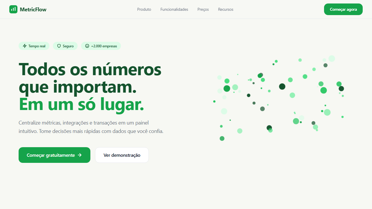
Design uma landing page analytics SaaS em scroll contínuo: hero fullscreen com headline 'Every number that matters. Ideal for saas analytics, dashboards de métricas, plataformas de dados, ferramentas de integração. AI-ready template.
Use case: SaaS Analytics, Dashboards de métricas, Platforms de dados, Tools de integração
Historical Context
The analytics landing page has always been a confidence game. You're selling abstraction — the promise that messy, overwhelming data becomes legible the moment it hits your platform. Early SaaS analytics pages leaned on static screenshots, maybe a cropped dashboard floating in a browser mockup. It worked, barely. The real shift came when teams like Mixpanel and Amplitude started treating the hero section as a live proof point — not showing the product, but performing it. Large metrics cascading down the viewport, animated data points connecting in real time, the page itself becoming the dashboard. Continuous scroll changed the economics of attention here. Instead of cramming every insight above the fold, the best analytics pages now unfold like a narrative — one metric leads to the next, each section building on the last. The hero doesn't need to say everything. It needs to say one number, impossibly large, rendered with enough confidence that you believe the rest. Data visualization in the hero isn't decoration. It's the entire sales pitch compressed into three seconds of scroll.
When to Use
Deploy this pattern when your product's core value is numerical — when the thing you sell is clarity over chaos. Analytics platforms, revenue dashboards, monitoring tools, any SaaS where the user's first question is 'what's my number right now.' It works best when you have real metrics to show (or convincing synthetic ones), and when your audience already understands what the data means. Don't use it for products that need heavy explanation before the numbers make sense.
Design Principles
- Let one metric dominate — if everything is big, nothing is. Pick the single number that makes prospects lean in and give it absurd visual weight.
- Continuous scroll should feel like zooming in, not scrolling down. Each section reveals a deeper layer of the same story, not a new topic.
- Data point illustrations must feel generated, not illustrated. The moment a chart looks hand-drawn or overly stylized, you lose the credibility that makes analytics pages convert.
- White space around large metrics isn't empty — it's the frame that makes the number feel authoritative. Crowd it and you get a dashboard; space it and you get a statement.
- Motion should follow data logic. Points connect, lines draw, numbers count up. Never animate for atmosphere — animate to demonstrate how the product actually thinks.
DESIGN.md
---
version: "alpha"
name: "Analytics Metric Flow"
description: "Design uma landing page analytics SaaS em scroll contínuo: hero fullscreen com headline 'Every number that matters. Ideal for saas analytics, dashboards de métricas, plataformas de dados, ferramentas de integração. AI-ready template."
colors:
  primary: "#14532D"
  secondary: "#16A34A"
  tertiary: "#F7F8F3"
  neutral: "#111827"
  surface: "#E5E7EB"
  accent: "#DCFCE7"
typography:
  h1:
    fontFamily: SF Pro Text
    fontSize: 2.25rem
    fontWeight: 700
  body-md:
    fontFamily: SF Pro Text
    fontSize: 1rem
    fontWeight: 400
  label-caps:
    fontFamily: SF Pro Text
    fontSize: 0.75rem
    fontWeight: 500
rounded:
  sm: 14px
  md: 28px
  lg: 42px
components:
  button-primary:
    backgroundColor: "{colors.primary}"
    textColor: "{colors.neutral}"
    rounded: "{rounded.sm}"
    padding: 12px
---

## Overview

Design uma landing page analytics SaaS em scroll contínuo: hero fullscreen com headline 'Every number that matters. Ideal for saas analytics, dashboards de métricas, plataformas de dados, ferramentas de integração. AI-ready template. The analytics landing page has always been a confidence game. You're selling abstraction — the promise that messy, overwhelming data becomes legible the moment it hits your platform. Early SaaS analytics pages leaned on static screenshots, maybe a cropped dashboard floating in a browser mockup. It worked, barely. The real shift came when teams like Mixpanel and Amplitude started treating the hero section as a live proof point — not showing the product, but performing it. Large metrics cascading down the viewport, animated data points connecting in real time, the page itself becoming the dashboard.

Continuous scroll changed the economics of attention here. Instead of cramming every insight above the fold, the best analytics pages now unfold like a narrative — one metric leads to the next, each section building on the last. The hero doesn't need to say everything. It needs to say one number, impossibly large, rendered with enough confidence that you believe the rest. Data visualization in the hero isn't decoration. It's the entire sales pitch compressed into three seconds of scroll.

- Density: 8/10 — Dense
- Variance: 2/10 — Structured
- Motion: 4/10 — Subtle

- **Style:** General
- **Keywords:** analytics SaaS scroll contínuo, hero com ilustração de dados em pontos, métricas grandes, cards funcionais, integrações em grid, tabela de transações, fluxo vertical limpo
- **Era:** 2020s Minimal Analytics Flow
- **Light/Dark:** ✓ Full / ◐ Partial

## Colors

- **Verde escuro** (#14532D) — Dark surface, primary background
- **Verde CTA** (#16A34A) — Primary accent, CTAs and interactive elements
- **Branco quente** (#F7F8F3) — Light surface, card backgrounds
- **Cinza texto** (#111827) — Primary text color
- **Cinza suave** (#E5E7EB) — Secondary text, borders, muted elements
- **Verde claro** (#DCFCE7) — Success states, positive indicators
- **Cinza tabela** (#F3F4F6) — Secondary text, borders, muted elements


## Typography

- **Display / Hero:** SF Pro Text — Weight 700, tight tracking, used for headline impact
- **Accent:** Segoe UI — Used for decorative or emphasis text
- **Body:** SF Pro Text — Weight 400, 16px/1.6 line-height, max 72ch per line
- **UI Labels / Captions:** SF Pro Text — 0.875rem, weight 500, slight letter-spacing
- **Monospace:** JetBrains Mono — Used for code, metadata, and technical values

Scale:
- Hero: clamp(2.5rem, 5vw, 4rem)
- H1: 2.25rem
- H2: 1.5rem
- Body: 1rem / 1.6
- Small: 0.875rem


## Layout

- **Grid:** CSS Grid primary. Max-width containment: 1280px centered with 1.5rem side padding.
- **Spacing rhythm:** Balanced. Base unit: 0.5rem (8px).
- **Section vertical gaps:** clamp(4rem, 8vw, 8rem).
- **Hero layout:** Split-screen (text left, visual right).
- **Feature sections:** Zig-zag alternating text+image rows. No 3-equal-columns.
- **Mobile collapse:** All multi-column layouts collapse below 768px. No horizontal overflow.
- **z-index contract:** base (0) / sticky-nav (100) / overlay (200) / modal (300) / toast (500).


## Elevation & Depth

Background off-white contínuo, ilustração de nuvem de pontos verdes escalável, cards com borda 1px sutil e sombra mínima, CTAs sólidos em verde com texto branco, tabela com linhas alternadas

- **Physics:** Ease-out curves, 200-300ms duration. Smooth and predictable.
- **Entry animations:** Fade + translate-Y (16px → 0) over 420ms ease-out. Staggered cascades for lists: 80ms between items.
- **Hover states:** Subtle color shift + shadow adjustment over 200ms.
- **Page transitions:** Fade only (200ms).
- **Performance:** Only transform and opacity animated. No layout-triggering properties.


## Shapes

Base corner radius: 14px. See rounded tokens in front matter for the full scale.


## Components

- **Primary Button:** Pill-shaped (9999px) shape. Accent color fill. Hover: 8% darken + subtle lift shadow. Active: -1px translate tactile press. Font weight 600. No outer glows.
- **Secondary / Ghost Button:** Outline variant. 1.5px border in muted color. Text in primary color. Hover: subtle background fill.
- **Cards:** Pill-shaped (9999px) corners. Surface background. Subtle shadow (0 2px 12px rgba(0,0,0,0.06)). 1px border stroke.
- **Inputs:** Label above input. 1px border stroke. Focus ring: 2px accent color offset 2px. Error text below in semantic red. No floating labels.
- **Navigation:** Primary surface background. Active item: accent color indicator. Font weight 500 when active.
- **Skeletons:** Shimmer animation matching component dimensions. No circular spinners.
- **Empty States:** Icon-based composition with descriptive text and action button.


## Do's and Don'ts

- No emojis in UI — use icon system only (Lucide, Heroicons)
- No pure black (#000000) — use off-black or charcoal variants
- No oversaturated accent colors (saturation cap: 80%)
- No 3-column equal-width feature layouts — use zig-zag or asymmetric grid
- No `h-screen` — use `min-h-[100dvh]`
- No AI copywriting clichés: "Elevate", "Seamless", "Unleash", "Next-Gen"
- No broken external image links — use picsum.photos or inline SVG
- No generic lorem ipsum in demos

- Do Hero fullscreen com headline grande + subheadline + badges + CTA verde + ilustração de pontos verdes escalável
- Do Seção imediata de 3 métricas grandes em linha (números em verde
- Do labels abaixo)
- Do Seção 'Connects with every tool' com grid 4x2 de ícones de integrações em cards com borda arredondada
- Do Seção tabela transações recentes com 5–6 linhas alternadas cinza/branco
- Do CTA final em bloco com headline curta + botão verde
- Do Fundo off-white contínuo sem quebras abruptas
- Do Navegação fixa superior simples (logo + 4 links + CTA)


## Use Case

SaaS Analytics, Dashboards de métricas, Platforms de dados, Tools de integração
Technical Specs
CSS
background-color: #F7F8F3; color: #111827; font-family: system-ui, -apple-system, BlinkMacSystemFont, 'SF Pro Text', 'Segoe UI', sans-serif; letter-spacing: -0.02em; border-radius: 14px; box-shadow: 0 18px 45px rgba(15,23,42,0.04); border: 1px solid #E5E7EB; padding: clamp(2rem, 8vw, 6rem);
Variables
--page-bg: #F7F8F3; --surface: #FFFFFF; --surface-soft: #F3F4F6; --color-primary: #16A34A; --color-primary-dark: #14532D; --color-text-main: #111827; --color-text-muted: #6B7280; --color-border-soft: #E5E7EB; --color-pill-bg: #DCFCE7; --radius-card: 14px; --radius-icon: 12px; --shadow-card: 0 18px 45px rgba(15,23,42,0.04); --space-xl: clamp(2rem, 8vw, 6rem);
Checklist
☐ Hero fullscreen com headline grande + subheadline + badges + CTA verde + ilustração de pontos verdes escalável, ☐ Seção imediata de 3 métricas grandes em linha (números em verde, labels abaixo), ☐ Seção 'Connects with every tool' com grid 4x2 de ícones de integrações em cards com borda arredondada, ☐ Seção tabela transações recentes com 5–6 linhas alternadas cinza/branco, ☐ CTA final em bloco com headline curta + botão verde, ☐ Fundo off-white contínuo sem quebras abruptas, ☐ Navegação fixa superior simples (logo + 4 links + CTA)
Colors
Primary
Secondary
Effects
Background off-white contínuo, ilustração de nuvem de pontos verdes escalável, cards com borda 1px sutil e sombra mínima, CTAs sólidos em verde com texto branco, tabela com linhas alternadas
Light/Dark
✓ Full / ◐ Partial
AI Prompt
Act as a Senior Frontend Engineer and Expert UI Designer.
Your task is to code a complete Landing Page on the first attempt.
- Landing Page Theme: <INSERT THEME>
- Sections to add: <INSERT SECTIONS>

Generate the final code immediately following these definitions:

## Style

- **Name:** Analytics Metric Flow
- **Type:** General
- **Keywords:** analytics SaaS scroll contínuo, hero com ilustração de dados em pontos, métricas grandes, cards funcionais, integrações em grid, tabela de transações, fluxo vertical limpo
- **Era:** 2020s Minimal Analytics Flow
- **Light/Dark:** ✓ Full / ◐ Partial

## Color Palette

- **Primary:** Verde escuro #14532D, Verde CTA #16A34A, Branco quente #F7F8F3
- **Secondary:** Cinza texto #111827, Cinza suave #E5E7EB, Verde claro #DCFCE7, Cinza tabela #F3F4F6

## Visual Effects

Background off-white contínuo, ilustração de nuvem de pontos verdes escalável, cards com borda 1px sutil e sombra mínima, CTAs sólidos em verde com texto branco, tabela com linhas alternadas

## AI Visual Direction

Design uma landing page analytics SaaS em scroll contínuo: hero fullscreen com headline 'Every number that matters. All in one place.', ilustração abstrata de dados em pontos verdes à direita, navbar superior simples, seção de métricas com 3 KPIs (ex: 1.845, $125K, 92%), seção 'Connects with every tool' com grid de ícones de integrações em cards arredondados, seção tabela de transações recentes com linhas alternadas, e CTA final 'Your data is waiting' com botão verde. Use muito espaço em branco, fundo off-white, e verde como cor principal de ação.

## CSS Technical

```css
background-color: #F7F8F3; color: #111827; font-family: system-ui, -apple-system, BlinkMacSystemFont, 'SF Pro Text', 'Segoe UI', sans-serif; letter-spacing: -0.02em; border-radius: 14px; box-shadow: 0 18px 45px rgba(15,23,42,0.04); border: 1px solid #E5E7EB; padding: clamp(2rem, 8vw, 6rem);
```

## Design System Variables

```css
--page-bg: #F7F8F3; --surface: #FFFFFF; --surface-soft: #F3F4F6; --color-primary: #16A34A; --color-primary-dark: #14532D; --color-text-main: #111827; --color-text-muted: #6B7280; --color-border-soft: #E5E7EB; --color-pill-bg: #DCFCE7; --radius-card: 14px; --radius-icon: 12px; --shadow-card: 0 18px 45px rgba(15,23,42,0.04); --space-xl: clamp(2rem, 8vw, 6rem);
```

## Implementation Checklist

- ☐ Hero fullscreen com headline grande + subheadline + badges + CTA verde + ilustração de pontos verdes escalável
- ☐ Seção imediata de 3 métricas grandes em linha (números em verde
- labels abaixo)
- ☐ Seção 'Connects with every tool' com grid 4x2 de ícones de integrações em cards com borda arredondada
- ☐ Seção tabela transações recentes com 5–6 linhas alternadas cinza/branco
- ☐ CTA final em bloco com headline curta + botão verde
- ☐ Fundo off-white contínuo sem quebras abruptas
- ☐ Navegação fixa superior simples (logo + 4 links + CTA)

## Execution Rules

1. Strictly follow the defined visual style.
2. Use high-quality inline SVG icons (Heroicons or Lucide style) — NEVER use emojis as icons.
3. Add `cursor-pointer` and smooth `hover` states (transition-all) on all interactive elements.
4. Required Page Structure:
   - Navbar (Logo + Links + CTA)
   - Hero Section (Impactful Headline + Subtitle + 2 buttons + 3D/Abstract visual element via CSS)
   - Features (3 cards with icons)
   - Testimonials (3 cards)
   - Pricing (3 tiers, highlight the middle one)
   - Final CTA
   - Full Footer with social links, privacy policy, terms of use, contact and SEO links.
5. All text content must be in English.
6. The visual must be CLEARLY distinct — do not create a "default Bootstrap" design. Force the use of the provided design system variables.
7. Use `<style>` tags in the head for custom classes (especially for complex backdrop-filter effects and animations) that Tailwind CDN doesn't cover.
8. Full Responsiveness: Layout must adapt perfectly to Mobile, Tablet and Desktop (vertical stack on mobile).
9. Include basic SEO, Viewport and Open Graph meta tags in `<head>`.
10. Footer must contain: Copyright 2026, Secondary navigation links and Social media icons.
11. Make the creative decisions needed to deliver the complete, functional result now.
Related
Last synced: 4/1/2026