Airbnb Coral Marketplace
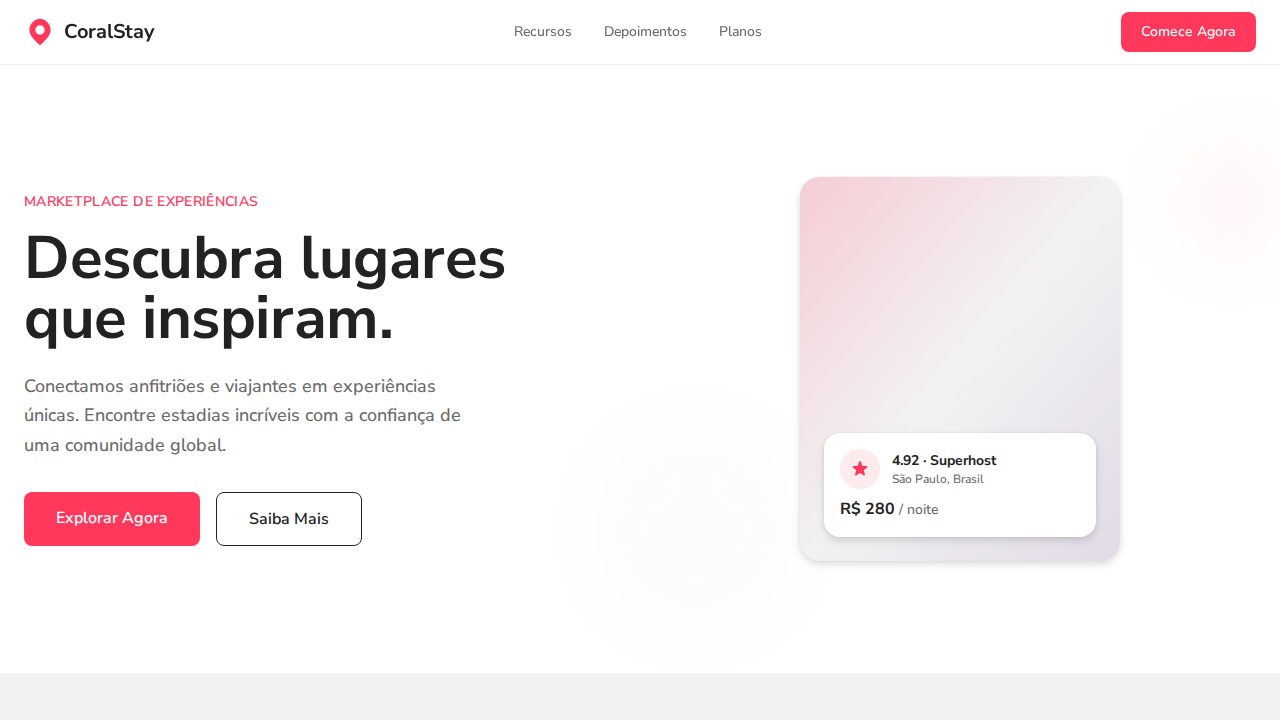
Design an Airbnb-inspired warm marketplace landing page. Ideal for marketplaces, viagens, plataformas de hospedagem, e-commerce experiencial. AI-ready template.
Use case: Marketplaces, Viagens, Platforms de hospedagem, E-commerce experiencial
Historical Context
Airbnb's design system didn't emerge from a rebrand exercise or a design trends mood board. It came from operational pain. By 2016, the product had grown into a sprawling mess of inconsistent patterns across web, iOS, and Android — different teams shipping different interpretations of the same components. The DLS (Design Language System) was their first serious attempt at unification, but Coral represents the maturation of that thinking into something far more ambitious. Coral is fundamentally a marketplace design system, which means it has to solve problems most design systems never face: trust between strangers, complex multi-party flows, and the tension between host and guest experiences that share the same interface. The system had to encode hospitality — warmth, approachability, clarity — without sacrificing the transactional efficiency a booking platform demands. What makes Coral genuinely interesting is how it treats illustration, photography, and motion as first-class citizens rather than decorative afterthoughts. The rounded forms, the Cereal typeface, the deliberate softness — these aren't aesthetic choices, they're trust-building mechanisms. Every visual decision serves the goal of making strangers comfortable enough to sleep in each other's homes.
When to Use
Reach for Coral's patterns when you're building any platform where trust is the product. Peer-to-peer marketplaces, hospitality platforms, travel booking flows, or any service where users transact with strangers. The system excels at balancing warmth with utility — if your product needs to feel human and approachable while handling complex multi-step transactions, this is your reference. Skip it if you're building enterprise tooling or data-heavy dashboards; Coral's generosity with whitespace and illustration won't survive information density requirements.
Design Principles
- Trust through visual warmth — rounded corners, soft illustration, and generous spacing aren't decoration, they're psychological safety mechanisms for peer-to-peer transactions
- Dual-persona architecture — every component must work for both sides of the marketplace without feeling like a compromise for either party
- Progressive disclosure of complexity — booking flows hide enormous transactional depth behind deceptively simple surfaces, revealing complexity only when the user needs it
- Photography as interface — real images of real spaces do more trust-building work than any UI pattern; the system treats content imagery as a structural element, not a fill
- Locality without fragmentation — the system flexes across cultures, languages, and currencies while maintaining a single coherent identity that feels native everywhere
DESIGN.md
---
version: "alpha"
name: "Airbnb Coral Marketplace"
description: "Design an Airbnb-inspired warm marketplace landing page. Ideal for marketplaces, viagens, plataformas de hospedagem, e-commerce experiencial. AI-ready template."
colors:
  primary: "#ffffff"
  secondary: "#222222"
  tertiary: "#ff385c"
  neutral: "#f2f2f2"
  surface: "#3f3f3f"
  accent: "#6a6a6a"
typography:
  h1:
    fontFamily: system-ui
    fontSize: 2.25rem
    fontWeight: 700
  body-md:
    fontFamily: system-ui
    fontSize: 1rem
    fontWeight: 400
  label-caps:
    fontFamily: system-ui
    fontSize: 0.75rem
    fontWeight: 500
rounded:
  sm: 8px
  md: 16px
  lg: 24px
components:
  button-primary:
    backgroundColor: "{colors.primary}"
    textColor: "{colors.neutral}"
    rounded: "{rounded.sm}"
    padding: 12px
---

## Overview

Design an Airbnb-inspired warm marketplace landing page. Ideal for marketplaces, viagens, plataformas de hospedagem, e-commerce experiencial. AI-ready template. Airbnb's design system didn't emerge from a rebrand exercise or a design trends mood board. It came from operational pain. By 2016, the product had grown into a sprawling mess of inconsistent patterns across web, iOS, and Android — different teams shipping different interpretations of the same components. The DLS (Design Language System) was their first serious attempt at unification, but Coral represents the maturation of that thinking into something far more ambitious.

Coral is fundamentally a marketplace design system, which means it has to solve problems most design systems never face: trust between strangers, complex multi-party flows, and the tension between host and guest experiences that share the same interface. The system had to encode hospitality — warmth, approachability, clarity — without sacrificing the transactional efficiency a booking platform demands.

What makes Coral genuinely interesting is how it treats illustration, photography, and motion as first-class citizens rather than decorative afterthoughts. The rounded forms, the Cereal typeface, the deliberate softness — these aren't aesthetic choices, they're trust-building mechanisms. Every visual decision serves the goal of making strangers comfortable enough to sleep in each other's homes.

- Density: 5/10 — Balanced
- Variance: 4/10 — Moderate
- Motion: 4/10 — Subtle

- **Style:** Warm White Canvas, Rausch Red Accent, Cereal VF Variable Font, Three-Layer Shadows, Photography-First
- **Keywords:** airbnb, coral, marketplace, Rausch Red, Cereal VF, three-layer shadows, warm near-black, circular controls, photography-first, palette tokens
- **Era:** 2024-2026 Travel Marketplace
- **Light/Dark:** ✓ Full / ✗ Not Recommended

## Colors

- **Branco** (#ffffff) — Light surface, card backgrounds
- **Near Black** (#222222) — Dark surface, primary background
- **Rausch Red** (#ff385c) — Error states, destructive actions
- **Light Surface** (#f2f2f2) — Supporting palette color
- **Focused Gray** (#3f3f3f) — Secondary text, borders, muted elements
- **Secondary Gray** (#6a6a6a) — Secondary text, borders, muted elements
- **Border Gray** (#c1c1c1) — Secondary text, borders, muted elements
- **Luxe Purple** (#460479) — Accent color, emphasis elements


## Typography

- **Display / Hero:** system-ui — Weight 700, tight tracking, used for headline impact
- **Body:** system-ui — Weight 400, 16px/1.6 line-height, max 72ch per line
- **UI Labels / Captions:** system-ui — 0.875rem, weight 500, slight letter-spacing
- **Monospace:** JetBrains Mono — Used for code, metadata, and technical values

Scale:
- Hero: clamp(2.5rem, 5vw, 4rem)
- H1: 2.25rem
- H2: 1.5rem
- Body: 1rem / 1.6
- Small: 0.875rem


## Layout

- **Grid:** CSS Grid primary. Max-width containment: 1280px centered with 1.5rem side padding.
- **Spacing rhythm:** Balanced. Base unit: 0.5rem (8px).
- **Section vertical gaps:** clamp(4rem, 8vw, 8rem).
- **Hero layout:** Split-screen (text left, visual right).
- **Feature sections:** Zig-zag alternating text+image rows. No 3-equal-columns.
- **Mobile collapse:** All multi-column layouts collapse below 768px. No horizontal overflow.
- **z-index contract:** base (0) / sticky-nav (100) / overlay (200) / modal (300) / toast (500).


## Elevation & Depth

Canvas branco puro com Rausch Red (#ff385c) como acento singular icônico. Texto near-black quente (#222222) — nunca preto puro. Cereal VF variable font com terminais arredondados quentes, pesos 500-700. Sombras three-layer: ring (0.02) + soft blur (0.04) + primary lift (0.1). Radius generoso: 8px botões, 14px badges, 20px cards, 32px large, 50% circular. Controles circulares (50%) para carrosséis. Fotografia como conteúdo primário. Letter-spacing negativo (-0.18px a -0.44px) em headings para intimidade.

- **Physics:** Ease-out curves, 200-300ms duration. Smooth and predictable.
- **Entry animations:** Fade + translate-Y (16px → 0) over 420ms ease-out. Staggered cascades for lists: 80ms between items.
- **Hover states:** Subtle color shift + shadow adjustment over 200ms.
- **Page transitions:** Fade only (200ms).
- **Performance:** Only transform and opacity animated. No layout-triggering properties.


## Shapes

Base corner radius: 8px. See rounded tokens in front matter for the full scale.


## Components

- **Primary Button:** Rounded (8px buttons) shape. Accent color fill. Hover: 8% darken + subtle lift shadow. Active: -1px translate tactile press. Font weight 600. No outer glows.
- **Secondary / Ghost Button:** Outline variant. 1.5px border in muted color. Text in primary color. Hover: subtle background fill.
- **Cards:** Rounded (8px buttons) corners. Surface background. Subtle shadow (0 2px 12px rgba(0,0,0,0.06)). 1px border stroke.
- **Inputs:** Label above input. 1px border stroke. Focus ring: 2px accent color offset 2px. Error text below in semantic red. No floating labels.
- **Navigation:** Primary surface background. Active item: accent color indicator. Font weight 500 when active.
- **Skeletons:** Shimmer animation matching component dimensions. No circular spinners.
- **Empty States:** Icon-based composition with descriptive text and action button.


## Do's and Don'ts

- No emojis in UI — use icon system only (Lucide, Heroicons)
- No pure black (#000000) — use off-black or charcoal variants
- No oversaturated accent colors (saturation cap: 80%)
- No 3-column equal-width feature layouts — use zig-zag or asymmetric grid
- No `h-screen` — use `min-h-[100dvh]`
- No AI copywriting clichés: "Elevate", "Seamless", "Unleash", "Next-Gen"
- No broken external image links — use picsum.photos or inline SVG
- No generic lorem ipsum in demos

- Do Canvas branco com Rausch Red
- Do Texto near-black #222222
- Do Variable font 500-700
- Do Sombras three-layer
- Do Radius generoso 8-50%
- Do Controles circulares
- Do Fotografia-first
- Do Tracking negativo headings
- Do Responsivo


## Use Case

Marketplaces, Viagens, Platforms de hospedagem, E-commerce experiencial
Technical Specs
CSS
background:#ffffff;color:#222222;accent:#ff385c;box-shadow:rgba(0,0,0,0.02) 0px 0px 0px 1px,rgba(0,0,0,0.04) 0px 2px 6px,rgba(0,0,0,0.1) 0px 4px 8px;border-radius:8px buttons,20px cards,50% circles;font-family:system-ui;font-weight:500-700;letter-spacing:-0.44px at 22px
Variables
--bg:#ffffff;--text:#222222;--red:#ff385c;--surface:#f2f2f2;--secondary:#6a6a6a;--border:#c1c1c1;--luxe:#460479;--radius-btn:8px;--radius-card:20px;--radius-circle:50%
Checklist
☐ Canvas branco com Rausch Red, ☐ Texto near-black #222222, ☐ Variable font 500-700, ☐ Sombras three-layer, ☐ Radius generoso 8-50%, ☐ Controles circulares, ☐ Fotografia-first, ☐ Tracking negativo headings, ☐ Responsivo
Colors
Primary
Secondary
Effects
Canvas branco puro com Rausch Red (#ff385c) como acento singular icônico. Texto near-black quente (#222222) — nunca preto puro. Cereal VF variable font com terminais arredondados quentes, pesos 500-700. Sombras three-layer: ring (0.02) + soft blur (0.04) + primary lift (0.1). Radius generoso: 8px botões, 14px badges, 20px cards, 32px large, 50% circular. Controles circulares (50%) para carrosséis. Fotografia como conteúdo primário. Letter-spacing negativo (-0.18px a -0.44px) em headings para intimidade.
Light/Dark
✓ Full / ✗ Not Recommended
AI Prompt
Act as a Senior Frontend Engineer and Expert UI Designer.
Your task is to code a complete Landing Page on the first attempt.
- Landing Page Theme: <INSERT THEME>
- Sections to add: <INSERT SECTIONS>

Generate the final code immediately following these definitions:

## Style

- **Name:** Airbnb Coral Marketplace
- **Type:** Warm White Canvas, Rausch Red Accent, Cereal VF Variable Font, Three-Layer Shadows, Photography-First
- **Keywords:** airbnb, coral, marketplace, Rausch Red, Cereal VF, three-layer shadows, warm near-black, circular controls, photography-first, palette tokens
- **Era:** 2024-2026 Travel Marketplace
- **Light/Dark:** ✓ Full / ✗ Not Recommended

## Color Palette

- **Primary:** Branco #ffffff, Near Black #222222, Rausch Red #ff385c, Light Surface #f2f2f2
- **Secondary:** Focused Gray #3f3f3f, Secondary Gray #6a6a6a, Border Gray #c1c1c1, Luxe Purple #460479

## Visual Effects

Canvas branco puro com Rausch Red (#ff385c) como acento singular icônico. Texto near-black quente (#222222) — nunca preto puro. Cereal VF variable font com terminais arredondados quentes, pesos 500-700. Sombras three-layer: ring (0.02) + soft blur (0.04) + primary lift (0.1). Radius generoso: 8px botões, 14px badges, 20px cards, 32px large, 50% circular. Controles circulares (50%) para carrosséis. Fotografia como conteúdo primário. Letter-spacing negativo (-0.18px a -0.44px) em headings para intimidade.

## AI Visual Direction

Design an Airbnb-inspired warm marketplace landing page. White canvas with Rausch Red (#ff385c) as singular iconic accent. Warm near-black (#222222) text — never pure black. Variable font with rounded terminals at weight 500-700. Three-layer card shadows: rgba(0,0,0,0.02) 0px 0px 0px 1px + rgba(0,0,0,0.04) 0px 2px 6px + rgba(0,0,0,0.1) 0px 4px 8px. Generous radius: 8px buttons, 20px cards, 50% circular controls. Photography-first listing cards. Negative letter-spacing (-0.18px to -0.44px) on headings.

## CSS Technical

```css
background:#ffffff;color:#222222;accent:#ff385c;box-shadow:rgba(0,0,0,0.02) 0px 0px 0px 1px,rgba(0,0,0,0.04) 0px 2px 6px,rgba(0,0,0,0.1) 0px 4px 8px;border-radius:8px buttons,20px cards,50% circles;font-family:system-ui;font-weight:500-700;letter-spacing:-0.44px at 22px
```

## Design System Variables

```css
--bg:#ffffff;--text:#222222;--red:#ff385c;--surface:#f2f2f2;--secondary:#6a6a6a;--border:#c1c1c1;--luxe:#460479;--radius-btn:8px;--radius-card:20px;--radius-circle:50%
```

## Implementation Checklist

- ☐ Canvas branco com Rausch Red
- ☐ Texto near-black #222222
- ☐ Variable font 500-700
- ☐ Sombras three-layer
- ☐ Radius generoso 8-50%
- ☐ Controles circulares
- ☐ Fotografia-first
- ☐ Tracking negativo headings
- ☐ Responsivo

## Execution Rules

1. Strictly follow the defined visual style.
2. Use high-quality inline SVG icons (Heroicons or Lucide style) — NEVER use emojis as icons.
3. Add `cursor-pointer` and smooth `hover` states (transition-all) on all interactive elements.
4. Required Page Structure:
   - Navbar (Logo + Links + CTA)
   - Hero Section (Impactful Headline + Subtitle + 2 buttons + 3D/Abstract visual element via CSS)
   - Features (3 cards with icons)
   - Testimonials (3 cards)
   - Pricing (3 tiers, highlight the middle one)
   - Final CTA
   - Full Footer with social links, privacy policy, terms of use, contact and SEO links.
5. All text content must be in English.
6. The visual must be CLEARLY distinct — do not create a "default Bootstrap" design. Force the use of the provided design system variables.
7. Use `<style>` tags in the head for custom classes (especially for complex backdrop-filter effects and animations) that Tailwind CDN doesn't cover.
8. Full Responsiveness: Layout must adapt perfectly to Mobile, Tablet and Desktop (vertical stack on mobile).
9. Include basic SEO, Viewport and Open Graph meta tags in `<head>`.
10. Footer must contain: Copyright 2026, Secondary navigation links and Social media icons.
11. Make the creative decisions needed to deliver the complete, functional result now.
Related
Last synced: 4/1/2026