Vibrant & Block-based
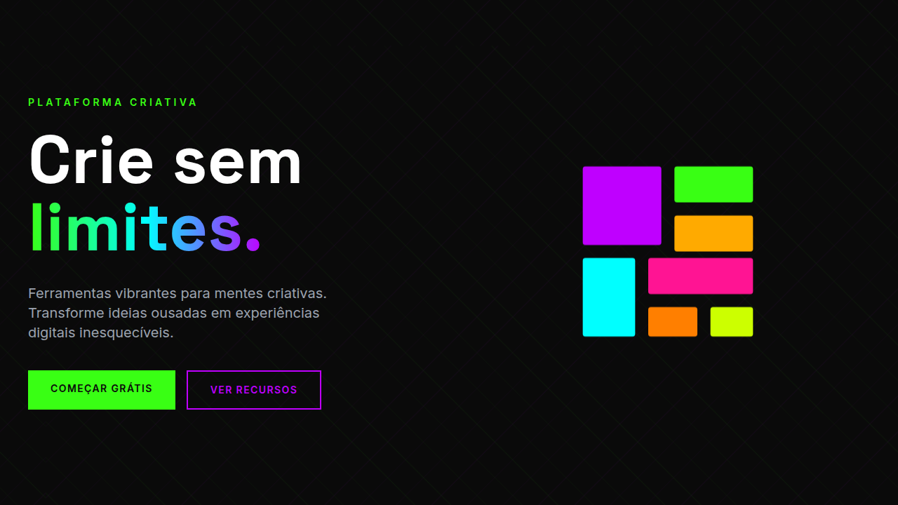
Design an energetic, vibrant interface with bold block layouts, geometric shapes, high color contrast, large typography (32px+), animated background patterns, duotone effects. Ideal for startups, ecommerce fashion, apps gaming, marketing conversível. AI-ready template.
Use case: Startups, Ecommerce fashion, Apps gaming, Conversion marketing
Historical Context
Memphis Design landed like a grenade in 1981. Ettore Sottsass and his Milan collective looked at the beige minimalism dominating furniture and interiors and said: absolutely not. They threw clashing colors together, stacked geometric shapes without apology, and treated pattern like a weapon. It was polarizing. Critics hated it. But it cracked open a door that never fully closed — the idea that design could be loud, irreverent, and still intentional. Fast forward to the 2020s and you see the same energy resurface through Y2K revivals on the web. Designers raised on early-2000s Flash sites started pulling those aesthetics back — saturated palettes, chunky type, unapologetic scale — but now with modern CSS Grid and variable fonts backing them up. The block-based layout is the structural backbone here. It rejects the polite 12-column grid in favor of massive, self-contained sections that breathe with 48px+ gaps between them. This isn't subtle. It's not trying to be. Block layouts treat each section as its own poster, its own moment. You scroll and each block hits you fresh. That's the lineage: Memphis irreverence meets Y2K maximalism meets modern component architecture.
When to Use
Bold blocks work when your audience expects energy — startups pitching something new, gaming apps, fashion ecommerce, conversion-focused landing pages. Younger demographics read this visual language fluently. They don't find it noisy; they find it alive. But here's the thing: this style overwhelms fast if your content is dense or your audience skews corporate. A fintech dashboard in Memphis colors? Nightmare. A B2B SaaS with 48px section gaps and animated patterns? Your users will bounce. Match the energy to the context. If people need to focus and complete tasks, dial it way back. If they need to feel something and act on impulse, go loud.
Design Principles
- Treat every section as a standalone poster — each block should carry its own color story, type hierarchy, and visual weight without depending on its neighbors.
- Commit to scale contrast. If your gaps are big, make them genuinely big (48px minimum). If your type is bold, push it to 700+ weight. Half-measures kill the energy.
- Use geometric shapes as structural elements, not decoration. Circles, rectangles, and triangles should anchor layouts and guide the eye, not float around aimlessly.
- Animate with purpose — hover states should feel physical (scale shifts, color swaps, shadow pops). Avoid subtle opacity fades; they contradict the boldness of everything else.
- Limit your palette to 3-4 high-saturation colors max. Vibrant doesn't mean chaotic. The constraint is what keeps Memphis-inspired work from tipping into visual noise.
DESIGN.md
---
version: "alpha"
name: "Vibrant & Block-based"
description: "Design an energetic, vibrant interface with bold block layouts, geometric shapes, high color contrast, large typography (32px+), animated background patterns, duotone effects. Ideal for startups, ecommerce fashion, apps gaming, marketing conversível. AI-ready template."
colors:
  primary: "#39FF14"
  secondary: "#BF00FF"
  tertiary: "#FF1493"
  neutral: "#00FFFF"
  surface: "#FFAA00"
  accent: "#FF7F00"

typography:
  h1:
    fontFamily: -apple-system, sans-serif
    fontSize: 2.25rem
    fontWeight: 700
  body-md:
    fontFamily: -apple-system, sans-serif
    fontSize: 1rem
    fontWeight: 400
  label-caps:
    fontFamily: -apple-system, sans-serif
    fontSize: 0.75rem
    fontWeight: 500
spacing:
  sm: 48.0px
  md: 96.0px
  lg: 192.0px
components:
  button-primary:
    backgroundColor: "{colors.primary}"
    textColor: "{colors.neutral}"
    padding: 12px
---

## Overview

Design an energetic, vibrant interface with bold block layouts, geometric shapes, high color contrast, large typography (32px+), animated background patterns, duotone effects. Ideal for startups, ecommerce fashion, apps gaming, marketing conversível. AI-ready template. Memphis Design landed like a grenade in 1981. Ettore Sottsass and his Milan collective looked at the beige minimalism dominating furniture and interiors and said: absolutely not. They threw clashing colors together, stacked geometric shapes without apology, and treated pattern like a weapon. It was polarizing. Critics hated it. But it cracked open a door that never fully closed — the idea that design could be loud, irreverent, and still intentional.

Fast forward to the 2020s and you see the same energy resurface through Y2K revivals on the web. Designers raised on early-2000s Flash sites started pulling those aesthetics back — saturated palettes, chunky type, unapologetic scale — but now with modern CSS Grid and variable fonts backing them up. The block-based layout is the structural backbone here. It rejects the polite 12-column grid in favor of massive, self-contained sections that breathe with 48px+ gaps between them.

This isn't subtle. It's not trying to be. Block layouts treat each section as its own poster, its own moment. You scroll and each block hits you fresh. That's the lineage: Memphis irreverence meets Y2K maximalism meets modern component architecture.

- Density: 5/10 — Balanced
- Variance: 4/10 — Moderate
- Motion: 6/10 — Expressive

- **Style:** Bold, Energetic, Playful, Geometric
- **Keywords:** Bold, energetic, playful, block layout, geometric shapes, high color contrast, duotone, modern, energetic
- **Era:** 2020s Modern
- **Light/Dark:** ✓ Full / ✓ Full

## Colors

- **Neon Green** (#39FF14) — Primary surface or dominant color
- **Electric Purple** (#BF00FF) — Accent color, emphasis elements
- **Vivid Pink** (#FF1493) — Primary text color
- **Bright Cyan** (#00FFFF) — Accent highlight, links and focus states
- **Sunburst** (#FFAA00) — Supporting palette color
- **Orange** (#FF7F00) — Warm accent, call-to-action secondary
- **Shocking Pink** (#FF006E) — Primary text color
- **Lime** (#CCFF00) — Extended palette, decorative use


## Typography

- **Display / Hero:** System UI stack (-apple-system, sans-serif) — Weight 700, tight tracking, used for headline impact
- **Body:** System UI stack (-apple-system, sans-serif) — Weight 400, 16px/1.6 line-height, max 72ch per line
- **UI Labels / Captions:** System UI stack (-apple-system, sans-serif) — 0.875rem, weight 500, slight letter-spacing
- **Monospace:** JetBrains Mono — Used for code, metadata, and technical values

Scale:
- Hero: clamp(2.5rem, 5vw, 4rem)
- H1: 2.25rem
- H2: 1.5rem
- Body: 1rem / 1.6
- Small: 0.875rem


## Layout

- **Grid:** CSS Grid primary. Max-width containment: 1280px centered with 1.5rem side padding.
- **Spacing rhythm:** Balanced. Base unit: 0.5rem (8px).
- **Section vertical gaps:** clamp(4rem, 8vw, 8rem).
- **Hero layout:** Split-screen (text left, visual right).
- **Feature sections:** Zig-zag alternating text+image rows. No 3-equal-columns.
- **Mobile collapse:** All multi-column layouts collapse below 768px. No horizontal overflow.
- **z-index contract:** base (0) / sticky-nav (100) / overlay (200) / modal (300) / toast (500).


## Elevation & Depth

Large sections (48px+ gaps), animated patterns, bold hover (color shift), scroll-snap, large type (32px+), 200-300ms

- **Physics:** Spring — stiffness 120, damping 20. Confident, weighted transitions.
- **Entry animations:** Fade + translate-Y (16px → 0) over 480ms ease-out. Staggered cascades for lists: 100ms between items.
- **Hover states:** Scale(1.03) + shadow lift over 200ms.
- **Page transitions:** Fade + slide (300ms).
- **Performance:** Only transform and opacity animated. No layout-triggering properties.


## Shapes

Base corner radius: 4px. See rounded tokens in front matter for the full scale.

## Components

- **Primary Button:** Subtly rounded (0.5rem) shape. Accent color fill. Hover: 8% darken + subtle lift shadow. Active: -1px translate tactile press. Font weight 600. No outer glows.
- **Secondary / Ghost Button:** Outline variant. 1.5px border in muted color. Text in primary color. Hover: subtle background fill.
- **Cards:** Subtly rounded (0.5rem) corners. Surface background. Subtle shadow (0 2px 12px rgba(0,0,0,0.06)). 1px border stroke.
- **Inputs:** Label above input. 1px border stroke. Focus ring: 2px accent color offset 2px. Error text below in semantic red. No floating labels.
- **Navigation:** Primary surface background. Active item: accent color indicator. Font weight 500 when active.
- **Skeletons:** Shimmer animation matching component dimensions. No circular spinners.
- **Empty States:** Icon-based composition with descriptive text and action button.


## Do's and Don'ts

- No emojis in UI — use icon system only (Lucide, Heroicons)
- No pure black (#000000) — use off-black or charcoal variants
- No oversaturated accent colors (saturation cap: 80%)
- No 3-column equal-width feature layouts — use zig-zag or asymmetric grid
- No `h-screen` — use `min-h-[100dvh]`
- No AI copywriting clichés: "Elevate", "Seamless", "Unleash", "Next-Gen"
- No broken external image links — use picsum.photos or inline SVG
- No generic lorem ipsum in demos

- Do Block layout with 48px+ gaps
- Do Large typography 32px+
- Do 4-6 vibrant colors max
- Do Animated patterns active
- Do Scroll-snap enabled
- Do High contrast verified (7:1+)


## Use Case

Startups, Ecommerce fashion, Apps gaming, Conversion marketing
Technical Specs
CSS
display: flex/grid with large gaps (48px+), font-size: 32px+, background: animated patterns (CSS), color: neon/vibrant colors, animation: continuous pattern movement
Variables
--block-gap: 48px, --typography-size: 32px+, --color-palette: 4-6 vibrant colors, --animation: continuous pattern, --contrast-ratio: 7:1+
Checklist
☐ Block layout with 48px+ gaps, ☐ Large typography 32px+, ☐ 4-6 vibrant colors max, ☐ Animated patterns active, ☐ Scroll-snap enabled, ☐ High contrast verified (7:1+)
Colors
Primary
Secondary
Effects
Large sections (48px+ gaps), animated patterns, bold hover (color shift), scroll-snap, large type (32px+), 200-300ms
Light/Dark
✓ Full / ✓ Full
AI Prompt
Act as a Senior Frontend Engineer and Expert UI Designer.
Your task is to code a complete Landing Page on the first attempt.
- Landing Page Theme: <INSERT THEME>
- Sections to add: <INSERT SECTIONS>

Generate the final code immediately following these definitions:

## Style

- **Name:** Vibrant & Block-based
- **Type:** Bold, Energetic, Playful, Geometric
- **Keywords:** Bold, energetic, playful, block layout, geometric shapes, high color contrast, duotone, modern, energetic
- **Era:** 2020s Modern
- **Light/Dark:** ✓ Full / ✓ Full

## Color Palette

- **Primary:** Neon Green #39FF14, Electric Purple #BF00FF, Vivid Pink #FF1493, Bright Cyan #00FFFF, Sunburst #FFAA00
- **Secondary:** Complementary: Orange #FF7F00, Shocking Pink #FF006E, Lime #CCFF00, triadic schemes

## Visual Effects

Large sections (48px+ gaps), animated patterns, bold hover (color shift), scroll-snap, large type (32px+), 200-300ms

## AI Visual Direction

Design an energetic, vibrant interface with bold block layouts, geometric shapes, high color contrast, large typography (32px+), animated background patterns, duotone effects. Perfect for startups and youth-focused apps. Use 4-6 contrasting colors from complementary/triadic schemes.

## CSS Technical

```css
display: flex/grid with large gaps (48px+), font-size: 32px+, background: animated patterns (CSS), color: neon/vibrant colors, animation: continuous pattern movement
```

## Design System Variables

```css
--block-gap: 48px, --typography-size: 32px+, --color-palette: 4-6 vibrant colors, --animation: continuous pattern, --contrast-ratio: 7:1+
```

## Implementation Checklist

- ☐ Block layout with 48px+ gaps
- ☐ Large typography 32px+
- ☐ 4-6 vibrant colors max
- ☐ Animated patterns active
- ☐ Scroll-snap enabled
- ☐ High contrast verified (7:1+)

## Execution Rules

1. Strictly follow the defined visual style.
2. Use high-quality inline SVG icons (Heroicons or Lucide style) — NEVER use emojis as icons.
3. Add `cursor-pointer` and smooth `hover` states (transition-all) on all interactive elements.
4. Required Page Structure:
   - Navbar (Logo + Links + CTA)
   - Hero Section (Impactful Headline + Subtitle + 2 buttons + 3D/Abstract visual element via CSS)
   - Features (3 cards with icons)
   - Testimonials (3 cards)
   - Pricing (3 tiers, highlight the middle one)
   - Final CTA
   - Full Footer with social links, privacy policy, terms of use, contact and SEO links.
5. All text content must be in English.
6. The visual must be CLEARLY distinct — do not create a "default Bootstrap" design. Force the use of the provided design system variables.
7. Use `<style>` tags in the head for custom classes (especially for complex backdrop-filter effects and animations) that Tailwind CDN doesn't cover.
8. Full Responsiveness: Layout must adapt perfectly to Mobile, Tablet and Desktop (vertical stack on mobile).
9. Include basic SEO, Viewport and Open Graph meta tags in `<head>`.
10. Footer must contain: Copyright 2026, Secondary navigation links and Social media icons.
11. Make the creative decisions needed to deliver the complete, functional result now.
Related
Last synced: 4/1/2026