Steampunk Vitoriano
Victorian steampunk landing page. Ideal for landing pages, saas. AI-ready template.
Use case: Landing pages, SaaS
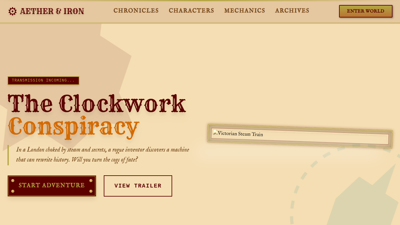
Historical Context
Victorian Steampunk isn't just cogs glued onto top hats. It's a specific design lineage rooted in the speculative machinery of Jules Verne and H.G. Wells — writers who imagined futures built from brass, steam, and obsessive ornamentation. Their worlds weren't minimalist. They were layered, riveted, overwrought in the best possible way. Every surface carried information. The Victorian era itself was drunk on mechanical complexity. Exposed clockwork, filigree ventilation grilles, engraved nameplates on industrial equipment — these weren't decorative afterthoughts, they were the interface. The machine communicated its function through its form. That's the translation opportunity for UI: borders that feel forged rather than drawn, typography with the weight of letterpress, navigation that suggests physical mechanisms rather than flat abstractions. What separates Victorian Steampunk from generic steampunk is restraint within excess. Real Victorian engineering had rules — symmetry, proportion, hierarchical ornamentation that guided the eye. The best steampunk interfaces honor that structure instead of just piling on texture. Gears should turn with purpose. Brass should patina where hands would touch.
When to Use
Reach for this when your product lives in narrative worlds — games with alternate timelines, maker-brand storefronts, themed entertainment platforms. It works when users expect immersion over efficiency, when the journey through the interface IS the experience. Terrible for productivity tools. Perfect for anything where wonder matters more than speed. Also surprisingly effective for hardware brands and IoT dashboards that want to celebrate mechanical heritage rather than hide it behind flat glass.
Design Principles
- Mechanical honesty — every decorative element should suggest function, never pure ornament without implied purpose
- Layered depth — build interfaces like Victorian machinery: foreground controls, midground frames, background texture creating physical dimensionality
- Patina over perfection — wear marks, uneven brass tones, and subtle imperfection signal authenticity; too-clean steampunk reads as costume
- Typographic weight — favor serif faces with ink trap details, set heavier than modern convention; these interfaces should feel letterpress-printed
- Purposeful complexity — ornate doesn't mean cluttered; Victorian engineers used ornamentation to create visual hierarchy, not destroy it
DESIGN.md
---
version: "alpha"
name: "Steampunk Vitoriano"
description: "Victorian steampunk landing page. Ideal for landing pages, saas. AI-ready template."
colors:
  primary: "#B5A642"
  secondary: "#5C0000"
  tertiary: "#704214"
  neutral: "#F5DEB3"
  surface: "#B87333"
  accent: "#008080"
typography:
  h1:
    fontFamily: IM Fell English
    fontSize: 2.5rem
    fontWeight: 700
  body-md:
    fontFamily: IM Fell English
    fontSize: 1rem
    fontWeight: 400
components:
  button-primary:
    backgroundColor: "{colors.primary}"
    textColor: "{colors.neutral}"
    padding: 12px
---

## Overview

Victorian steampunk landing page. Ideal for landing pages, saas. AI-ready template. Victorian Steampunk isn't just cogs glued onto top hats. It's a specific design lineage rooted in the speculative machinery of Jules Verne and H.G. Wells — writers who imagined futures built from brass, steam, and obsessive ornamentation. Their worlds weren't minimalist. They were layered, riveted, overwrought in the best possible way. Every surface carried information.

The Victorian era itself was drunk on mechanical complexity. Exposed clockwork, filigree ventilation grilles, engraved nameplates on industrial equipment — these weren't decorative afterthoughts, they were the interface. The machine communicated its function through its form. That's the translation opportunity for UI: borders that feel forged rather than drawn, typography with the weight of letterpress, navigation that suggests physical mechanisms rather than flat abstractions.

What separates Victorian Steampunk from generic steampunk is restraint within excess. Real Victorian engineering had rules — symmetry, proportion, hierarchical ornamentation that guided the eye. The best steampunk interfaces honor that structure instead of just piling on texture. Gears should turn with purpose. Brass should patina where hands would touch.

- Density: 5/10 — Balanced
- Variance: 8/10 — Expressive
- Motion: 6/10 — Expressive

- **Style:** Ornate, Mechanical, Adventurous
- **Keywords:** steampunk, victorian, ornate, mechanical, adventurous, brass, gears, leather, intricate, imaginative
- **Era:** 19th Century, Industrial Revolution Fantasy
- **Light/Dark:** ✓ Full / ✗ No

## Colors

- **Brass** (#B5A642) — Primary surface or dominant color
- **Rich Mahogany** (#5C0000) — Secondary surface or text color
- **Sepia** (#704214) — Supporting palette color
- **Parchment** (#F5DEB3) — Supporting palette color
- **Copper** (#B87333) — Metallic accent, decorative detail
- **Deep Teal** (#008080) — Secondary accent
- **Clockwork Orange** (#D46A00) — Warm accent, call-to-action secondary
- **Ivory** (#FFFFF0) — Secondary surface


## Typography

- **Display / Hero:** IM Fell English — Weight 700, tight tracking, used for headline impact
- **Body:** IM Fell English — Weight 400, 16px/1.6 line-height, max 72ch per line
- **UI Labels / Captions:** IM Fell English — 0.875rem, weight 500, slight letter-spacing
- **Monospace:** JetBrains Mono — Used for code, metadata, and technical values

Scale:
- Hero: clamp(2.5rem, 5vw, 4rem)
- H1: 2.25rem
- H2: 1.5rem
- Body: 1rem / 1.6
- Small: 0.875rem


## Layout

- **Grid:** CSS Grid primary. Max-width containment: 1280px centered with 1.5rem side padding.
- **Spacing rhythm:** Balanced. Base unit: 0.5rem (8px).
- **Section vertical gaps:** clamp(4rem, 8vw, 8rem).
- **Hero layout:** Asymmetric composition.
- **Feature sections:** Asymmetric grid with varied card sizes. No 3-equal-columns.
- **Mobile collapse:** All multi-column layouts collapse below 768px. No horizontal overflow.
- **z-index contract:** base (0) / sticky-nav (100) / overlay (200) / modal (300) / toast (500).


## Elevation & Depth

Intricate gear animations, brass borders, leather textures, detailed illustrations, vintage typography, gas lamp glows, schematic overlays, interactive mechanical elements

- **Physics:** Spring — stiffness 120, damping 20. Confident, weighted transitions.
- **Entry animations:** Fade + translate-Y (16px → 0) over 480ms ease-out. Staggered cascades for lists: 100ms between items.
- **Hover states:** Scale(1.03) + shadow lift over 200ms.
- **Page transitions:** Fade + slide (300ms).
- **Performance:** Only transform and opacity animated. No layout-triggering properties.


## Shapes

Base corner radius: 8px. See rounded tokens in front matter for the full scale.


## Components

- **Primary Button:** Subtly rounded (0.5rem) shape. Accent color fill. Hover: 8% darken + subtle lift shadow. Active: -1px translate tactile press. Font weight 600. No outer glows.
- **Secondary / Ghost Button:** Outline variant. 1.5px border in muted color. Text in primary color. Hover: subtle background fill.
- **Cards:** Subtly rounded (0.5rem) corners. Surface background. Subtle shadow (0 2px 12px rgba(0,0,0,0.06)). 1px border stroke.
- **Inputs:** Label above input. 1px border stroke. Focus ring: 2px accent color offset 2px. Error text below in semantic red. No floating labels.
- **Navigation:** Primary surface background. Active item: accent color indicator. Font weight 500 when active.
- **Skeletons:** Shimmer animation matching component dimensions. No circular spinners.
- **Empty States:** Icon-based composition with descriptive text and action button.


## Do's and Don'ts

- No emojis in UI — use icon system only (Lucide, Heroicons)
- No pure black (#000000) — use off-black or charcoal variants
- No oversaturated accent colors (saturation cap: 80%)
- No 3-column equal-width feature layouts — use zig-zag or asymmetric grid
- No `h-screen` — use `min-h-[100dvh]`
- No AI copywriting clichés: "Elevate", "Seamless", "Unleash", "Next-Gen"
- No broken external image links — use picsum.photos or inline SVG
- No generic lorem ipsum in demos

- Do Intricate gear animations
- Do Brass borders
- Do Leather textures
- Do Detailed illustrations
- Do Vintage typography
- Do Gas lamp glows


## Use Case

Landing pages, SaaS
Technical Specs
CSS
background-image: url('parchment-texture.jpg'), background-color: #F5DEB3, color: #5C0000, font-family: 'IM Fell English', serif, border: 3px solid #B5A642, box-shadow: 0 0 10px rgba(0,0,0,0.5), text-shadow: 1px 1px 0 #FFFFF0, animation: gear-rotate 20s linear infinite, transform-style: preserve-3d, perspective: 1000pxVariables
--brass-steampunk: #B5A642, --mahogany-steampunk: #5C0000, --sepia-steampunk: #704214, --parchment-steampunk: #F5DEB3, --gear-animation-duration: 20s, --font-steampunk: 'IM Fell English', serif
Checklist
☐ Intricate gear animations, ☐ Brass borders, ☐ Leather textures, ☐ Detailed illustrations, ☐ Vintage typography, ☐ Gas lamp glows
Colors
Primary
Secondary
Effects
Intricate gear animations, brass borders, leather textures, detailed illustrations, vintage typography, gas lamp glows, schematic overlays, interactive mechanical elements
Light/Dark
✓ Full / ✗ No
AI Prompt
Act as a Senior Frontend Engineer and Expert UI Designer.
Your task is to code a complete Landing Page on the first attempt.
- Landing Page Theme: <INSERT THEME>
- Sections to add: <INSERT SECTIONS>

Generate the final code immediately following these definitions:

## Style

- **Name:** Steampunk Vitoriano
- **Type:** Ornate, Mechanical, Adventurous
- **Keywords:** steampunk, victorian, ornate, mechanical, adventurous, brass, gears, leather, intricate, imaginative
- **Era:** 19th Century, Industrial Revolution Fantasy
- **Light/Dark:** ✓ Full / ✗ No

## Color Palette

- **Primary:** Brass #B5A642, Rich Mahogany #5C0000, Sepia #704214, Parchment #F5DEB3
- **Secondary:** Copper #B87333, Deep Teal #008080, Clockwork Orange #D46A00, Ivory #FFFFF0

## Visual Effects

Intricate gear animations, brass borders, leather textures, detailed illustrations, vintage typography, gas lamp glows, schematic overlays, interactive mechanical elements

## AI Visual Direction

Design a Victorian steampunk landing page. Use: brass and rich mahogany, intricate gear animations, leather textures, detailed illustrations, vintage typography, gas lamp glows, schematic overlays, interactive mechanical elements.

## CSS Technical

```css
background-image: url('parchment-texture.jpg'), background-color: #F5DEB3, color: #5C0000, font-family: 'IM Fell English', serif, border: 3px solid #B5A642, box-shadow: 0 0 10px rgba(0,0,0,0.5), text-shadow: 1px 1px 0 #FFFFF0, animation: gear-rotate 20s linear infinite, transform-style: preserve-3d, perspective: 1000px
```

## Design System Variables

```css
--brass-steampunk: #B5A642, --mahogany-steampunk: #5C0000, --sepia-steampunk: #704214, --parchment-steampunk: #F5DEB3, --gear-animation-duration: 20s, --font-steampunk: 'IM Fell English', serif
```

## Implementation Checklist

- ☐ Intricate gear animations
- ☐ Brass borders
- ☐ Leather textures
- ☐ Detailed illustrations
- ☐ Vintage typography
- ☐ Gas lamp glows

## Execution Rules

1. Strictly follow the defined visual style.
2. Use high-quality inline SVG icons (Heroicons or Lucide style) — NEVER use emojis as icons.
3. Add `cursor-pointer` and smooth `hover` states (transition-all) on all interactive elements.
4. Required Page Structure:
   - Navbar (Logo + Links + CTA)
   - Hero Section (Impactful Headline + Subtitle + 2 buttons + 3D/Abstract visual element via CSS)
   - Features (3 cards with icons)
   - Testimonials (3 cards)
   - Pricing (3 tiers, highlight the middle one)
   - Final CTA
   - Full Footer with social links, privacy policy, terms of use, contact and SEO links.
5. All text content must be in English.
6. The visual must be CLEARLY distinct — do not create a "default Bootstrap" design. Force the use of the provided design system variables.
7. Use `<style>` tags in the head for custom classes (especially for complex backdrop-filter effects and animations) that Tailwind CDN doesn't cover.
8. Full Responsiveness: Layout must adapt perfectly to Mobile, Tablet and Desktop (vertical stack on mobile).
9. Include basic SEO, Viewport and Open Graph meta tags in `<head>`.
10. Footer must contain: Copyright 2026, Secondary navigation links and Social media icons.
11. Make the creative decisions needed to deliver the complete, functional result now.Related
Last synced: 4/1/2026