Solarpunk Utópico
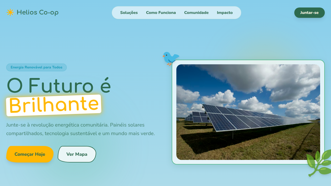
Solarpunk utopian landing page. Ideal for landing pages, saas. AI-ready template.
Use case: Landing pages, SaaS
Historical Context
Solarpunk emerged in the early 2010s as a deliberate rejection of dystopia. Where cyberpunk gave us rain-soaked neon and corporate decay, solarpunk asked: what if we actually got it right? The aesthetic draws from Art Nouveau's organic curves, pairs them with photovoltaic glass and vertical gardens, and wraps everything in a palette that feels like morning light through leaves. It's speculative design with genuine hope baked in. The visual language is unmistakable — translucent solar panels as architectural ornament, mycelium networks rendered as data flows, cities where infrastructure and ecology aren't fighting each other. Think Gaudi meets greenhouse. The movement borrows heavily from indigenous futurism and solves the problem most tech aesthetics ignore: how do you make sustainability look desirable rather than sacrificial? Green tech companies caught on fast. Tesla's early marketing flirted with it. Newer climate startups lean in hard — using those warm ambers, deep botanical greens, and flowing geometries to signal that their product isn't just less bad, it's actively beautiful. The aesthetic does real work: it makes the future feel like somewhere you'd want to live.
When to Use
Reach for solarpunk when your product genuinely builds toward a better world and you need the visuals to match that ambition. Climate tech, renewable energy platforms, sustainable commerce, urban planning tools — anything where optimism isn't naive but earned. It works beautifully for brands tired of the sterile minimalism that dominates green marketing. Skip it if your product has nothing to do with sustainability. Borrowed utopia reads as greenwashing instantly, and audiences are sharp enough to notice.
Design Principles
- Organic geometry over rigid grids — curves, arcs, and flowing forms that echo natural growth patterns rather than industrial precision
- Warm luminosity as a system value — ambers, soft golds, and filtered greens that evoke sunlight passing through living things
- Transparency and layering — translucent panels, overlapping botanical elements, and depth that suggests interconnected systems
- Technology as symbiosis, not domination — UI elements that feel grown rather than manufactured, where data visualization mimics root networks and canopy structures
- Earned optimism in motion — animations that unfurl, bloom, and breathe rather than snap or bounce, reinforcing the patience inherent in sustainable thinking
DESIGN.md
---
version: "alpha"
name: "Solarpunk Utópico"
description: "Solarpunk utopian landing page. Ideal for landing pages, saas. AI-ready template."
colors:
  primary: "#2D6A4F"
  secondary: "#FFB703"
  tertiary: "#219EBC"
  neutral: "#FFF8E7"
  surface: "#C1440E"
  accent: "#52B788"
typography:
  h1:
    fontFamily: Nunito
    fontSize: 2.5rem
    fontWeight: 700
  body-md:
    fontFamily: Nunito
    fontSize: 1rem
    fontWeight: 400
rounded:
  sm: 20px
  md: 40px
  lg: 60px
components:
  button-primary:
    backgroundColor: "{colors.primary}"
    textColor: "{colors.neutral}"
    rounded: "{rounded.sm}"
    padding: 12px
---

## Overview

Solarpunk utopian landing page. Ideal for landing pages, saas. AI-ready template. Solarpunk emerged in the early 2010s as a deliberate rejection of dystopia. Where cyberpunk gave us rain-soaked neon and corporate decay, solarpunk asked: what if we actually got it right? The aesthetic draws from Art Nouveau's organic curves, pairs them with photovoltaic glass and vertical gardens, and wraps everything in a palette that feels like morning light through leaves. It's speculative design with genuine hope baked in.

The visual language is unmistakable — translucent solar panels as architectural ornament, mycelium networks rendered as data flows, cities where infrastructure and ecology aren't fighting each other. Think Gaudi meets greenhouse. The movement borrows heavily from indigenous futurism and solves the problem most tech aesthetics ignore: how do you make sustainability look desirable rather than sacrificial?

Green tech companies caught on fast. Tesla's early marketing flirted with it. Newer climate startups lean in hard — using those warm ambers, deep botanical greens, and flowing geometries to signal that their product isn't just less bad, it's actively beautiful. The aesthetic does real work: it makes the future feel like somewhere you'd want to live.

- Density: 5/10 — Balanced
- Variance: 8/10 — Expressive
- Motion: 8/10 — Cinematic

- **Style:** Optimistic, Green, Futuristic-Organic
- **Keywords:** solarpunk, utopian, green technology, organic architecture, sustainable, lush, botanical, optimistic future, community, renewable
- **Era:** Near-Future Sustainable Utopia
- **Light/Dark:** ✓ Full / ✗ No

## Colors

- **Verdant Green** (#2D6A4F) — Primary surface or dominant color
- **Solar Gold** (#FFB703) — Premium accent, decorative highlights
- **Sky Blue** (#219EBC) — Accent highlight, links and focus states
- **Warm White** (#FFF8E7) — Light surface, card backgrounds
- **Terracotta** (#C1440E) — Extended palette, decorative use
- **Moss** (#52B788) — Extended palette, decorative use
- **Soft Lavender** (#C7B8EA) — Extended palette, decorative use
- **Earth Brown** (#6B4226) — Extended palette, decorative use


## Typography

- **Display / Hero:** Nunito — Weight 700, tight tracking, used for headline impact
- **Body:** Nunito — Weight 400, 16px/1.6 line-height, max 72ch per line
- **UI Labels / Captions:** Nunito — 0.875rem, weight 500, slight letter-spacing
- **Monospace:** JetBrains Mono — Used for code, metadata, and technical values

Scale:
- Hero: clamp(2.5rem, 5vw, 4rem)
- H1: 2.25rem
- H2: 1.5rem
- Body: 1rem / 1.6
- Small: 0.875rem


## Layout

- **Grid:** CSS Grid primary. Max-width containment: 1280px centered with 1.5rem side padding.
- **Spacing rhythm:** Balanced. Base unit: 0.5rem (8px).
- **Section vertical gaps:** clamp(4rem, 8vw, 8rem).
- **Hero layout:** Asymmetric composition.
- **Feature sections:** Asymmetric grid with varied card sizes. No 3-equal-columns.
- **Mobile collapse:** All multi-column layouts collapse below 768px. No horizontal overflow.
- **z-index contract:** base (0) / sticky-nav (100) / overlay (200) / modal (300) / toast (500).


## Elevation & Depth

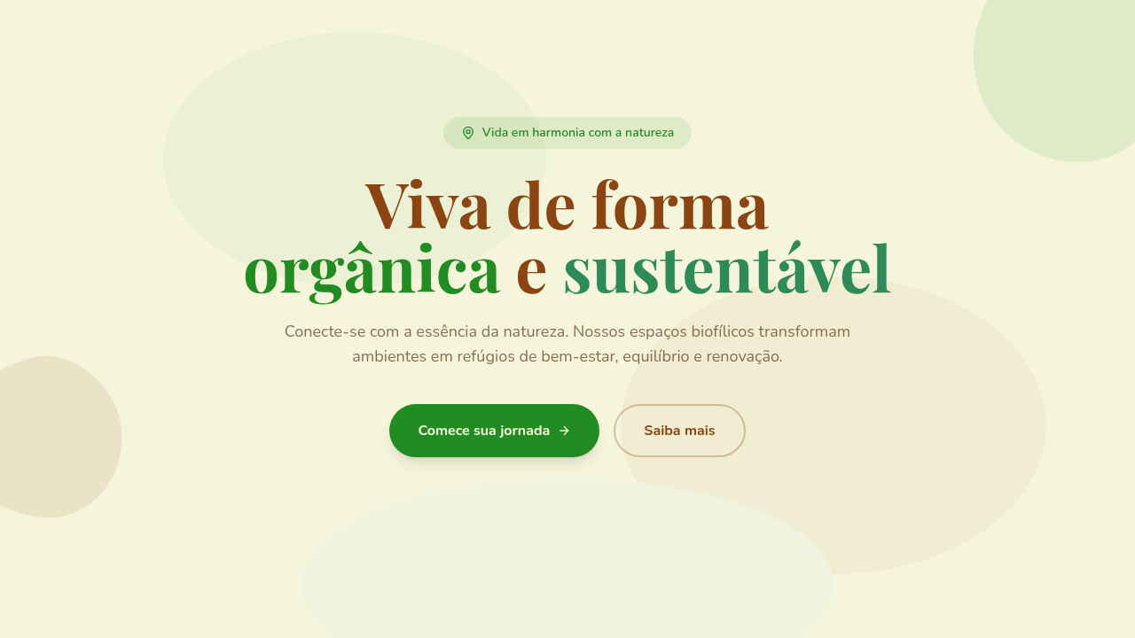
Organic vine borders, solar flare animations, botanical illustrations, living architecture patterns, gradient skies, leaf particle effects, curved glass panels, soft ambient glow

- **Physics:** Spring — stiffness 120, damping 20. Confident, weighted transitions.
- **Entry animations:** Fade + translate-Y (16px → 0) over 540ms ease-out. Staggered cascades for lists: 120ms between items.
- **Hover states:** Scale(1.03) + shadow lift over 200ms.
- **Page transitions:** Fade + slide (300ms).
- **Performance:** Only transform and opacity animated. No layout-triggering properties.


## Shapes

Base corner radius: 20px. See rounded tokens in front matter for the full scale.


## Components

- **Primary Button:** Generously rounded (1.5rem) shape. Accent color fill. Hover: 8% darken + subtle lift shadow. Active: -1px translate tactile press. Font weight 600. No outer glows.
- **Secondary / Ghost Button:** Outline variant. 1.5px border in muted color. Text in primary color. Hover: subtle background fill.
- **Cards:** Generously rounded (1.5rem) corners. Surface background. Subtle shadow (0 2px 12px rgba(0,0,0,0.06)). 1px border stroke.
- **Inputs:** Label above input. 1px border stroke. Focus ring: 2px accent color offset 2px. Error text below in semantic red. No floating labels.
- **Navigation:** Primary surface background. Active item: accent color indicator. Font weight 500 when active.
- **Skeletons:** Shimmer animation matching component dimensions. No circular spinners.
- **Empty States:** Icon-based composition with descriptive text and action button.


## Do's and Don'ts

- No emojis in UI — use icon system only (Lucide, Heroicons)
- No pure black (#000000) — use off-black or charcoal variants
- No oversaturated accent colors (saturation cap: 80%)
- No 3-column equal-width feature layouts — use zig-zag or asymmetric grid
- No `h-screen` — use `min-h-[100dvh]`
- No AI copywriting clichés: "Elevate", "Seamless", "Unleash", "Next-Gen"
- No broken external image links — use picsum.photos or inline SVG
- No generic lorem ipsum in demos

- Do Organic vine borders
- Do Solar flare animations
- Do Botanical illustrations
- Do Living architecture patterns
- Do Gradient skies
- Do Leaf particle effects


## Use Case

Landing pages, SaaS
Technical Specs
CSS
background: linear-gradient(180deg, #87CEEB, #FFF8E7), color: #2D6A4F, font-family: 'Nunito', sans-serif, border: 2px solid #52B788, box-shadow: 0 8px 24px rgba(45,106,79,0.15), animation: solar-pulse 4s ease-in-out infinite, border-radius: 20px, background-blend-mode: overlay
Variables
--verdant-green-solar: #2D6A4F, --solar-gold: #FFB703, --sky-blue-solar: #219EBC, --warm-white-solar: #FFF8E7, --vine-border-radius: 20px, --font-solarpunk: 'Nunito', sans-serif
Checklist
☐ Organic vine borders, ☐ Solar flare animations, ☐ Botanical illustrations, ☐ Living architecture patterns, ☐ Gradient skies, ☐ Leaf particle effects
Colors
Primary
Secondary
Effects
Organic vine borders, solar flare animations, botanical illustrations, living architecture patterns, gradient skies, leaf particle effects, curved glass panels, soft ambient glow
Light/Dark
✓ Full / ✗ No
AI Prompt
Act as a Senior Frontend Engineer and Expert UI Designer.
Your task is to code a complete Landing Page on the first attempt.
- Landing Page Theme: <INSERT THEME>
- Sections to add: <INSERT SECTIONS>

Generate the final code immediately following these definitions:

## Style

- **Name:** Solarpunk Utópico
- **Type:** Optimistic, Green, Futuristic-Organic
- **Keywords:** solarpunk, utopian, green technology, organic architecture, sustainable, lush, botanical, optimistic future, community, renewable
- **Era:** Near-Future Sustainable Utopia
- **Light/Dark:** ✓ Full / ✗ No

## Color Palette

- **Primary:** Verdant Green #2D6A4F, Solar Gold #FFB703, Sky Blue #219EBC, Warm White #FFF8E7
- **Secondary:** Terracotta #C1440E, Moss #52B788, Soft Lavender #C7B8EA, Earth Brown #6B4226

## Visual Effects

Organic vine borders, solar flare animations, botanical illustrations, living architecture patterns, gradient skies, leaf particle effects, curved glass panels, soft ambient glow

## AI Visual Direction

Design a solarpunk utopian landing page. Use: verdant green and solar gold, organic vine borders, solar flare animations, botanical illustrations, living architecture patterns, gradient skies, leaf particle effects, curved glass panels.

## CSS Technical

```css
background: linear-gradient(180deg, #87CEEB, #FFF8E7), color: #2D6A4F, font-family: 'Nunito', sans-serif, border: 2px solid #52B788, box-shadow: 0 8px 24px rgba(45,106,79,0.15), animation: solar-pulse 4s ease-in-out infinite, border-radius: 20px, background-blend-mode: overlay
```

## Design System Variables

```css
--verdant-green-solar: #2D6A4F, --solar-gold: #FFB703, --sky-blue-solar: #219EBC, --warm-white-solar: #FFF8E7, --vine-border-radius: 20px, --font-solarpunk: 'Nunito', sans-serif
```

## Implementation Checklist

- ☐ Organic vine borders
- ☐ Solar flare animations
- ☐ Botanical illustrations
- ☐ Living architecture patterns
- ☐ Gradient skies
- ☐ Leaf particle effects

## Execution Rules

1. Strictly follow the defined visual style.
2. Use high-quality inline SVG icons (Heroicons or Lucide style) — NEVER use emojis as icons.
3. Add `cursor-pointer` and smooth `hover` states (transition-all) on all interactive elements.
4. Required Page Structure:
   - Navbar (Logo + Links + CTA)
   - Hero Section (Impactful Headline + Subtitle + 2 buttons + 3D/Abstract visual element via CSS)
   - Features (3 cards with icons)
   - Testimonials (3 cards)
   - Pricing (3 tiers, highlight the middle one)
   - Final CTA
   - Full Footer with social links, privacy policy, terms of use, contact and SEO links.
5. All text content must be in English.
6. The visual must be CLEARLY distinct — do not create a "default Bootstrap" design. Force the use of the provided design system variables.
7. Use `<style>` tags in the head for custom classes (especially for complex backdrop-filter effects and animations) that Tailwind CDN doesn't cover.
8. Full Responsiveness: Layout must adapt perfectly to Mobile, Tablet and Desktop (vertical stack on mobile).
9. Include basic SEO, Viewport and Open Graph meta tags in `<head>`.
10. Footer must contain: Copyright 2026, Secondary navigation links and Social media icons.
11. Make the creative decisions needed to deliver the complete, functional result now.
Related
Last synced: 4/1/2026