Scrapbook / Collage
Scrapbook/collage landing page with analog handmade tactile aesthetics. Ideal for diários pessoais, convites de casamento, vision boards, publicações acolhedoras em redes sociais. AI-ready template.
Use case: Personal diaries, Wedding invitations, Vision boards, Cozy social media posts
Historical Context
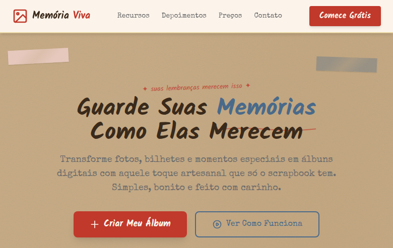
The scrapbook is one of the oldest forms of personal visual storytelling. Long before Instagram grids or Pinterest boards, people were cutting, tearing, and taping fragments of their lives onto pages — ticket stubs next to polaroids next to handwritten notes. The practice exploded in Victorian England as a bourgeois hobby, but its real power has always been democratic: anyone with scissors and glue could compose a narrative. Digitally, the collage aesthetic resurfaces every time culture gets tired of clean minimalism. It showed up in zine culture, in early Tumblr, in Y2K revival graphics, and now in apps that want to signal authenticity over polish. The visual language — overlapping layers, visible tape, rotated photos, sticker accents — communicates that something was made by a human hand, even when it wasn't. What makes scrapbook UI interesting is the tension between chaos and composition. The best implementations look effortless but are carefully art-directed. Random rotation angles that are actually constrained to a range. Overlaps that follow a z-index hierarchy. Tape strips that anchor without obscuring. It's controlled messiness — and that's genuinely hard to pull off.
When to Use
Reach for scrapbook patterns when your product needs to feel personal, handmade, or emotionally warm. It works brilliantly for memory apps, creative journals, personal brand sites, and social platforms where self-expression matters more than information density. Avoid it for data-heavy interfaces or anything requiring scanning efficiency — collage layouts sacrifice readability for personality. If your users are creating or reminiscing rather than completing tasks, this is your aesthetic.
Design Principles
- Constrain the chaos — use deliberate rotation ranges (±3–7°), consistent shadow depths, and a clear z-index stack so overlapping elements feel composed rather than dumped
- Anchor with tactile details — tape strips, paper clips, washi tape, and pin marks give layers a reason to exist and ground floating elements to the surface beneath them
- Mix media textures intentionally — combine photo edges, torn paper, lined notebook fragments, and kraft backgrounds but limit to 3-4 texture families per composition to avoid visual noise
- Respect the content hierarchy even in disorder — the eye should still land on the primary photo or message first; use scale contrast and central placement to guide attention through apparent randomness
- Leave breathing room at the margins — real scrapbooks have page edges; digital ones need padding and negative space to prevent the composition from feeling suffocating or cluttered at viewport boundaries
DESIGN.md
---
version: "alpha"
name: "Scrapbook / Collage"
description: "Scrapbook/collage landing page with analog handmade tactile aesthetics. Ideal for diários pessoais, convites de casamento, vision boards, publicações acolhedoras em redes sociais. AI-ready template."
colors:
  primary: "#C4A882"
  secondary: "#FFF8F0"
  tertiary: "#F5D5D5"
  neutral: "#4A6A8A"
  surface: "#E8D5A0"
  accent: "#C0392B"
typography:
  h1:
    fontFamily: Kalam
    fontSize: 2.5rem
    fontWeight: 700
  body-md:
    fontFamily: Kalam
    fontSize: 1rem
    fontWeight: 400
spacing:
  sm: 1.5rem
  md: 3.0rem
  lg: 6.0rem
components:
  button-primary:
    backgroundColor: "{colors.primary}"
    textColor: "{colors.neutral}"
    padding: 12px
---

## Overview

Scrapbook/collage landing page with analog handmade tactile aesthetics. Ideal for diários pessoais, convites de casamento, vision boards, publicações acolhedoras em redes sociais. AI-ready template. The scrapbook is one of the oldest forms of personal visual storytelling. Long before Instagram grids or Pinterest boards, people were cutting, tearing, and taping fragments of their lives onto pages — ticket stubs next to polaroids next to handwritten notes. The practice exploded in Victorian England as a bourgeois hobby, but its real power has always been democratic: anyone with scissors and glue could compose a narrative.

Digitally, the collage aesthetic resurfaces every time culture gets tired of clean minimalism. It showed up in zine culture, in early Tumblr, in Y2K revival graphics, and now in apps that want to signal authenticity over polish. The visual language — overlapping layers, visible tape, rotated photos, sticker accents — communicates that something was made by a human hand, even when it wasn't.

What makes scrapbook UI interesting is the tension between chaos and composition. The best implementations look effortless but are carefully art-directed. Random rotation angles that are actually constrained to a range. Overlaps that follow a z-index hierarchy. Tape strips that anchor without obscuring. It's controlled messiness — and that's genuinely hard to pull off.

- Density: 5/10 — Balanced
- Variance: 7/10 — Dynamic
- Motion: 8/10 — Cinematic

- **Style:** Analog, Tactile, Layered, Handmade
- **Keywords:** Scrapbook, collage, photos, text cutouts, decorative elements, analog, tactile, handmade, layered, vision board, journal, cozy
- **Era:** Analog Craft Culture
- **Light/Dark:** ✓ Full / ✗ Not Recommended

## Colors

- **Kraft Paper** (#C4A882) — Primary surface or dominant color
- **Cream White** (#FFF8F0) — Light surface, card backgrounds
- **Washi Pink** (#F5D5D5) — Primary text color
- **Denim Blue** (#4A6A8A) — Accent highlight, links and focus states
- **Tape Yellow** (#E8D5A0) — Warning states, attention indicators
- **Stamp Red** (#C0392B) — Error states, destructive actions
- **Marker Green** (#4CAF50) — Success states, positive indicators
- **Pencil Grey** (#6B6B6B) — Secondary text, borders, muted elements


## Typography

- **Display / Hero:** Kalam — Weight 700, tight tracking, used for headline impact
- **Accent:** Special Elite — Used for decorative or emphasis text
- **Body:** Kalam — Weight 400, 16px/1.6 line-height, max 72ch per line
- **UI Labels / Captions:** Kalam — 0.875rem, weight 500, slight letter-spacing
- **Monospace:** JetBrains Mono — Used for code, metadata, and technical values

Scale:
- Hero: clamp(2.5rem, 5vw, 4rem)
- H1: 2.25rem
- H2: 1.5rem
- Body: 1rem / 1.6
- Small: 0.875rem


## Layout

- **Grid:** CSS Grid primary. Max-width containment: 1280px centered with 1.5rem side padding.
- **Spacing rhythm:** Balanced. Base unit: 0.5rem (8px).
- **Section vertical gaps:** clamp(4rem, 8vw, 8rem).
- **Hero layout:** Asymmetric composition.
- **Feature sections:** Asymmetric grid with varied card sizes. No 3-equal-columns.
- **Mobile collapse:** All multi-column layouts collapse below 768px. No horizontal overflow.
- **z-index contract:** base (0) / sticky-nav (100) / overlay (200) / modal (300) / toast (500).


## Elevation & Depth

Layered photo-style elements with slight rotation (-3deg to 5deg), washi tape SVG border decorations, paper clip/pin SVG accents, torn paper edges via clip-path, polaroid-style photo frames, handwritten annotation overlays, cork board texture backgrounds, sticker-like decorative elements

- **Physics:** Spring — stiffness 120, damping 20. Confident, weighted transitions.
- **Entry animations:** Fade + translate-Y (16px → 0) over 540ms ease-out. Staggered cascades for lists: 120ms between items.
- **Hover states:** Scale(1.03) + shadow lift over 200ms.
- **Page transitions:** Fade + slide (300ms).
- **Performance:** Only transform and opacity animated. No layout-triggering properties.


## Shapes

Base corner radius: 24px. See rounded tokens in front matter for the full scale.


## Components

- **Primary Button:** Generously rounded (1.5rem) shape. Accent color fill. Hover: 8% darken + subtle lift shadow. Active: -1px translate tactile press. Font weight 600. No outer glows.
- **Secondary / Ghost Button:** Outline variant. 1.5px border in muted color. Text in primary color. Hover: subtle background fill.
- **Cards:** Generously rounded (1.5rem) corners. Surface background. Subtle shadow (0 2px 12px rgba(0,0,0,0.06)). 1px border stroke.
- **Inputs:** Label above input. 1px border stroke. Focus ring: 2px accent color offset 2px. Error text below in semantic red. No floating labels.
- **Navigation:** Primary surface background. Active item: accent color indicator. Font weight 500 when active.
- **Skeletons:** Shimmer animation matching component dimensions. No circular spinners.
- **Empty States:** Icon-based composition with descriptive text and action button.


## Do's and Don'ts

- No emojis in UI — use icon system only (Lucide, Heroicons)
- No pure black (#000000) — use off-black or charcoal variants
- No oversaturated accent colors (saturation cap: 80%)
- No 3-column equal-width feature layouts — use zig-zag or asymmetric grid
- No `h-screen` — use `min-h-[100dvh]`
- No AI copywriting clichés: "Elevate", "Seamless", "Unleash", "Next-Gen"
- No broken external image links — use picsum.photos or inline SVG
- No generic lorem ipsum in demos

- Do Layered elements with rotation
- Do Washi tape SVG borders
- Do Paper clip/pin accents
- Do Torn paper edge effects
- Do Polaroid photo frames
- Do Handwritten + typewriter typography
- Do Cork board texture background
- Do Cozy handmade atmosphere
- Do Responsive with maintained craft feel


## Use Case

Personal diaries, Wedding invitations, Vision boards, Cozy social media posts
Technical Specs
CSS
font-family: 'Kalam', cursive mixed with 'Special Elite', background: #C4A882 with cork texture, color: #3A2A1A, transform: rotate(-3deg to 5deg) on layered elements, clip-path: polygon() for torn edges, box-shadow: 2px 3px 5px rgba(0,0,0,0.15), border: none (use tape/pin decorations), z-index stacking for layers
Variables
--color-kraft: #C4A882, --color-cream: #FFF8F0, --color-washi: #F5D5D5, --color-denim: #4A6A8A, --font-handwritten: 'Kalam', --font-typewriter: 'Special Elite', --rotation-range: -3deg to 5deg, --shadow: 2px 3px 5px rgba(0,0,0,0.15), --spacing: 1.5rem
Checklist
☐ Layered elements with rotation, ☐ Washi tape SVG borders, ☐ Paper clip/pin accents, ☐ Torn paper edge effects, ☐ Polaroid photo frames, ☐ Handwritten + typewriter typography, ☐ Cork board texture background, ☐ Cozy handmade atmosphere, ☐ Responsive with maintained craft feel
Colors
Primary
Secondary
Effects
Layered photo-style elements with slight rotation (-3deg to 5deg), washi tape SVG border decorations, paper clip/pin SVG accents, torn paper edges via clip-path, polaroid-style photo frames, handwritten annotation overlays, cork board texture backgrounds, sticker-like decorative elements
Light/Dark
✓ Full / ✗ Not Recommended
AI Prompt
Act as a Senior Frontend Engineer and Expert UI Designer.
Your task is to code a complete Landing Page on the first attempt.
- Landing Page Theme: <INSERT THEME>
- Sections to add: <INSERT SECTIONS>

Generate the final code immediately following these definitions:

## Style

- **Name:** Scrapbook / Collage
- **Type:** Analog, Tactile, Layered, Handmade
- **Keywords:** Scrapbook, collage, photos, text cutouts, decorative elements, analog, tactile, handmade, layered, vision board, journal, cozy
- **Era:** Analog Craft Culture
- **Light/Dark:** ✓ Full / ✗ Not Recommended

## Color Palette

- **Primary:** Kraft Paper #C4A882, Cream White #FFF8F0, Washi Pink #F5D5D5, Denim Blue #4A6A8A
- **Secondary:** Tape Yellow #E8D5A0, Stamp Red #C0392B, Marker Green #4CAF50, Pencil Grey #6B6B6B

## Visual Effects

Layered photo-style elements with slight rotation (-3deg to 5deg), washi tape SVG border decorations, paper clip/pin SVG accents, torn paper edges via clip-path, polaroid-style photo frames, handwritten annotation overlays, cork board texture backgrounds, sticker-like decorative elements

## AI Visual Direction

Design a scrapbook/collage landing page with analog handmade tactile aesthetics. Use kraft paper, cream white, washi pink, denim blue. Apply layered elements with slight rotation, washi tape SVG borders, paper clip/pin accents, torn paper clip-path edges, polaroid photo frames, handwritten annotations, cork board textures, sticker decorations. Typography should mix handwritten and typewriter styles. Cozy, personal, journal-like atmosphere.

## CSS Technical

```css
font-family: 'Kalam', cursive mixed with 'Special Elite', background: #C4A882 with cork texture, color: #3A2A1A, transform: rotate(-3deg to 5deg) on layered elements, clip-path: polygon() for torn edges, box-shadow: 2px 3px 5px rgba(0,0,0,0.15), border: none (use tape/pin decorations), z-index stacking for layers
```

## Design System Variables

```css
--color-kraft: #C4A882, --color-cream: #FFF8F0, --color-washi: #F5D5D5, --color-denim: #4A6A8A, --font-handwritten: 'Kalam', --font-typewriter: 'Special Elite', --rotation-range: -3deg to 5deg, --shadow: 2px 3px 5px rgba(0,0,0,0.15), --spacing: 1.5rem
```

## Implementation Checklist

- ☐ Layered elements with rotation
- ☐ Washi tape SVG borders
- ☐ Paper clip/pin accents
- ☐ Torn paper edge effects
- ☐ Polaroid photo frames
- ☐ Handwritten + typewriter typography
- ☐ Cork board texture background
- ☐ Cozy handmade atmosphere
- ☐ Responsive with maintained craft feel

## Execution Rules

1. Strictly follow the defined visual style.
2. Use high-quality inline SVG icons (Heroicons or Lucide style) — NEVER use emojis as icons.
3. Add `cursor-pointer` and smooth `hover` states (transition-all) on all interactive elements.
4. Required Page Structure:
   - Navbar (Logo + Links + CTA)
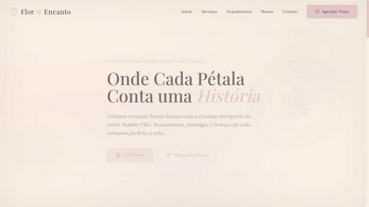
   - Hero Section (Impactful Headline + Subtitle + 2 buttons + 3D/Abstract visual element via CSS)
   - Features (3 cards with icons)
   - Testimonials (3 cards)
   - Pricing (3 tiers, highlight the middle one)
   - Final CTA
   - Full Footer with social links, privacy policy, terms of use, contact and SEO links.
5. All text content must be in English.
6. The visual must be CLEARLY distinct — do not create a "default Bootstrap" design. Force the use of the provided design system variables.
7. Use `<style>` tags in the head for custom classes (especially for complex backdrop-filter effects and animations) that Tailwind CDN doesn't cover.
8. Full Responsiveness: Layout must adapt perfectly to Mobile, Tablet and Desktop (vertical stack on mobile).
9. Include basic SEO, Viewport and Open Graph meta tags in `<head>`.
10. Footer must contain: Copyright 2026, Secondary navigation links and Social media icons.
11. Make the creative decisions needed to deliver the complete, functional result now.
Related
Last synced: 4/1/2026