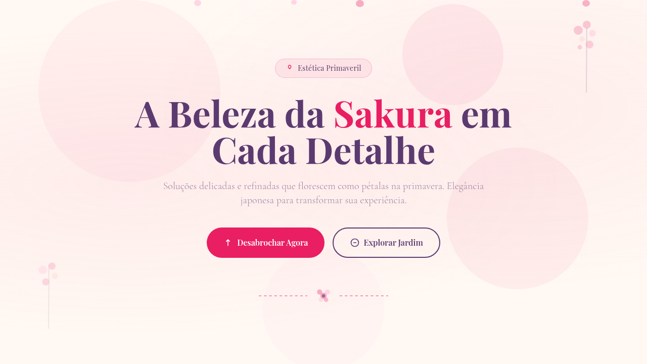
Sakura / Floral Japonês
Sakura floral Japanese infographic. Ideal for landing pages, modern websites. AI-ready template.
Use case: Landing pages, Modern websites
Historical Context
Sakura isn't decoration. It's a philosophical stance. The Japanese concept of mono no aware — that bittersweet awareness of impermanence — lives inside every petal. For centuries, cherry blossoms have marked the fleeting boundary between seasons, reminding us that beauty exists precisely because it doesn't last. Hanami gatherings aren't about the trees. They're about confronting transience together. When this sensibility enters digital interfaces, something interesting happens. Data visualization gains emotional weight. Infographics stop being purely rational and start breathing. The sakura motif brings organic asymmetry to rigid grid systems — petals don't fall in columns. They drift. That tension between structured information and natural movement is where the best work lives. As a design motif, cherry blossoms carry centuries of visual refinement. Ukiyo-e woodblock prints. Kimono textile patterns. Ceramic glazework. Each generation distilled the form further. What we inherit isn't just a flower — it's a compressed visual language that communicates elegance, brevity, and cultural depth in a single gesture.
When to Use
Reach for this when your data needs to feel alive rather than clinical. Japanese brands expecting cultural authenticity. Spring campaigns where generic florals won't cut it. Beauty products that need sophistication without stuffiness. Cultural events demanding respect for tradition while staying contemporary. It works best when information density is high but the emotional register needs to stay soft — financial reports for luxury brands, seasonal analytics dashboards, event programs where numbers tell a story worth savoring.
Design Principles
- Asymmetric balance — petals scatter with intention, never centered, never random. Let compositions breathe unevenly.
- Restrained palette — pinks exist on a spectrum from barely-there blush to deep magenta. Pick two tones maximum. White space does the rest.
- Temporal rhythm — build in motion suggestions. Falling, drifting, settling. Static sakura feels dead. Even in print, imply movement.
- Negative space as structure — ma (間) isn't emptiness, it's the interval that gives meaning. Let data points float in generous space.
- Material honesty — avoid photorealistic petals in flat interfaces. Match the abstraction level to your medium. Simplified forms often carry more weight.
DESIGN.md
---
version: "alpha"
name: "Sakura / Floral Japonês"
description: "Sakura floral Japanese infographic. Ideal for landing pages, modern websites. AI-ready template."
colors:
  primary: "#FFF8F3"
  secondary: "#5B3A70"
  tertiary: "#E91E63"
  neutral: "#F06292"
  surface: "#EC407A"
  accent: "#E83D58"
typography:
  h1:
    fontFamily: System UI stack
    fontSize: 2.25rem
    fontWeight: 700
  body-md:
    fontFamily: System UI stack
    fontSize: 1rem
    fontWeight: 400
  label-caps:
    fontFamily: System UI stack
    fontSize: 0.75rem
    fontWeight: 500
components:
  button-primary:
    backgroundColor: "{colors.primary}"
    textColor: "{colors.neutral}"
    padding: 12px
---

## Overview

Sakura floral Japanese infographic. Ideal for landing pages, modern websites. AI-ready template. Sakura isn't decoration. It's a philosophical stance. The Japanese concept of mono no aware — that bittersweet awareness of impermanence — lives inside every petal. For centuries, cherry blossoms have marked the fleeting boundary between seasons, reminding us that beauty exists precisely because it doesn't last. Hanami gatherings aren't about the trees. They're about confronting transience together.

When this sensibility enters digital interfaces, something interesting happens. Data visualization gains emotional weight. Infographics stop being purely rational and start breathing. The sakura motif brings organic asymmetry to rigid grid systems — petals don't fall in columns. They drift. That tension between structured information and natural movement is where the best work lives.

As a design motif, cherry blossoms carry centuries of visual refinement. Ukiyo-e woodblock prints. Kimono textile patterns. Ceramic glazework. Each generation distilled the form further. What we inherit isn't just a flower — it's a compressed visual language that communicates elegance, brevity, and cultural depth in a single gesture.

- Density: 5/10 — Balanced
- Variance: 4/10 — Moderate
- Motion: 6/10 — Expressive

- **Style:** Infographic
- **Keywords:** Cherry blossom, sakura flowers, petals, seasonal Japanese aesthetics, elegant, feminine, refined, watercolor-like, spring
- **Era:** Japanese Seasonal
- **Light/Dark:** ✓ Full / ◐ Partial

## Colors

- **Soft Blush** (#FFF8F3) — Primary surface or dominant color
- **Deep Purple** (#5B3A70) — Accent color, emphasis elements
- **Rose** (#E91E63) — Supporting palette color
- **Pink** (#F06292) — Primary text color
- **Magenta** (#EC407A) — Decorative accent, highlight elements
- **Coral** (#E83D58) — Extended palette, decorative use
- **Light Pink** (#FFB3D9) — Primary text color
- **Peach** (#FCCACB) — Extended palette, decorative use


## Typography

- **Display / Hero:** System UI stack (-apple-system, sans-serif) — Weight 700, tight tracking, used for headline impact
- **Body:** System UI stack (-apple-system, sans-serif) — Weight 400, 16px/1.6 line-height, max 72ch per line
- **UI Labels / Captions:** System UI stack (-apple-system, sans-serif) — 0.875rem, weight 500, slight letter-spacing
- **Monospace:** JetBrains Mono — Used for code, metadata, and technical values

Scale:
- Hero: clamp(2.5rem, 5vw, 4rem)
- H1: 2.25rem
- H2: 1.5rem
- Body: 1rem / 1.6
- Small: 0.875rem


## Layout

- **Grid:** CSS Grid primary. Max-width containment: 1280px centered with 1.5rem side padding.
- **Spacing rhythm:** Balanced. Base unit: 0.5rem (8px).
- **Section vertical gaps:** clamp(4rem, 8vw, 8rem).
- **Hero layout:** Split-screen (text left, visual right).
- **Feature sections:** Zig-zag alternating text+image rows. No 3-equal-columns.
- **Mobile collapse:** All multi-column layouts collapse below 768px. No horizontal overflow.
- **z-index contract:** base (0) / sticky-nav (100) / overlay (200) / modal (300) / toast (500).


## Elevation & Depth

Soft dreamy warm lighting, petal falling animations, watercolor fade-in, branch sway effects, delicate hover transitions, spring bloom reveals

- **Physics:** Spring — stiffness 120, damping 20. Confident, weighted transitions.
- **Entry animations:** Fade + translate-Y (16px → 0) over 480ms ease-out. Staggered cascades for lists: 100ms between items.
- **Hover states:** Scale(1.03) + shadow lift over 200ms.
- **Page transitions:** Fade + slide (300ms).
- **Performance:** Only transform and opacity animated. No layout-triggering properties.


## Shapes

Base corner radius: 8px. See rounded tokens in front matter for the full scale.


## Components

- **Primary Button:** Subtly rounded (0.5rem) shape. Accent color fill. Hover: 8% darken + subtle lift shadow. Active: -1px translate tactile press. Font weight 600. No outer glows.
- **Secondary / Ghost Button:** Outline variant. 1.5px border in muted color. Text in primary color. Hover: subtle background fill.
- **Cards:** Subtly rounded (0.5rem) corners. Surface background. Subtle shadow (0 2px 12px rgba(0,0,0,0.06)). 1px border stroke.
- **Inputs:** Label above input. 1px border stroke. Focus ring: 2px accent color offset 2px. Error text below in semantic red. No floating labels.
- **Navigation:** Primary surface background. Active item: accent color indicator. Font weight 500 when active.
- **Skeletons:** Shimmer animation matching component dimensions. No circular spinners.
- **Empty States:** Icon-based composition with descriptive text and action button.


## Do's and Don'ts

- No emojis in UI — use icon system only (Lucide, Heroicons)
- No pure black (#000000) — use off-black or charcoal variants
- No oversaturated accent colors (saturation cap: 80%)
- No 3-column equal-width feature layouts — use zig-zag or asymmetric grid
- No `h-screen` — use `min-h-[100dvh]`
- No AI copywriting clichés: "Elevate", "Seamless", "Unleash", "Next-Gen"
- No broken external image links — use picsum.photos or inline SVG
- No generic lorem ipsum in demos

- Do Sakura flowers present
- Do Petals falling animation
- Do Soft blush background
- Do Watercolor effects
- Do Elegant typography
- Do Spring aesthetic


## Use Case

Landing pages, Modern websites
Technical Specs
CSS
background: #FFF8F3, color: #5B3A70, SVG sakura flowers/petals, animation: petal-fall (translateY + rotate), watercolor overlay (mix-blend-mode: multiply), font: elegant serif, organic flowing layout
Variables
--blush-bg: #FFF8F3, --deep-purple: #5B3A70, --rose: #E91E63, --pink: #F06292, --petal-fall-duration: 6s, --watercolor-opacity: 0.3
Checklist
☐ Sakura flowers present, ☐ Petals falling animation, ☐ Soft blush background, ☐ Watercolor effects, ☐ Elegant typography, ☐ Spring aesthetic
Colors
Primary
Secondary
Effects
Soft dreamy warm lighting, petal falling animations, watercolor fade-in, branch sway effects, delicate hover transitions, spring bloom reveals
Light/Dark
✓ Full / ◐ Partial
AI Prompt
Act as a Senior Frontend Engineer and Expert UI Designer.
Your task is to code a complete Landing Page on the first attempt.
- Landing Page Theme: <INSERT THEME>
- Sections to add: <INSERT SECTIONS>

Generate the final code immediately following these definitions:

## Style

- **Name:** Sakura / Floral Japonês
- **Type:** Infographic
- **Keywords:** Cherry blossom, sakura flowers, petals, seasonal Japanese aesthetics, elegant, feminine, refined, watercolor-like, spring
- **Era:** Japanese Seasonal
- **Light/Dark:** ✓ Full / ◐ Partial

## Color Palette

- **Primary:** Soft Blush #FFF8F3, Deep Purple #5B3A70, Rose #E91E63, Pink #F06292
- **Secondary:** Magenta #EC407A, Coral #E83D58, Light Pink #FFB3D9, Peach #FCCACB, watercolor washes

## Visual Effects

Soft dreamy warm lighting, petal falling animations, watercolor fade-in, branch sway effects, delicate hover transitions, spring bloom reveals

## AI Visual Direction

Design a sakura floral Japanese infographic. Use: cherry blossom illustrations, sakura flower decorations, falling petal animations, soft blush background (#FFF8F3), watercolor-like qualities, elegant serif typography, organic floral arrangement, spring aesthetic.

## CSS Technical

```css
background: #FFF8F3, color: #5B3A70, SVG sakura flowers/petals, animation: petal-fall (translateY + rotate), watercolor overlay (mix-blend-mode: multiply), font: elegant serif, organic flowing layout
```

## Design System Variables

```css
--blush-bg: #FFF8F3, --deep-purple: #5B3A70, --rose: #E91E63, --pink: #F06292, --petal-fall-duration: 6s, --watercolor-opacity: 0.3
```

## Implementation Checklist

- ☐ Sakura flowers present
- ☐ Petals falling animation
- ☐ Soft blush background
- ☐ Watercolor effects
- ☐ Elegant typography
- ☐ Spring aesthetic

## Execution Rules

1. Strictly follow the defined visual style.
2. Use high-quality inline SVG icons (Heroicons or Lucide style) — NEVER use emojis as icons.
3. Add `cursor-pointer` and smooth `hover` states (transition-all) on all interactive elements.
4. Required Page Structure:
   - Navbar (Logo + Links + CTA)
   - Hero Section (Impactful Headline + Subtitle + 2 buttons + 3D/Abstract visual element via CSS)
   - Features (3 cards with icons)
   - Testimonials (3 cards)
   - Pricing (3 tiers, highlight the middle one)
   - Final CTA
   - Full Footer with social links, privacy policy, terms of use, contact and SEO links.
5. All text content must be in English.
6. The visual must be CLEARLY distinct — do not create a "default Bootstrap" design. Force the use of the provided design system variables.
7. Use `<style>` tags in the head for custom classes (especially for complex backdrop-filter effects and animations) that Tailwind CDN doesn't cover.
8. Full Responsiveness: Layout must adapt perfectly to Mobile, Tablet and Desktop (vertical stack on mobile).
9. Include basic SEO, Viewport and Open Graph meta tags in `<head>`.
10. Footer must contain: Copyright 2026, Secondary navigation links and Social media icons.
11. Make the creative decisions needed to deliver the complete, functional result now.
Related

Last synced: 4/1/2026