Rococó Delicado
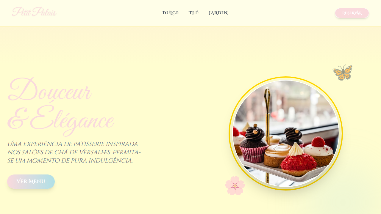
Delicate Rococo landing page. Ideal for landing pages, saas. AI-ready template.
Use case: Landing pages, SaaS
Historical Context
Rococo emerged around 1730 as a deliberate rebellion against Baroque grandeur. Where Baroque demanded you kneel, Rococo invited you to flirt. The movement traded heavy marble columns for shell-shaped ornaments, replaced dramatic chiaroscuro with powdery pinks and celadon greens. It was aristocratic leisure made visual — Fragonard's swings, Boucher's clouds, Meissen porcelain so thin light passed through it. The key distinction matters for designers: Baroque is power architecture. Rococo is intimate theater. One fills cathedrals; the other decorates boudoirs. That shift from public spectacle to private pleasure is exactly what makes Rococo translate so well to luxury digital branding. The asymmetrical scrollwork, the gold leaf accents, the deliberate lightness — these aren't just decorative choices. They signal exclusivity without aggression. When you bring Rococo into screen-based work, you're borrowing its core promise: that beauty can be excessive and still feel effortless. The gilt frame becomes a border treatment. The pastoral scene becomes editorial photography direction. The ornamental curve becomes a UI flourish that whispers rather than shouts.
When to Use
Reach for this when the brand needs to feel expensive but never heavy. Wedding stationery, niche perfumery, haute couture lookbooks, luxury skincare — anywhere the audience expects craft and indulgence. It works beautifully for editorial layouts that need breathing room and decorative confidence. Avoid it for anything utilitarian, tech-forward, or masculine-coded. Rococo falls apart the moment it feels ironic. Commit fully or don't bother.
Design Principles
- Asymmetry over symmetry — Rococo rejects rigid mirroring. Let ornamental elements feel organic, slightly off-center, as if they grew rather than were placed.
- Restrained palette, lavish detail — Stick to soft pastels and muted golds. The richness comes from density of ornament, not saturation of color.
- Curves terminate in flourishes — No hard stops. Lines should taper, curl, dissolve. Every endpoint is an invitation to follow the eye further.
- Negative space is sacred — Ornament only works against emptiness. The more decorative your elements, the more generous your margins must be.
- Gold as punctuation, not paint — Use metallic accents the way you'd use italics in typography. Sparingly, deliberately, to elevate a single moment.
DESIGN.md
---
version: "alpha"
name: "Rococó Delicado"
description: "Delicate Rococo landing page. Ideal for landing pages, saas. AI-ready template."
colors:
  primary: "#FADADD"
  secondary: "#B0E0E6"
  tertiary: "#98FF98"
  neutral: "#FFD700"
  surface: "#FFFDD0"
  accent: "#E6E6FA"
typography:
  h1:
    fontFamily: Great Vibes
    fontSize: 2.5rem
    fontWeight: 700
  body-md:
    fontFamily: Great Vibes
    fontSize: 1rem
    fontWeight: 400
components:
  button-primary:
    backgroundColor: "{colors.primary}"
    textColor: "{colors.neutral}"
    padding: 12px
---

## Overview

Delicate Rococo landing page. Ideal for landing pages, saas. AI-ready template. Rococo emerged around 1730 as a deliberate rebellion against Baroque grandeur. Where Baroque demanded you kneel, Rococo invited you to flirt. The movement traded heavy marble columns for shell-shaped ornaments, replaced dramatic chiaroscuro with powdery pinks and celadon greens. It was aristocratic leisure made visual — Fragonard's swings, Boucher's clouds, Meissen porcelain so thin light passed through it.

The key distinction matters for designers: Baroque is power architecture. Rococo is intimate theater. One fills cathedrals; the other decorates boudoirs. That shift from public spectacle to private pleasure is exactly what makes Rococo translate so well to luxury digital branding. The asymmetrical scrollwork, the gold leaf accents, the deliberate lightness — these aren't just decorative choices. They signal exclusivity without aggression.

When you bring Rococo into screen-based work, you're borrowing its core promise: that beauty can be excessive and still feel effortless. The gilt frame becomes a border treatment. The pastoral scene becomes editorial photography direction. The ornamental curve becomes a UI flourish that whispers rather than shouts.

- Density: 5/10 — Balanced
- Variance: 7/10 — Dynamic
- Motion: 6/10 — Expressive

- **Style:** Ornate, Playful, Elegant
- **Keywords:** rococo, delicate, ornate, playful, elegant, pastel, gilded, asymmetrical, floral, charming
- **Era:** 18th Century, French Rococo
- **Light/Dark:** ✓ Full / ✗ No

## Colors

- **Pastel Pink** (#FADADD) — Primary text color
- **Powder Blue** (#B0E0E6) — Accent highlight, links and focus states
- **Mint Green** (#98FF98) — Supporting palette color
- **Gilded Gold** (#FFD700) — Premium accent, decorative highlights
- **Cream** (#FFFDD0) — Secondary surface
- **Lavender** (#E6E6FA) — Extended palette, decorative use
- **White** (#FFFFFF) — Secondary surface
- **Light Grey** (#D3D3D3) — Secondary text, borders, muted elements


## Typography

- **Display / Hero:** Great Vibes — Weight 700, tight tracking, used for headline impact
- **Body:** Great Vibes — Weight 400, 16px/1.6 line-height, max 72ch per line
- **UI Labels / Captions:** Great Vibes — 0.875rem, weight 500, slight letter-spacing
- **Monospace:** JetBrains Mono — Used for code, metadata, and technical values

Scale:
- Hero: clamp(2.5rem, 5vw, 4rem)
- H1: 2.25rem
- H2: 1.5rem
- Body: 1rem / 1.6
- Small: 0.875rem


## Layout

- **Grid:** CSS Grid primary. Max-width containment: 1280px centered with 1.5rem side padding.
- **Spacing rhythm:** Balanced. Base unit: 0.5rem (8px).
- **Section vertical gaps:** clamp(4rem, 8vw, 8rem).
- **Hero layout:** Asymmetric composition.
- **Feature sections:** Asymmetric grid with varied card sizes. No 3-equal-columns.
- **Mobile collapse:** All multi-column layouts collapse below 768px. No horizontal overflow.
- **z-index contract:** base (0) / sticky-nav (100) / overlay (200) / modal (300) / toast (500).


## Elevation & Depth

Gilded scrollwork, delicate floral patterns, asymmetrical layouts, soft pastel colors, ornate mirrors, shell motifs, playful cherubs, elegant typography, subtle animations

- **Physics:** Spring — stiffness 120, damping 20. Confident, weighted transitions.
- **Entry animations:** Fade + translate-Y (16px → 0) over 480ms ease-out. Staggered cascades for lists: 100ms between items.
- **Hover states:** Scale(1.03) + shadow lift over 200ms.
- **Page transitions:** Fade + slide (300ms).
- **Performance:** Only transform and opacity animated. No layout-triggering properties.


## Shapes

Base corner radius: 12px. See rounded tokens in front matter for the full scale.


## Components

- **Primary Button:** Moderately rounded (0.75rem) shape. Accent color fill. Hover: 8% darken + subtle lift shadow. Active: -1px translate tactile press. Font weight 600. No outer glows.
- **Secondary / Ghost Button:** Outline variant. 1.5px border in muted color. Text in primary color. Hover: subtle background fill.
- **Cards:** Moderately rounded (0.75rem) corners. Surface background. Subtle shadow (0 2px 12px rgba(0,0,0,0.06)). 1px border stroke.
- **Inputs:** Label above input. 1px border stroke. Focus ring: 2px accent color offset 2px. Error text below in semantic red. No floating labels.
- **Navigation:** Primary surface background. Active item: accent color indicator. Font weight 500 when active.
- **Skeletons:** Shimmer animation matching component dimensions. No circular spinners.
- **Empty States:** Icon-based composition with descriptive text and action button.


## Do's and Don'ts

- No emojis in UI — use icon system only (Lucide, Heroicons)
- No pure black (#000000) — use off-black or charcoal variants
- No oversaturated accent colors (saturation cap: 80%)
- No 3-column equal-width feature layouts — use zig-zag or asymmetric grid
- No `h-screen` — use `min-h-[100dvh]`
- No AI copywriting clichés: "Elevate", "Seamless", "Unleash", "Next-Gen"
- No broken external image links — use picsum.photos or inline SVG
- No generic lorem ipsum in demos

- Do Gilded scrollwork
- Do Delicate floral patterns
- Do Asymmetrical layouts
- Do Soft pastel colors
- Do Shell motifs
- Do Elegant typography


## Use Case

Landing pages, SaaS
Technical Specs
CSS
background: #FFFDD0, color: #5C4033, font-family: 'Great Vibes', cursive, border: 1px solid #FFD700, box-shadow: 0 4px 8px rgba(0,0,0,0.1), text-shadow: 1px 1px 0 #FFFFFF, animation: shimmer-effect 3s infinite, background-image: url('floral-rococo.png'), background-blend-mode: soft-lightVariables
--pastel-pink-rococo: #FADADD, --powder-blue-rococo: #B0E0E6, --mint-green-rococo: #98FF98, --gilded-gold-rococo: #FFD700, --scrollwork-thickness: 1px, --font-rococo: 'Great Vibes', cursive
Checklist
☐ Gilded scrollwork, ☐ Delicate floral patterns, ☐ Asymmetrical layouts, ☐ Soft pastel colors, ☐ Shell motifs, ☐ Elegant typography
Colors
Primary
Secondary
Effects
Gilded scrollwork, delicate floral patterns, asymmetrical layouts, soft pastel colors, ornate mirrors, shell motifs, playful cherubs, elegant typography, subtle animations
Light/Dark
✓ Full / ✗ No
AI Prompt
Act as a Senior Frontend Engineer and Expert UI Designer.
Your task is to code a complete Landing Page on the first attempt.
- Landing Page Theme: <INSERT THEME>
- Sections to add: <INSERT SECTIONS>

Generate the final code immediately following these definitions:

## Style

- **Name:** Rococó Delicado
- **Type:** Ornate, Playful, Elegant
- **Keywords:** rococo, delicate, ornate, playful, elegant, pastel, gilded, asymmetrical, floral, charming
- **Era:** 18th Century, French Rococo
- **Light/Dark:** ✓ Full / ✗ No

## Color Palette

- **Primary:** Pastel Pink #FADADD, Powder Blue #B0E0E6, Mint Green #98FF98, Gilded Gold #FFD700
- **Secondary:** Cream #FFFDD0, Lavender #E6E6FA, White #FFFFFF, Light Grey #D3D3D3

## Visual Effects

Gilded scrollwork, delicate floral patterns, asymmetrical layouts, soft pastel colors, ornate mirrors, shell motifs, playful cherubs, elegant typography, subtle animations

## AI Visual Direction

Design a delicate Rococo landing page. Use: pastel pink and powder blue, gilded scrollwork, delicate floral patterns, asymmetrical layouts, soft pastel colors, ornate mirrors, shell motifs, playful cherubs, elegant typography.

## CSS Technical

```css
background: #FFFDD0, color: #5C4033, font-family: 'Great Vibes', cursive, border: 1px solid #FFD700, box-shadow: 0 4px 8px rgba(0,0,0,0.1), text-shadow: 1px 1px 0 #FFFFFF, animation: shimmer-effect 3s infinite, background-image: url('floral-rococo.png'), background-blend-mode: soft-light
```

## Design System Variables

```css
--pastel-pink-rococo: #FADADD, --powder-blue-rococo: #B0E0E6, --mint-green-rococo: #98FF98, --gilded-gold-rococo: #FFD700, --scrollwork-thickness: 1px, --font-rococo: 'Great Vibes', cursive
```

## Implementation Checklist

- ☐ Gilded scrollwork
- ☐ Delicate floral patterns
- ☐ Asymmetrical layouts
- ☐ Soft pastel colors
- ☐ Shell motifs
- ☐ Elegant typography

## Execution Rules

1. Strictly follow the defined visual style.
2. Use high-quality inline SVG icons (Heroicons or Lucide style) — NEVER use emojis as icons.
3. Add `cursor-pointer` and smooth `hover` states (transition-all) on all interactive elements.
4. Required Page Structure:
   - Navbar (Logo + Links + CTA)
   - Hero Section (Impactful Headline + Subtitle + 2 buttons + 3D/Abstract visual element via CSS)
   - Features (3 cards with icons)
   - Testimonials (3 cards)
   - Pricing (3 tiers, highlight the middle one)
   - Final CTA
   - Full Footer with social links, privacy policy, terms of use, contact and SEO links.
5. All text content must be in English.
6. The visual must be CLEARLY distinct — do not create a "default Bootstrap" design. Force the use of the provided design system variables.
7. Use `<style>` tags in the head for custom classes (especially for complex backdrop-filter effects and animations) that Tailwind CDN doesn't cover.
8. Full Responsiveness: Layout must adapt perfectly to Mobile, Tablet and Desktop (vertical stack on mobile).
9. Include basic SEO, Viewport and Open Graph meta tags in `<head>`.
10. Footer must contain: Copyright 2026, Secondary navigation links and Social media icons.
11. Make the creative decisions needed to deliver the complete, functional result now.Related
Last synced: 4/1/2026