Replicate Blaze Gallery
Replicate-inspired explosive landing page. Ideal for plataformas de modelos ai, apis de ml, comunidades developer, marketplaces de ai. AI-ready template.
Use case: Platforms de modelos AI, APIs de ML, Comunidades developer, Marketplaces de AI
Historical Context
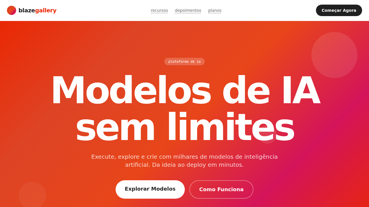
The gradient hero pattern didn't emerge from aesthetic whimsy — it solved a real problem. Early AI model platforms like Replicate needed to communicate technical sophistication without alienating creative users. The solution was borrowed from demo culture and generative art: large-format gradient fields that signal computation, transformation, and possibility without requiring literal illustration. Blaze Gallery takes this lineage seriously. Where most ML marketplaces default to dark themes with neon accents (the lazy shorthand for 'technical'), this approach uses warm, saturated gradient compositions that reference illustration and fine art traditions. The hero becomes a canvas rather than a billboard. It says: this is where models live, and models make beautiful things. The broader pattern — gradient-as-hero on model platforms — matured around 2023-2024 as the market shifted from developer-only tools to creative professional audiences. Replicate's own evolution mirrors this: from API documentation aesthetic to gallery experience. The gradient hero became the bridge between technical infrastructure and artistic output.
When to Use
Deploy this pattern when your platform serves as a marketplace or gallery for AI-generated creative work. It works when you need to communicate both technical capability and artistic sensibility without committing to a single visual style that might conflict with the diverse outputs your models produce. Particularly effective for model discovery pages, featured collections, and landing experiences where the content itself is visually heterogeneous. Avoid it for documentation-heavy or developer-first interfaces where the gradient competes with code blocks.
Design Principles
- Gradient as neutral canvas — the hero gradient should complement model outputs without competing; saturation stays high but hue ranges remain controlled to avoid visual noise
- Typographic restraint over the field — headlines sit clean against the gradient with minimal layering; no drop shadows, no outlines, just confident weight and considered placement
- Card density communicates abundance — the gallery grid below the hero should feel generous and browsable, not sparse; whitespace lives in the hero, density lives in the content
- Warm-to-cool transitions signal creative range — gradient direction matters; moving from warm (creation, human) to cool (computation, model) reinforces the platform narrative
- Motion is atmospheric, not performative — subtle gradient animation or parallax shift suggests living infrastructure; anything faster than a slow breathe breaks the gallery mood
DESIGN.md
---
version: "alpha"
name: "Replicate Blaze Gallery"
description: "Replicate-inspired explosive landing page. Ideal for plataformas de modelos ai, apis de ml, comunidades developer, marketplaces de ai. AI-ready template."
colors:
  primary: "#202020"
  secondary: "#ffffff"
  tertiary: "#ea2804"
  neutral: "#dd4425"
  surface: "#2b9a66"
  accent: "#24292e"
typography:
  h1:
    fontFamily: system-ui display
    fontSize: 2.25rem
    fontWeight: 700
  body-md:
    fontFamily: system-ui display
    fontSize: 1rem
    fontWeight: 400
  label-caps:
    fontFamily: system-ui display
    fontSize: 0.75rem
    fontWeight: 500
rounded:
  sm: 9999px
  md: 19998px
  lg: 29997px
components:
  button-primary:
    backgroundColor: "{colors.primary}"
    textColor: "{colors.neutral}"
    rounded: "{rounded.sm}"
    padding: 12px
---

## Overview

Replicate-inspired explosive landing page. Ideal for plataformas de modelos ai, apis de ml, comunidades developer, marketplaces de ai. AI-ready template. The gradient hero pattern didn't emerge from aesthetic whimsy — it solved a real problem. Early AI model platforms like Replicate needed to communicate technical sophistication without alienating creative users. The solution was borrowed from demo culture and generative art: large-format gradient fields that signal computation, transformation, and possibility without requiring literal illustration.

Blaze Gallery takes this lineage seriously. Where most ML marketplaces default to dark themes with neon accents (the lazy shorthand for 'technical'), this approach uses warm, saturated gradient compositions that reference illustration and fine art traditions. The hero becomes a canvas rather than a billboard. It says: this is where models live, and models make beautiful things.

The broader pattern — gradient-as-hero on model platforms — matured around 2023-2024 as the market shifted from developer-only tools to creative professional audiences. Replicate's own evolution mirrors this: from API documentation aesthetic to gallery experience. The gradient hero became the bridge between technical infrastructure and artistic output.

- Density: 5/10 — Balanced
- Variance: 4/10 — Moderate
- Motion: 4/10 — Subtle

- **Style:** Explosive Gradient Hero, Heavy Display Font, All-Pill Geometry, Developer Community, AI Gallery
- **Keywords:** replicate, blaze, gradient hero, heavy display, all-pill, developer community, rb-freigeist, basier-square, JetBrains Mono, model gallery
- **Era:** 2024-2026 AI Model Playground
- **Light/Dark:** ✓ Full / ✗ Not Recommended

## Colors

- **Escuro** (#202020) — Dark surface, primary background
- **Branco** (#ffffff) — Light surface, card backgrounds
- **Vermelho Brand** (#ea2804) — Primary accent, CTAs and interactive elements
- **Vermelho Secundário** (#dd4425) — Error states, destructive actions
- **Verde Status** (#2b9a66) — Success states, positive indicators
- **GitHub Dark** (#24292e) — Deep contrast surface
- **Cinza** (#646464) — Secondary text, borders, muted elements
- **Silver** (#bbbbbb) — Extended palette, decorative use


## Typography

- **Display / Hero:** system-ui display — Weight 700, tight tracking, used for headline impact
- **Body:** system-ui display — Weight 400, 16px/1.6 line-height, max 72ch per line
- **UI Labels / Captions:** system-ui display — 0.875rem, weight 500, slight letter-spacing
- **Monospace:** JetBrains Mono — Used for code, metadata, and technical values

Scale:
- Hero: clamp(2.5rem, 5vw, 4rem)
- H1: 2.25rem
- H2: 1.5rem
- Body: 1rem / 1.6
- Small: 0.875rem


## Layout

- **Grid:** CSS Grid primary. Max-width containment: 1280px centered with 1.5rem side padding.
- **Spacing rhythm:** Balanced. Base unit: 0.5rem (8px).
- **Section vertical gaps:** clamp(4rem, 8vw, 8rem).
- **Hero layout:** Split-screen (text left, visual right).
- **Feature sections:** Zig-zag alternating text+image rows. No 3-equal-columns.
- **Mobile collapse:** All multi-column layouts collapse below 768px. No horizontal overflow.
- **z-index contract:** base (0) / sticky-nav (100) / overlay (200) / modal (300) / toast (500).


## Elevation & Depth

Hero explosivo com gradiente laranja-vermelho-magenta-rosa (#ea2804 âncora). Tipografia display massiva (até 128px) em font heavy bold. Geometria exclusivamente pill (9999px) em TUDO. Alto contraste preto (#202020) e branco. Galeria de modelos AI com imagens geradas. Links com underline pontilhado. Badges verdes (#2b9a66) para status. Manifesto de fechamento 'Imagine o que você pode construir' em 128px. Tags lowercase (text-transform: lowercase).

- **Physics:** Ease-out curves, 200-300ms duration. Smooth and predictable.
- **Entry animations:** Fade + translate-Y (16px → 0) over 420ms ease-out. Staggered cascades for lists: 80ms between items.
- **Hover states:** Subtle color shift + shadow adjustment over 200ms.
- **Page transitions:** Fade only (200ms).
- **Performance:** Only transform and opacity animated. No layout-triggering properties.


## Shapes

Base corner radius: 9999px. See rounded tokens in front matter for the full scale.


## Components

- **Primary Button:** Pill-shaped (9999px) shape. Accent color fill. Hover: 8% darken + subtle lift shadow. Active: -1px translate tactile press. Font weight 600. No outer glows.
- **Secondary / Ghost Button:** Outline variant. 1.5px border in muted color. Text in primary color. Hover: subtle background fill.
- **Cards:** Pill-shaped (9999px) corners. Surface background. Subtle shadow (0 2px 12px rgba(0,0,0,0.06)). 1px border stroke.
- **Inputs:** Label above input. 1px border stroke. Focus ring: 2px accent color offset 2px. Error text below in semantic red. No floating labels.
- **Navigation:** Primary surface background. Active item: accent color indicator. Font weight 500 when active.
- **Skeletons:** Shimmer animation matching component dimensions. No circular spinners.
- **Empty States:** Icon-based composition with descriptive text and action button.


## Do's and Don'ts

- No emojis in UI — use icon system only (Lucide, Heroicons)
- No pure black (#000000) — use off-black or charcoal variants
- No oversaturated accent colors (saturation cap: 80%)
- No 3-column equal-width feature layouts — use zig-zag or asymmetric grid
- No `h-screen` — use `min-h-[100dvh]`
- No AI copywriting clichés: "Elevate", "Seamless", "Unleash", "Next-Gen"
- No broken external image links — use picsum.photos or inline SVG
- No generic lorem ipsum in demos

- Do Hero gradiente explosivo
- Do Display até 128px weight 700
- Do Pill 9999px em tudo
- Do Alto contraste
- Do Galeria de modelos AI
- Do Links pontilhados
- Do Badges verdes
- Do Tags lowercase
- Do Responsivo


## Use Case

Platforms de modelos AI, APIs de ML, Comunidades developer, Marketplaces de AI
Technical Specs
CSS
background:#ffffff;color:#202020;accent:#ea2804;border-radius:9999px everything;font-family:system-ui display,sans-serif body,monospace code;font-weight:700 display;font-size:128px max;text-transform:lowercase tags
Variables
--bg:#ffffff;--text:#202020;--brand:#ea2804;--secondary:#dd4425;--green:#2b9a66;--github:#24292e;--gray:#646464;--silver:#bbbbbb;--radius:9999px
Checklist
☐ Hero gradiente explosivo, ☐ Display até 128px weight 700, ☐ Pill 9999px em tudo, ☐ Alto contraste, ☐ Galeria de modelos AI, ☐ Links pontilhados, ☐ Badges verdes, ☐ Tags lowercase, ☐ Responsivo
Colors
Primary
Secondary
Effects
Hero explosivo com gradiente laranja-vermelho-magenta-rosa (#ea2804 âncora). Tipografia display massiva (até 128px) em font heavy bold. Geometria exclusivamente pill (9999px) em TUDO. Alto contraste preto (#202020) e branco. Galeria de modelos AI com imagens geradas. Links com underline pontilhado. Badges verdes (#2b9a66) para status. Manifesto de fechamento 'Imagine o que você pode construir' em 128px. Tags lowercase (text-transform: lowercase).
Light/Dark
✓ Full / ✗ Not Recommended
AI Prompt
Act as a Senior Frontend Engineer and Expert UI Designer.
Your task is to code a complete Landing Page on the first attempt.
- Landing Page Theme: <INSERT THEME>
- Sections to add: <INSERT SECTIONS>

Generate the final code immediately following these definitions:

## Style

- **Name:** Replicate Blaze Gallery
- **Type:** Explosive Gradient Hero, Heavy Display Font, All-Pill Geometry, Developer Community, AI Gallery
- **Keywords:** replicate, blaze, gradient hero, heavy display, all-pill, developer community, rb-freigeist, basier-square, JetBrains Mono, model gallery
- **Era:** 2024-2026 AI Model Playground
- **Light/Dark:** ✓ Full / ✗ Not Recommended

## Color Palette

- **Primary:** Escuro #202020, Branco #ffffff, Vermelho Brand #ea2804, Vermelho Secundário #dd4425
- **Secondary:** Verde Status #2b9a66, GitHub Dark #24292e, Cinza #646464, Silver #bbbbbb

## Visual Effects

Hero explosivo com gradiente laranja-vermelho-magenta-rosa (#ea2804 âncora). Tipografia display massiva (até 128px) em font heavy bold. Geometria exclusivamente pill (9999px) em TUDO. Alto contraste preto (#202020) e branco. Galeria de modelos AI com imagens geradas. Links com underline pontilhado. Badges verdes (#2b9a66) para status. Manifesto de fechamento 'Imagine o que você pode construir' em 128px. Tags lowercase (text-transform: lowercase).

## AI Visual Direction

Design a Replicate-inspired explosive landing page. Hero with orange-red-magenta gradient (#ea2804 anchor). Massive display typography up to 128px weight 700. Exclusively pill-shaped geometry (9999px) on EVERYTHING. High-contrast dark (#202020) and white palette. AI model gallery with generated images. Dotted-underline links. Green status badges (#2b9a66). Closing manifesto at 128px. Lowercase tags. basier-square for body, JetBrains Mono for code.

## CSS Technical

```css
background:#ffffff;color:#202020;accent:#ea2804;border-radius:9999px everything;font-family:system-ui display,sans-serif body,monospace code;font-weight:700 display;font-size:128px max;text-transform:lowercase tags
```

## Design System Variables

```css
--bg:#ffffff;--text:#202020;--brand:#ea2804;--secondary:#dd4425;--green:#2b9a66;--github:#24292e;--gray:#646464;--silver:#bbbbbb;--radius:9999px
```

## Implementation Checklist

- ☐ Hero gradiente explosivo
- ☐ Display até 128px weight 700
- ☐ Pill 9999px em tudo
- ☐ Alto contraste
- ☐ Galeria de modelos AI
- ☐ Links pontilhados
- ☐ Badges verdes
- ☐ Tags lowercase
- ☐ Responsivo

## Execution Rules

1. Strictly follow the defined visual style.
2. Use high-quality inline SVG icons (Heroicons or Lucide style) — NEVER use emojis as icons.
3. Add `cursor-pointer` and smooth `hover` states (transition-all) on all interactive elements.
4. Required Page Structure:
   - Navbar (Logo + Links + CTA)
   - Hero Section (Impactful Headline + Subtitle + 2 buttons + 3D/Abstract visual element via CSS)
   - Features (3 cards with icons)
   - Testimonials (3 cards)
   - Pricing (3 tiers, highlight the middle one)
   - Final CTA
   - Full Footer with social links, privacy policy, terms of use, contact and SEO links.
5. All text content must be in English.
6. The visual must be CLEARLY distinct — do not create a "default Bootstrap" design. Force the use of the provided design system variables.
7. Use `<style>` tags in the head for custom classes (especially for complex backdrop-filter effects and animations) that Tailwind CDN doesn't cover.
8. Full Responsiveness: Layout must adapt perfectly to Mobile, Tablet and Desktop (vertical stack on mobile).
9. Include basic SEO, Viewport and Open Graph meta tags in `<head>`.
10. Footer must contain: Copyright 2026, Secondary navigation links and Social media icons.
11. Make the creative decisions needed to deliver the complete, functional result now.
Related
Last synced: 4/1/2026