ClickHouse Neon Volt
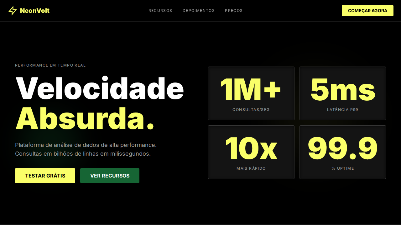
Estilo ClickHouse Neon Volt com acid yellow-green, tipografia extra-heavy e estética de cockpit de performance. Ideal para databases, analytics e infraestrutura de dados.
Uso: Databases, Analytics em tempo real, Infraestrutura de dados, Data warehouses
Contexto Histórico
Inspirado no design do ClickHouse, que comunica velocidade bruta através de neon acid e tipografia com massa física.
Especificações Técnicas
Cores
Primárias
Secundárias
Efeitos
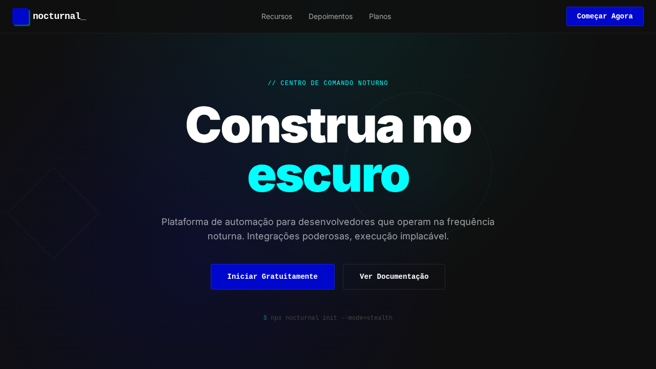
Neon acid yellow-green (#faff69) sobre preto puro — contraste máximo. Inter weight 900 (Black) para hero headline em 96px — texto com massa física. Cards com bordas charcoal (#414141) a 80% opacity. Forest green (#166534) para CTAs secundários. Labels uppercase com letter-spacing 1.4px. Active state muda texto para pale yellow (#f4f692). Hover universal para neon. Inset shadows em elementos selecionados. Stats de performance como números oversized.
Light/Dark
✗ Not Recommended / ✓ Full
CSS
background:#000000;color:#ffffff;accent:#faff69;secondary:#166534;border:1px solid rgba(65,65,65,0.8);border-radius:4px;font-family:Inter,sans-serif;font-weight:900 display;letter-spacing:1.4px uppercase labels;box-shadow:inset on select
Variáveis
--bg:#000000;--text:#ffffff;--neon:#faff69;--forest:#166534;--near-black:#141414;--charcoal:rgba(65,65,65,0.8);--pale:#f4f692;--olive:#4f5100;--silver:#a0a0a0;--radius:4px
Checklist
☐ Preto com neon #faff69, ☐ Inter weight 900 hero, ☐ Bordas charcoal, ☐ Forest green CTAs, ☐ Uppercase labels 1.4px, ☐ Active pale yellow, ☐ Sharp corners 4px, ☐ Stats oversized, ☐ Responsivo
DESIGN.md
Design System: ClickHouse Neon Volt
1. Visual Theme & Atmosphere
Estilo ClickHouse Neon Volt com acid yellow-green, tipografia extra-heavy e estética de cockpit de performance. Ideal para databases, analytics e infraestrutura de dados. Inspirado no design do ClickHouse, que comunica velocidade bruta através de neon acid e tipografia com massa física.
- Density: 5/10 — Balanced
- Variance: 4/10 — Moderate
- Motion: 4/10 — Subtle
2. Color Palette & Roles
- Preto (#000000) — Dark surface, primary background
- Neon Volt (#faff69) — Secondary surface or text color
- Forest Green (#166534) — Supporting palette color
- Quase Preto (#141414) — Dark surface, primary background
- Pale Yellow (#f4f692) — Warning states, attention indicators
- Olive Border (#4f5100) — Extended palette, decorative use
- Charcoal (#414141) — Deep contrast surface
- Silver (#a0a0a0) — Extended palette, decorative use
3. Typography Rules
- Display / Hero: Inter — Weight 700, tight tracking, used for headline impact
- Body: Inter — Weight 400, 16px/1.6 line-height, max 72ch per line
- UI Labels / Captions: Inter — 0.875rem, weight 500, slight letter-spacing
- Monospace: JetBrains Mono — Used for code, metadata, and technical values
Scale:
- Hero: clamp(2.5rem, 5vw, 4rem)
- H1: 2.25rem
- H2: 1.5rem
- Body: 1rem / 1.6
- Small: 0.875rem
4. Component Stylings
- Primary Button: Sharp edges (0px) shape. Accent color fill. Hover: 8% darken + subtle lift shadow. Active: -1px translate tactile press. Font weight 600. No outer glows.
- Secondary / Ghost Button: Outline variant. 1.5px border in muted color. Text in primary color. Hover: subtle background fill.
- Cards: Sharp edges (0px) corners. Surface background. Subtle shadow (0 2px 12px rgba(0,0,0,0.06)). 1px border stroke.
- Inputs: Label above input. 1px border stroke. Focus ring: 2px accent color offset 2px. Error text below in semantic red. No floating labels.
- Navigation: Primary surface background. Active item: accent color indicator. Font weight 500 when active.
- Skeletons: Shimmer animation matching component dimensions. No circular spinners.
- Empty States: Icon-based composition with descriptive text and action button.
5. Layout Principles
- Grid: CSS Grid primary. Max-width containment: 1280px centered with 1.5rem side padding.
- Spacing rhythm: Balanced. Base unit: 0.5rem (8px).
- Section vertical gaps: clamp(4rem, 8vw, 8rem).
- Hero layout: Split-screen (text left, visual right).
- Feature sections: Zig-zag alternating text+image rows. No 3-equal-columns.
- Mobile collapse: All multi-column layouts collapse below 768px. No horizontal overflow.
- z-index contract: base (0) / sticky-nav (100) / overlay (200) / modal (300) / toast (500).
6. Motion & Interaction
- Physics: Ease-out curves, 200-300ms duration. Smooth and predictable.
- Entry animations: Fade + translate-Y (16px → 0) over 420ms ease-out. Staggered cascades for lists: 80ms between items.
- Hover states: Subtle color shift + shadow adjustment over 200ms.
- Page transitions: Fade only (200ms).
- Performance: Only transform and opacity animated. No layout-triggering properties.
7. Anti-Patterns (Banned)
- No emojis in UI — use icon system only (Lucide, Heroicons)
- No pure white (#FFFFFF) backgrounds — use off-white or dark surfaces
- No oversaturated accent colors (saturation cap: 80%)
- No 3-column equal-width feature layouts — use zig-zag or asymmetric grid
- No
h-screen— usemin-h-[100dvh] - No AI copywriting clichés: "Elevate", "Seamless", "Unleash", "Next-Gen"
- No broken external image links — use picsum.photos or inline SVG
- No generic lorem ipsum in demos
Prompt para AI
Design a ClickHouse-inspired neon performance landing page. Pure black canvas (#000000) with acid yellow-green (#faff69) accent — maximum contrast. Inter at weight 900 (Black) for hero headline at 96px. Dark charcoal card borders (#414141 at 80%). Forest green (#166534) secondary CTA buttons. Uppercase labels with 1.4px letter-spacing. Active state shifts text to pale yellow (#f4f692). Sharp corners (4px radius). Performance stats as oversized display numbers. Inset shadows on select elements.
Relacionados
Última sincronização: 01/04/2026