Together Pastel Cloud
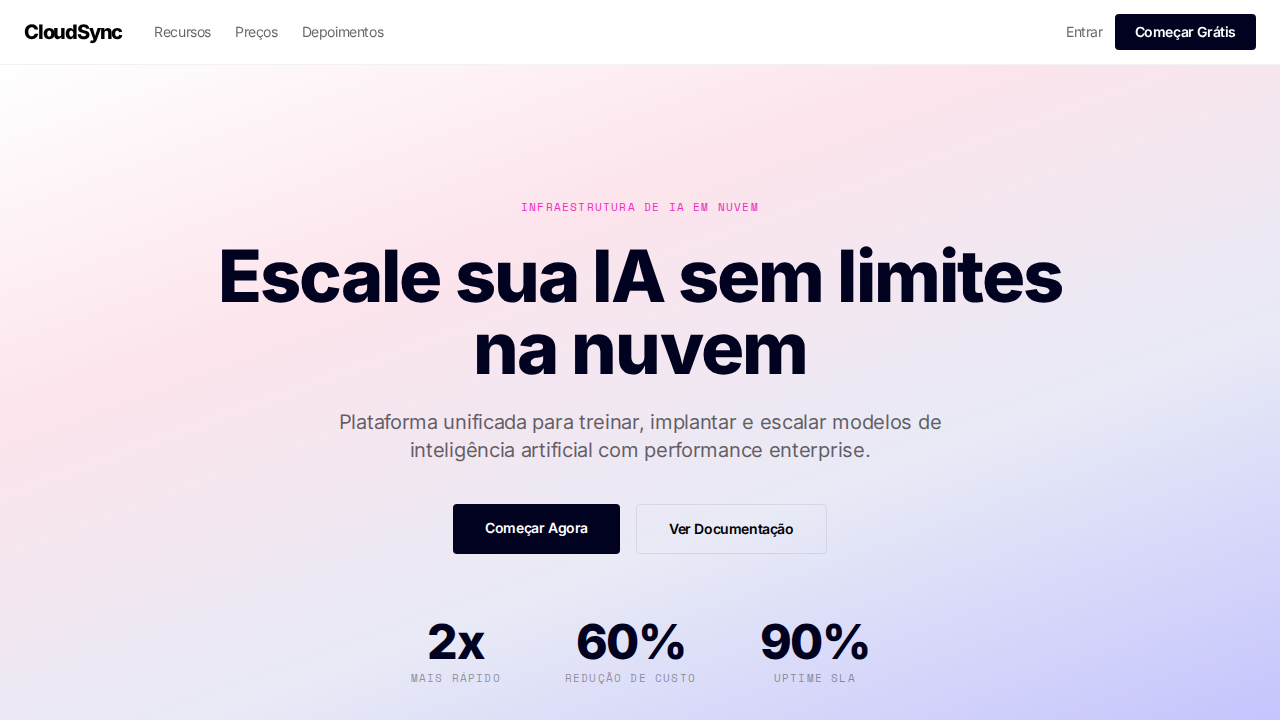
Estilo Together Pastel Cloud com gradientes pastel, midnight blue e stats enterprise. Ideal para infraestrutura AI, cloud computing e plataformas de modelos.
Uso: Infraestrutura AI, Cloud computing, Plataformas de modelos, GPU clusters
Contexto Histórico
Inspirado no design da Together AI, que faz GPU clusters parecerem leves e otimistas com gradientes pastel e tipografia precisa.
Especificações Técnicas
Cores
Primárias
Secundárias
Efeitos
Gradientes pastel suaves (rosa, azul, lavanda) contra canvas branco. Seções dark em midnight blue (#010120 — não cinza-preto). Font 'The Future' com tracking negativo em todo tamanho (-0.16px a -1.92px). PP Neue Montreal Mono uppercase para labels técnicos. Geometria sharp (4px, 8px radius). Magenta (#ef2cc1) e laranja (#fc4c02) apenas em ilustrações. Stats enterprise proeminentes (2x, 60%, 90%). Sombras blue-tinted (rgba(1,1,32,0.1)).
Light/Dark
✓ Full / ✓ Full
CSS
background:#ffffff dark:#010120;color:#000000;accent:#ef2cc1;box-shadow:rgba(1,1,32,0.1) 0px 4px 10px;border-radius:4px badges,8px containers;font-family:system-ui;letter-spacing:-1.92px at 64px;border:1px solid rgba(0,0,0,0.08)
Variáveis
--bg-light:#ffffff;--bg-dark:#010120;--text-light:#000000;--text-dark:#ffffff;--magenta:#ef2cc1;--orange:#fc4c02;--lavender:#bdbbff;--glass:rgba(255,255,255,0.12);--border-light:rgba(0,0,0,0.08);--shadow:rgba(1,1,32,0.1)
Checklist
☐ Gradientes pastel suaves, ☐ Dark sections midnight blue, ☐ Tracking negativo em tudo, ☐ Mono uppercase labels, ☐ Geometria sharp 4-8px, ☐ Stats enterprise, ☐ Sombras blue-tinted, ☐ Responsivo
DESIGN.md
Design System: Together Pastel Cloud
1. Visual Theme & Atmosphere
Estilo Together Pastel Cloud com gradientes pastel, midnight blue e stats enterprise. Ideal para infraestrutura AI, cloud computing e plataformas de modelos. Inspirado no design da Together AI, que faz GPU clusters parecerem leves e otimistas com gradientes pastel e tipografia precisa.
- Density: 5/10 — Balanced
- Variance: 4/10 — Moderate
- Motion: 4/10 — Subtle
2. Color Palette & Roles
- Branco (#ffffff) — Light surface, card backgrounds
- Preto (#000000) — Dark surface, primary background
- Midnight Blue (#010120) — Dark surface, primary background
- Magenta (#ef2cc1) — Decorative accent, highlight elements
- Laranja (#fc4c02) — Warm accent, call-to-action secondary
- Lavanda (#bdbbff) — Extended palette, decorative use
- Vidro (rgba(255,255,255,0.12)) — Extended palette, decorative use
- Borda (rgba(0,0,0,0.08)) — Extended palette, decorative use
3. Typography Rules
- Display / Hero: The Future — Weight 700, tight tracking, used for headline impact
- Accent: system-ui — Used for decorative or emphasis text
- Body: The Future — Weight 400, 16px/1.6 line-height, max 72ch per line
- UI Labels / Captions: The Future — 0.875rem, weight 500, slight letter-spacing
- Monospace: JetBrains Mono — Used for code, metadata, and technical values
Scale:
- Hero: clamp(2.5rem, 5vw, 4rem)
- H1: 2.25rem
- H2: 1.5rem
- Body: 1rem / 1.6
- Small: 0.875rem
4. Component Stylings
- Primary Button: Sharp edges (0px) shape. Accent color fill. Hover: 8% darken + subtle lift shadow. Active: -1px translate tactile press. Font weight 600. No outer glows.
- Secondary / Ghost Button: Outline variant. 1.5px border in muted color. Text in primary color. Hover: subtle background fill.
- Cards: Sharp edges (0px) corners. Surface background. Subtle shadow (0 2px 12px rgba(0,0,0,0.06)). 1px border stroke.
- Inputs: Label above input. 1px border stroke. Focus ring: 2px accent color offset 2px. Error text below in semantic red. No floating labels.
- Navigation: Primary surface background. Active item: accent color indicator. Font weight 500 when active.
- Skeletons: Shimmer animation matching component dimensions. No circular spinners.
- Empty States: Icon-based composition with descriptive text and action button.
5. Layout Principles
- Grid: CSS Grid primary. Max-width containment: 1280px centered with 1.5rem side padding.
- Spacing rhythm: Balanced. Base unit: 0.5rem (8px).
- Section vertical gaps: clamp(4rem, 8vw, 8rem).
- Hero layout: Split-screen (text left, visual right).
- Feature sections: Zig-zag alternating text+image rows. No 3-equal-columns.
- Mobile collapse: All multi-column layouts collapse below 768px. No horizontal overflow.
- z-index contract: base (0) / sticky-nav (100) / overlay (200) / modal (300) / toast (500).
6. Motion & Interaction
- Physics: Ease-out curves, 200-300ms duration. Smooth and predictable.
- Entry animations: Fade + translate-Y (16px → 0) over 420ms ease-out. Staggered cascades for lists: 80ms between items.
- Hover states: Subtle color shift + shadow adjustment over 200ms.
- Page transitions: Fade only (200ms).
- Performance: Only transform and opacity animated. No layout-triggering properties.
7. Anti-Patterns (Banned)
- No emojis in UI — use icon system only (Lucide, Heroicons)
- No pure black (#000000) — use off-black or charcoal variants
- No oversaturated accent colors (saturation cap: 80%)
- No 3-column equal-width feature layouts — use zig-zag or asymmetric grid
- No
h-screen— usemin-h-[100dvh] - No AI copywriting clichés: "Elevate", "Seamless", "Unleash", "Next-Gen"
- No broken external image links — use picsum.photos or inline SVG
- No generic lorem ipsum in demos
Prompt para AI
Design a Together AI-inspired pastel cloud landing page. Soft pastel gradients (pink, blue, lavender) against white canvas. Dark sections in midnight blue (#010120). Custom font with negative letter-spacing throughout (-0.16px to -1.92px). Monospace uppercase labels. Sharp geometry (4px-8px radius). Magenta (#ef2cc1) and orange (#fc4c02) in illustrations only. Prominent enterprise stats. Blue-tinted shadows (rgba(1,1,32,0.1)). Glass buttons on dark sections.
Relacionados
Última sincronização: 01/04/2026