Radial Diagram / Donut Chart
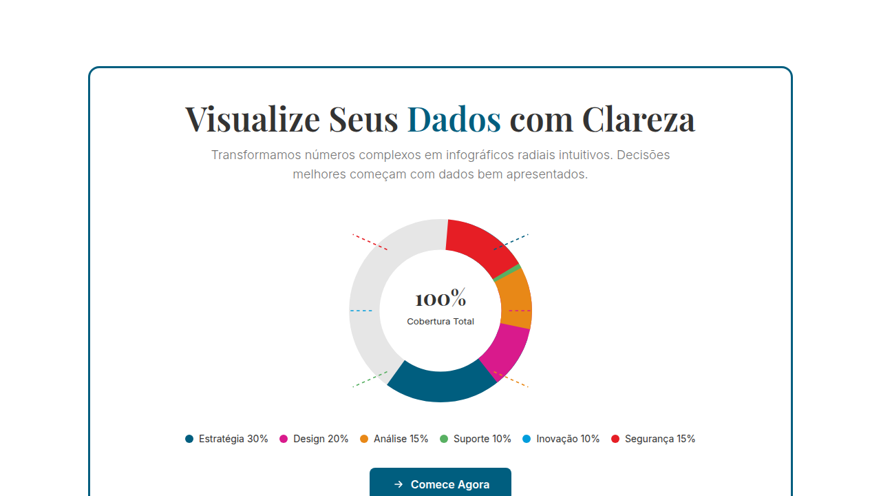
Radial donut chart infographic. Ideal for landing pages, modern websites. AI-ready template.
Use case: Landing pages, Modern websites
Historical Context
The pie chart has been around since 1801. The donut chart fixed it. That hollow center isn't decorative — it solves a real perceptual problem. When you remove the convergence point where all slices meet, you eliminate the visual noise that makes pie charts so notoriously hard to read. The eye stops comparing acute angles and starts comparing arc lengths instead. Easier. Faster. Less lying to yourself about what 23% versus 27% actually looks like. Circular data visualization works when you're showing parts of a whole — and only then. The moment you need precise comparison between categories, reach for a bar chart. But for proportion? For completion? The ring is unbeatable. Apple understood this when they designed the Activity Rings for Watch. Three concentric donuts, each tracking progress toward a daily goal. No labels needed. No legend. Just color and arc length doing all the work. That interaction pattern — radial progress as motivation — reshaped how an entire generation thinks about circular data. The donut went from corporate dashboard staple to something people check forty times a day on their wrist.
When to Use
Reach for the donut when you're showing composition or progress toward a target. Budget breakdowns with 3-6 categories. Portfolio allocation at a glance. KPI completion rings on executive dashboards. It shines when the user needs the gestalt — the overall shape of distribution — more than exact values. Pair it with a center metric (total, percentage, key figure) to anchor meaning. Skip it entirely if you have more than seven segments, if segments are nearly identical in size, or if precise comparison matters more than proportion.
Design Principles
- Keep segments between 2-6 maximum — beyond that, the arcs become indistinguishable and you're just making a rainbow
- Use the center void intentionally: place a key metric, icon, or contextual label there — empty centers are wasted real estate
- Maintain consistent stroke width across all radial elements; varying thickness implies hierarchy where none exists
- Flat vector iconography pairs naturally with donut charts — match the geometric simplicity, avoid illustrated or dimensional styles that fight the abstraction
- Animate arc draws on entry to build narrative sequence — static donuts lose half their communicative power
DESIGN.md
---
version: "alpha"
name: "Radial Diagram / Donut Chart"
description: "Radial donut chart infographic. Ideal for landing pages, modern websites. AI-ready template."
colors:
  primary: "#FFFFFF"
  secondary: "#333333"
  tertiary: "#005E7F"
  neutral: "#D91A8C"
  surface: "#E61E25"
  accent: "#E88817"
typography:
  h1:
    fontFamily: System UI stack
    fontSize: 2.25rem
    fontWeight: 700
  body-md:
    fontFamily: System UI stack
    fontSize: 1rem
    fontWeight: 400
  label-caps:
    fontFamily: System UI stack
    fontSize: 0.75rem
    fontWeight: 500
components:
  button-primary:
    backgroundColor: "{colors.primary}"
    textColor: "{colors.neutral}"
    padding: 12px
---

## Overview

Radial donut chart infographic. Ideal for landing pages, modern websites. AI-ready template. The pie chart has been around since 1801. The donut chart fixed it.

That hollow center isn't decorative — it solves a real perceptual problem. When you remove the convergence point where all slices meet, you eliminate the visual noise that makes pie charts so notoriously hard to read. The eye stops comparing acute angles and starts comparing arc lengths instead. Easier. Faster. Less lying to yourself about what 23% versus 27% actually looks like.

Circular data visualization works when you're showing parts of a whole — and only then. The moment you need precise comparison between categories, reach for a bar chart. But for proportion? For completion? The ring is unbeatable. Apple understood this when they designed the Activity Rings for Watch. Three concentric donuts, each tracking progress toward a daily goal. No labels needed. No legend. Just color and arc length doing all the work. That interaction pattern — radial progress as motivation — reshaped how an entire generation thinks about circular data. The donut went from corporate dashboard staple to something people check forty times a day on their wrist.

- Density: 5/10 — Balanced
- Variance: 2/10 — Structured
- Motion: 6/10 — Expressive

- **Style:** Infographic
- **Keywords:** Central radial diagram, donut chart, flat vector iconography, dotted connector lines, numbered list, thick framing border, symmetrical, informative
- **Era:** Modern Infographic
- **Light/Dark:** ✓ Full / ✓ Full

## Colors

- **White** (#FFFFFF) — Light surface, card backgrounds
- **Dark Text** (#333333) — Dark surface, primary background
- **Deep Teal** (#005E7F) — Accent highlight, links and focus states
- **Magenta** (#D91A8C) — Decorative accent, highlight elements
- **Red** (#E61E25) — Error states, destructive actions
- **Orange** (#E88817) — Warm accent, call-to-action secondary
- **Green** (#58B062) — Success states, positive indicators
- **Blue** (#009DDC) — Secondary accent


## Typography

- **Display / Hero:** System UI stack (-apple-system, sans-serif) — Weight 700, tight tracking, used for headline impact
- **Body:** System UI stack (-apple-system, sans-serif) — Weight 400, 16px/1.6 line-height, max 72ch per line
- **UI Labels / Captions:** System UI stack (-apple-system, sans-serif) — 0.875rem, weight 500, slight letter-spacing
- **Monospace:** JetBrains Mono — Used for code, metadata, and technical values

Scale:
- Hero: clamp(2.5rem, 5vw, 4rem)
- H1: 2.25rem
- H2: 1.5rem
- Body: 1rem / 1.6
- Small: 0.875rem


## Layout

- **Grid:** CSS Grid primary. Max-width containment: 1280px centered with 1.5rem side padding.
- **Spacing rhythm:** Balanced. Base unit: 0.5rem (8px).
- **Section vertical gaps:** clamp(4rem, 8vw, 8rem).
- **Hero layout:** Split-screen (text left, visual right).
- **Feature sections:** Zig-zag alternating text+image rows. No 3-equal-columns.
- **Mobile collapse:** All multi-column layouts collapse below 768px. No horizontal overflow.
- **z-index contract:** base (0) / sticky-nav (100) / overlay (200) / modal (300) / toast (500).


## Elevation & Depth

Flat illumination, uniform brightness, donut segment animations (stroke-dashoffset), connector line drawing, number count-up, segment hover highlight

- **Physics:** Spring — stiffness 120, damping 20. Confident, weighted transitions.
- **Entry animations:** Fade + translate-Y (16px → 0) over 480ms ease-out. Staggered cascades for lists: 100ms between items.
- **Hover states:** Scale(1.03) + shadow lift over 200ms.
- **Page transitions:** Fade + slide (300ms).
- **Performance:** Only transform and opacity animated. No layout-triggering properties.


## Shapes

Base corner radius: 8px. See rounded tokens in front matter for the full scale.


## Components

- **Primary Button:** Subtly rounded (0.5rem) shape. Accent color fill. Hover: 8% darken + subtle lift shadow. Active: -1px translate tactile press. Font weight 600. No outer glows.
- **Secondary / Ghost Button:** Outline variant. 1.5px border in muted color. Text in primary color. Hover: subtle background fill.
- **Cards:** Subtly rounded (0.5rem) corners. Surface background. Subtle shadow (0 2px 12px rgba(0,0,0,0.06)). 1px border stroke.
- **Inputs:** Label above input. 1px border stroke. Focus ring: 2px accent color offset 2px. Error text below in semantic red. No floating labels.
- **Navigation:** Primary surface background. Active item: accent color indicator. Font weight 500 when active.
- **Skeletons:** Shimmer animation matching component dimensions. No circular spinners.
- **Empty States:** Icon-based composition with descriptive text and action button.


## Do's and Don'ts

- No emojis in UI — use icon system only (Lucide, Heroicons)
- No pure black (#000000) — use off-black or charcoal variants
- No oversaturated accent colors (saturation cap: 80%)
- No 3-column equal-width feature layouts — use zig-zag or asymmetric grid
- No `h-screen` — use `min-h-[100dvh]`
- No AI copywriting clichés: "Elevate", "Seamless", "Unleash", "Next-Gen"
- No broken external image links — use picsum.photos or inline SVG
- No generic lorem ipsum in demos

- Do Donut chart centered
- Do Segments color-coded
- Do Connector lines dotted
- Do Numbers in circles
- Do Thick border frame
- Do Flat vector icons


## Use Case

Landing pages, Modern websites
Technical Specs
CSS
SVG circle with stroke-dasharray for donut, stroke-dashoffset animation, dotted lines (stroke-dasharray: 4 4), numbered circles, border: 3px solid, font: serif heading + sans body, flat colors
Variables
--bg-white: #FFFFFF, --text-dark: #333333, --teal: #005E7F, --magenta: #D91A8C, --donut-stroke: 40px, --connector-dash: 4 4
Checklist
☐ Donut chart centered, ☐ Segments color-coded, ☐ Connector lines dotted, ☐ Numbers in circles, ☐ Thick border frame, ☐ Flat vector icons
Colors
Primary
Secondary
Effects
Flat illumination, uniform brightness, donut segment animations (stroke-dashoffset), connector line drawing, number count-up, segment hover highlight
Light/Dark
✓ Full / ✓ Full
AI Prompt
Act as a Senior Frontend Engineer and Expert UI Designer.
Your task is to code a complete Landing Page on the first attempt.
- Landing Page Theme: <INSERT THEME>
- Sections to add: <INSERT SECTIONS>

Generate the final code immediately following these definitions:

## Style

- **Name:** Radial Diagram / Donut Chart
- **Type:** Infographic
- **Keywords:** Central radial diagram, donut chart, flat vector iconography, dotted connector lines, numbered list, thick framing border, symmetrical, informative
- **Era:** Modern Infographic
- **Light/Dark:** ✓ Full / ✓ Full

## Color Palette

- **Primary:** White #FFFFFF, Dark Text #333333, Deep Teal #005E7F, Magenta #D91A8C
- **Secondary:** Red #E61E25, Orange #E88817, Green #58B062, Blue #009DDC, dotted guide lines

## Visual Effects

Flat illumination, uniform brightness, donut segment animations (stroke-dashoffset), connector line drawing, number count-up, segment hover highlight

## AI Visual Direction

Design a radial donut chart infographic. Use: central radial diagram (donut chart style), flat vector iconography, dotted connector lines, numbered list integration, thick framing border, centrally balanced layout, serif heading + sans-serif body, minimalist white glyphs in colored circles.

## CSS Technical

```css
SVG circle with stroke-dasharray for donut, stroke-dashoffset animation, dotted lines (stroke-dasharray: 4 4), numbered circles, border: 3px solid, font: serif heading + sans body, flat colors
```

## Design System Variables

```css
--bg-white: #FFFFFF, --text-dark: #333333, --teal: #005E7F, --magenta: #D91A8C, --donut-stroke: 40px, --connector-dash: 4 4
```

## Implementation Checklist

- ☐ Donut chart centered
- ☐ Segments color-coded
- ☐ Connector lines dotted
- ☐ Numbers in circles
- ☐ Thick border frame
- ☐ Flat vector icons

## Execution Rules

1. Strictly follow the defined visual style.
2. Use high-quality inline SVG icons (Heroicons or Lucide style) — NEVER use emojis as icons.
3. Add `cursor-pointer` and smooth `hover` states (transition-all) on all interactive elements.
4. Required Page Structure:
   - Navbar (Logo + Links + CTA)
   - Hero Section (Impactful Headline + Subtitle + 2 buttons + 3D/Abstract visual element via CSS)
   - Features (3 cards with icons)
   - Testimonials (3 cards)
   - Pricing (3 tiers, highlight the middle one)
   - Final CTA
   - Full Footer with social links, privacy policy, terms of use, contact and SEO links.
5. All text content must be in English.
6. The visual must be CLEARLY distinct — do not create a "default Bootstrap" design. Force the use of the provided design system variables.
7. Use `<style>` tags in the head for custom classes (especially for complex backdrop-filter effects and animations) that Tailwind CDN doesn't cover.
8. Full Responsiveness: Layout must adapt perfectly to Mobile, Tablet and Desktop (vertical stack on mobile).
9. Include basic SEO, Viewport and Open Graph meta tags in `<head>`.
10. Footer must contain: Copyright 2026, Secondary navigation links and Social media icons.
11. Make the creative decisions needed to deliver the complete, functional result now.
Related
Last synced: 4/1/2026