Psicodélico Anos 60
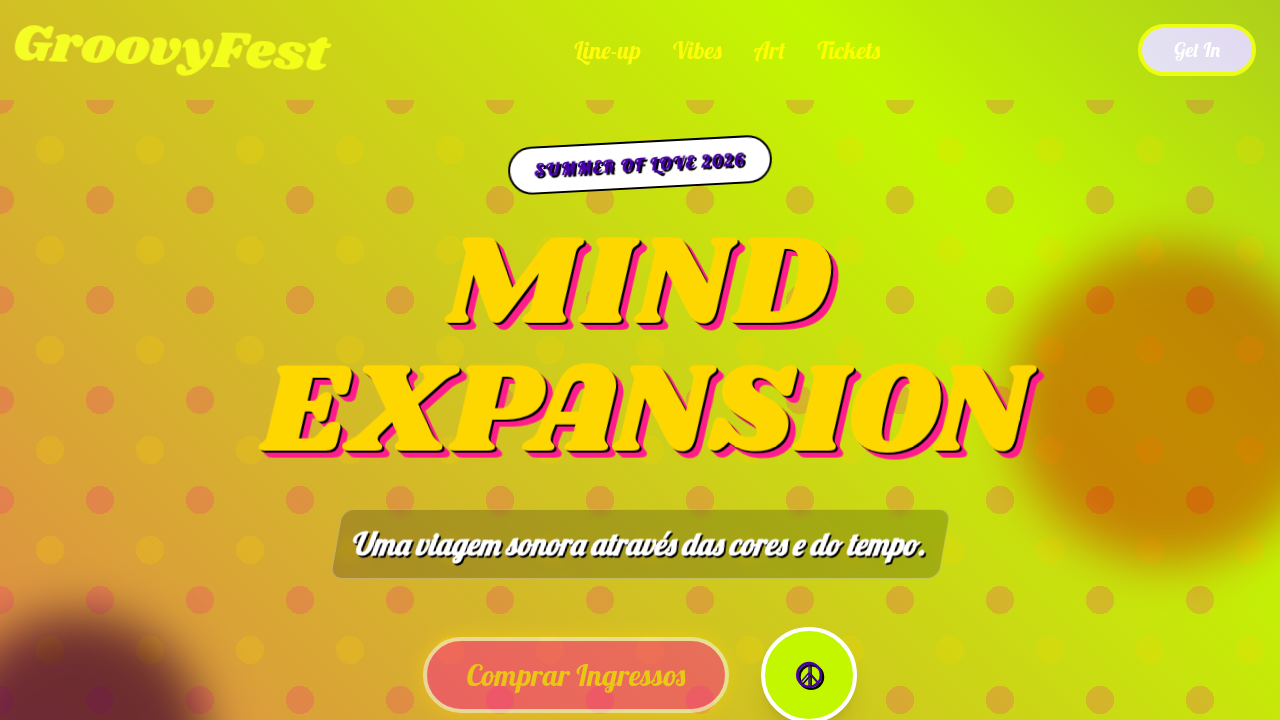
60s psychedelic landing page. Ideal for landing pages, saas. AI-ready template.
Use case: Landing pages, SaaS
Historical Context
The San Francisco concert poster scene of 1965–1971 wasn't just graphic design — it was visual rebellion. Wes Wilson's hand-lettered Fillmore posters bent typography until letters became organisms, pulsing and breathing against saturated backgrounds. Victor Moscoso, trained at Yale under Josef Albers, weaponized color theory by pairing vibrating complementary hues that made your eyes physically struggle to focus. That was the point. The discomfort was the message. These artists worked under absurd constraints — one-color separations, cheap newsprint, tight deadlines from Bill Graham's office — and still produced work that redefined what a poster could do. The lettering wasn't meant to be read quickly. The colors weren't meant to be comfortable. Everything fought against the clean Swiss modernism that dominated commercial design. Translating this energy to digital interfaces means understanding what made it dangerous in the first place: sensory overload as intentional communication. Modern screens handle vibrating color pairs beautifully. CSS gradients can swirl. Variable fonts can undulate. The toolkit is better now — the question is whether you have the nerve to actually push it.
When to Use
Reach for psychedelic aesthetics when the brand needs to feel countercultural, sensory, and unapologetically loud. Music platforms, cannabis brands, festival marketing, retro entertainment — anywhere the audience expects visual excess and rewards it. This style works when you want people to linger, not scan. It's terrible for utility interfaces and anything requiring quick comprehension. But for landing pages, event promotion, album art, and brand worlds that need to feel like an experience rather than a transaction? Nothing else hits the same way.
Design Principles
- Vibrating color pairs over safe palettes — complementary hues at maximum saturation create optical tension that demands attention
- Typography as illustration — letterforms should flow, melt, and morph into the composition rather than sitting obediently on a baseline
- Horror vacui as philosophy — fill the space, layer the elements, reject minimalism entirely
- Organic over geometric — swirling forms, Art Nouveau curves, and biological shapes replace rigid grids
- Intentional disorientation — if the viewer feels slightly overwhelmed, the design is working correctly
DESIGN.md
---
version: "alpha"
name: "Psicodélico Anos 60"
description: "60s psychedelic landing page. Ideal for landing pages, saas. AI-ready template."
colors:
  primary: "#FF5F00"
  secondary: "#FF1D8E"
  tertiary: "#C2F700"
  neutral: "#4700A5"
  surface: "#FFD700"
  accent: "#A020F0"
typography:
  h1:
    fontFamily: Lobster
    fontSize: 2.5rem
    fontWeight: 700
  body-md:
    fontFamily: Lobster
    fontSize: 1rem
    fontWeight: 400
components:
  button-primary:
    backgroundColor: "{colors.primary}"
    textColor: "{colors.neutral}"
    padding: 12px
---

## Overview

60s psychedelic landing page. Ideal for landing pages, saas. AI-ready template. The San Francisco concert poster scene of 1965–1971 wasn't just graphic design — it was visual rebellion. Wes Wilson's hand-lettered Fillmore posters bent typography until letters became organisms, pulsing and breathing against saturated backgrounds. Victor Moscoso, trained at Yale under Josef Albers, weaponized color theory by pairing vibrating complementary hues that made your eyes physically struggle to focus. That was the point. The discomfort was the message.

These artists worked under absurd constraints — one-color separations, cheap newsprint, tight deadlines from Bill Graham's office — and still produced work that redefined what a poster could do. The lettering wasn't meant to be read quickly. The colors weren't meant to be comfortable. Everything fought against the clean Swiss modernism that dominated commercial design.

Translating this energy to digital interfaces means understanding what made it dangerous in the first place: sensory overload as intentional communication. Modern screens handle vibrating color pairs beautifully. CSS gradients can swirl. Variable fonts can undulate. The toolkit is better now — the question is whether you have the nerve to actually push it.

- Density: 5/10 — Balanced
- Variance: 4/10 — Moderate
- Motion: 6/10 — Expressive

- **Style:** Trippy, Vibrant, Free-form
- **Keywords:** psychedelic, 60s, trippy, vibrant, free-form, groovy, abstract, swirling patterns, bold colors, counter-culture
- **Era:** 1960s, Summer of Love
- **Light/Dark:** ✓ Full / ✗ No

## Colors

- **Electric Orange** (#FF5F00) — Warm accent, call-to-action secondary
- **Hot Pink** (#FF1D8E) — Primary text color
- **Lime Green** (#C2F700) — Supporting palette color
- **Royal Blue** (#4700A5) — Accent highlight, links and focus states
- **Sunshine Yellow** (#FFD700) — Warning states, attention indicators
- **Purple Haze** (#A020F0) — Accent color, emphasis elements
- **White** (#FFFFFF) — Secondary surface
- **Black** (#000000) — Deep contrast surface


## Typography

- **Display / Hero:** Lobster — Weight 700, tight tracking, used for headline impact
- **Body:** Lobster — Weight 400, 16px/1.6 line-height, max 72ch per line
- **UI Labels / Captions:** Lobster — 0.875rem, weight 500, slight letter-spacing
- **Monospace:** JetBrains Mono — Used for code, metadata, and technical values

Scale:
- Hero: clamp(2.5rem, 5vw, 4rem)
- H1: 2.25rem
- H2: 1.5rem
- Body: 1rem / 1.6
- Small: 0.875rem


## Layout

- **Grid:** CSS Grid primary. Max-width containment: 1280px centered with 1.5rem side padding.
- **Spacing rhythm:** Balanced. Base unit: 0.5rem (8px).
- **Section vertical gaps:** clamp(4rem, 8vw, 8rem).
- **Hero layout:** Split-screen (text left, visual right).
- **Feature sections:** Zig-zag alternating text+image rows. No 3-equal-columns.
- **Mobile collapse:** All multi-column layouts collapse below 768px. No horizontal overflow.
- **z-index contract:** base (0) / sticky-nav (100) / overlay (200) / modal (300) / toast (500).


## Elevation & Depth

Swirling patterns, liquid light show effects, distorted typography, vibrant color clashes, abstract illustrations, mind-bending animations, paisley patterns, free-form layouts

- **Physics:** Spring — stiffness 120, damping 20. Confident, weighted transitions.
- **Entry animations:** Fade + translate-Y (16px → 0) over 480ms ease-out. Staggered cascades for lists: 100ms between items.
- **Hover states:** Scale(1.03) + shadow lift over 200ms.
- **Page transitions:** Fade + slide (300ms).
- **Performance:** Only transform and opacity animated. No layout-triggering properties.


## Shapes

Base corner radius: 8px. See rounded tokens in front matter for the full scale.


## Components

- **Primary Button:** Subtly rounded (0.5rem) shape. Accent color fill. Hover: 8% darken + subtle lift shadow. Active: -1px translate tactile press. Font weight 600. No outer glows.
- **Secondary / Ghost Button:** Outline variant. 1.5px border in muted color. Text in primary color. Hover: subtle background fill.
- **Cards:** Subtly rounded (0.5rem) corners. Surface background. Subtle shadow (0 2px 12px rgba(0,0,0,0.06)). 1px border stroke.
- **Inputs:** Label above input. 1px border stroke. Focus ring: 2px accent color offset 2px. Error text below in semantic red. No floating labels.
- **Navigation:** Primary surface background. Active item: accent color indicator. Font weight 500 when active.
- **Skeletons:** Shimmer animation matching component dimensions. No circular spinners.
- **Empty States:** Icon-based composition with descriptive text and action button.


## Do's and Don'ts

- No emojis in UI — use icon system only (Lucide, Heroicons)
- No pure black (#000000) — use off-black or charcoal variants
- No oversaturated accent colors (saturation cap: 80%)
- No 3-column equal-width feature layouts — use zig-zag or asymmetric grid
- No `h-screen` — use `min-h-[100dvh]`
- No AI copywriting clichés: "Elevate", "Seamless", "Unleash", "Next-Gen"
- No broken external image links — use picsum.photos or inline SVG
- No generic lorem ipsum in demos

- Do Swirling patterns
- Do Liquid light show effects
- Do Distorted typography
- Do Vibrant color clashes
- Do Abstract illustrations
- Do Mind-bending animations


## Use Case

Landing pages, SaaS
Technical Specs
CSS
background: linear-gradient(45deg, #FF5F00, #FF1D8E, #C2F700), color: #FFFFFF, animation: liquid-flow 10s infinite alternate, font-family: 'Lobster', cursive, text-shadow: 2px 2px 0 #000000, filter: contrast(1.5) saturate(1.5), transform: skew(3deg), border: none
Variables
--electric-orange-psych: #FF5F00, --hot-pink-psych: #FF1D8E, --lime-green-psych: #C2F700, --royal-blue-psych: #4700A5, --liquid-flow-duration: 10s, --font-psych: 'Lobster', cursive
Checklist
☐ Swirling patterns, ☐ Liquid light show effects, ☐ Distorted typography, ☐ Vibrant color clashes, ☐ Abstract illustrations, ☐ Mind-bending animations
Colors
Primary
Secondary
Effects
Swirling patterns, liquid light show effects, distorted typography, vibrant color clashes, abstract illustrations, mind-bending animations, paisley patterns, free-form layouts
Light/Dark
✓ Full / ✗ No
AI Prompt
Act as a Senior Frontend Engineer and Expert UI Designer.
Your task is to code a complete Landing Page on the first attempt.
- Landing Page Theme: <INSERT THEME>
- Sections to add: <INSERT SECTIONS>

Generate the final code immediately following these definitions:

## Style

- **Name:** Psicodélico Anos 60
- **Type:** Trippy, Vibrant, Free-form
- **Keywords:** psychedelic, 60s, trippy, vibrant, free-form, groovy, abstract, swirling patterns, bold colors, counter-culture
- **Era:** 1960s, Summer of Love
- **Light/Dark:** ✓ Full / ✗ No

## Color Palette

- **Primary:** Electric Orange #FF5F00, Hot Pink #FF1D8E, Lime Green #C2F700, Royal Blue #4700A5
- **Secondary:** Sunshine Yellow #FFD700, Purple Haze #A020F0, White #FFFFFF, Black #000000

## Visual Effects

Swirling patterns, liquid light show effects, distorted typography, vibrant color clashes, abstract illustrations, mind-bending animations, paisley patterns, free-form layouts

## AI Visual Direction

Design a 60s psychedelic landing page. Use: electric orange and hot pink, swirling patterns, liquid light show effects, distorted typography, vibrant color clashes, abstract illustrations, mind-bending animations, paisley patterns.

## CSS Technical

```css
background: linear-gradient(45deg, #FF5F00, #FF1D8E, #C2F700), color: #FFFFFF, animation: liquid-flow 10s infinite alternate, font-family: 'Lobster', cursive, text-shadow: 2px 2px 0 #000000, filter: contrast(1.5) saturate(1.5), transform: skew(3deg), border: none
```

## Design System Variables

```css
--electric-orange-psych: #FF5F00, --hot-pink-psych: #FF1D8E, --lime-green-psych: #C2F700, --royal-blue-psych: #4700A5, --liquid-flow-duration: 10s, --font-psych: 'Lobster', cursive
```

## Implementation Checklist

- ☐ Swirling patterns
- ☐ Liquid light show effects
- ☐ Distorted typography
- ☐ Vibrant color clashes
- ☐ Abstract illustrations
- ☐ Mind-bending animations

## Execution Rules

1. Strictly follow the defined visual style.
2. Use high-quality inline SVG icons (Heroicons or Lucide style) — NEVER use emojis as icons.
3. Add `cursor-pointer` and smooth `hover` states (transition-all) on all interactive elements.
4. Required Page Structure:
   - Navbar (Logo + Links + CTA)
   - Hero Section (Impactful Headline + Subtitle + 2 buttons + 3D/Abstract visual element via CSS)
   - Features (3 cards with icons)
   - Testimonials (3 cards)
   - Pricing (3 tiers, highlight the middle one)
   - Final CTA
   - Full Footer with social links, privacy policy, terms of use, contact and SEO links.
5. All text content must be in English.
6. The visual must be CLEARLY distinct — do not create a "default Bootstrap" design. Force the use of the provided design system variables.
7. Use `<style>` tags in the head for custom classes (especially for complex backdrop-filter effects and animations) that Tailwind CDN doesn't cover.
8. Full Responsiveness: Layout must adapt perfectly to Mobile, Tablet and Desktop (vertical stack on mobile).
9. Include basic SEO, Viewport and Open Graph meta tags in `<head>`.
10. Footer must contain: Copyright 2026, Secondary navigation links and Social media icons.
11. Make the creative decisions needed to deliver the complete, functional result now.
Related
Last synced: 4/1/2026