Pop Art
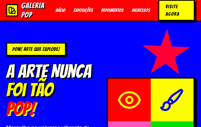
Pop Art landing page with extremely saturated bold colors and comic-strip aesthetics. Ideal for branding lúdico, design de vestuário, embalagens icônicas, capas editoriais. AI-ready template.
Use case: Playful branding, Clothing design, Iconic packaging, Editorial covers
Historical Context
Pop Art didn't ask permission. It kicked down the gallery door in the late 1950s and dragged commercial culture — soup cans, comic strips, celebrity headshots — into spaces that had been reserved for oil-on-canvas reverence. Warhol understood repetition as critique; Lichtenstein turned Ben-Day dots into a weapon against artistic pretension. The movement was a direct rejection of Abstract Expressionism's navel-gazing — suddenly art could be loud, accessible, and mass-produced without apology. What makes Pop Art endure in design isn't nostalgia — it's the underlying philosophy. These artists treated visual culture as raw material. They flattened hierarchy between high and low, proving that a Brillo box could carry the same weight as a Rothko. That democratization of imagery is essentially what every brand designer does today when they pull from memes, street culture, or TikTok aesthetics. The palette was never subtle. Saturated magentas, electric yellows, cyan pushed to the edge — colors chosen for maximum retinal impact, borrowed directly from commercial printing limitations that became deliberate stylistic choices.
When to Use
Pop Art works when you need to be impossible to ignore. Entertainment brands, youth-facing products, fashion campaigns that refuse to whisper — this is your territory. It's the right call when your audience scrolls fast and you need to stop thumbs dead. Bold outlines and saturated color create instant recognition at any scale, from billboard to app icon. But commit fully. Half-hearted Pop Art reads as clip art. You either embrace the maximalism or you pick a different direction entirely.
Design Principles
- Saturate without fear — push color to full intensity, let hues clash deliberately rather than harmonize politely
- Outline everything with confident, uniform weight — the bold black stroke is non-negotiable and creates the graphic punch that separates Pop from generic illustration
- Flatten depth aggressively — eliminate gradients and subtle shadows in favor of hard-edged color blocks that read instantly
- Repeat and multiply — single images gain power through serialization, grids, and pattern; repetition is meaning, not laziness
- Scale disproportionately — blow up mundane objects to monumental size or shrink important ones; the tension between scale and subject creates visual interest
DESIGN.md
---
version: "alpha"
name: "Pop Art"
description: "Pop Art landing page with extremely saturated bold colors and comic-strip aesthetics. Ideal for branding lúdico, design de vestuário, embalagens icônicas, capas editoriais. AI-ready template."
colors:
  primary: "#FF0000"
  secondary: "#FFFF00"
  tertiary: "#0000FF"
  neutral: "#FFFFFF"
  surface: "#FF69B4"
  accent: "#FF8C00"
typography:
  h1:
    fontFamily: Bangers
    fontSize: 2.5rem
    fontWeight: 700
  body-md:
    fontFamily: Bangers
    fontSize: 1rem
    fontWeight: 400
rounded:
  sm: 2px
  md: 4px
  lg: 8px
spacing:
  sm: 1.5rem
  md: 3.0rem
  lg: 6.0rem
components:
  button-primary:
    backgroundColor: "{colors.primary}"
    textColor: "{colors.neutral}"
    rounded: "{rounded.sm}"
    padding: 12px
---

## Overview

Pop Art landing page with extremely saturated bold colors and comic-strip aesthetics. Ideal for branding lúdico, design de vestuário, embalagens icônicas, capas editoriais. AI-ready template. Pop Art didn't ask permission. It kicked down the gallery door in the late 1950s and dragged commercial culture — soup cans, comic strips, celebrity headshots — into spaces that had been reserved for oil-on-canvas reverence. Warhol understood repetition as critique; Lichtenstein turned Ben-Day dots into a weapon against artistic pretension. The movement was a direct rejection of Abstract Expressionism's navel-gazing — suddenly art could be loud, accessible, and mass-produced without apology.

What makes Pop Art endure in design isn't nostalgia — it's the underlying philosophy. These artists treated visual culture as raw material. They flattened hierarchy between high and low, proving that a Brillo box could carry the same weight as a Rothko. That democratization of imagery is essentially what every brand designer does today when they pull from memes, street culture, or TikTok aesthetics.

The palette was never subtle. Saturated magentas, electric yellows, cyan pushed to the edge — colors chosen for maximum retinal impact, borrowed directly from commercial printing limitations that became deliberate stylistic choices.

- Density: 5/10 — Balanced
- Variance: 7/10 — Dynamic
- Motion: 6/10 — Expressive

- **Style:** Saturated, Bold, Comic-Strip, Repetitive
- **Keywords:** Pop art, saturated colors, bold, comic strip, Andy Warhol, Roy Lichtenstein, halftone dots, repetition, everyday objects, iconic
- **Era:** 1950s-1960s Pop Art Movement
- **Light/Dark:** ✓ Full / ◐ Partial

## Colors

- **Pop Red** (#FF0000) — Error states, destructive actions
- **Pop Yellow** (#FFFF00) — Warning states, attention indicators
- **Pop Blue** (#0000FF) — Accent highlight, links and focus states
- **Pure White** (#FFFFFF) — Light surface, card backgrounds
- **Hot Pink** (#FF69B4) — Primary text color
- **Bright Orange** (#FF8C00) — Warm accent, call-to-action secondary
- **Lime Green** (#32CD32) — Success states, positive indicators
- **Black** (#000000) — Deep contrast surface


## Typography

- **Display / Hero:** Bangers — Weight 700, tight tracking, used for headline impact
- **Body:** Bangers — Weight 400, 16px/1.6 line-height, max 72ch per line
- **UI Labels / Captions:** Bangers — 0.875rem, weight 500, slight letter-spacing
- **Monospace:** JetBrains Mono — Used for code, metadata, and technical values

Scale:
- Hero: clamp(2.5rem, 5vw, 4rem)
- H1: 2.25rem
- H2: 1.5rem
- Body: 1rem / 1.6
- Small: 0.875rem


## Layout

- **Grid:** CSS Grid primary. Max-width containment: 1280px centered with 1.5rem side padding.
- **Spacing rhythm:** Balanced. Base unit: 0.5rem (8px).
- **Section vertical gaps:** clamp(4rem, 8vw, 8rem).
- **Hero layout:** Asymmetric composition.
- **Feature sections:** Asymmetric grid with varied card sizes. No 3-equal-columns.
- **Mobile collapse:** All multi-column layouts collapse below 768px. No horizontal overflow.
- **z-index contract:** base (0) / sticky-nav (100) / overlay (200) / modal (300) / toast (500).


## Elevation & Depth

Halftone dot pattern overlays (CSS radial-gradient), bold black outlines (3-4px), comic speech bubble shapes, Ben-Day dots background, repetitive grid layouts (Warhol-style), high saturation filters, pop-in scale animations

- **Physics:** Spring — stiffness 120, damping 20. Confident, weighted transitions.
- **Entry animations:** Fade + translate-Y (16px → 0) over 480ms ease-out. Staggered cascades for lists: 100ms between items.
- **Hover states:** Scale(1.03) + shadow lift over 200ms.
- **Page transitions:** Fade + slide (300ms).
- **Performance:** Only transform and opacity animated. No layout-triggering properties.


## Shapes

Base corner radius: 0px. See rounded tokens in front matter for the full scale.


## Components

- **Primary Button:** Sharp edges (0px) shape. Accent color fill. Hover: 8% darken + subtle lift shadow. Active: -1px translate tactile press. Font weight 600. No outer glows.
- **Secondary / Ghost Button:** Outline variant. 1.5px border in muted color. Text in primary color. Hover: subtle background fill.
- **Cards:** Sharp edges (0px) corners. Surface background. Subtle shadow (0 2px 12px rgba(0,0,0,0.06)). 1px border stroke.
- **Inputs:** Label above input. 1px border stroke. Focus ring: 2px accent color offset 2px. Error text below in semantic red. No floating labels.
- **Navigation:** Primary surface background. Active item: accent color indicator. Font weight 500 when active.
- **Skeletons:** Shimmer animation matching component dimensions. No circular spinners.
- **Empty States:** Icon-based composition with descriptive text and action button.


## Do's and Don'ts

- No emojis in UI — use icon system only (Lucide, Heroicons)
- No pure black (#000000) — use off-black or charcoal variants
- No oversaturated accent colors (saturation cap: 80%)
- No 3-column equal-width feature layouts — use zig-zag or asymmetric grid
- No `h-screen` — use `min-h-[100dvh]`
- No AI copywriting clichés: "Elevate", "Seamless", "Unleash", "Next-Gen"
- No broken external image links — use picsum.photos or inline SVG
- No generic lorem ipsum in demos

- Do Extremely saturated bold colors
- Do Halftone dot pattern overlays
- Do Bold black outlines on all elements
- Do Comic speech bubble shapes
- Do Repetitive grid layouts
- Do Bold uppercase comic typography
- Do High saturation maintained
- Do Responsive with maintained pop energy


## Use Case

Playful branding, Clothing design, Iconic packaging, Editorial covers
Technical Specs
CSS
font-family: 'Bangers', cursive, background: #FFFF00 or #FF0000 with radial-gradient halftone dots, color: #000000, border: 4px solid #000000, border-radius: 0px, text-transform: uppercase, font-weight: 700, box-shadow: 6px 6px 0 #000000, filter: saturate(1.5)
Variables
--color-red: #FF0000, --color-yellow: #FFFF00, --color-blue: #0000FF, --color-black: #000000, --font-display: 'Bangers', --border: 4px solid #000000, --shadow: 6px 6px 0 #000000, --border-radius: 0px, --spacing: 1.5rem
Checklist
☐ Extremely saturated bold colors, ☐ Halftone dot pattern overlays, ☐ Bold black outlines on all elements, ☐ Comic speech bubble shapes, ☐ Repetitive grid layouts, ☐ Bold uppercase comic typography, ☐ High saturation maintained, ☐ Responsive with maintained pop energy
Colors
Primary
Secondary
Effects
Halftone dot pattern overlays (CSS radial-gradient), bold black outlines (3-4px), comic speech bubble shapes, Ben-Day dots background, repetitive grid layouts (Warhol-style), high saturation filters, pop-in scale animations
Light/Dark
✓ Full / ◐ Partial
AI Prompt
Act as a Senior Frontend Engineer and Expert UI Designer.
Your task is to code a complete Landing Page on the first attempt.
- Landing Page Theme: <INSERT THEME>
- Sections to add: <INSERT SECTIONS>

Generate the final code immediately following these definitions:

## Style

- **Name:** Pop Art
- **Type:** Saturated, Bold, Comic-Strip, Repetitive
- **Keywords:** Pop art, saturated colors, bold, comic strip, Andy Warhol, Roy Lichtenstein, halftone dots, repetition, everyday objects, iconic
- **Era:** 1950s-1960s Pop Art Movement
- **Light/Dark:** ✓ Full / ◐ Partial

## Color Palette

- **Primary:** Pop Red #FF0000, Pop Yellow #FFFF00, Pop Blue #0000FF, Pure White #FFFFFF
- **Secondary:** Hot Pink #FF69B4, Bright Orange #FF8C00, Lime Green #32CD32, Black #000000

## Visual Effects

Halftone dot pattern overlays (CSS radial-gradient), bold black outlines (3-4px), comic speech bubble shapes, Ben-Day dots background, repetitive grid layouts (Warhol-style), high saturation filters, pop-in scale animations

## AI Visual Direction

Design a Pop Art landing page with extremely saturated bold colors and comic-strip aesthetics. Use pop red, yellow, blue, white with bold black outlines. Apply halftone dot patterns (Ben-Day dots), comic speech bubbles, repetitive Warhol-style grid layouts, thick black outlines on all elements. Typography should be bold, uppercase, comic-style. Loud, iconic, everyday-objects-elevated aesthetic.

## CSS Technical

```css
font-family: 'Bangers', cursive, background: #FFFF00 or #FF0000 with radial-gradient halftone dots, color: #000000, border: 4px solid #000000, border-radius: 0px, text-transform: uppercase, font-weight: 700, box-shadow: 6px 6px 0 #000000, filter: saturate(1.5)
```

## Design System Variables

```css
--color-red: #FF0000, --color-yellow: #FFFF00, --color-blue: #0000FF, --color-black: #000000, --font-display: 'Bangers', --border: 4px solid #000000, --shadow: 6px 6px 0 #000000, --border-radius: 0px, --spacing: 1.5rem
```

## Implementation Checklist

- ☐ Extremely saturated bold colors
- ☐ Halftone dot pattern overlays
- ☐ Bold black outlines on all elements
- ☐ Comic speech bubble shapes
- ☐ Repetitive grid layouts
- ☐ Bold uppercase comic typography
- ☐ High saturation maintained
- ☐ Responsive with maintained pop energy

## Execution Rules

1. Strictly follow the defined visual style.
2. Use high-quality inline SVG icons (Heroicons or Lucide style) — NEVER use emojis as icons.
3. Add `cursor-pointer` and smooth `hover` states (transition-all) on all interactive elements.
4. Required Page Structure:
   - Navbar (Logo + Links + CTA)
   - Hero Section (Impactful Headline + Subtitle + 2 buttons + 3D/Abstract visual element via CSS)
   - Features (3 cards with icons)
   - Testimonials (3 cards)
   - Pricing (3 tiers, highlight the middle one)
   - Final CTA
   - Full Footer with social links, privacy policy, terms of use, contact and SEO links.
5. All text content must be in English.
6. The visual must be CLEARLY distinct — do not create a "default Bootstrap" design. Force the use of the provided design system variables.
7. Use `<style>` tags in the head for custom classes (especially for complex backdrop-filter effects and animations) that Tailwind CDN doesn't cover.
8. Full Responsiveness: Layout must adapt perfectly to Mobile, Tablet and Desktop (vertical stack on mobile).
9. Include basic SEO, Viewport and Open Graph meta tags in `<head>`.
10. Footer must contain: Copyright 2026, Secondary navigation links and Social media icons.
11. Make the creative decisions needed to deliver the complete, functional result now.
Related
Last synced: 4/1/2026