People's Platform (Block & Bold)
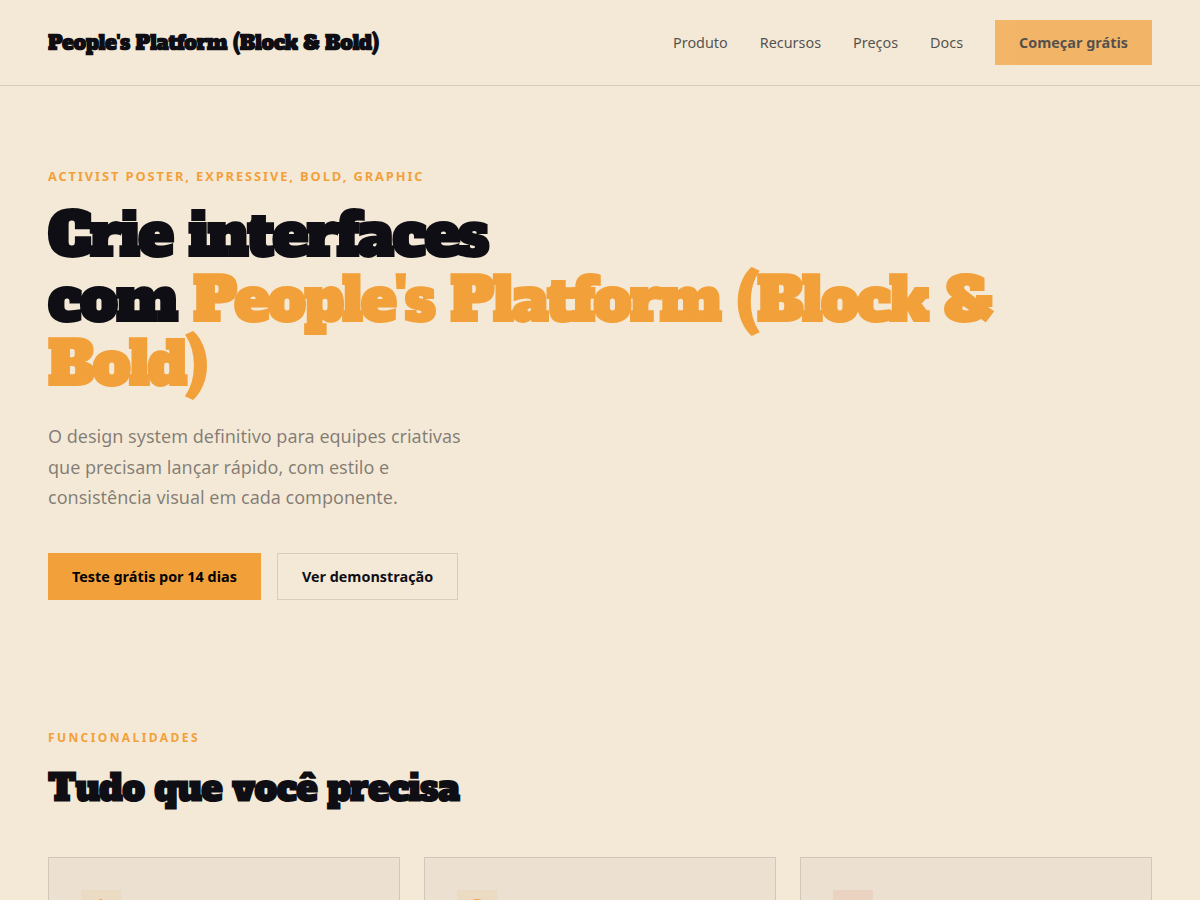
People's Platform (Block & Bold) — Activist poster energy: blue, orange, red on cream, with Alfa Slab + Caveat Brush. Alfa Slab One typography. saturated political-poster palette: cobalt blue, signal orange, warning red, on . Best for cultural commentary, manifesto, community / civic deck. AI-ready design system.
Use case: cultural commentary, manifesto, community / civic deck, design talk, campaign pitch, founder vision
Historical Context
The activist poster tradition didn't emerge from design schools — it came from urgency. From the Atelier Populaire screenprints of May '68 to ACT UP's silence=death triangle, the most powerful political graphics were made by people who needed to be heard yesterday. Bold slab serifs weren't chosen for aesthetic reasons; they were chosen because they could be read from across a street, stenciled onto a wall, or photocopied a hundred times without losing legibility. This pairing — Alfa Slab One's unapologetic weight against Caveat's raw handwritten energy — captures that duality perfectly. The slab says institution, authority, demand. The handwriting says human, personal, urgent. Together they recreate the visual language of movements that understood something most brands never will: typography is a political act. Every zine cover, every wheat-pasted broadsheet, every hand-lettered banner at a march carries this DNA. The block-and-bold approach isn't decorative. It's functional dissent. It exists because marginalized voices learned that whispered messages get ignored, and that the combination of structural boldness with human imperfection is what makes people stop, read, and act.
When to Use
Deploy this when your project serves people organizing for change — not corporations cosplaying activism. It works for mutual aid networks, grassroots campaigns, community land trusts, labor unions, and NGOs that actually do the work. Use it when the message matters more than the polish, when you need to communicate across language barriers and literacy levels, and when your audience expects authenticity over refinement. Avoid it for anything that would feel exploitative borrowing this visual language without the politics behind it.
Design Principles
- Legibility is solidarity — if someone can't read it from ten feet away or on a cracked phone screen, you've failed the people you claim to serve
- Imperfection is proof of life — the handwritten elements aren't decorative, they signal that a human made this and a human is asking you to care
- Contrast carries conviction — pair maximum typographic weight against open space; let the message breathe like a chant needs silence between repetitions
- Hierarchy serves urgency — the most important information hits first and hardest, because your audience is scrolling past a hundred other demands for attention
- Color is a megaphone — use it sparingly and deliberately; one accent color at full saturation against monochrome creates the same visual punch as a raised fist in a crowd
DESIGN.md
---
version: "alpha"
name: "People's Platform (Block & Bold)"
description: "People's Platform (Block & Bold) — Activist poster energy: blue, orange, red on cream, with Alfa Slab + Caveat Brush. Alfa Slab One typography. saturated political-poster palette: cobalt blue, signal orange, warning red, on . Best for cultural commentary, manifesto, community / civic deck. AI-ready design system."
colors:
  primary: "#2C2CDC"
  secondary: "#F2A03A"
  tertiary: "#E83A2A"
  neutral: "#F4E9D6"
  surface: "#0E0E14"
typography:
  h1:
    fontFamily: Alfa Slab One
    fontSize: 2.5rem
    fontWeight: 700
  body-md:
    fontFamily: Alfa Slab One
    fontSize: 1rem
    fontWeight: 400
spacing:
  sm: 1.0rem
  md: 2.0rem
  lg: 4.0rem
components:
  button-primary:
    backgroundColor: "{colors.primary}"
    textColor: "{colors.neutral}"
    padding: 12px
---

## Overview

People's Platform (Block & Bold) — Activist poster energy: blue, orange, red on cream, with Alfa Slab + Caveat Brush. Alfa Slab One typography. saturated political-poster palette: cobalt blue, signal orange, warning red, on . Best for cultural commentary, manifesto, community / civic deck. AI-ready design system. The activist poster tradition didn't emerge from design schools — it came from urgency. From the Atelier Populaire screenprints of May '68 to ACT UP's silence=death triangle, the most powerful political graphics were made by people who needed to be heard yesterday. Bold slab serifs weren't chosen for aesthetic reasons; they were chosen because they could be read from across a street, stenciled onto a wall, or photocopied a hundred times without losing legibility.

This pairing — Alfa Slab One's unapologetic weight against Caveat's raw handwritten energy — captures that duality perfectly. The slab says institution, authority, demand. The handwriting says human, personal, urgent. Together they recreate the visual language of movements that understood something most brands never will: typography is a political act. Every zine cover, every wheat-pasted broadsheet, every hand-lettered banner at a march carries this DNA.

The block-and-bold approach isn't decorative. It's functional dissent. It exists because marginalized voices learned that whispered messages get ignored, and that the combination of structural boldness with human imperfection is what makes people stop, read, and act.

- Density: 7/10 — Rich
- Variance: 5/10 — Moderate
- Motion: 7/10 — Kinetic

- **Style:** Activist Poster, Expressive, Bold, Graphic
- **Keywords:** Activist poster, Alfa Slab One, Caveat, protest energy, bold, honest, multi-accent, graphic
- **Era:** 2020s Neo-Brutalist
- **Light/Dark:** ✓ Full / ✗ None

## Colors

- **Blue** (#2C2CDC) — Primary surface or dominant color
- **Orange** (#F2A03A) — Accent highlight, links and focus states
- **Red** (#E83A2A) — Secondary accent
- **Cream** (#F4E9D6) — Accent color, emphasis elements
- **Ink** (#0E0E14) — Extended palette, decorative use


## Typography

- **Display / Hero:** Alfa Slab One — Weight 700, tight tracking, used for headline impact
- **Body:** sans-serif — Weight 400, 16px/1.6 line-height, max 72ch per line
- **UI Labels / Captions:** sans-serif — 0.875rem, weight 500, slight letter-spacing
- **Monospace:** DM Mono — Used for code, metadata, and technical values

Scale:
- Hero: clamp(2.5rem, 5vw, 4rem)
- H1: 2.25rem
- H2: 1.5rem
- Body: 1rem / 1.6
- Small: 0.875rem


## Layout

- **Grid:** CSS Grid primary. Max-width containment: 1280px centered with 1.5rem side padding.
- **Spacing rhythm:** Balanced. Base unit: 0.5rem (8px).
- **Section vertical gaps:** clamp(4rem, 8vw, 8rem).
- **Hero layout:** Split-screen (text left, visual right).
- **Feature sections:** Zig-zag alternating text+image rows. No 3-equal-columns.
- **Mobile collapse:** All multi-column layouts collapse below 768px. No horizontal overflow.
- **z-index contract:** base (0) / sticky-nav (100) / overlay (200) / modal (300) / toast (500).


## Elevation & Depth

display font Alfa Slab One for hero headlines, bold hover color shift (150ms), high-contrast active states, activist poster color blocks, slab+handwritten font collision, red/blue/orange

- **Physics:** Ease-out curves, 200-300ms duration. Smooth and predictable.
- **Entry animations:** Fade + translate-Y (16px → 0) over 420ms ease-out. Staggered cascades for lists: 80ms between items.
- **Hover states:** Subtle color shift + shadow adjustment over 200ms.
- **Page transitions:** Fade only (200ms).
- **Performance:** Only transform and opacity animated. No layout-triggering properties.


## Shapes

Base corner radius: 0px. See rounded tokens in front matter for the full scale.


## Components

- **Primary Button:** 0px border-radius. Accent color fill. Hover: 8% darken + subtle lift shadow. Active: -1px translate tactile press. Font weight 600. No outer glows.
- **Secondary / Ghost Button:** Outline variant. 1.5px border in muted color. Text in primary color. Hover: subtle background fill.
- **Cards:** 0px corners. Surface background. Subtle shadow (0 2px 12px rgba(0,0,0,0.06)). 1px border stroke.
- **Inputs:** Label above input. 1px border stroke. Focus ring: 2px accent color offset 2px. Error text below in semantic red. No floating labels.
- **Navigation:** Primary surface background. Active item: accent color indicator. Font weight 500 when active.
- **Skeletons:** Shimmer animation matching component dimensions. No circular spinners.
- **Empty States:** Icon-based composition with descriptive text and action button.


## Do's and Don'ts

- No emojis in UI — use icon system only (Lucide, Heroicons)
- No pure black (#000000) — use off-black or charcoal variants
- No oversaturated accent colors (saturation cap: 80%)
- No 3-column equal-width feature layouts — use zig-zag or asymmetric grid
- No `h-screen` — use `min-h-[100dvh]`
- No AI copywriting clichés: "Elevate", "Seamless", "Unleash", "Next-Gen"
- No broken external image links — use picsum.photos or inline SVG
- No generic lorem ipsum in demos

- Do Alfa Slab One display font loaded via Google Fonts
- Do Color palette variables applied consistently
- Do Typography scale: hero clamp(2.5rem,5vw,4rem)
- Do H1 2.25rem
- Do body 1rem/1.6
- Do WCAG AA contrast ratio verified (4.5:1 body text)
- Do Brutalist borders 2-3px solid applied
- Do Offset box-shadow on cards
- Do Mobile responsive layout (stack below 768px)


## Use Case

cultural commentary, manifesto, community / civic deck, design talk, campaign pitch, founder vision
Technical Specs
CSS
font-family: 'Alfa Slab One', serif; background: #F5F0E0; color: #1A1A6E; --red: #D42B1E; --orange: #E8821E; --blue: #1A1A6E; font-weight: 900
Variables
--bg: #F4E9D6, --fg: #0E0E14, --accent: #F2A03A, --font-display: 'Alfa Slab One', --font-body: 'sans-serif', --radius: 0px, --spacing: 1rem
Checklist
☐ Alfa Slab One display font loaded via Google Fonts, ☐ Color palette variables applied consistently, ☐ Typography scale: hero clamp(2.5rem,5vw,4rem), H1 2.25rem, body 1rem/1.6, ☐ WCAG AA contrast ratio verified (4.5:1 body text), ☐ Brutalist borders 2-3px solid applied, ☐ Offset box-shadow on cards, ☐ Mobile responsive layout (stack below 768px)
Colors
Primary
Secondary
Effects
display font Alfa Slab One for hero headlines, bold hover color shift (150ms), high-contrast active states, activist poster color blocks, slab+handwritten font collision, red/blue/orange
Light/Dark
✓ Full / ✗ None
AI Prompt
Act as a Senior Frontend Engineer and Expert UI Designer.
Your task is to code a complete Landing Page on the first attempt.
- Landing Page Theme: <INSERT THEME>
- Sections to add: <INSERT SECTIONS>

Generate the final code immediately following these definitions:

## Style

- **Name:** People's Platform (Block & Bold)
- **Type:** Activist Poster, Expressive, Bold, Graphic
- **Keywords:** Activist poster, Alfa Slab One, Caveat, protest energy, bold, honest, multi-accent, graphic
- **Era:** 2020s Neo-Brutalist
- **Light/Dark:** ✓ Full / ✗ None

## Color Palette

- **Primary:** Blue #2C2CDC, Orange #F2A03A, Red #E83A2A
- **Secondary:** Cream #F4E9D6, Ink #0E0E14

## Visual Effects

display font Alfa Slab One for hero headlines, bold hover color shift (150ms), high-contrast active states, activist poster color blocks, slab+handwritten font collision, red/blue/orange

## AI Visual Direction

Design an activist poster editorial layout. Use: cream ground (#F5F0E0), blue/orange/red multi-accent (cobalt #1A1A6E, orange #E8821E, red #D42B1E), Alfa Slab One + Caveat font collision, full-bleed color blocks for section headers. Protest-poster energy.

## CSS Technical

```css
font-family: 'Alfa Slab One', serif; background: #F5F0E0; color: #1A1A6E; --red: #D42B1E; --orange: #E8821E; --blue: #1A1A6E; font-weight: 900
```

## Design System Variables

```css
--bg: #F4E9D6, --fg: #0E0E14, --accent: #F2A03A, --font-display: 'Alfa Slab One', --font-body: 'sans-serif', --radius: 0px, --spacing: 1rem
```

## Implementation Checklist

- ☐ Alfa Slab One display font loaded via Google Fonts
- ☐ Color palette variables applied consistently
- ☐ Typography scale: hero clamp(2.5rem,5vw,4rem)
- H1 2.25rem
- body 1rem/1.6
- ☐ WCAG AA contrast ratio verified (4.5:1 body text)
- ☐ Brutalist borders 2-3px solid applied
- ☐ Offset box-shadow on cards
- ☐ Mobile responsive layout (stack below 768px)

## Execution Rules

1. Strictly follow the defined visual style.
2. Use high-quality inline SVG icons (Heroicons or Lucide style) — NEVER use emojis as icons.
3. Add `cursor-pointer` and smooth `hover` states (transition-all) on all interactive elements.
4. Required Page Structure:
   - Navbar (Logo + Links + CTA)
   - Hero Section (Impactful Headline + Subtitle + 2 buttons + 3D/Abstract visual element via CSS)
   - Features (3 cards with icons)
   - Testimonials (3 cards)
   - Pricing (3 tiers, highlight the middle one)
   - Final CTA
   - Full Footer with social links, privacy policy, terms of use, contact and SEO links.
5. All text content must be in English.
6. The visual must be CLEARLY distinct — do not create a "default Bootstrap" design. Force the use of the provided design system variables.
7. Use `<style>` tags in the head for custom classes (especially for complex backdrop-filter effects and animations) that Tailwind CDN doesn't cover.
8. Full Responsiveness: Layout must adapt perfectly to Mobile, Tablet and Desktop (vertical stack on mobile).
9. Include basic SEO, Viewport and Open Graph meta tags in `<head>`.
10. Footer must contain: Copyright 2026, Secondary navigation links and Social media icons.
11. Make the creative decisions needed to deliver the complete, functional result now.
Related
Last synced: 5/6/2026