Modernismo Jornalístico Brasileiro
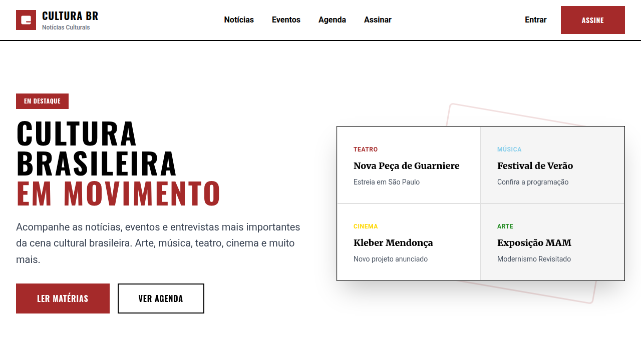
Structured and dynamic landing page for a Brazilian cultural news portal, inspired by modernism and azulejaria. Ideal for landing pages, saas. AI-ready template.
Use case: Landing pages, SaaS
Historical Context
Brazilian journalism never got the memo about restraint. When Folha de S.Paulo redesigned in the early 2000s, they took Müller-Brockmann's grid and ran it through São Paulo's concrete jungle — tight columns, aggressive hierarchy, but always that underlying pulse of color that Swiss purists would never allow. The result was something genuinely new: information architecture that could handle the chaos of Brazilian politics without losing its spine. Estadão and O Globo followed different paths to similar territory. Estadão leaned conservative — serif-heavy, dense, trusting readers to navigate complexity. O Globo went warmer, rounder, more Rio in its bones. But all three understood something fundamental: Brazilian readers consume news differently. The cadência is different. Headlines hit harder, subheads do more work, and white space isn't emptiness — it's breathing room between stories that demand emotional investment. What emerged across two decades of digital transformation is a distinct typographic voice. Not European minimalism. Not American maximalism. Something in between — structured enough to convey authority, loose enough to feel alive. The grid bends but never breaks.
When to Use
Reach for this when you're building platforms that need to handle volume without feeling overwhelming. News portals, obviously. But also cultural magazines where editorial hierarchy matters, event platforms juggling dozens of listings, or any content-heavy product serving Portuguese-speaking audiences. It works when your content is dense, your audience is literate, and you need the design to get out of the way while still feeling intentional. Not for marketing sites. Not for minimal portfolios. This is a workhorse aesthetic.
Design Principles
- Dense but never cluttered — pack information tight, then let typography create the breathing room instead of whitespace alone
- Warm neutrals over cold grays — Brazilian journalism uses cream, sand, and muted gold where Nordic design would reach for slate
- Hierarchy through scale contrast, not decoration — jump from 48px headlines to 14px body without apology, let the gap do the talking
- Color as editorial signal, not ornament — section colors, category badges, and accent lines serve navigation first, aesthetics second
- Horizontal rhythm matters as much as vertical — multi-column layouts should feel like a newspaper spread, not a feed
DESIGN.md
---
version: "alpha"
name: "Modernismo Jornalístico Brasileiro"
description: "Structured and dynamic landing page for a Brazilian cultural news portal, inspired by modernism and azulejaria. Ideal for landing pages, saas. AI-ready template."
colors:
  primary: "#FFFFFF"
  secondary: "#000000"
  tertiary: "#A52A2A"
  neutral: "#87CEEB"
  surface: "#FFD700"
  accent: "#228B22"
typography:
  h1:
    fontFamily: Roboto
    fontSize: 2.5rem
    fontWeight: 700
  body-md:
    fontFamily: Roboto
    fontSize: 1rem
    fontWeight: 400
components:
  button-primary:
    backgroundColor: "{colors.primary}"
    textColor: "{colors.neutral}"
    padding: 12px
---

## Overview

Structured and dynamic landing page for a Brazilian cultural news portal, inspired by modernism and azulejaria. Ideal for landing pages, saas. AI-ready template. Brazilian journalism never got the memo about restraint. When Folha de S.Paulo redesigned in the early 2000s, they took Müller-Brockmann's grid and ran it through São Paulo's concrete jungle — tight columns, aggressive hierarchy, but always that underlying pulse of color that Swiss purists would never allow. The result was something genuinely new: information architecture that could handle the chaos of Brazilian politics without losing its spine.

Estadão and O Globo followed different paths to similar territory. Estadão leaned conservative — serif-heavy, dense, trusting readers to navigate complexity. O Globo went warmer, rounder, more Rio in its bones. But all three understood something fundamental: Brazilian readers consume news differently. The cadência is different. Headlines hit harder, subheads do more work, and white space isn't emptiness — it's breathing room between stories that demand emotional investment.

What emerged across two decades of digital transformation is a distinct typographic voice. Not European minimalism. Not American maximalism. Something in between — structured enough to convey authority, loose enough to feel alive. The grid bends but never breaks.

- Density: 5/10 — Balanced
- Variance: 8/10 — Expressive
- Motion: 4/10 — Subtle

- **Style:** Structured, Dynamic, Informative, Cultural
- **Keywords:** news, culture, events, Brazilian, modernism, structured, dynamic, informative, artistic, engaging
- **Era:** 2026+ Cultura em Movimento
- **Light/Dark:** ✓ Full / ✗ No

## Colors

- **Branco** (#FFFFFF) — Light surface, card backgrounds
- **Preto** (#000000) — Dark surface, primary background
- **Vermelho Terra** (#A52A2A) — Error states, destructive actions
- **Azul Celeste** (#87CEEB) — Accent highlight, links and focus states
- **Amarelo Ouro** (#FFD700) — Warning states, attention indicators
- **Verde Floresta** (#228B22) — Success states, positive indicators
- **Laranja Queimado** (#CC5500) — Warm accent, call-to-action secondary
- **Cinza Escuro** (#333333) — Deep contrast surface


## Typography

- **Display / Hero:** Roboto — Weight 700, tight tracking, used for headline impact
- **Body:** Roboto — Weight 400, 16px/1.6 line-height, max 72ch per line
- **UI Labels / Captions:** Roboto — 0.875rem, weight 500, slight letter-spacing
- **Monospace:** JetBrains Mono — Used for code, metadata, and technical values

Scale:
- Hero: clamp(2.5rem, 5vw, 4rem)
- H1: 2.25rem
- H2: 1.5rem
- Body: 1rem / 1.6
- Small: 0.875rem


## Layout

- **Grid:** CSS Grid primary. Max-width containment: 1280px centered with 1.5rem side padding.
- **Spacing rhythm:** Balanced. Base unit: 0.5rem (8px).
- **Section vertical gaps:** clamp(4rem, 8vw, 8rem).
- **Hero layout:** Asymmetric composition.
- **Feature sections:** Asymmetric grid with varied card sizes. No 3-equal-columns.
- **Mobile collapse:** All multi-column layouts collapse below 768px. No horizontal overflow.
- **z-index contract:** base (0) / sticky-nav (100) / overlay (200) / modal (300) / toast (500).


## Elevation & Depth

Layouts de grid com blocos de conteúdo que se assemelham a painéis de azulejos, tipografia sans-serif e serifada contrastante para hierarquia, imagens de eventos culturais em destaque, micro-interações de hover com realce de borda e sombra, transições de seção com efeito de "revelação" de conteúdo.

- **Physics:** Ease-out curves, 200-300ms duration. Smooth and predictable.
- **Entry animations:** Fade + translate-Y (16px → 0) over 420ms ease-out. Staggered cascades for lists: 80ms between items.
- **Hover states:** Subtle color shift + shadow adjustment over 200ms.
- **Page transitions:** Fade only (200ms).
- **Performance:** Only transform and opacity animated. No layout-triggering properties.


## Shapes

Base corner radius: 8px. See rounded tokens in front matter for the full scale.


## Components

- **Primary Button:** Subtly rounded (0.5rem) shape. Accent color fill. Hover: 8% darken + subtle lift shadow. Active: -1px translate tactile press. Font weight 600. No outer glows.
- **Secondary / Ghost Button:** Outline variant. 1.5px border in muted color. Text in primary color. Hover: subtle background fill.
- **Cards:** Subtly rounded (0.5rem) corners. Surface background. Subtle shadow (0 2px 12px rgba(0,0,0,0.06)). 1px border stroke.
- **Inputs:** Label above input. 1px border stroke. Focus ring: 2px accent color offset 2px. Error text below in semantic red. No floating labels.
- **Navigation:** Primary surface background. Active item: accent color indicator. Font weight 500 when active.
- **Skeletons:** Shimmer animation matching component dimensions. No circular spinners.
- **Empty States:** Icon-based composition with descriptive text and action button.


## Do's and Don'ts

- No emojis in UI — use icon system only (Lucide, Heroicons)
- No pure black (#000000) — use off-black or charcoal variants
- No oversaturated accent colors (saturation cap: 80%)
- No 3-column equal-width feature layouts — use zig-zag or asymmetric grid
- No `h-screen` — use `min-h-[100dvh]`
- No AI copywriting clichés: "Elevate", "Seamless", "Unleash", "Next-Gen"
- No broken external image links — use picsum.photos or inline SVG
- No generic lorem ipsum in demos

- Do Layouts de grid com blocos (azulejo)
- Do Tipografia sans-serif/serifada
- Do Imagens de eventos culturais
- Do Micro-interações de realce de borda/sombra
- Do Transições de "revelação" de conteúdo
- Do Foco em cultura brasileira.


## Use Case

Landing pages, SaaS
Technical Specs
CSS
background: #FFFFFF, color: #000000, border: 1px solid #E0E0E0, box-shadow: 2px 2px 0px #A52A2A, font-family: "Roboto, sans-serif", transition: all 0.4s ease-in-out, .tile-block, .cultural-event-card, .content-reveal-transition.
Variables
--white-bg: #FFFFFF, --black-text: #000000, --earth-red: #A52A2A, --sky-blue: #87CEEB, --border-subtle: 1px solid #E0E0E0, --shadow-accent: 2px 2px 0px #A52A2A, --font-sans: "Roboto, sans-serif", --font-serif: "Merriweather, serif".
Checklist
☐ Layouts de grid com blocos (azulejo), ☐ Tipografia sans-serif/serifada, ☐ Imagens de eventos culturais, ☐ Micro-interações de realce de borda/sombra, ☐ Transições de "revelação" de conteúdo, ☐ Foco em cultura brasileira.
Colors
Primary
Secondary
Effects
Layouts de grid com blocos de conteúdo que se assemelham a painéis de azulejos, tipografia sans-serif e serifada contrastante para hierarquia, imagens de eventos culturais em destaque, micro-interações de hover com realce de borda e sombra, transições de seção com efeito de "revelação" de conteúdo.
Light/Dark
✓ Full / ✗ No
AI Prompt
Act as a Senior Frontend Engineer and Expert UI Designer.
Your task is to code a complete Landing Page on the first attempt.
- Landing Page Theme: <INSERT THEME>
- Sections to add: <INSERT SECTIONS>

Generate the final code immediately following these definitions:

## Style

- **Name:** Modernismo Jornalístico Brasileiro
- **Type:** Structured, Dynamic, Informative, Cultural
- **Keywords:** news, culture, events, Brazilian, modernism, structured, dynamic, informative, artistic, engaging
- **Era:** 2026+ Cultura em Movimento
- **Light/Dark:** ✓ Full / ✗ No

## Color Palette

- **Primary:** Branco #FFFFFF, Preto #000000, Vermelho Terra #A52A2A, Azul Celeste #87CEEB
- **Secondary:** Amarelo Ouro #FFD700, Verde Floresta #228B22, Laranja Queimado #CC5500, Cinza Escuro #333333

## Visual Effects

Layouts de grid com blocos de conteúdo que se assemelham a painéis de azulejos, tipografia sans-serif e serifada contrastante para hierarquia, imagens de eventos culturais em destaque, micro-interações de hover com realce de borda e sombra, transições de seção com efeito de "revelação" de conteúdo.

## AI Visual Direction

Design a structured and dynamic landing page for a Brazilian cultural news portal, inspired by modernism and azulejaria. Use: grid layouts with content blocks resembling tile panels, contrasting sans-serif and serif typography for hierarchy, featured cultural event images, border/shadow highlight hover micro-interactions, content "reveal" section transitions, earthy red and sky blue accents, informative and engaging feel.

## CSS Technical

```css
background: #FFFFFF, color: #000000, border: 1px solid #E0E0E0, box-shadow: 2px 2px 0px #A52A2A, font-family: "Roboto, sans-serif", transition: all 0.4s ease-in-out, .tile-block, .cultural-event-card, .content-reveal-transition.
```

## Design System Variables

```css
--white-bg: #FFFFFF, --black-text: #000000, --earth-red: #A52A2A, --sky-blue: #87CEEB, --border-subtle: 1px solid #E0E0E0, --shadow-accent: 2px 2px 0px #A52A2A, --font-sans: "Roboto, sans-serif", --font-serif: "Merriweather, serif".
```

## Implementation Checklist

- ☐ Layouts de grid com blocos (azulejo)
- ☐ Tipografia sans-serif/serifada
- ☐ Imagens de eventos culturais
- ☐ Micro-interações de realce de borda/sombra
- ☐ Transições de "revelação" de conteúdo
- ☐ Foco em cultura brasileira.

## Execution Rules

1. Strictly follow the defined visual style.
2. Use high-quality inline SVG icons (Heroicons or Lucide style) — NEVER use emojis as icons.
3. Add `cursor-pointer` and smooth `hover` states (transition-all) on all interactive elements.
4. Required Page Structure:
   - Navbar (Logo + Links + CTA)
   - Hero Section (Impactful Headline + Subtitle + 2 buttons + 3D/Abstract visual element via CSS)
   - Features (3 cards with icons)
   - Testimonials (3 cards)
   - Pricing (3 tiers, highlight the middle one)
   - Final CTA
   - Full Footer with social links, privacy policy, terms of use, contact and SEO links.
5. All text content must be in English.
6. The visual must be CLEARLY distinct — do not create a "default Bootstrap" design. Force the use of the provided design system variables.
7. Use `<style>` tags in the head for custom classes (especially for complex backdrop-filter effects and animations) that Tailwind CDN doesn't cover.
8. Full Responsiveness: Layout must adapt perfectly to Mobile, Tablet and Desktop (vertical stack on mobile).
9. Include basic SEO, Viewport and Open Graph meta tags in `<head>`.
10. Footer must contain: Copyright 2026, Secondary navigation links and Social media icons.
11. Make the creative decisions needed to deliver the complete, functional result now.
Related
Last synced: 4/1/2026