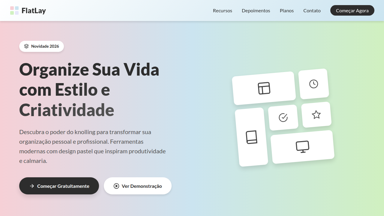
Knolling Pastel Flat Lay
Knolling landing page, flat lay style, organized objects, pastel background, clean 90 degree alignment, overhead photography look. Ideal for landing pages, modern websites. AI-ready template.
Use case: Landing pages, Modern websites
Historical Context
Knolling started on a shop floor. Andrew Kromelow, a janitor at Frank Gehry's furniture studio in 1987, began arranging tools at right angles on flat surfaces — everything parallel, everything visible. Tom Sachs adopted the practice religiously in his studio, turning it into a creative discipline. "Always be knolling" became a mantra. The idea was simple: if you can see everything, you can think clearly. Product photography picked it up fast. Magazines, catalogs, then Instagram. The flat-lay explosion of 2014–2018 turned every lifestyle brand into a knolling practitioner — skincare routines, desk setups, travel essentials, all shot from directly above on muted backgrounds. It was aspirational organization. UI design absorbed this through osmosis. The same overhead perspective, the same pastel restraint, the same obsessive alignment. E-commerce cards started mimicking flat-lay compositions. Hero sections borrowed that clinical-yet-warm tension. The photography aesthetic became the interface aesthetic — soft shadows, generous whitespace, objects floating in deliberate grids. Not skeuomorphism, not brutalism. Something quieter. Something that says: we thought about where everything goes.
When to Use
Reach for this when the product itself is the hero. E-commerce pages where you want items to feel curated, not crammed. Lifestyle brands that need warmth without visual noise. Portfolio layouts where spacing communicates taste. It works beautifully for product launches, seasonal collections, and any context where organized simplicity signals premium quality. Avoid it for data-heavy interfaces or anything requiring dense information hierarchy — knolling breathes, and it needs room to do so.
Design Principles
- Orthogonal alignment is non-negotiable — every element sits at 90° to its neighbors, no casual rotations, no 'artful' tilts
- Pastel palette as structural choice, not decoration — muted tones reduce visual weight and let product shapes do the talking
- Generous negative space is load-bearing — the emptiness between objects carries as much meaning as the objects themselves
- Top-down perspective flattens hierarchy intentionally — everything gets equal visual importance, forcing composition to create flow
- Soft shadows only, and sparingly — just enough depth to separate layers without breaking the flat-lay illusion
DESIGN.md
---
version: "alpha"
name: "Knolling Pastel Flat Lay"
description: "Knolling landing page, flat lay style, organized objects, pastel background, clean 90 degree alignment, overhead photography look. Ideal for landing pages, modern websites. AI-ready template."
colors:
  primary: "#F6D0D6"
  secondary: "#2D2D2D"
  tertiary: "#CBE4F0"
  neutral: "#D0F0C0"
  surface: "#E6E6FA"
typography:
  h1:
    fontFamily: Lato
    fontSize: 2.5rem
    fontWeight: 700
  body-md:
    fontFamily: Lato
    fontSize: 1rem
    fontWeight: 400
spacing:
  sm: 20.0px
  md: 40.0px
  lg: 80.0px
components:
  button-primary:
    backgroundColor: "{colors.primary}"
    textColor: "{colors.neutral}"
    padding: 12px
---

## Overview

Knolling landing page, flat lay style, organized objects, pastel background, clean 90 degree alignment, overhead photography look. Ideal for landing pages, modern websites. AI-ready template. Knolling started on a shop floor. Andrew Kromelow, a janitor at Frank Gehry's furniture studio in 1987, began arranging tools at right angles on flat surfaces — everything parallel, everything visible. Tom Sachs adopted the practice religiously in his studio, turning it into a creative discipline. "Always be knolling" became a mantra. The idea was simple: if you can see everything, you can think clearly.

Product photography picked it up fast. Magazines, catalogs, then Instagram. The flat-lay explosion of 2014–2018 turned every lifestyle brand into a knolling practitioner — skincare routines, desk setups, travel essentials, all shot from directly above on muted backgrounds. It was aspirational organization.

UI design absorbed this through osmosis. The same overhead perspective, the same pastel restraint, the same obsessive alignment. E-commerce cards started mimicking flat-lay compositions. Hero sections borrowed that clinical-yet-warm tension. The photography aesthetic became the interface aesthetic — soft shadows, generous whitespace, objects floating in deliberate grids. Not skeuomorphism, not brutalism. Something quieter. Something that says: we thought about where everything goes.

- Density: 3/10 — Airy
- Variance: 2/10 — Structured
- Motion: 4/10 — Subtle

- **Style:** Organized, Instructional, Calm
- **Keywords:** knolling, flat lay, organized, pastel, clean, photography, symmetrical, grid
- **Era:** Modern Photography
- **Light/Dark:** ✓ Full / ✗ No

## Colors

- **Background** (#F6D0D6) — Primary background surface
- **Text** (#2D2D2D) — Primary text color
- **Accent** (#CBE4F0) — Primary accent, CTAs and interactive elements
- **Soft Mint** (#D0F0C0) — Extended palette, decorative use
- **Lavender** (#E6E6FA) — Extended palette, decorative use
- **Shadow Grey** (#00000020) — Secondary text, borders, muted elements


## Typography

- **Display / Hero:** Lato — Weight 700, tight tracking, used for headline impact
- **Body:** Lato — Weight 400, 16px/1.6 line-height, max 72ch per line
- **UI Labels / Captions:** Lato — 0.875rem, weight 500, slight letter-spacing
- **Monospace:** JetBrains Mono — Used for code, metadata, and technical values

Scale:
- Hero: clamp(2.5rem, 5vw, 4rem)
- H1: 2.25rem
- H2: 1.5rem
- Body: 1rem / 1.6
- Small: 0.875rem


## Layout

- **Grid:** CSS Grid primary. Max-width containment: 1280px centered with 1.5rem side padding.
- **Spacing rhythm:** Balanced. Base unit: 0.5rem (8px).
- **Section vertical gaps:** clamp(4rem, 8vw, 8rem).
- **Hero layout:** Split-screen (text left, visual right).
- **Feature sections:** Zig-zag alternating text+image rows. No 3-equal-columns.
- **Mobile collapse:** All multi-column layouts collapse below 768px. No horizontal overflow.
- **z-index contract:** base (0) / sticky-nav (100) / overlay (200) / modal (300) / toast (500).


## Elevation & Depth

Photorealistic stationery items, 50/50 vertical background split, tech and analog mixture, soft natural shadows, matte paper stock.

- **Physics:** Ease-out curves, 200-300ms duration. Smooth and predictable.
- **Entry animations:** Fade + translate-Y (16px → 0) over 420ms ease-out. Staggered cascades for lists: 80ms between items.
- **Hover states:** Subtle color shift + shadow adjustment over 200ms.
- **Page transitions:** Fade only (200ms).
- **Performance:** Only transform and opacity animated. No layout-triggering properties.


## Shapes

Base corner radius: 12px. See rounded tokens in front matter for the full scale.


## Components

- **Primary Button:** Moderately rounded (0.75rem) shape. Accent color fill. Hover: 8% darken + subtle lift shadow. Active: -1px translate tactile press. Font weight 600. No outer glows.
- **Secondary / Ghost Button:** Outline variant. 1.5px border in muted color. Text in primary color. Hover: subtle background fill.
- **Cards:** Moderately rounded (0.75rem) corners. Surface background. Subtle shadow (0 2px 12px rgba(0,0,0,0.06)). 1px border stroke.
- **Inputs:** Label above input. 1px border stroke. Focus ring: 2px accent color offset 2px. Error text below in semantic red. No floating labels.
- **Navigation:** Primary surface background. Active item: accent color indicator. Font weight 500 when active.
- **Skeletons:** Shimmer animation matching component dimensions. No circular spinners.
- **Empty States:** Icon-based composition with descriptive text and action button.


## Do's and Don'ts

- No emojis in UI — use icon system only (Lucide, Heroicons)
- No pure black (#000000) — use off-black or charcoal variants
- No oversaturated accent colors (saturation cap: 80%)
- No 3-column equal-width feature layouts — use zig-zag or asymmetric grid
- No `h-screen` — use `min-h-[100dvh]`
- No AI copywriting clichés: "Elevate", "Seamless", "Unleash", "Next-Gen"
- No broken external image links — use picsum.photos or inline SVG
- No generic lorem ipsum in demos

- Do Grid alignment (Knolling)
- Do Soft pastel background split
- Do Realistic drop shadows (depth)
- Do Mixed media (tech + analog objects)
- Do Clean sans-serif type


## Use Case

Landing pages, Modern websites
Technical Specs
CSS
background-color: #F6D0D6; color: #2D2D2D; font-family: 'Lato', sans-serif; display: grid; grid-template-columns: repeat(auto-fill, minmax(100px, 1fr)); gap: 20px; box-shadow: 2px 2px 5px rgba(0,0,0,0.1);
Variables
--bg-pink: #F6D0D6, --bg-blue: #CBE4F0, --text-dark: #2D2D2D, --font-clean: 'Lato', sans-serif, --shadow-soft: 0 4px 6px rgba(0,0,0,0.1)
Checklist
☐ Grid alignment (Knolling), ☐ Soft pastel background split, ☐ Realistic drop shadows (depth), ☐ Mixed media (tech + analog objects), ☐ Clean sans-serif type
Colors
Primary
Secondary
Effects
Photorealistic stationery items, 50/50 vertical background split, tech and analog mixture, soft natural shadows, matte paper stock.
Light/Dark
✓ Full / ✗ No
AI Prompt
Act as a Senior Frontend Engineer and Expert UI Designer.
Your task is to code a complete Landing Page on the first attempt.
- Landing Page Theme: <INSERT THEME>
- Sections to add: <INSERT SECTIONS>

Generate the final code immediately following these definitions:

## Style

- **Name:** Knolling Pastel Flat Lay
- **Type:** Organized, Instructional, Calm
- **Keywords:** knolling, flat lay, organized, pastel, clean, photography, symmetrical, grid
- **Era:** Modern Photography
- **Light/Dark:** ✓ Full / ✗ No

## Color Palette

- **Primary:** Background #F6D0D6, Text #2D2D2D, Accent #CBE4F0
- **Secondary:** Soft Mint #D0F0C0, Lavender #E6E6FA, Shadow Grey #00000020

## Visual Effects

Photorealistic stationery items, 50/50 vertical background split, tech and analog mixture, soft natural shadows, matte paper stock.

## AI Visual Direction

knolling landing page, flat lay style, organized objects, pastel background, clean 90 degree alignment, overhead photography look

## CSS Technical

```css
background-color: #F6D0D6; color: #2D2D2D; font-family: 'Lato', sans-serif; display: grid; grid-template-columns: repeat(auto-fill, minmax(100px, 1fr)); gap: 20px; box-shadow: 2px 2px 5px rgba(0,0,0,0.1);
```

## Design System Variables

```css
--bg-pink: #F6D0D6, --bg-blue: #CBE4F0, --text-dark: #2D2D2D, --font-clean: 'Lato', sans-serif, --shadow-soft: 0 4px 6px rgba(0,0,0,0.1)
```

## Implementation Checklist

- ☐ Grid alignment (Knolling)
- ☐ Soft pastel background split
- ☐ Realistic drop shadows (depth)
- ☐ Mixed media (tech + analog objects)
- ☐ Clean sans-serif type

## Execution Rules

1. Strictly follow the defined visual style.
2. Use high-quality inline SVG icons (Heroicons or Lucide style) — NEVER use emojis as icons.
3. Add `cursor-pointer` and smooth `hover` states (transition-all) on all interactive elements.
4. Required Page Structure:
   - Navbar (Logo + Links + CTA)
   - Hero Section (Impactful Headline + Subtitle + 2 buttons + 3D/Abstract visual element via CSS)
   - Features (3 cards with icons)
   - Testimonials (3 cards)
   - Pricing (3 tiers, highlight the middle one)
   - Final CTA
   - Full Footer with social links, privacy policy, terms of use, contact and SEO links.
5. All text content must be in English.
6. The visual must be CLEARLY distinct — do not create a "default Bootstrap" design. Force the use of the provided design system variables.
7. Use `<style>` tags in the head for custom classes (especially for complex backdrop-filter effects and animations) that Tailwind CDN doesn't cover.
8. Full Responsiveness: Layout must adapt perfectly to Mobile, Tablet and Desktop (vertical stack on mobile).
9. Include basic SEO, Viewport and Open Graph meta tags in `<head>`.
10. Footer must contain: Copyright 2026, Secondary navigation links and Social media icons.
11. Make the creative decisions needed to deliver the complete, functional result now.
Related
Last synced: 4/1/2026