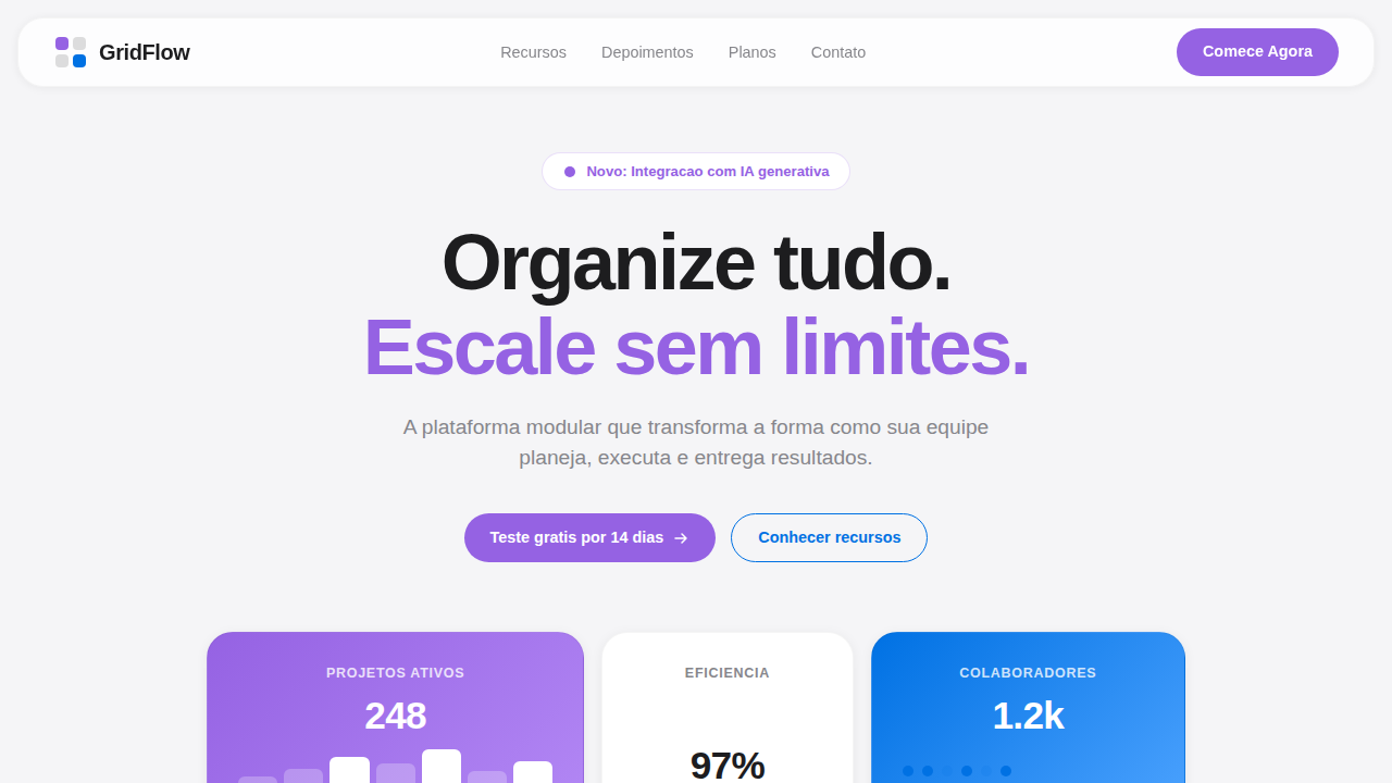
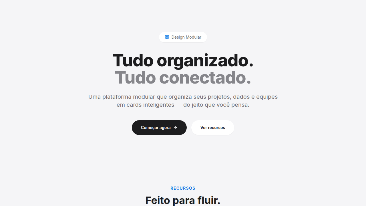
Bento Grid Tech Minimalist
Bento grid landing page, apple style aesthetic, modular layout, rounded cards, clean minimalist tech, organized grid system. Ideal for landing pages, modern websites. AI-ready template.
Use case: Landing pages, Modern websites
Historical Context
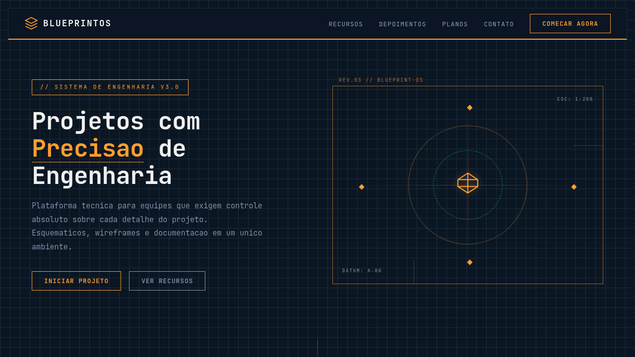
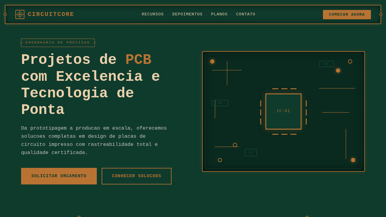
Apple made bento grids famous with those splashy keynote slides — big rounded cards, candy gradients, product shots floating in space. Beautiful stuff. But somewhere around 2021, a quieter mutation emerged. Linear shipped their landing page with bento cards that felt more like terminal windows than marketing material. Dark backgrounds, monospace type, subtle borders that barely whispered. Vercel followed. Then Raycast. The pattern crystallized into something distinctly developer-facing. This tech-minimalist variant strips the bento grid down to its structural bones. Where Apple uses the format to dazzle, dev-tool companies use it to organize. The cards become containers for code snippets, API response previews, architecture diagrams. Color is functional, not decorative — maybe a single accent against near-black surfaces. The grid itself does the talking. What's interesting is how this restraint actually increases information density. You can pack more into a bento layout when you're not competing with gradients and blur effects. Companies like Planetscale, Railway, and Resend understood this early. The grid becomes documentation that happens to look good, rather than marketing that happens to contain information.
When to Use
Reach for this when your product speaks to technical audiences who distrust flash. API documentation landing pages, developer tool feature breakdowns, infrastructure product marketing — anywhere the content itself (code blocks, terminal output, schema diagrams) needs to be the hero. Works exceptionally well when you have 4-8 distinct features that benefit from visual separation without narrative flow. Skip it if your audience needs emotional persuasion over logical organization.
Design Principles
- Borders over shadows — use 1px borders at 8-12% opacity to define cards, never drop shadows that lift elements off the surface
- Monochromatic with surgical accent — one highlight color maximum, applied only to interactive elements or key data points
- Content-first density — cards should feel like they contain real artifacts (code, diagrams, metrics), not marketing abstractions
- Asymmetric grid rhythm — mix 1:2 and 2:1 column spans to create visual hierarchy without relying on type scale alone
- Negative space as structure — generous internal padding and grid gaps replace decorative elements as the primary design language
Technical Specs
Colors
Primary
Secondary
Effects
Modular bento-box layout, rounded container corners (squircles), large typographic metrics, minimalist iconography, smooth matte finish.
Light/Dark
✓ Full / ◐ Part
Related
Last synced: 4/1/2026