Kinetic Typography
Design with kinetic typography. Ideal for landing pages, saas. AI-ready template.
Use case: Landing pages, SaaS
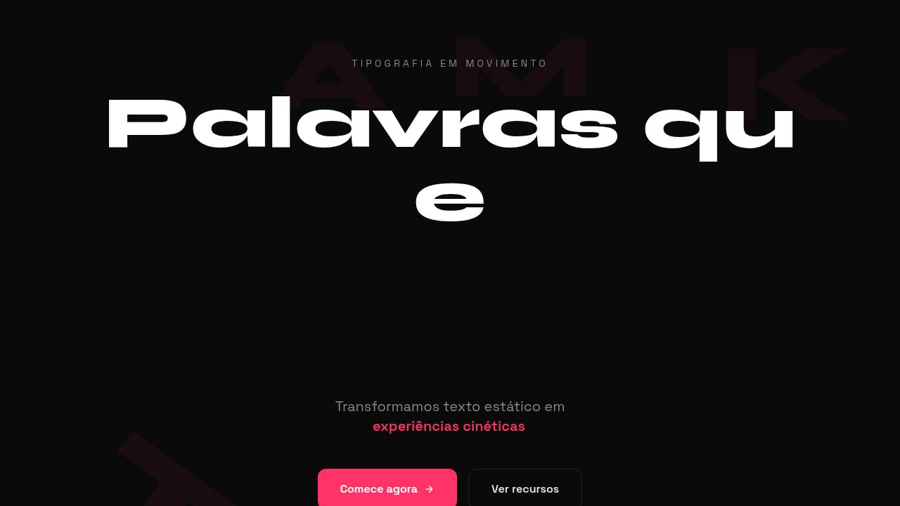
Historical Context
Kinetic typography didn't start on the web. It started in darkened theaters — Saul Bass splitting words apart for Hitchcock, letters crashing into frame with the weight of a plot twist. The idea was radical: text isn't just something you read. It's something you feel. That philosophy sat dormant in motion graphics for decades, confined to After Effects timelines and broadcast bumpers. Then the web caught up. GSAP's SplitText made character-level control trivial. Framer Motion brought spring physics to individual glyphs. Suddenly, a headline could stagger in letter by letter, words could scatter on scroll, entire paragraphs could breathe with viewport movement. The barrier dropped from 'hire a motion studio' to 'npm install.' What matters now isn't the technology — it's the intent. The best kinetic type on the web today treats letterforms as choreography. Each character has timing, weight, personality. Text stopped being content to animate around. It became the animation itself.
When to Use
When the words ARE the experience. Agency homepages where the brand voice needs to hit physically. Portfolio pieces where craft demonstration matters more than information density. Music and entertainment sites where energy trumps readability. Brand launches where a single phrase needs to land with cinematic weight. Skip it entirely for content-heavy pages, documentation, or anywhere users need to actually read at speed. Kinetic type is a statement — not a utility.
Design Principles
- Legibility survives motion — if you can't read it mid-animation, the animation fails. Every frame should produce recognizable words.
- Timing is meaning — a slow reveal implies gravitas, a snap-in implies confidence. Don't animate at arbitrary speeds. Choose duration like you choose a typeface.
- One technique per viewport — stagger OR scale OR path. Combining multiple kinetic effects creates noise, not sophistication. Restraint separates craft from chaos.
- Respect the scroll contract — if text animates on scroll, the user must feel in control. Scrub-linked animations feel intentional. Autoplay animations mid-scroll feel like interruptions.
- Performance is non-negotiable — animate transform and opacity only. A janky text animation is worse than static text. 60fps or don't ship it.
DESIGN.md
---
version: "alpha"
name: "Kinetic Typography"
description: "Design with kinetic typography. Ideal for landing pages, saas. AI-ready template."
colors:
  primary: "#1A1A1A"
  secondary: "#4A4A4A"
  tertiary: "#0066FF"
  neutral: "#FFFFFF"
typography:
  h1:
    fontFamily: System UI stack
    fontSize: 2.25rem
    fontWeight: 700
  body-md:
    fontFamily: System UI stack
    fontSize: 1rem
    fontWeight: 400
  label-caps:
    fontFamily: System UI stack
    fontSize: 0.75rem
    fontWeight: 500
---

## Overview

Design with kinetic typography. Ideal for landing pages, saas. AI-ready template. Kinetic typography didn't start on the web. It started in darkened theaters — Saul Bass splitting words apart for Hitchcock, letters crashing into frame with the weight of a plot twist. The idea was radical: text isn't just something you read. It's something you feel. That philosophy sat dormant in motion graphics for decades, confined to After Effects timelines and broadcast bumpers.

Then the web caught up. GSAP's SplitText made character-level control trivial. Framer Motion brought spring physics to individual glyphs. Suddenly, a headline could stagger in letter by letter, words could scatter on scroll, entire paragraphs could breathe with viewport movement. The barrier dropped from 'hire a motion studio' to 'npm install.'

What matters now isn't the technology — it's the intent. The best kinetic type on the web today treats letterforms as choreography. Each character has timing, weight, personality. Text stopped being content to animate around. It became the animation itself.

- Density: 5/10 — Balanced
- Variance: 4/10 — Moderate
- Motion: 6/10 — Expressive

- **Style:** Typographic, Animated, Expressive, Dynamic
- **Keywords:** Motion text, animated type, moving letters, dynamic, typing effect, morphing, scroll-triggered text
- **Era:** 2020s Modern
- **Light/Dark:** ✓ Full / ✓ Full

## Colors

- Palette derived from style keywords and era context


## Typography

- **Display / Hero:** System UI stack (-apple-system, sans-serif) — Weight 700, tight tracking, used for headline impact
- **Body:** System UI stack (-apple-system, sans-serif) — Weight 400, 16px/1.6 line-height, max 72ch per line
- **UI Labels / Captions:** System UI stack (-apple-system, sans-serif) — 0.875rem, weight 500, slight letter-spacing
- **Monospace:** JetBrains Mono — Used for code, metadata, and technical values

Scale:
- Hero: clamp(2.5rem, 5vw, 4rem)
- H1: 2.25rem
- H2: 1.5rem
- Body: 1rem / 1.6
- Small: 0.875rem


## Layout

- **Grid:** CSS Grid primary. Max-width containment: 1280px centered with 1.5rem side padding.
- **Spacing rhythm:** Balanced. Base unit: 0.5rem (8px).
- **Section vertical gaps:** clamp(4rem, 8vw, 8rem).
- **Hero layout:** Split-screen (text left, visual right).
- **Feature sections:** Zig-zag alternating text+image rows. No 3-equal-columns.
- **Mobile collapse:** All multi-column layouts collapse below 768px. No horizontal overflow.
- **z-index contract:** base (0) / sticky-nav (100) / overlay (200) / modal (300) / toast (500).


## Elevation & Depth

@keyframes text animation, typing effect, background-clip: text, GSAP ScrollTrigger, split text

- **Physics:** Spring — stiffness 120, damping 20. Confident, weighted transitions.
- **Entry animations:** Fade + translate-Y (16px → 0) over 480ms ease-out. Staggered cascades for lists: 100ms between items.
- **Hover states:** Scale(1.03) + shadow lift over 200ms.
- **Page transitions:** Fade + slide (300ms).
- **Performance:** Only transform and opacity animated. No layout-triggering properties.


## Shapes

Base corner radius: 8px. See rounded tokens in front matter for the full scale.


## Components

- **Primary Button:** Subtly rounded (0.5rem) shape. Accent color fill. Hover: 8% darken + subtle lift shadow. Active: -1px translate tactile press. Font weight 600. No outer glows.
- **Secondary / Ghost Button:** Outline variant. 1.5px border in muted color. Text in primary color. Hover: subtle background fill.
- **Cards:** Subtly rounded (0.5rem) corners. Surface background. Subtle shadow (0 2px 12px rgba(0,0,0,0.06)). 1px border stroke.
- **Inputs:** Label above input. 1px border stroke. Focus ring: 2px accent color offset 2px. Error text below in semantic red. No floating labels.
- **Navigation:** Primary surface background. Active item: accent color indicator. Font weight 500 when active.
- **Skeletons:** Shimmer animation matching component dimensions. No circular spinners.
- **Empty States:** Icon-based composition with descriptive text and action button.


## Do's and Don'ts

- No emojis in UI — use icon system only (Lucide, Heroicons)
- No pure black (#000000) — use off-black or charcoal variants
- No oversaturated accent colors (saturation cap: 80%)
- No 3-column equal-width feature layouts — use zig-zag or asymmetric grid
- No `h-screen` — use `min-h-[100dvh]`
- No AI copywriting clichés: "Elevate", "Seamless", "Unleash", "Next-Gen"
- No broken external image links — use picsum.photos or inline SVG
- No generic lorem ipsum in demos

- Do Text animations smooth
- Do Prefers-reduced-motion respected
- Do Fallback for no-JS
- Do Mobile performance ok
- Do Typing effect timed
- Do Scroll triggers work


## Use Case

Landing pages, SaaS
Technical Specs
CSS
@keyframes for text animation, background-clip: text, GSAP SplitText, typing effect (steps()), transform on letters, scroll-triggered (Intersection Observer), variable fonts for morphing
Variables
--text-animation-duration: 1s, --letter-delay: 0.05s, --typing-speed: 100ms, --gradient-text: linear-gradient(90deg, #color1, #color2), --morph-duration: 0.5s
Checklist
☐ Text animations smooth, ☐ Prefers-reduced-motion respected, ☐ Fallback for no-JS, ☐ Mobile performance ok, ☐ Typing effect timed, ☐ Scroll triggers work
Colors
Effects
@keyframes text animation, typing effect, background-clip: text, GSAP ScrollTrigger, split text
Light/Dark
✓ Full / ✓ Full
AI Prompt
Act as a Senior Frontend Engineer and Expert UI Designer.
Your task is to code a complete Landing Page on the first attempt.
- Landing Page Theme: <INSERT THEME>
- Sections to add: <INSERT SECTIONS>

Generate the final code immediately following these definitions:

## Style

- **Name:** Kinetic Typography
- **Type:** Typographic, Animated, Expressive, Dynamic
- **Keywords:** Motion text, animated type, moving letters, dynamic, typing effect, morphing, scroll-triggered text
- **Era:** 2020s Modern
- **Light/Dark:** ✓ Full / ✓ Full

## Color Palette

- **Primary:** Flexible - high contrast recommended, bold colors for emphasis, animation-friendly palette
- **Secondary:** Accent colors for emphasis, transition colors, gradient text fills

## Visual Effects

@keyframes text animation, typing effect, background-clip: text, GSAP ScrollTrigger, split text

## AI Visual Direction

Design with kinetic typography. Use: animated text, scroll-triggered reveals, typing effects, letter-by-letter animations, morphing text, gradient text fills, oversized hero text, text as the main visual element.

## CSS Technical

```css
@keyframes for text animation, background-clip: text, GSAP SplitText, typing effect (steps()), transform on letters, scroll-triggered (Intersection Observer), variable fonts for morphing
```

## Design System Variables

```css
--text-animation-duration: 1s, --letter-delay: 0.05s, --typing-speed: 100ms, --gradient-text: linear-gradient(90deg, #color1, #color2), --morph-duration: 0.5s
```

## Implementation Checklist

- ☐ Text animations smooth
- ☐ Prefers-reduced-motion respected
- ☐ Fallback for no-JS
- ☐ Mobile performance ok
- ☐ Typing effect timed
- ☐ Scroll triggers work

## Execution Rules

1. Strictly follow the defined visual style.
2. Use high-quality inline SVG icons (Heroicons or Lucide style) — NEVER use emojis as icons.
3. Add `cursor-pointer` and smooth `hover` states (transition-all) on all interactive elements.
4. Required Page Structure:
   - Navbar (Logo + Links + CTA)
   - Hero Section (Impactful Headline + Subtitle + 2 buttons + 3D/Abstract visual element via CSS)
   - Features (3 cards with icons)
   - Testimonials (3 cards)
   - Pricing (3 tiers, highlight the middle one)
   - Final CTA
   - Full Footer with social links, privacy policy, terms of use, contact and SEO links.
5. All text content must be in English.
6. The visual must be CLEARLY distinct — do not create a "default Bootstrap" design. Force the use of the provided design system variables.
7. Use `<style>` tags in the head for custom classes (especially for complex backdrop-filter effects and animations) that Tailwind CDN doesn't cover.
8. Full Responsiveness: Layout must adapt perfectly to Mobile, Tablet and Desktop (vertical stack on mobile).
9. Include basic SEO, Viewport and Open Graph meta tags in `<head>`.
10. Footer must contain: Copyright 2026, Secondary navigation links and Social media icons.
11. Make the creative decisions needed to deliver the complete, functional result now.
Related
Last synced: 4/1/2026