Horror / Gothic Dark
Horror gothic dark interface. Ideal for landing pages, saas. AI-ready template.
Use case: Landing pages, SaaS
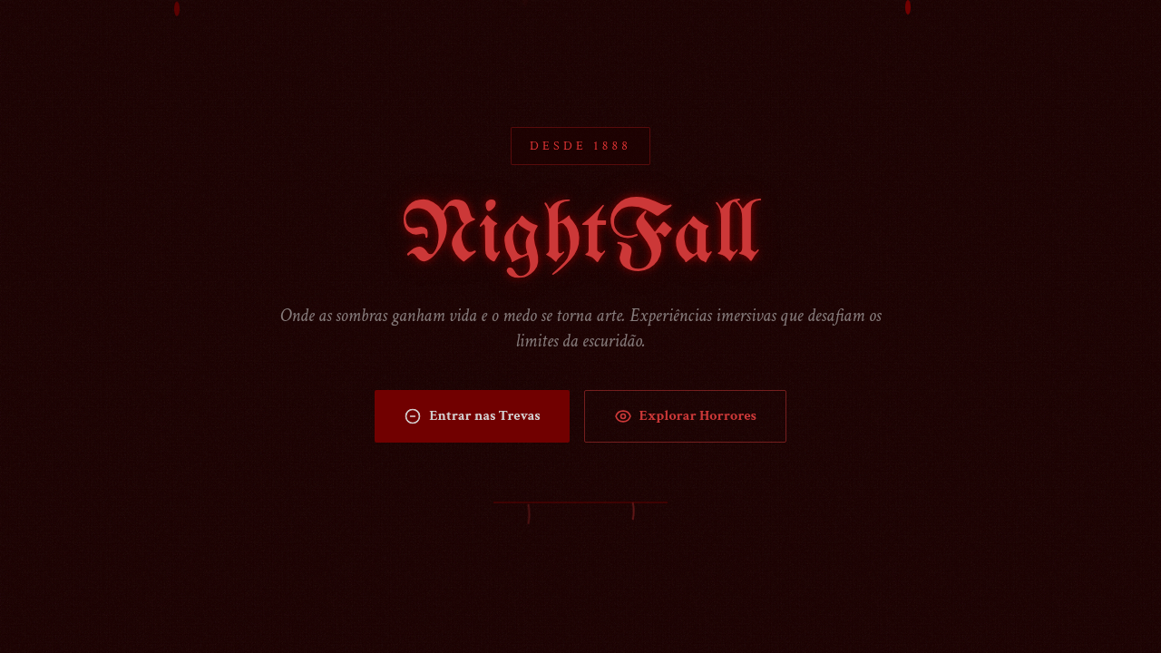
Historical Context
Gothic design didn't start on screens. It started in cathedrals — pointed arches, grotesques, the deliberate orchestration of shadow to make you feel small. That psychological weight carried straight into print (penny dreadfuls, Hammer Horror posters) and eventually into digital. The tradition is about controlled dread. When Resident Evil dropped in '96, the UI was part of the horror. That heartbeat monitor, the inventory screen that looked like a blood-stained notebook — every pixel reinforced vulnerability. Bloodborne pushed it further: the HUD barely existed, letting the architecture and fog do the emotional work. Silent Hill's grain and rust. Darkest Dungeon's woodcut stress meters. These aren't decorative choices. They're tension systems. Dark atmospheric design works because it restricts information. You can't see everything. The palette is suffocating. Typography feels carved, not typed. When done right, the interface itself becomes a source of unease — which is exactly the point.
When to Use
When the product needs to evoke dread, intensity, or dark grandeur. Horror games, obviously. But also gothic fashion brands, Halloween campaigns, dark entertainment platforms, metal music sites, haunted attractions, true crime content. Works when your audience wants to feel something visceral — not comforted. Avoid if accessibility is paramount or if the darkness is purely aesthetic with no narrative backing it. This theme demands commitment. Half-gothic looks like a costume.
Design Principles
- Restrict visibility — withhold information through deep blacks, narrow value ranges, and selective reveals to build tension
- Let typography bleed — use blackletter, distressed serifs, or hand-carved faces that feel ancient and slightly wrong, never clean sans-serifs
- Blood red is earned — reserve saturated reds and crimsons for moments of impact; overuse kills the drama
- Texture over flatness — grain, noise, scratches, vignettes; gothic surfaces should feel decayed and tactile, never pristine
- Sound the architecture — pointed shapes, vertical emphasis, heavy borders; the layout itself should loom over the viewer like a cathedral nave
DESIGN.md
---
version: "alpha"
name: "Horror / Gothic Dark"
description: "Horror gothic dark interface. Ideal for landing pages, saas. AI-ready template."
colors:
  primary: "#1A0000"
  secondary: "#FF5050"
  tertiary: "#8B0000"
  neutral: "#800000"
  surface: "#FFFFFF"
  accent: "#330000"
typography:
  h1:
    fontFamily: gothic/blackletter
    fontSize: 2.25rem
    fontWeight: 700
  body-md:
    fontFamily: gothic/blackletter
    fontSize: 1rem
    fontWeight: 400
  label-caps:
    fontFamily: gothic/blackletter
    fontSize: 0.75rem
    fontWeight: 500
components:
  button-primary:
    backgroundColor: "{colors.primary}"
    textColor: "{colors.neutral}"
    padding: 12px
---

## Overview

Horror gothic dark interface. Ideal for landing pages, saas. AI-ready template. Gothic design didn't start on screens. It started in cathedrals — pointed arches, grotesques, the deliberate orchestration of shadow to make you feel small. That psychological weight carried straight into print (penny dreadfuls, Hammer Horror posters) and eventually into digital. The tradition is about controlled dread.

When Resident Evil dropped in '96, the UI was part of the horror. That heartbeat monitor, the inventory screen that looked like a blood-stained notebook — every pixel reinforced vulnerability. Bloodborne pushed it further: the HUD barely existed, letting the architecture and fog do the emotional work. Silent Hill's grain and rust. Darkest Dungeon's woodcut stress meters. These aren't decorative choices. They're tension systems.

Dark atmospheric design works because it restricts information. You can't see everything. The palette is suffocating. Typography feels carved, not typed. When done right, the interface itself becomes a source of unease — which is exactly the point.

- Density: 5/10 — Balanced
- Variance: 8/10 — Expressive
- Motion: 6/10 — Expressive

- **Style:** Dark, Gothic, Dramatic, Mysterious
- **Keywords:** Ominous, dramatic, intense, mysterious, dark textures, dripping effects, gothic typography, grunge, distressed, blood-red, haunted
- **Era:** Gothic Horror
- **Light/Dark:** ✗ No / ✓ Only

## Colors

- **Deep Blood** (#1A0000) — Primary surface or dominant color
- **Blood Red** (#FF5050) — Error states, destructive actions
- **Dark Crimson** (#8B0000) — Dark surface, primary background
- **Maroon** (#800000) — Supporting palette color
- **Pure White** (#FFFFFF) — Secondary surface
- **Dark Red** (#330000) — Deep contrast surface


## Typography

- **Display / Hero:** gothic/blackletter — Weight 700, tight tracking, used for headline impact
- **Body:** gothic/blackletter — Weight 400, 16px/1.6 line-height, max 72ch per line
- **UI Labels / Captions:** gothic/blackletter — 0.875rem, weight 500, slight letter-spacing
- **Monospace:** JetBrains Mono — Used for code, metadata, and technical values

Scale:
- Hero: clamp(2.5rem, 5vw, 4rem)
- H1: 2.25rem
- H2: 1.5rem
- Body: 1rem / 1.6
- Small: 0.875rem


## Layout

- **Grid:** CSS Grid primary. Max-width containment: 1280px centered with 1.5rem side padding.
- **Spacing rhythm:** Balanced. Base unit: 0.5rem (8px).
- **Section vertical gaps:** clamp(4rem, 8vw, 8rem).
- **Hero layout:** Asymmetric composition.
- **Feature sections:** Asymmetric grid with varied card sizes. No 3-equal-columns.
- **Mobile collapse:** All multi-column layouts collapse below 768px. No horizontal overflow.
- **z-index contract:** base (0) / sticky-nav (100) / overlay (200) / modal (300) / toast (500).


## Elevation & Depth

Low-key dramatic shadows, blood-red highlights, dripping animations, flicker effects, grunge texture overlays, eerie hover transitions, fog/mist effects

- **Physics:** Spring — stiffness 120, damping 20. Confident, weighted transitions.
- **Entry animations:** Fade + translate-Y (16px → 0) over 480ms ease-out. Staggered cascades for lists: 100ms between items.
- **Hover states:** Scale(1.03) + shadow lift over 200ms.
- **Page transitions:** Fade + slide (300ms).
- **Performance:** Only transform and opacity animated. No layout-triggering properties.


## Shapes

Base corner radius: 8px. See rounded tokens in front matter for the full scale.


## Components

- **Primary Button:** Subtly rounded (0.5rem) shape. Accent color fill. Hover: 8% darken + subtle lift shadow. Active: -1px translate tactile press. Font weight 600. No outer glows.
- **Secondary / Ghost Button:** Outline variant. 1.5px border in muted color. Text in primary color. Hover: subtle background fill.
- **Cards:** Subtly rounded (0.5rem) corners. Surface background. Subtle shadow (0 2px 12px rgba(0,0,0,0.06)). 1px border stroke.
- **Inputs:** Label above input. 1px border stroke. Focus ring: 2px accent color offset 2px. Error text below in semantic red. No floating labels.
- **Navigation:** Primary surface background. Active item: accent color indicator. Font weight 500 when active.
- **Skeletons:** Shimmer animation matching component dimensions. No circular spinners.
- **Empty States:** Icon-based composition with descriptive text and action button.


## Do's and Don'ts

- No emojis in UI — use icon system only (Lucide, Heroicons)
- No pure white (#FFFFFF) backgrounds — use off-white or dark surfaces
- No oversaturated accent colors (saturation cap: 80%)
- No 3-column equal-width feature layouts — use zig-zag or asymmetric grid
- No `h-screen` — use `min-h-[100dvh]`
- No AI copywriting clichés: "Elevate", "Seamless", "Unleash", "Next-Gen"
- No broken external image links — use picsum.photos or inline SVG
- No generic lorem ipsum in demos

- Do Dark background dominant
- Do Blood-red accents
- Do Gothic typography
- Do Grunge textures
- Do Dramatic shadows
- Do Eerie atmosphere


## Use Case

Landing pages, SaaS
Technical Specs
CSS
background: #1A0000 with grunge texture, color: #FF5050, font-family: gothic/blackletter, text-shadow: 0 0 10px rgba(255,0,0,0.5), animation: flicker, filter: contrast(1.2) brightness(0.8), drip SVG effects
Variables
--blood-bg: #1A0000, --blood-red: #FF5050, --dark-crimson: #8B0000, --maroon: #800000, --grunge-opacity: 0.3, --flicker-duration: 0.1s
Checklist
☐ Dark background dominant, ☐ Blood-red accents, ☐ Gothic typography, ☐ Grunge textures, ☐ Dramatic shadows, ☐ Eerie atmosphere
Colors
Primary
Secondary
Effects
Low-key dramatic shadows, blood-red highlights, dripping animations, flicker effects, grunge texture overlays, eerie hover transitions, fog/mist effects
Light/Dark
✗ No / ✓ Only
AI Prompt
Act as a Senior Frontend Engineer and Expert UI Designer.
Your task is to code a complete Landing Page on the first attempt.
- Landing Page Theme: <INSERT THEME>
- Sections to add: <INSERT SECTIONS>

Generate the final code immediately following these definitions:

## Style

- **Name:** Horror / Gothic Dark
- **Type:** Dark, Gothic, Dramatic, Mysterious
- **Keywords:** Ominous, dramatic, intense, mysterious, dark textures, dripping effects, gothic typography, grunge, distressed, blood-red, haunted
- **Era:** Gothic Horror
- **Light/Dark:** ✗ No / ✓ Only

## Color Palette

- **Primary:** Deep Blood #1A0000, Blood Red #FF5050, Dark Crimson #8B0000, Maroon #800000
- **Secondary:** Pure White #FFFFFF, Dark Red #330000, charcoal, grunge textures, distressed overlays

## Visual Effects

Low-key dramatic shadows, blood-red highlights, dripping animations, flicker effects, grunge texture overlays, eerie hover transitions, fog/mist effects

## AI Visual Direction

Design a horror gothic dark interface. Use: deep dark backgrounds (#1A0000), blood-red accents, gothic typography, dripping effects, grunge textures, dramatic shadows, distressed overlays, eerie atmosphere, haunted aesthetic.

## CSS Technical

```css
background: #1A0000 with grunge texture, color: #FF5050, font-family: gothic/blackletter, text-shadow: 0 0 10px rgba(255,0,0,0.5), animation: flicker, filter: contrast(1.2) brightness(0.8), drip SVG effects
```

## Design System Variables

```css
--blood-bg: #1A0000, --blood-red: #FF5050, --dark-crimson: #8B0000, --maroon: #800000, --grunge-opacity: 0.3, --flicker-duration: 0.1s
```

## Implementation Checklist

- ☐ Dark background dominant
- ☐ Blood-red accents
- ☐ Gothic typography
- ☐ Grunge textures
- ☐ Dramatic shadows
- ☐ Eerie atmosphere

## Execution Rules

1. Strictly follow the defined visual style.
2. Use high-quality inline SVG icons (Heroicons or Lucide style) — NEVER use emojis as icons.
3. Add `cursor-pointer` and smooth `hover` states (transition-all) on all interactive elements.
4. Required Page Structure:
   - Navbar (Logo + Links + CTA)
   - Hero Section (Impactful Headline + Subtitle + 2 buttons + 3D/Abstract visual element via CSS)
   - Features (3 cards with icons)
   - Testimonials (3 cards)
   - Pricing (3 tiers, highlight the middle one)
   - Final CTA
   - Full Footer with social links, privacy policy, terms of use, contact and SEO links.
5. All text content must be in English.
6. The visual must be CLEARLY distinct — do not create a "default Bootstrap" design. Force the use of the provided design system variables.
7. Use `<style>` tags in the head for custom classes (especially for complex backdrop-filter effects and animations) that Tailwind CDN doesn't cover.
8. Full Responsiveness: Layout must adapt perfectly to Mobile, Tablet and Desktop (vertical stack on mobile).
9. Include basic SEO, Viewport and Open Graph meta tags in `<head>`.
10. Footer must contain: Copyright 2026, Secondary navigation links and Social media icons.
11. Make the creative decisions needed to deliver the complete, functional result now.
Related
Last synced: 4/1/2026