Geometric
Geometric patterns infographic. Ideal for landing pages, modern websites. AI-ready template.
Use case: Landing pages, Modern websites
Historical Context
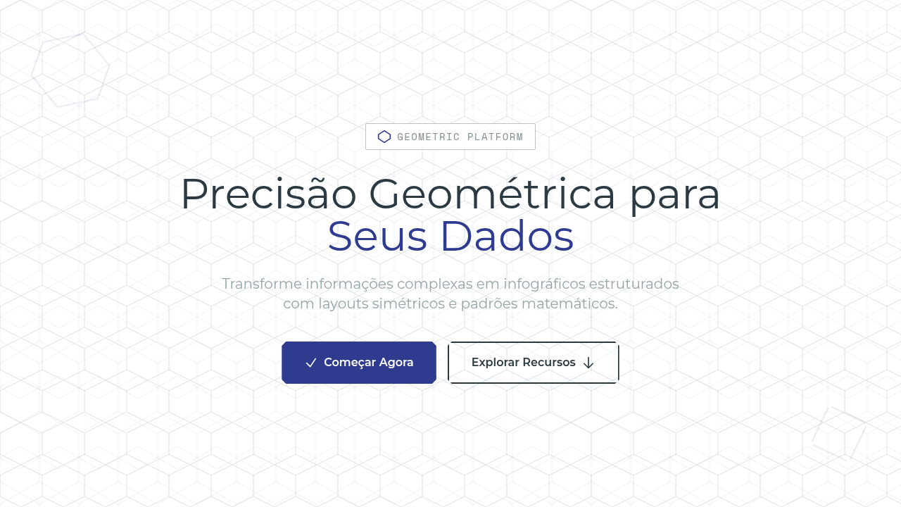
Geometry has always been the skeleton of clear thinking. Long before software existed, cartographers and engineers used grids, triangles, and hexagonal tessellations to impose legibility on chaos. The idea is simple: mathematical relationships don't lie. A circle divided into proportional arcs communicates ratio faster than any paragraph ever could. The Bauhaus understood this instinctively. Kandinsky's point-line-plane framework wasn't just art theory — it was information architecture avant la lettre. When Swiss designers later codified the grid system in the 1950s, they were essentially building the first design systems for data. Josef Müller-Brockmann's concert posters proved that geometric constraint doesn't flatten expression; it amplifies signal. Today geometric infographics carry that same DNA. Tessellation patterns tile complex datasets into digestible units. Symmetrical layouts create visual anchors so the eye knows where to rest and where to read. The math does the heavy lifting — the designer's job is choosing which geometry serves the story.
When to Use
Reach for geometric infographics when your data has inherent structure — hierarchies, proportions, cyclical processes, or comparative sets. They shine in corporate reports where credibility matters more than charm, in architectural documentation where precision is non-negotiable, and in technical papers where the audience already thinks in systems. If your dataset is messy, emotional, or narrative-driven, look elsewhere. Geometry rewards order. It punishes ambiguity.
Design Principles
- Let mathematical relationships dictate visual relationships — if two values share a 3:1 ratio, the shapes should too. No decorative distortion.
- Anchor every composition with a visible grid. The grid isn't scaffolding you remove later; it's part of the communication.
- Limit your geometric vocabulary per piece. Circles OR hexagons OR triangles — mixing primitives without reason creates noise, not richness.
- Use symmetry as a default, asymmetry as emphasis. Breaking the pattern should mean something.
- Color is secondary to structure. The infographic should remain legible in grayscale; chromatic coding is a layer, never the foundation.
DESIGN.md
---
version: "alpha"
name: "Geometric"
description: "Geometric patterns infographic. Ideal for landing pages, modern websites. AI-ready template."
colors:
  primary: "#FFFFFF"
  secondary: "#2B3A42"
  tertiary: "#2E3B8F"
  neutral: "#34495E"
  surface: "#BDC3C7"
  accent: "#95A5A6"
typography:
  h1:
    fontFamily: System UI stack
    fontSize: 2.25rem
    fontWeight: 700
  body-md:
    fontFamily: System UI stack
    fontSize: 1rem
    fontWeight: 400
  label-caps:
    fontFamily: System UI stack
    fontSize: 0.75rem
    fontWeight: 500
components:
  button-primary:
    backgroundColor: "{colors.primary}"
    textColor: "{colors.neutral}"
    padding: 12px
---

## Overview

Geometric patterns infographic. Ideal for landing pages, modern websites. AI-ready template. Geometry has always been the skeleton of clear thinking. Long before software existed, cartographers and engineers used grids, triangles, and hexagonal tessellations to impose legibility on chaos. The idea is simple: mathematical relationships don't lie. A circle divided into proportional arcs communicates ratio faster than any paragraph ever could.

The Bauhaus understood this instinctively. Kandinsky's point-line-plane framework wasn't just art theory — it was information architecture avant la lettre. When Swiss designers later codified the grid system in the 1950s, they were essentially building the first design systems for data. Josef Müller-Brockmann's concert posters proved that geometric constraint doesn't flatten expression; it amplifies signal.

Today geometric infographics carry that same DNA. Tessellation patterns tile complex datasets into digestible units. Symmetrical layouts create visual anchors so the eye knows where to rest and where to read. The math does the heavy lifting — the designer's job is choosing which geometry serves the story.

- Density: 7/10 — Compact
- Variance: 2/10 — Structured
- Motion: 6/10 — Expressive

- **Style:** Infographic
- **Keywords:** Geometric shapes, tessellation patterns, symmetrical layouts, mathematical diagrams, grid-based, precise lines, structured, modern, technical
- **Era:** Modern Technical
- **Light/Dark:** ✓ Full / ✓ Full

## Colors

- **White** (#FFFFFF) — Light surface, card backgrounds
- **Dark Teal** (#2B3A42) — Dark surface, primary background
- **Navy** (#2E3B8F) — Supporting palette color
- **Dark Slate** (#34495E) — Dark surface, primary background
- **Silver Grey** (#BDC3C7) — Secondary text, borders, muted elements
- **Cool Grey** (#95A5A6) — Secondary text, borders, muted elements
- **Medium Grey** (#7F8C8D) — Secondary text, borders, muted elements
- **Light Grey** (#ECF0F1) — Secondary text, borders, muted elements


## Typography

- **Display / Hero:** System UI stack (-apple-system, sans-serif) — Weight 700, tight tracking, used for headline impact
- **Body:** System UI stack (-apple-system, sans-serif) — Weight 400, 16px/1.6 line-height, max 72ch per line
- **UI Labels / Captions:** System UI stack (-apple-system, sans-serif) — 0.875rem, weight 500, slight letter-spacing
- **Monospace:** JetBrains Mono — Used for code, metadata, and technical values

Scale:
- Hero: clamp(2.5rem, 5vw, 4rem)
- H1: 2.25rem
- H2: 1.5rem
- Body: 1rem / 1.6
- Small: 0.875rem


## Layout

- **Grid:** CSS Grid primary. Max-width containment: 1280px centered with 1.5rem side padding.
- **Spacing rhythm:** Balanced. Base unit: 0.5rem (8px).
- **Section vertical gaps:** clamp(4rem, 8vw, 8rem).
- **Hero layout:** Split-screen (text left, visual right).
- **Feature sections:** Zig-zag alternating text+image rows. No 3-equal-columns.
- **Mobile collapse:** All multi-column layouts collapse below 768px. No horizontal overflow.
- **z-index contract:** base (0) / sticky-nav (100) / overlay (200) / modal (300) / toast (500).


## Elevation & Depth

Flat uniform technical lighting, geometric shape rotation animations, tessellation pattern reveals, symmetrical transitions, mathematical precision movements

- **Physics:** Spring — stiffness 120, damping 20. Confident, weighted transitions.
- **Entry animations:** Fade + translate-Y (16px → 0) over 480ms ease-out. Staggered cascades for lists: 100ms between items.
- **Hover states:** Scale(1.03) + shadow lift over 200ms.
- **Page transitions:** Fade + slide (300ms).
- **Performance:** Only transform and opacity animated. No layout-triggering properties.


## Shapes

Base corner radius: 8px. See rounded tokens in front matter for the full scale.


## Components

- **Primary Button:** Subtly rounded (0.5rem) shape. Accent color fill. Hover: 8% darken + subtle lift shadow. Active: -1px translate tactile press. Font weight 600. No outer glows.
- **Secondary / Ghost Button:** Outline variant. 1.5px border in muted color. Text in primary color. Hover: subtle background fill.
- **Cards:** Subtly rounded (0.5rem) corners. Surface background. Subtle shadow (0 2px 12px rgba(0,0,0,0.06)). 1px border stroke.
- **Inputs:** Label above input. 1px border stroke. Focus ring: 2px accent color offset 2px. Error text below in semantic red. No floating labels.
- **Navigation:** Primary surface background. Active item: accent color indicator. Font weight 500 when active.
- **Skeletons:** Shimmer animation matching component dimensions. No circular spinners.
- **Empty States:** Icon-based composition with descriptive text and action button.


## Do's and Don'ts

- No emojis in UI — use icon system only (Lucide, Heroicons)
- No pure black (#000000) — use off-black or charcoal variants
- No oversaturated accent colors (saturation cap: 80%)
- No 3-column equal-width feature layouts — use zig-zag or asymmetric grid
- No `h-screen` — use `min-h-[100dvh]`
- No AI copywriting clichés: "Elevate", "Seamless", "Unleash", "Next-Gen"
- No broken external image links — use picsum.photos or inline SVG
- No generic lorem ipsum in demos

- Do Geometric shapes dominant
- Do Tessellation patterns
- Do Symmetrical layout
- Do Grid-based precision
- Do Clean vector lines
- Do Mathematical balance


## Use Case

Landing pages, Modern websites
Technical Specs
CSS
clip-path: polygon() for shapes, display: grid strict, background: tessellation pattern (repeating SVG), font: geometric sans-serif (Montserrat/Futura), monospace for labels, symmetrical balance, precise lines
Variables
--bg-white: #FFFFFF, --dark-teal: #2B3A42, --navy: #2E3B8F, --shape-stroke: 1px, --grid-strict: 12-column, --font-geometric: Montserrat
Checklist
☐ Geometric shapes dominant, ☐ Tessellation patterns, ☐ Symmetrical layout, ☐ Grid-based precision, ☐ Clean vector lines, ☐ Mathematical balance
Colors
Primary
Secondary
Effects
Flat uniform technical lighting, geometric shape rotation animations, tessellation pattern reveals, symmetrical transitions, mathematical precision movements
Light/Dark
✓ Full / ✓ Full
AI Prompt
Act as a Senior Frontend Engineer and Expert UI Designer.
Your task is to code a complete Landing Page on the first attempt.
- Landing Page Theme: <INSERT THEME>
- Sections to add: <INSERT SECTIONS>

Generate the final code immediately following these definitions:

## Style

- **Name:** Geometric
- **Type:** Infographic
- **Keywords:** Geometric shapes, tessellation patterns, symmetrical layouts, mathematical diagrams, grid-based, precise lines, structured, modern, technical
- **Era:** Modern Technical
- **Light/Dark:** ✓ Full / ✓ Full

## Color Palette

- **Primary:** White #FFFFFF, Dark Teal #2B3A42, Navy #2E3B8F, Dark Slate #34495E
- **Secondary:** Silver Grey #BDC3C7, Cool Grey #95A5A6, Medium Grey #7F8C8D, Light Grey #ECF0F1

## Visual Effects

Flat uniform technical lighting, geometric shape rotation animations, tessellation pattern reveals, symmetrical transitions, mathematical precision movements

## AI Visual Direction

Design a geometric patterns infographic. Use: geometric shapes (triangles, hexagons, circles), tessellation patterns, symmetrical layouts, mathematical precision, grid-based composition, clean vector lines, monospace labels, structured modern aesthetic.

## CSS Technical

```css
clip-path: polygon() for shapes, display: grid strict, background: tessellation pattern (repeating SVG), font: geometric sans-serif (Montserrat/Futura), monospace for labels, symmetrical balance, precise lines
```

## Design System Variables

```css
--bg-white: #FFFFFF, --dark-teal: #2B3A42, --navy: #2E3B8F, --shape-stroke: 1px, --grid-strict: 12-column, --font-geometric: Montserrat
```

## Implementation Checklist

- ☐ Geometric shapes dominant
- ☐ Tessellation patterns
- ☐ Symmetrical layout
- ☐ Grid-based precision
- ☐ Clean vector lines
- ☐ Mathematical balance

## Execution Rules

1. Strictly follow the defined visual style.
2. Use high-quality inline SVG icons (Heroicons or Lucide style) — NEVER use emojis as icons.
3. Add `cursor-pointer` and smooth `hover` states (transition-all) on all interactive elements.
4. Required Page Structure:
   - Navbar (Logo + Links + CTA)
   - Hero Section (Impactful Headline + Subtitle + 2 buttons + 3D/Abstract visual element via CSS)
   - Features (3 cards with icons)
   - Testimonials (3 cards)
   - Pricing (3 tiers, highlight the middle one)
   - Final CTA
   - Full Footer with social links, privacy policy, terms of use, contact and SEO links.
5. All text content must be in English.
6. The visual must be CLEARLY distinct — do not create a "default Bootstrap" design. Force the use of the provided design system variables.
7. Use `<style>` tags in the head for custom classes (especially for complex backdrop-filter effects and animations) that Tailwind CDN doesn't cover.
8. Full Responsiveness: Layout must adapt perfectly to Mobile, Tablet and Desktop (vertical stack on mobile).
9. Include basic SEO, Viewport and Open Graph meta tags in `<head>`.
10. Footer must contain: Copyright 2026, Secondary navigation links and Social media icons.
11. Make the creative decisions needed to deliver the complete, functional result now.
Related

Last synced: 4/1/2026