Flat Design Corporativo
Corporate flat design landing page. Ideal for landing pages, saas. AI-ready template.
Use case: Landing pages, SaaS
Historical Context
Corporate flat design didn't win on merit alone — it won on safety. When Microsoft stripped Chrome of its Aero glass in 2012 and Google flattened everything into Material, enterprise teams finally had permission to stop pretending skeuomorphism was necessary. The boardroom exhaled. Clean geometry, solid colors, predictable grids. Nobody gets fired for choosing flat. And that's precisely the tension. Flat became the uniform of serious software — the navy suit of interface design. It signals competence, structure, reliability. Every enterprise SaaS from 2014 onward adopted some version of it because it photographs well in pitch decks and offends absolutely no one. The visual language of "we are a real company." But here's what nobody says out loud: most corporate flat design is boring on purpose. The trade-off is real. You gain instant credibility and cross-cultural neutrality. You lose memorability. You lose the thing that makes someone actually enjoy using your tool on a Tuesday afternoon. The best practitioners know this and smuggle personality back in through motion, spacing rhythm, and typographic choices — not through the color palette.
When to Use
When trust matters more than delight. Enterprise dashboards, B2B platforms, internal tools where users didn't choose to be there — they were assigned. Corporate sites that need to convey stability to procurement teams and CTOs scanning your homepage for thirty seconds. Anywhere the audience penalizes whimsy. Also works when you have twelve product teams shipping independently and need a visual language simple enough that nobody can break it.
Design Principles
- Reduction over decoration — every element earns its pixel. If it's not communicating hierarchy or state, remove it.
- Consistent density — maintain uniform spacing and predictable rhythm so users build spatial memory across screens.
- Color as signal, not atmosphere — reserve saturation for status, actions, and alerts. Let neutrals do the structural work.
- Typography carries the personality — when surfaces are flat and colors are muted, type weight, size contrast, and font choice become your entire voice.
- Structured flexibility — build rigid grid systems with intentional breakpoints for content variation. Flat doesn't mean static.
DESIGN.md
---
version: "alpha"
name: "Flat Design Corporativo"
description: "Corporate flat design landing page. Ideal for landing pages, saas. AI-ready template."
colors:
  primary: "#007BFF"
  secondary: "#343A40"
  tertiary: "#FFFFFF"
  neutral: "#F8F9FA"
  surface: "#28A745"
  accent: "#FFC107"
typography:
  h1:
    fontFamily: Lato
    fontSize: 2.5rem
    fontWeight: 700
  body-md:
    fontFamily: Lato
    fontSize: 1rem
    fontWeight: 400
rounded:
  sm: 4px
  md: 8px
  lg: 12px
components:
  button-primary:
    backgroundColor: "{colors.primary}"
    textColor: "{colors.neutral}"
    rounded: "{rounded.sm}"
    padding: 12px
---

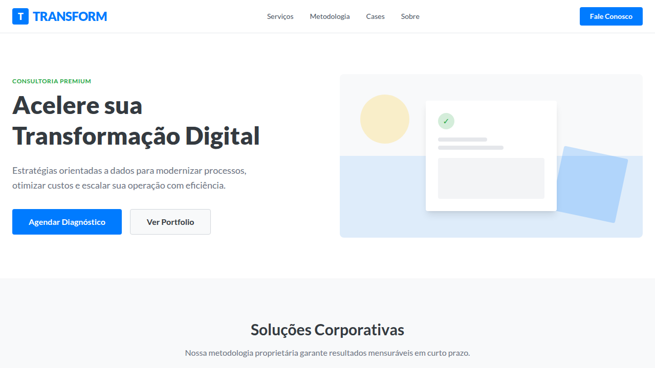
## Overview

Corporate flat design landing page. Ideal for landing pages, saas. AI-ready template. Corporate flat design didn't win on merit alone — it won on safety. When Microsoft stripped Chrome of its Aero glass in 2012 and Google flattened everything into Material, enterprise teams finally had permission to stop pretending skeuomorphism was necessary. The boardroom exhaled. Clean geometry, solid colors, predictable grids. Nobody gets fired for choosing flat.

And that's precisely the tension. Flat became the uniform of serious software — the navy suit of interface design. It signals competence, structure, reliability. Every enterprise SaaS from 2014 onward adopted some version of it because it photographs well in pitch decks and offends absolutely no one. The visual language of "we are a real company."

But here's what nobody says out loud: most corporate flat design is boring on purpose. The trade-off is real. You gain instant credibility and cross-cultural neutrality. You lose memorability. You lose the thing that makes someone actually enjoy using your tool on a Tuesday afternoon. The best practitioners know this and smuggle personality back in through motion, spacing rhythm, and typographic choices — not through the color palette.

- Density: 3/10 — Airy
- Variance: 2/10 — Structured
- Motion: 6/10 — Expressive

- **Style:** Clean, Professional, Modern
- **Keywords:** flat design, corporate, clean, professional, modern, minimalist, vibrant, user-friendly, structured, efficient
- **Era:** Contemporary, Corporate
- **Light/Dark:** ✓ Full / ✗ No

## Colors

- **Corporate Blue** (#007BFF) — Accent highlight, links and focus states
- **Dark Grey** (#343A40) — Dark surface, primary background
- **White** (#FFFFFF) — Light surface, card backgrounds
- **Light Grey** (#F8F9FA) — Secondary text, borders, muted elements
- **Success Green** (#28A745) — Success states, positive indicators
- **Warning Orange** (#FFC107) — Warning states, attention indicators
- **Danger Red** (#DC3545) — Error states, destructive actions
- **Info Cyan** (#17A2B8) — Secondary accent


## Typography

- **Display / Hero:** Lato — Weight 700, tight tracking, used for headline impact
- **Body:** Lato — Weight 400, 16px/1.6 line-height, max 72ch per line
- **UI Labels / Captions:** Lato — 0.875rem, weight 500, slight letter-spacing
- **Monospace:** JetBrains Mono — Used for code, metadata, and technical values

Scale:
- Hero: clamp(2.5rem, 5vw, 4rem)
- H1: 2.25rem
- H2: 1.5rem
- Body: 1rem / 1.6
- Small: 0.875rem


## Layout

- **Grid:** CSS Grid primary. Max-width containment: 1280px centered with 1.5rem side padding.
- **Spacing rhythm:** Balanced. Base unit: 0.5rem (8px).
- **Section vertical gaps:** clamp(4rem, 8vw, 8rem).
- **Hero layout:** Split-screen (text left, visual right).
- **Feature sections:** Zig-zag alternating text+image rows. No 3-equal-columns.
- **Mobile collapse:** All multi-column layouts collapse below 768px. No horizontal overflow.
- **z-index contract:** base (0) / sticky-nav (100) / overlay (200) / modal (300) / toast (500).


## Elevation & Depth

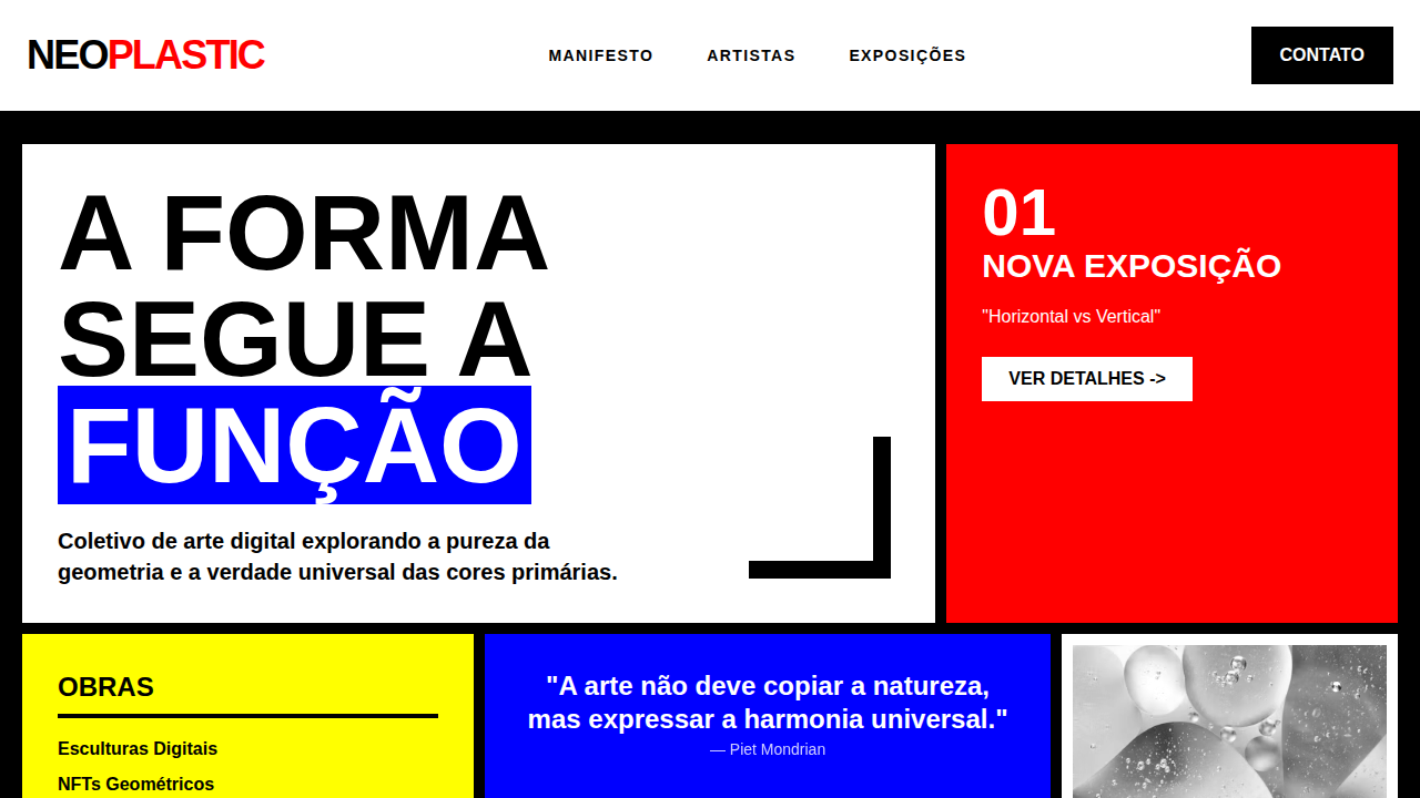
Sharp corners, solid colors, clean typography, intuitive icons, simple animations, clear visual hierarchy, focus on usability, grid-based layout

- **Physics:** Spring — stiffness 120, damping 20. Confident, weighted transitions.
- **Entry animations:** Fade + translate-Y (16px → 0) over 480ms ease-out. Staggered cascades for lists: 100ms between items.
- **Hover states:** Scale(1.03) + shadow lift over 200ms.
- **Page transitions:** Fade + slide (300ms).
- **Performance:** Only transform and opacity animated. No layout-triggering properties.


## Shapes

Base corner radius: 4px. See rounded tokens in front matter for the full scale.


## Components

- **Primary Button:** Rounded (4px) shape. Accent color fill. Hover: 8% darken + subtle lift shadow. Active: -1px translate tactile press. Font weight 600. No outer glows.
- **Secondary / Ghost Button:** Outline variant. 1.5px border in muted color. Text in primary color. Hover: subtle background fill.
- **Cards:** Rounded (4px) corners. Surface background. Subtle shadow (0 2px 12px rgba(0,0,0,0.06)). 1px border stroke.
- **Inputs:** Label above input. 1px border stroke. Focus ring: 2px accent color offset 2px. Error text below in semantic red. No floating labels.
- **Navigation:** Primary surface background. Active item: accent color indicator. Font weight 500 when active.
- **Skeletons:** Shimmer animation matching component dimensions. No circular spinners.
- **Empty States:** Icon-based composition with descriptive text and action button.


## Do's and Don'ts

- No emojis in UI — use icon system only (Lucide, Heroicons)
- No decorative gradients — flat color only
- No shadows heavier than 0 2px 8px rgba(0,0,0,0.08)
- No pure black (#000000) — use off-black or charcoal variants
- No oversaturated accent colors (saturation cap: 80%)
- No 3-column equal-width feature layouts — use zig-zag or asymmetric grid
- No `h-screen` — use `min-h-[100dvh]`
- No AI copywriting clichés: "Elevate", "Seamless", "Unleash", "Next-Gen"
- No broken external image links — use picsum.photos or inline SVG
- No generic lorem ipsum in demos

- Do Sharp corners
- Do Solid colors
- Do Clean typography
- Do Intuitive icons
- Do Simple animations
- Do Grid-based layout


## Use Case

Landing pages, SaaS
Technical Specs
CSS
background: #F8F9FA, color: #343A40, font-family: 'Lato', sans-serif, border: none, box-shadow: 0 2px 4px rgba(0,0,0,0.1), transition: transform 0.2s ease-out, border-radius: 4px, .btn-primary { background-color: #007BFF; color: #FFFFFF; }Variables
--corporate-blue: #007BFF, --dark-grey-flat: #343A40, --white-flat: #FFFFFF, --light-grey-flat: #F8F9FA, --flat-shadow-strength: 0.1, --font-flat: 'Lato', sans-serif
Checklist
☐ Sharp corners, ☐ Solid colors, ☐ Clean typography, ☐ Intuitive icons, ☐ Simple animations, ☐ Grid-based layout
Colors
Primary
Secondary
Effects
Sharp corners, solid colors, clean typography, intuitive icons, simple animations, clear visual hierarchy, focus on usability, grid-based layout
Light/Dark
✓ Full / ✗ No
AI Prompt
Act as a Senior Frontend Engineer and Expert UI Designer.
Your task is to code a complete Landing Page on the first attempt.
- Landing Page Theme: <INSERT THEME>
- Sections to add: <INSERT SECTIONS>

Generate the final code immediately following these definitions:

## Style

- **Name:** Flat Design Corporativo
- **Type:** Clean, Professional, Modern
- **Keywords:** flat design, corporate, clean, professional, modern, minimalist, vibrant, user-friendly, structured, efficient
- **Era:** Contemporary, Corporate
- **Light/Dark:** ✓ Full / ✗ No

## Color Palette

- **Primary:** Corporate Blue #007BFF, Dark Grey #343A40, White #FFFFFF, Light Grey #F8F9FA
- **Secondary:** Success Green #28A745, Warning Orange #FFC107, Danger Red #DC3545, Info Cyan #17A2B8

## Visual Effects

Sharp corners, solid colors, clean typography, intuitive icons, simple animations, clear visual hierarchy, focus on usability, grid-based layout

## AI Visual Direction

Design a corporate flat design landing page. Use: corporate blue and dark grey, sharp corners, solid colors, clean typography, intuitive icons, simple animations, clear visual hierarchy, grid-based layout.

## CSS Technical

```css
background: #F8F9FA, color: #343A40, font-family: 'Lato', sans-serif, border: none, box-shadow: 0 2px 4px rgba(0,0,0,0.1), transition: transform 0.2s ease-out, border-radius: 4px, .btn-primary { background-color: #007BFF; color: #FFFFFF; }
```

## Design System Variables

```css
--corporate-blue: #007BFF, --dark-grey-flat: #343A40, --white-flat: #FFFFFF, --light-grey-flat: #F8F9FA, --flat-shadow-strength: 0.1, --font-flat: 'Lato', sans-serif
```

## Implementation Checklist

- ☐ Sharp corners
- ☐ Solid colors
- ☐ Clean typography
- ☐ Intuitive icons
- ☐ Simple animations
- ☐ Grid-based layout

## Execution Rules

1. Strictly follow the defined visual style.
2. Use high-quality inline SVG icons (Heroicons or Lucide style) — NEVER use emojis as icons.
3. Add `cursor-pointer` and smooth `hover` states (transition-all) on all interactive elements.
4. Required Page Structure:
   - Navbar (Logo + Links + CTA)
   - Hero Section (Impactful Headline + Subtitle + 2 buttons + 3D/Abstract visual element via CSS)
   - Features (3 cards with icons)
   - Testimonials (3 cards)
   - Pricing (3 tiers, highlight the middle one)
   - Final CTA
   - Full Footer with social links, privacy policy, terms of use, contact and SEO links.
5. All text content must be in English.
6. The visual must be CLEARLY distinct — do not create a "default Bootstrap" design. Force the use of the provided design system variables.
7. Use `<style>` tags in the head for custom classes (especially for complex backdrop-filter effects and animations) that Tailwind CDN doesn't cover.
8. Full Responsiveness: Layout must adapt perfectly to Mobile, Tablet and Desktop (vertical stack on mobile).
9. Include basic SEO, Viewport and Open Graph meta tags in `<head>`.
10. Footer must contain: Copyright 2026, Secondary navigation links and Social media icons.
11. Make the creative decisions needed to deliver the complete, functional result now.Related
Last synced: 4/1/2026