Doodle / Sketch Livre
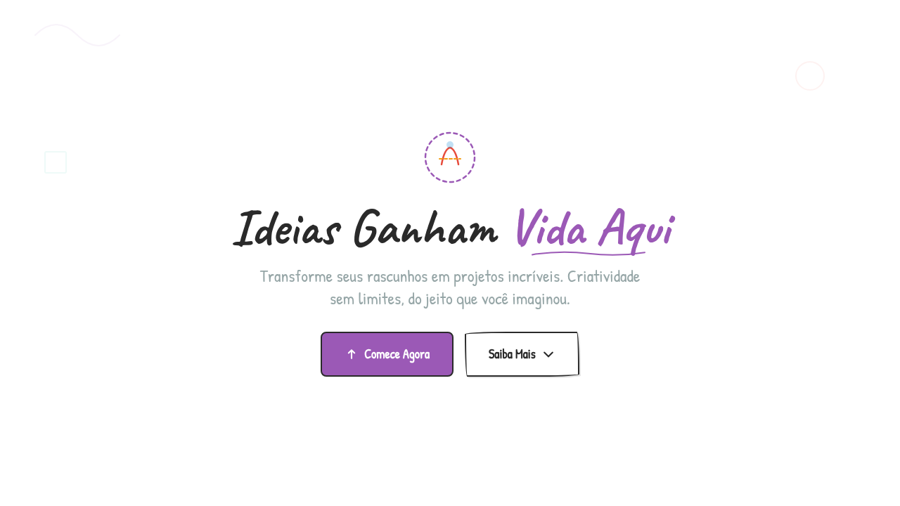
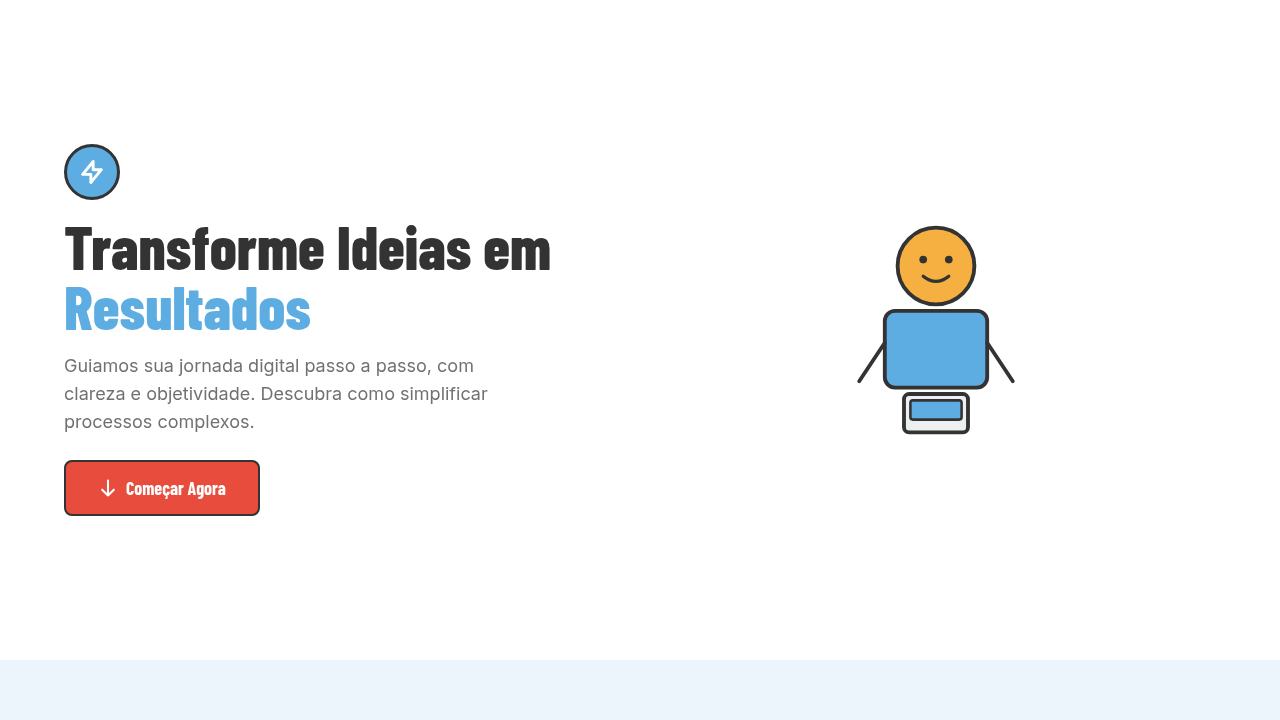
Doodle sketch infographic. Ideal for landing pages, modern websites. AI-ready template.
Use case: Landing pages, Modern websites
Historical Context
Long before Figma or Illustrator, people explained complex ideas with a marker and a napkin. The back-of-envelope sketch has always been the fastest path from confusion to clarity — messy, immediate, human. That tradition never really left; it just went digital. Excalidraw changed the conversation in 2020. Suddenly a free, open-source tool proved that wobbly lines and imperfect shapes could communicate architecture diagrams, user flows, and data relationships better than polished vector art. tldraw followed with the same conviction: roughness is a feature, not a bug. The aesthetic signals "this is a draft, think with me" — which lowers the stakes and invites collaboration in ways a pixel-perfect chart never could. Hand-drawn infographics tap into something cognitive. When data looks sketched, viewers slow down. They read instead of glance. The imperfection creates intimacy — it feels like someone sat across from you and drew it out. That's why education platforms, brainstorming tools, and whiteboard apps keep reaching for this style. It makes the complex feel approachable, and the intimidating feel like a conversation.
When to Use
Reach for doodle-style data graphics when you need to lower cognitive barriers. Education products explaining new concepts. Brainstorming sessions where polish would kill momentum. Internal presentations where "draft energy" keeps feedback flowing. Whiteboard apps that need to feel like thinking-out-loud, not finished deliverables. Avoid it for financial reports, regulatory dashboards, or anywhere precision signals trust. The sketch aesthetic says "let's explore" — make sure that's actually what you mean.
Design Principles
- Embrace wobble — perfectly imperfect strokes signal approachability and invite participation over passive consumption.
- Limit your palette — two or three colors max, hand-picked. Doodle style falls apart when it gets visually noisy.
- Maintain consistent roughness — mixing sketch elements with crisp vector art creates uncanny dissonance. Commit to the aesthetic fully.
- Prioritize legibility over charm — whimsy is worthless if people can't read the labels or follow the data flow.
- Design for annotation — leave whitespace and visual breathing room so users feel they can add to it, not just look at it.
DESIGN.md
---
version: "alpha"
name: "Doodle / Sketch Livre"
description: "Doodle sketch infographic. Ideal for landing pages, modern websites. AI-ready template."
colors:
  primary: "#FFFFFF"
  secondary: "#2A2A2A"
  tertiary: "#9B59B6"
  neutral: "#E74C3C"
  surface: "#F39C12"
  accent: "#3498DB"
typography:
  h1:
    fontFamily: System UI stack
    fontSize: 2.25rem
    fontWeight: 700
  body-md:
    fontFamily: System UI stack
    fontSize: 1rem
    fontWeight: 400
  label-caps:
    fontFamily: System UI stack
    fontSize: 0.75rem
    fontWeight: 500
components:
  button-primary:
    backgroundColor: "{colors.primary}"
    textColor: "{colors.neutral}"
    padding: 12px
---

## Overview

Doodle sketch infographic. Ideal for landing pages, modern websites. AI-ready template. Long before Figma or Illustrator, people explained complex ideas with a marker and a napkin. The back-of-envelope sketch has always been the fastest path from confusion to clarity — messy, immediate, human. That tradition never really left; it just went digital.

Excalidraw changed the conversation in 2020. Suddenly a free, open-source tool proved that wobbly lines and imperfect shapes could communicate architecture diagrams, user flows, and data relationships better than polished vector art. tldraw followed with the same conviction: roughness is a feature, not a bug. The aesthetic signals "this is a draft, think with me" — which lowers the stakes and invites collaboration in ways a pixel-perfect chart never could.

Hand-drawn infographics tap into something cognitive. When data looks sketched, viewers slow down. They read instead of glance. The imperfection creates intimacy — it feels like someone sat across from you and drew it out. That's why education platforms, brainstorming tools, and whiteboard apps keep reaching for this style. It makes the complex feel approachable, and the intimidating feel like a conversation.

- Density: 5/10 — Balanced
- Variance: 8/10 — Expressive
- Motion: 6/10 — Expressive

- **Style:** Infographic
- **Keywords:** Hand-drawn doodles, sketchy line art, whimsical illustrations, decorative elements, organic hand-drawn feel, varied line weights, casual, creative
- **Era:** Creative Casual
- **Light/Dark:** ✓ Full / ✓ Full

## Colors

- **White** (#FFFFFF) — Light surface, card backgrounds
- **Dark Text** (#2A2A2A) — Dark surface, primary background
- **Purple** (#9B59B6) — Accent color, emphasis elements
- **Red** (#E74C3C) — Error states, destructive actions
- **Amber** (#F39C12) — Warning states, attention indicators
- **Blue** (#3498DB) — Secondary accent
- **Teal** (#1ABC9C) — Secondary accent
- **Cool Grey** (#95A5A6) — Secondary text, borders, muted elements


## Typography

- **Display / Hero:** System UI stack (-apple-system, sans-serif) — Weight 700, tight tracking, used for headline impact
- **Body:** System UI stack (-apple-system, sans-serif) — Weight 400, 16px/1.6 line-height, max 72ch per line
- **UI Labels / Captions:** System UI stack (-apple-system, sans-serif) — 0.875rem, weight 500, slight letter-spacing
- **Monospace:** JetBrains Mono — Used for code, metadata, and technical values

Scale:
- Hero: clamp(2.5rem, 5vw, 4rem)
- H1: 2.25rem
- H2: 1.5rem
- Body: 1rem / 1.6
- Small: 0.875rem


## Layout

- **Grid:** CSS Grid primary. Max-width containment: 1280px centered with 1.5rem side padding.
- **Spacing rhythm:** Balanced. Base unit: 0.5rem (8px).
- **Section vertical gaps:** clamp(4rem, 8vw, 8rem).
- **Hero layout:** Asymmetric composition.
- **Feature sections:** Asymmetric grid with varied card sizes. No 3-equal-columns.
- **Mobile collapse:** All multi-column layouts collapse below 768px. No horizontal overflow.
- **z-index contract:** base (0) / sticky-nav (100) / overlay (200) / modal (300) / toast (500).


## Elevation & Depth

Soft natural informal lighting, doodle drawing animations (stroke-dasharray), sketch reveal on scroll, wobble effects, hand-drawn path animations

- **Physics:** Spring — stiffness 120, damping 20. Confident, weighted transitions.
- **Entry animations:** Fade + translate-Y (16px → 0) over 480ms ease-out. Staggered cascades for lists: 100ms between items.
- **Hover states:** Scale(1.03) + shadow lift over 200ms.
- **Page transitions:** Fade + slide (300ms).
- **Performance:** Only transform and opacity animated. No layout-triggering properties.


## Shapes

Base corner radius: 8px. See rounded tokens in front matter for the full scale.


## Components

- **Primary Button:** Subtly rounded (0.5rem) shape. Accent color fill. Hover: 8% darken + subtle lift shadow. Active: -1px translate tactile press. Font weight 600. No outer glows.
- **Secondary / Ghost Button:** Outline variant. 1.5px border in muted color. Text in primary color. Hover: subtle background fill.
- **Cards:** Subtly rounded (0.5rem) corners. Surface background. Subtle shadow (0 2px 12px rgba(0,0,0,0.06)). 1px border stroke.
- **Inputs:** Label above input. 1px border stroke. Focus ring: 2px accent color offset 2px. Error text below in semantic red. No floating labels.
- **Navigation:** Primary surface background. Active item: accent color indicator. Font weight 500 when active.
- **Skeletons:** Shimmer animation matching component dimensions. No circular spinners.
- **Empty States:** Icon-based composition with descriptive text and action button.


## Do's and Don'ts

- No emojis in UI — use icon system only (Lucide, Heroicons)
- No pure black (#000000) — use off-black or charcoal variants
- No oversaturated accent colors (saturation cap: 80%)
- No 3-column equal-width feature layouts — use zig-zag or asymmetric grid
- No `h-screen` — use `min-h-[100dvh]`
- No AI copywriting clichés: "Elevate", "Seamless", "Unleash", "Next-Gen"
- No broken external image links — use picsum.photos or inline SVG
- No generic lorem ipsum in demos

- Do Doodles hand-drawn feel
- Do Line weight varies
- Do Whimsical decorations
- Do Organic imperfect lines
- Do Playful arrangement
- Do Casual creative vibe


## Use Case

Landing pages, Modern websites
Technical Specs
CSS
background: #FFFFFF, SVG hand-drawn paths (stroke-linecap: round), stroke-dasharray animation for drawing, varied stroke-width (1-3px), font: hand-written style, organic curves, wobble transform
Variables
--bg-white: #FFFFFF, --text-dark: #2A2A2A, --purple: #9B59B6, --red: #E74C3C, --stroke-width: 2px, --wobble-amount: 1deg
Checklist
☐ Doodles hand-drawn feel, ☐ Line weight varies, ☐ Whimsical decorations, ☐ Organic imperfect lines, ☐ Playful arrangement, ☐ Casual creative vibe
Colors
Primary
Secondary
Effects
Soft natural informal lighting, doodle drawing animations (stroke-dasharray), sketch reveal on scroll, wobble effects, hand-drawn path animations
Light/Dark
✓ Full / ✓ Full
AI Prompt
Act as a Senior Frontend Engineer and Expert UI Designer.
Your task is to code a complete Landing Page on the first attempt.
- Landing Page Theme: <INSERT THEME>
- Sections to add: <INSERT SECTIONS>

Generate the final code immediately following these definitions:

## Style

- **Name:** Doodle / Sketch Livre
- **Type:** Infographic
- **Keywords:** Hand-drawn doodles, sketchy line art, whimsical illustrations, decorative elements, organic hand-drawn feel, varied line weights, casual, creative
- **Era:** Creative Casual
- **Light/Dark:** ✓ Full / ✓ Full

## Color Palette

- **Primary:** White #FFFFFF, Dark Text #2A2A2A, Purple #9B59B6, Red #E74C3C
- **Secondary:** Amber #F39C12, Blue #3498DB, Teal #1ABC9C, Cool Grey #95A5A6, sketchy lines

## Visual Effects

Soft natural informal lighting, doodle drawing animations (stroke-dasharray), sketch reveal on scroll, wobble effects, hand-drawn path animations

## AI Visual Direction

Design a doodle sketch infographic. Use: hand-drawn doodle illustrations, sketchy line art with varied weights, whimsical decorative elements, organic imperfect lines, playful arrangement, casual creative aesthetic, white background with colorful doodles.

## CSS Technical

```css
background: #FFFFFF, SVG hand-drawn paths (stroke-linecap: round), stroke-dasharray animation for drawing, varied stroke-width (1-3px), font: hand-written style, organic curves, wobble transform
```

## Design System Variables

```css
--bg-white: #FFFFFF, --text-dark: #2A2A2A, --purple: #9B59B6, --red: #E74C3C, --stroke-width: 2px, --wobble-amount: 1deg
```

## Implementation Checklist

- ☐ Doodles hand-drawn feel
- ☐ Line weight varies
- ☐ Whimsical decorations
- ☐ Organic imperfect lines
- ☐ Playful arrangement
- ☐ Casual creative vibe

## Execution Rules

1. Strictly follow the defined visual style.
2. Use high-quality inline SVG icons (Heroicons or Lucide style) — NEVER use emojis as icons.
3. Add `cursor-pointer` and smooth `hover` states (transition-all) on all interactive elements.
4. Required Page Structure:
   - Navbar (Logo + Links + CTA)
   - Hero Section (Impactful Headline + Subtitle + 2 buttons + 3D/Abstract visual element via CSS)
   - Features (3 cards with icons)
   - Testimonials (3 cards)
   - Pricing (3 tiers, highlight the middle one)
   - Final CTA
   - Full Footer with social links, privacy policy, terms of use, contact and SEO links.
5. All text content must be in English.
6. The visual must be CLEARLY distinct — do not create a "default Bootstrap" design. Force the use of the provided design system variables.
7. Use `<style>` tags in the head for custom classes (especially for complex backdrop-filter effects and animations) that Tailwind CDN doesn't cover.
8. Full Responsiveness: Layout must adapt perfectly to Mobile, Tablet and Desktop (vertical stack on mobile).
9. Include basic SEO, Viewport and Open Graph meta tags in `<head>`.
10. Footer must contain: Copyright 2026, Secondary navigation links and Social media icons.
11. Make the creative decisions needed to deliver the complete, functional result now.
Related
Last synced: 4/1/2026