Conversion-Optimized
Conversion-optimized landing page. Ideal for marketing, conversão, lead gen. AI-ready template.
Use case: Marketing, Conversion, Lead gen
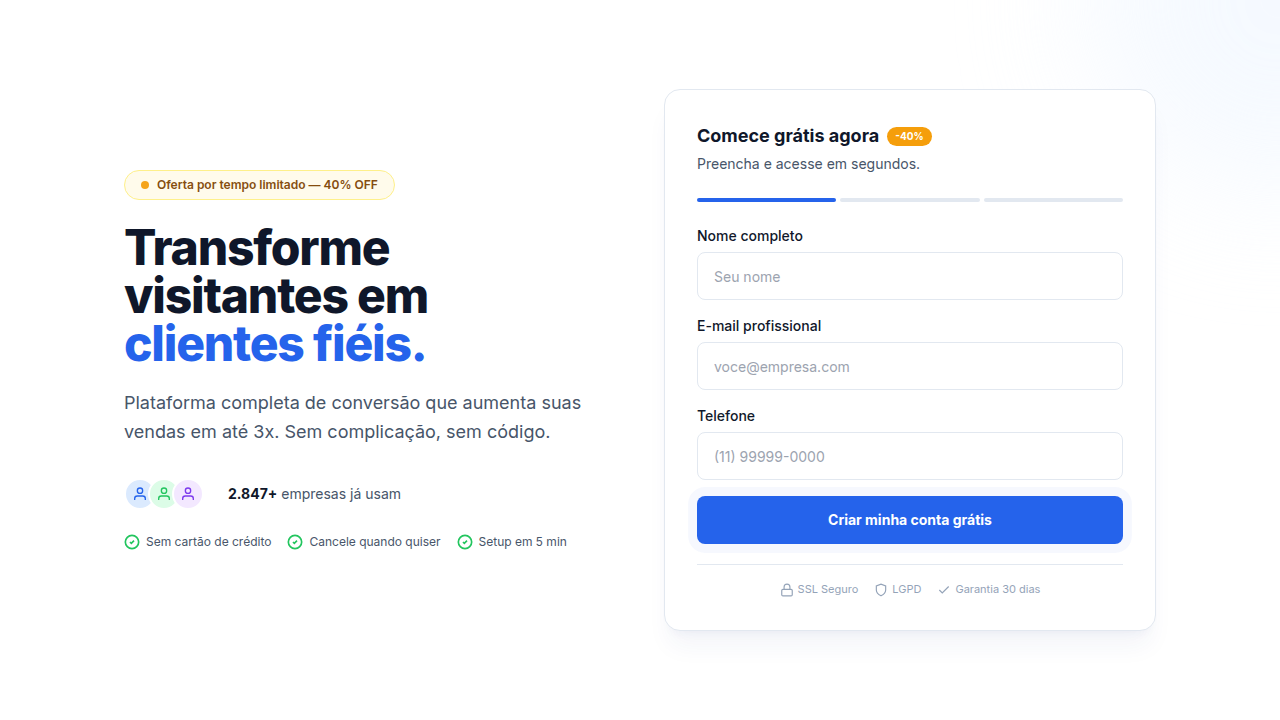
Historical Context
The conversion-optimized page didn't emerge from design theory. It came from A/B tests. Thousands of them. By the mid-2010s, tools like Unbounce, Leadpages, and Instapage had democratized landing page creation, and with that came an obsessive culture of testing every pixel. Designers watched heatmaps like hawks. The result was a ruthless distillation: one page, one goal, one button. Everything else got stripped away. What's interesting is how this functional pressure produced a genuine aesthetic. The single-CTA philosophy forced designers to master hierarchy through typography alone — no navigation bars to lean on, no sidebar distractions. You had a headline, a subhead, maybe a form, and a button. That's it. The constraint bred clarity, and clarity bred a look: generous whitespace, editorial type scales, high-contrast CTAs floating in negative space. By the 2020s, this wasn't just landing page doctrine anymore. SaaS companies adopted it wholesale for signup flows, trial pages, even homepages. The landing page builders didn't just shape a workflow — they shaped an entire design language built on the premise that attention is finite and every element must earn its place.
When to Use
Use this when you have one clear action you need someone to take. Newsletter signups, free trial starts, demo requests — moments where the user's decision is binary. It works because it respects attention. But be honest with yourself: if you're hiding pricing, burying cancellation flows, or using dark patterns to manufacture urgency, you've crossed from persuasion into manipulation. The line is intent. Are you removing friction from a decision they'd make anyway, or engineering consent? Conversion design serves the user when the offer is genuinely good. When it's not, all the whitespace in the world won't save you.
Design Principles
- One page, one job. Kill every element that doesn't directly support the primary action. Navigation, footer links, secondary CTAs — if it offers an escape route, it's working against you.
- Typography does the heavy lifting. With so few elements on the page, your type scale IS your hierarchy. Use dramatic size contrast between headline and body. Let the headline breathe.
- The form is the design. Don't treat it as an afterthought shoved below the fold. Style it with the same care as your hero. Reduce fields to the absolute minimum — every field you add costs you conversions.
- Whitespace is not empty space, it's pressure. Generous margins around your CTA create visual gravity. The button should feel like the only logical place for the eye to land.
- Contrast is commitment. Your CTA button needs to be the highest-contrast element on the page. Not just slightly different — unmissably different. If someone squints, it should be the only thing they see.
DESIGN.md
---
version: "alpha"
name: "Conversion-Optimized"
description: "Conversion-optimized landing page. Ideal for marketing, conversão, lead gen. AI-ready template."
colors:
  primary: "#1A1A1A"
  secondary: "#4A4A4A"
  tertiary: "#0066FF"
  neutral: "#FFFFFF"
typography:
  h1:
    fontFamily: System UI stack
    fontSize: 2.25rem
    fontWeight: 700
  body-md:
    fontFamily: System UI stack
    fontSize: 1rem
    fontWeight: 400
  label-caps:
    fontFamily: System UI stack
    fontSize: 0.75rem
    fontWeight: 500
---

## Overview

Conversion-optimized landing page. Ideal for marketing, conversão, lead gen. AI-ready template. The conversion-optimized page didn't emerge from design theory. It came from A/B tests. Thousands of them. By the mid-2010s, tools like Unbounce, Leadpages, and Instapage had democratized landing page creation, and with that came an obsessive culture of testing every pixel. Designers watched heatmaps like hawks. The result was a ruthless distillation: one page, one goal, one button. Everything else got stripped away.

What's interesting is how this functional pressure produced a genuine aesthetic. The single-CTA philosophy forced designers to master hierarchy through typography alone — no navigation bars to lean on, no sidebar distractions. You had a headline, a subhead, maybe a form, and a button. That's it. The constraint bred clarity, and clarity bred a look: generous whitespace, editorial type scales, high-contrast CTAs floating in negative space.

By the 2020s, this wasn't just landing page doctrine anymore. SaaS companies adopted it wholesale for signup flows, trial pages, even homepages. The landing page builders didn't just shape a workflow — they shaped an entire design language built on the premise that attention is finite and every element must earn its place.

- Density: 3/10 — Airy
- Variance: 3/10 — Restrained
- Motion: 6/10 — Expressive

- **Style:** Landing Page
- **Keywords:** Form-focused, minimalist design, single CTA focus, high contrast, urgency elements, trust signals, social proof, clear value
- **Era:** 2020s Modern
- **Light/Dark:** ✓ Full / ✓ Full

## Colors

- Palette derived from style keywords and era context


## Typography

- **Display / Hero:** System UI stack (-apple-system, sans-serif) — Weight 700, tight tracking, used for headline impact
- **Body:** System UI stack (-apple-system, sans-serif) — Weight 400, 16px/1.6 line-height, max 72ch per line
- **UI Labels / Captions:** System UI stack (-apple-system, sans-serif) — 0.875rem, weight 500, slight letter-spacing
- **Monospace:** JetBrains Mono — Used for code, metadata, and technical values

Scale:
- Hero: clamp(2.5rem, 5vw, 4rem)
- H1: 2.25rem
- H2: 1.5rem
- Body: 1rem / 1.6
- Small: 0.875rem


## Layout

- **Grid:** CSS Grid primary. Max-width containment: 1280px centered with 1.5rem side padding.
- **Spacing rhythm:** Balanced. Base unit: 0.5rem (8px).
- **Section vertical gaps:** clamp(4rem, 8vw, 8rem).
- **Hero layout:** Split-screen (text left, visual right).
- **Feature sections:** Zig-zag alternating text+image rows. No 3-equal-columns.
- **Mobile collapse:** All multi-column layouts collapse below 768px. No horizontal overflow.
- **z-index contract:** base (0) / sticky-nav (100) / overlay (200) / modal (300) / toast (500).


## Elevation & Depth

Hover states on CTA (color shift, slight scale), form field focus animations, loading spinner, success feedback

- **Physics:** Spring — stiffness 120, damping 20. Confident, weighted transitions.
- **Entry animations:** Fade + translate-Y (16px → 0) over 480ms ease-out. Staggered cascades for lists: 100ms between items.
- **Hover states:** Scale(1.03) + shadow lift over 200ms.
- **Page transitions:** Fade + slide (300ms).
- **Performance:** Only transform and opacity animated. No layout-triggering properties.


## Shapes

Base corner radius: 8px. See rounded tokens in front matter for the full scale.


## Components

- **Primary Button:** Subtly rounded (0.5rem) shape. Accent color fill. Hover: 8% darken + subtle lift shadow. Active: -1px translate tactile press. Font weight 600. No outer glows.
- **Secondary / Ghost Button:** Outline variant. 1.5px border in muted color. Text in primary color. Hover: subtle background fill.
- **Cards:** Subtly rounded (0.5rem) corners. Surface background. Subtle shadow (0 2px 12px rgba(0,0,0,0.06)). 1px border stroke.
- **Inputs:** Label above input. 1px border stroke. Focus ring: 2px accent color offset 2px. Error text below in semantic red. No floating labels.
- **Navigation:** Primary surface background. Active item: accent color indicator. Font weight 500 when active.
- **Skeletons:** Shimmer animation matching component dimensions. No circular spinners.
- **Empty States:** Icon-based composition with descriptive text and action button.


## Do's and Don'ts

- No emojis in UI — use icon system only (Lucide, Heroicons)
- No decorative gradients — flat color only
- No shadows heavier than 0 2px 8px rgba(0,0,0,0.08)
- No pure black (#000000) — use off-black or charcoal variants
- No oversaturated accent colors (saturation cap: 80%)
- No 3-column equal-width feature layouts — use zig-zag or asymmetric grid
- No `h-screen` — use `min-h-[100dvh]`
- No AI copywriting clichés: "Elevate", "Seamless", "Unleash", "Next-Gen"
- No broken external image links — use picsum.photos or inline SVG
- No generic lorem ipsum in demos

- Do Single primary CTA visible
- Do Form fields minimal (3-5)
- Do Trust badges present
- Do Social proof above fold
- Do Mobile form optimized
- Do Loading states implemented
- Do A/B test ready


## Use Case

Marketing, Conversion, Lead gen
Technical Specs
CSS
form with focus states, input:focus ring, button: primary color high contrast, position: sticky for CTA, max-width: 600px for form, loading spinner, success/error states
Variables
--cta-color: high contrast primary, --form-max-width: 600px, --input-height: 48px, --focus-ring: 3px solid accent, --success-color: #22C55E, --error-color: #EF4444
Checklist
☐ Single primary CTA visible, ☐ Form fields minimal (3-5), ☐ Trust badges present, ☐ Social proof above fold, ☐ Mobile form optimized, ☐ Loading states implemented, ☐ A/B test ready
Colors
Effects
Hover states on CTA (color shift, slight scale), form field focus animations, loading spinner, success feedback
Light/Dark
✓ Full / ✓ Full
AI Prompt
Act as a Senior Frontend Engineer and Expert UI Designer.
Your task is to code a complete Landing Page on the first attempt.
- Landing Page Theme: <INSERT THEME>
- Sections to add: <INSERT SECTIONS>

Generate the final code immediately following these definitions:

## Style

- **Name:** Conversion-Optimized
- **Type:** Landing Page
- **Keywords:** Form-focused, minimalist design, single CTA focus, high contrast, urgency elements, trust signals, social proof, clear value
- **Era:** 2020s Modern
- **Light/Dark:** ✓ Full / ✓ Full

## Color Palette

- **Primary:** Primary brand color, high-contrast white/light backgrounds, warning/urgency colors for time-limited offers
- **Secondary:** Secondary CTA color (muted), trust element colors (testimonial highlights), accent for key benefits

## Visual Effects

Hover states on CTA (color shift, slight scale), form field focus animations, loading spinner, success feedback

## AI Visual Direction

Design a conversion-optimized landing page. Use: single primary CTA, minimal distractions, trust badges, urgency elements (limited time), social proof (testimonials), clear value proposition, form above fold, progress indicators.

## CSS Technical

```css
form with focus states, input:focus ring, button: primary color high contrast, position: sticky for CTA, max-width: 600px for form, loading spinner, success/error states
```

## Design System Variables

```css
--cta-color: high contrast primary, --form-max-width: 600px, --input-height: 48px, --focus-ring: 3px solid accent, --success-color: #22C55E, --error-color: #EF4444
```

## Implementation Checklist

- ☐ Single primary CTA visible
- ☐ Form fields minimal (3-5)
- ☐ Trust badges present
- ☐ Social proof above fold
- ☐ Mobile form optimized
- ☐ Loading states implemented
- ☐ A/B test ready

## Execution Rules

1. Strictly follow the defined visual style.
2. Use high-quality inline SVG icons (Heroicons or Lucide style) — NEVER use emojis as icons.
3. Add `cursor-pointer` and smooth `hover` states (transition-all) on all interactive elements.
4. Required Page Structure:
   - Navbar (Logo + Links + CTA)
   - Hero Section (Impactful Headline + Subtitle + 2 buttons + 3D/Abstract visual element via CSS)
   - Features (3 cards with icons)
   - Testimonials (3 cards)
   - Pricing (3 tiers, highlight the middle one)
   - Final CTA
   - Full Footer with social links, privacy policy, terms of use, contact and SEO links.
5. All text content must be in English.
6. The visual must be CLEARLY distinct — do not create a "default Bootstrap" design. Force the use of the provided design system variables.
7. Use `<style>` tags in the head for custom classes (especially for complex backdrop-filter effects and animations) that Tailwind CDN doesn't cover.
8. Full Responsiveness: Layout must adapt perfectly to Mobile, Tablet and Desktop (vertical stack on mobile).
9. Include basic SEO, Viewport and Open Graph meta tags in `<head>`.
10. Footer must contain: Copyright 2026, Secondary navigation links and Social media icons.
11. Make the creative decisions needed to deliver the complete, functional result now.
Related
Last synced: 4/1/2026