Astryx Neutral
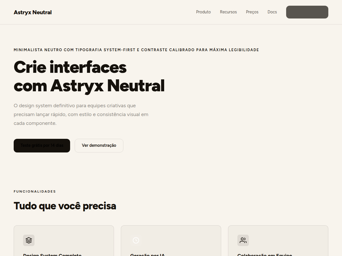
Neutral and minimalist theme from Meta Astryx Design System. Muted aesthetic with system fonts and monochromatic palette.
Use case: Corporate dashboards, productivity interfaces, text-heavy content apps, admin panels, and internal tools.
Historical Context
Astryx Neutral is the base theme of Meta's design system launched in 2026. It serves as the neutral foundation upon which thematic variations are built, prioritizing readability and accessibility.
When to Use
Apply when content must be the protagonist and the interface cannot compete for attention. Corporate dashboards, admin panels, internal tools, and productivity apps demand absolute visual neutrality. The monochromatic palette and system fonts eliminate decorative noise — the user focuses on data, text, and actions. Choose this theme when product branding is secondary to functionality, or when multiple third-party modules must coexist without visual conflict.
Design Principles
- Use system fonts exclusively — no custom fonts loaded
- Limit the palette to pure neutral grays with no color undertones
- Prioritize information density over decorative whitespace
- Reserve color only for interactive states and system feedback
- Keep components with subtle borders instead of shadows or elevation
DESIGN.md
---
version: "alpha"
name: "Astryx Neutral"
description: "Neutral and minimalist theme from Meta Astryx Design System. Muted aesthetic with system fonts and monochromatic palette."
colors:
  primary: "#15110C"
  secondary: "#4E606F"
  tertiary: "#111112"
  neutral: "#F8F4ED"
  surface: "#FFFFFF"
typography:
  h1:
    fontFamily: Figtree
    fontSize: 2.25rem
    fontWeight: 700
  body-md:
    fontFamily: Figtree
    fontSize: 1rem
    fontWeight: 400
  label-caps:
    fontFamily: Figtree
    fontSize: 0.75rem
    fontWeight: 500
rounded:
  sm: 8px
  md: 12px
  lg: 16px
spacing:
  sm: 1.0rem
  md: 1.5rem
  lg: 2.0rem
components:
  button-primary:
    backgroundColor: "{colors.primary}"
    textColor: "{colors.neutral}"
    rounded: "{rounded.md}"
    padding: 12px
---

## Overview

Neutral and minimalist theme from Meta Astryx Design System. Muted aesthetic with system fonts and monochromatic palette. Astryx Neutral is the base theme of Meta's design system launched in 2026. It serves as the neutral foundation upon which thematic variations are built, prioritizing readability and accessibility.


## Colors
- **Background:** #F8F4ED (light) / #111112 (dark)
- **Surface:** #FFFFFF (light) / #1F1F22 (dark)
- **Text:** #15110C (light) / #DFE2E5 (dark)
- **Accent:** #15110C (light) / #DFE2E5 (dark)
- **Secondary:** #4E606F
- **Border:** rgba(5,54,89,0.1)


## Typography
- **Heading:** Figtree 600/700
- **Body:** Figtree 400/500
- **Code:** SF Mono
- **Scale:** base 14px (0.875rem), ratio 1.2
- **Weights:** 400, 500, 600, 700


## Layout
- **Spacing scale:** 0/2/4/6/8/12/16/20/24/28/32/36/40/44/48 px
- **Radius:** inner 8px, element 12px, container 16px, page 32px
- **Element sizes:** sm 28px, md 32px, lg 36px


## Elevation & Depth
- Sem sombras pesadas. Profundidade comunicada por borders sutis e diferença de superfície.
- Border padrão: rgba(5,54,89,0.1)


## Shapes

Base corner radius: 8px. See rounded tokens in front matter for the full scale.


## Components
- Buttons com radius 12px e padding consistente
- Cards com surface #FFFFFF e border sutil
- Inputs com height md 32px e radius 8px


## Do's and Don'ts
- ✓ Use contraste alto para texto principal
- ✓ Mantenha hierarquia com peso tipográfico
- ✗ Não adicione cores saturadas
- ✗ Não use sombras dramáticas


## Use Case

Corporate dashboards, productivity interfaces, text-heavy content apps, admin panels, and internal tools.
Technical Specs
CSS
font-family: 'Figtree', sans-serif; border-radius: 12px; transition: all 410ms cubic-bezier(0.24, 1, 0.4, 1); background: #F8F4ED; color: #15110C;
Variables
--bg: #F8F4ED, --fg: #15110C, --accent: #15110C, --radius: 12px, --spacing: 1.5rem, --font-display: 'Figtree', --font-body: 'Figtree'
Checklist
1. Importar Figtree do Google Fonts 2. Configurar escala tipográfica base 14px ratio 1.2 3. Aplicar radius scale (8/12/16/32px) 4. Implementar tokens de spacing (0-48px) 5. Configurar motion tokens (175ms/410ms/975ms) 6. Testar contraste WCAG AA 7. Validar modo light e dark 8. Aplicar border sutil rgba(5,54,89,0.1)
Colors
Primary
Secondary
Effects
Transições suaves com cubic-bezier(0.24, 1, 0.4, 1), motion fast 175ms, medium 410ms. Sem sombras pesadas, foco em borders sutis.
Light/Dark
✓ Full / ✓ Full
AI Prompt
Act as a Senior Frontend Engineer and Expert UI Designer.
Your task is to code a complete Landing Page on the first attempt.
- Landing Page Theme: <INSERT THEME>
- Sections to add: <INSERT SECTIONS>

Generate the final code immediately following these definitions:

## Style

- **Name:** Astryx Neutral
- **Type:** Minimalista neutro com tipografia system-first e contraste calibrado para máxima legibilidade
- **Keywords:** neutral, minimal, system-font, monochrome, clean, figtree, muted, accessible, meta, astryx
- **Era:** 2026 Meta
- **Light/Dark:** ✓ Full / ✓ Full

## Color Palette

- **Primary:** Background #F8F4ED, Surface #FFFFFF, Text #15110C, Accent #15110C
- **Secondary:** Secondary #4E606F, Border rgba(5,54,89,0.1), Dark BG #111112, Dark Surface #1F1F22

## Visual Effects

Transições suaves com cubic-bezier(0.24, 1, 0.4, 1), motion fast 175ms, medium 410ms. Sem sombras pesadas, foco em borders sutis.

## AI Visual Direction

neutral minimal design system, muted monochrome UI, system font interface, clean corporate dashboard, warm paper-white background

## CSS Technical

```css
font-family: 'Figtree', sans-serif; border-radius: 12px; transition: all 410ms cubic-bezier(0.24, 1, 0.4, 1); background: #F8F4ED; color: #15110C;
```

## Design System Variables

```css
--bg: #F8F4ED, --fg: #15110C, --accent: #15110C, --radius: 12px, --spacing: 1.5rem, --font-display: 'Figtree', --font-body: 'Figtree'
```

## Implementation Checklist

- 1. Importar Figtree do Google Fonts 2. Configurar escala tipográfica base 14px ratio 1.2 3. Aplicar radius scale (8/12/16/32px) 4. Implementar tokens de spacing (0-48px) 5. Configurar motion tokens (175ms/410ms/975ms) 6. Testar contraste WCAG AA 7. Validar modo light e dark 8. Aplicar border sutil rgba(5,54,89,0.1)

## Execution Rules

1. Strictly follow the defined visual style.
2. Use high-quality inline SVG icons (Heroicons or Lucide style) — NEVER use emojis as icons.
3. Add `cursor-pointer` and smooth `hover` states (transition-all) on all interactive elements.
4. Required Page Structure:
   - Navbar (Logo + Links + CTA)
   - Hero Section (Impactful Headline + Subtitle + 2 buttons + 3D/Abstract visual element via CSS)
   - Features (3 cards with icons)
   - Testimonials (3 cards)
   - Pricing (3 tiers, highlight the middle one)
   - Final CTA
   - Full Footer with social links, privacy policy, terms of use, contact and SEO links.
5. All text content must be in English.
6. The visual must be CLEARLY distinct — do not create a "default Bootstrap" design. Force the use of the provided design system variables.
7. Use `<style>` tags in the head for custom classes (especially for complex backdrop-filter effects and animations) that Tailwind CDN doesn't cover.
8. Full Responsiveness: Layout must adapt perfectly to Mobile, Tablet and Desktop (vertical stack on mobile).
9. Include basic SEO, Viewport and Open Graph meta tags in `<head>`.
10. Footer must contain: Copyright 2026, Secondary navigation links and Social media icons.
11. Make the creative decisions needed to deliver the complete, functional result now.
Related
Last synced: 6/26/2026