Anti-Polish / Raw Aesthetic
Design with anti-polish raw aesthetic. Ideal for landing pages, saas. AI-ready template.
Use case: Landing pages, SaaS
Historical Context
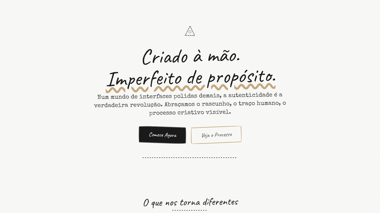
The anti-polish movement didn't start in a Figma file. It started at copy shops, in bedrooms, with scissors and glue sticks and whatever paper was lying around. Zine culture — punk zines, riot grrrl pamphlets, underground comics — taught us that imperfection carries more truth than any grid system ever could. That energy never really left. It just went dormant while we all got drunk on clean UI. Then AI happened. Suddenly every surface looked the same — smooth, optimized, soulless. Designers started scanning old receipts, photocopying their sketches at weird angles, pulling textures from deteriorating book covers. Not as nostalgia. As resistance. The hand-drawn line became political. The torn edge became a statement: this was made by a person, not a prompt. What we're seeing now isn't a trend. It's a correction. The rawness isn't decorative — it's structural. It says: we reject the premise that design must be frictionless. Sometimes friction is the whole point.
When to Use
When the brand needs to feel human above all else. Art publications, music labels, independent fashion — anywhere that corporate polish would actively damage credibility. This works when your audience is tired of perfection and craves evidence of a human hand. Zines, exhibition catalogs, artist portfolios, small-batch product packaging. If your client would describe their brand as 'raw,' 'honest,' or 'DIY' — you're in the right territory. Avoid it for healthcare, finance, or anywhere trust requires visual precision.
Design Principles
- Embrace visible process — show the scan lines, the tape marks, the pencil strokes. The artifact IS the aesthetic.
- Reject uniformity. Mix media recklessly: photography next to hand-lettering next to photocopied texture. Collision over composition.
- Texture carries meaning. A scanned paper grain says 'this existed in physical space' in ways no digital noise filter ever will.
- Imperfection is intentional, not lazy. Every rough edge should feel chosen. There's a difference between raw and careless — know it.
- Let the grid break. Overlap elements, let type bleed off edges, allow asymmetry to create tension. Comfort is not the goal.
DESIGN.md
---
version: "alpha"
name: "Anti-Polish / Raw Aesthetic"
description: "Design with anti-polish raw aesthetic. Ideal for landing pages, saas. AI-ready template."
colors:
  primary: "#FAFAF8"
  secondary: "#4A4A4A"
  tertiary: "#1A1A1A"
  neutral: "#C4A77D"
typography:
  h1:
    fontFamily: System UI stack
    fontSize: 2.25rem
    fontWeight: 700
  body-md:
    fontFamily: System UI stack
    fontSize: 1rem
    fontWeight: 400
  label-caps:
    fontFamily: System UI stack
    fontSize: 0.75rem
    fontWeight: 500
components:
  button-primary:
    backgroundColor: "{colors.primary}"
    textColor: "{colors.neutral}"
    padding: 12px
---

## Overview

Design with anti-polish raw aesthetic. Ideal for landing pages, saas. AI-ready template. The anti-polish movement didn't start in a Figma file. It started at copy shops, in bedrooms, with scissors and glue sticks and whatever paper was lying around. Zine culture — punk zines, riot grrrl pamphlets, underground comics — taught us that imperfection carries more truth than any grid system ever could. That energy never really left. It just went dormant while we all got drunk on clean UI.

Then AI happened. Suddenly every surface looked the same — smooth, optimized, soulless. Designers started scanning old receipts, photocopying their sketches at weird angles, pulling textures from deteriorating book covers. Not as nostalgia. As resistance. The hand-drawn line became political. The torn edge became a statement: this was made by a person, not a prompt.

What we're seeing now isn't a trend. It's a correction. The rawness isn't decorative — it's structural. It says: we reject the premise that design must be frictionless. Sometimes friction is the whole point.

- Density: 5/10 — Balanced
- Variance: 8/10 — Expressive
- Motion: 6/10 — Expressive

- **Style:** Raw, Imperfect, Authentic, Anti-Polish
- **Keywords:** Hand-drawn, collage, scanned textures, unfinished, imperfect, authentic, human, sketch, raw marks, creative process
- **Era:** 2025+ Anti-Digital
- **Light/Dark:** ✓ Full / ✓ Full

## Colors

- **Paper White** (#FAFAF8) — Light surface, card backgrounds
- **Pencil Grey** (#4A4A4A) — Secondary text, borders, muted elements
- **Marker Black** (#1A1A1A) — Dark surface, primary background
- **Kraft Brown** (#C4A77D) — Supporting palette color


## Typography

- **Display / Hero:** System UI stack (-apple-system, sans-serif) — Weight 700, tight tracking, used for headline impact
- **Body:** System UI stack (-apple-system, sans-serif) — Weight 400, 16px/1.6 line-height, max 72ch per line
- **UI Labels / Captions:** System UI stack (-apple-system, sans-serif) — 0.875rem, weight 500, slight letter-spacing
- **Monospace:** JetBrains Mono — Used for code, metadata, and technical values

Scale:
- Hero: clamp(2.5rem, 5vw, 4rem)
- H1: 2.25rem
- H2: 1.5rem
- Body: 1rem / 1.6
- Small: 0.875rem


## Layout

- **Grid:** CSS Grid primary. Max-width containment: 1280px centered with 1.5rem side padding.
- **Spacing rhythm:** Balanced. Base unit: 0.5rem (8px).
- **Section vertical gaps:** clamp(4rem, 8vw, 8rem).
- **Hero layout:** Asymmetric composition.
- **Feature sections:** Asymmetric grid with varied card sizes. No 3-equal-columns.
- **Mobile collapse:** All multi-column layouts collapse below 768px. No horizontal overflow.
- **z-index contract:** base (0) / sticky-nav (100) / overlay (200) / modal (300) / toast (500).


## Elevation & Depth

No smooth transitions, hand-drawn animations, paper texture overlays, jitter effects, sketch reveal

- **Physics:** Spring — stiffness 120, damping 20. Confident, weighted transitions.
- **Entry animations:** Fade + translate-Y (16px → 0) over 480ms ease-out. Staggered cascades for lists: 100ms between items.
- **Hover states:** Scale(1.03) + shadow lift over 200ms.
- **Page transitions:** Fade + slide (300ms).
- **Performance:** Only transform and opacity animated. No layout-triggering properties.


## Shapes

Base corner radius: 12px. See rounded tokens in front matter for the full scale.


## Components

- **Primary Button:** Moderately rounded (0.75rem) shape. Accent color fill. Hover: 8% darken + subtle lift shadow. Active: -1px translate tactile press. Font weight 600. No outer glows.
- **Secondary / Ghost Button:** Outline variant. 1.5px border in muted color. Text in primary color. Hover: subtle background fill.
- **Cards:** Moderately rounded (0.75rem) corners. Surface background. Subtle shadow (0 2px 12px rgba(0,0,0,0.06)). 1px border stroke.
- **Inputs:** Label above input. 1px border stroke. Focus ring: 2px accent color offset 2px. Error text below in semantic red. No floating labels.
- **Navigation:** Primary surface background. Active item: accent color indicator. Font weight 500 when active.
- **Skeletons:** Shimmer animation matching component dimensions. No circular spinners.
- **Empty States:** Icon-based composition with descriptive text and action button.


## Do's and Don'ts

- No emojis in UI — use icon system only (Lucide, Heroicons)
- No pure black (#000000) — use off-black or charcoal variants
- No oversaturated accent colors (saturation cap: 80%)
- No 3-column equal-width feature layouts — use zig-zag or asymmetric grid
- No `h-screen` — use `min-h-[100dvh]`
- No AI copywriting clichés: "Elevate", "Seamless", "Unleash", "Next-Gen"
- No broken external image links — use picsum.photos or inline SVG
- No generic lorem ipsum in demos

- Do Textures loaded
- Do Hand-drawn elements present
- Do Imperfections intentional
- Do Authentic feel achieved
- Do Performance ok with textures
- Do Accessibility maintained


## Use Case

Landing pages, SaaS
Technical Specs
CSS
background: url(paper-texture.png), filter: grayscale() contrast(), border: hand-drawn SVG, transform: rotate(small random), no smooth transitions, sketch-style fonts, opacity variations
Variables
--paper-bg: #FAFAF8, --pencil-color: #4A4A4A, --marker-black: #1A1A1A, --kraft-brown: #C4A77D, --sketch-rotation: random(-3deg, 3deg), --texture-opacity: 0.3
Checklist
☐ Textures loaded, ☐ Hand-drawn elements present, ☐ Imperfections intentional, ☐ Authentic feel achieved, ☐ Performance ok with textures, ☐ Accessibility maintained
Colors
Primary
Effects
No smooth transitions, hand-drawn animations, paper texture overlays, jitter effects, sketch reveal
Light/Dark
✓ Full / ✓ Full
AI Prompt
Act as a Senior Frontend Engineer and Expert UI Designer.
Your task is to code a complete Landing Page on the first attempt.
- Landing Page Theme: <INSERT THEME>
- Sections to add: <INSERT SECTIONS>

Generate the final code immediately following these definitions:

## Style

- **Name:** Anti-Polish / Raw Aesthetic
- **Type:** Raw, Imperfect, Authentic, Anti-Polish
- **Keywords:** Hand-drawn, collage, scanned textures, unfinished, imperfect, authentic, human, sketch, raw marks, creative process
- **Era:** 2025+ Anti-Digital
- **Light/Dark:** ✓ Full / ✓ Full

## Color Palette

- **Primary:** Paper White #FAFAF8, Pencil Grey #4A4A4A, Marker Black #1A1A1A, Kraft Brown #C4A77D
- **Secondary:** Watercolor washes, pencil shading, ink splatters, tape textures, aged paper tones

## Visual Effects

No smooth transitions, hand-drawn animations, paper texture overlays, jitter effects, sketch reveal

## AI Visual Direction

Design with anti-polish raw aesthetic. Use: hand-drawn elements, scanned textures, unfinished look, paper/pencil textures, collage style, authentic imperfection, sketch marks, tape/sticker overlays, human touch.

## CSS Technical

```css
background: url(paper-texture.png), filter: grayscale() contrast(), border: hand-drawn SVG, transform: rotate(small random), no smooth transitions, sketch-style fonts, opacity variations
```

## Design System Variables

```css
--paper-bg: #FAFAF8, --pencil-color: #4A4A4A, --marker-black: #1A1A1A, --kraft-brown: #C4A77D, --sketch-rotation: random(-3deg, 3deg), --texture-opacity: 0.3
```

## Implementation Checklist

- ☐ Textures loaded
- ☐ Hand-drawn elements present
- ☐ Imperfections intentional
- ☐ Authentic feel achieved
- ☐ Performance ok with textures
- ☐ Accessibility maintained

## Execution Rules

1. Strictly follow the defined visual style.
2. Use high-quality inline SVG icons (Heroicons or Lucide style) — NEVER use emojis as icons.
3. Add `cursor-pointer` and smooth `hover` states (transition-all) on all interactive elements.
4. Required Page Structure:
   - Navbar (Logo + Links + CTA)
   - Hero Section (Impactful Headline + Subtitle + 2 buttons + 3D/Abstract visual element via CSS)
   - Features (3 cards with icons)
   - Testimonials (3 cards)
   - Pricing (3 tiers, highlight the middle one)
   - Final CTA
   - Full Footer with social links, privacy policy, terms of use, contact and SEO links.
5. All text content must be in English.
6. The visual must be CLEARLY distinct — do not create a "default Bootstrap" design. Force the use of the provided design system variables.
7. Use `<style>` tags in the head for custom classes (especially for complex backdrop-filter effects and animations) that Tailwind CDN doesn't cover.
8. Full Responsiveness: Layout must adapt perfectly to Mobile, Tablet and Desktop (vertical stack on mobile).
9. Include basic SEO, Viewport and Open Graph meta tags in `<head>`.
10. Footer must contain: Copyright 2026, Secondary navigation links and Social media icons.
11. Make the creative decisions needed to deliver the complete, functional result now.
Related
Last synced: 4/1/2026