Anthropomorphic
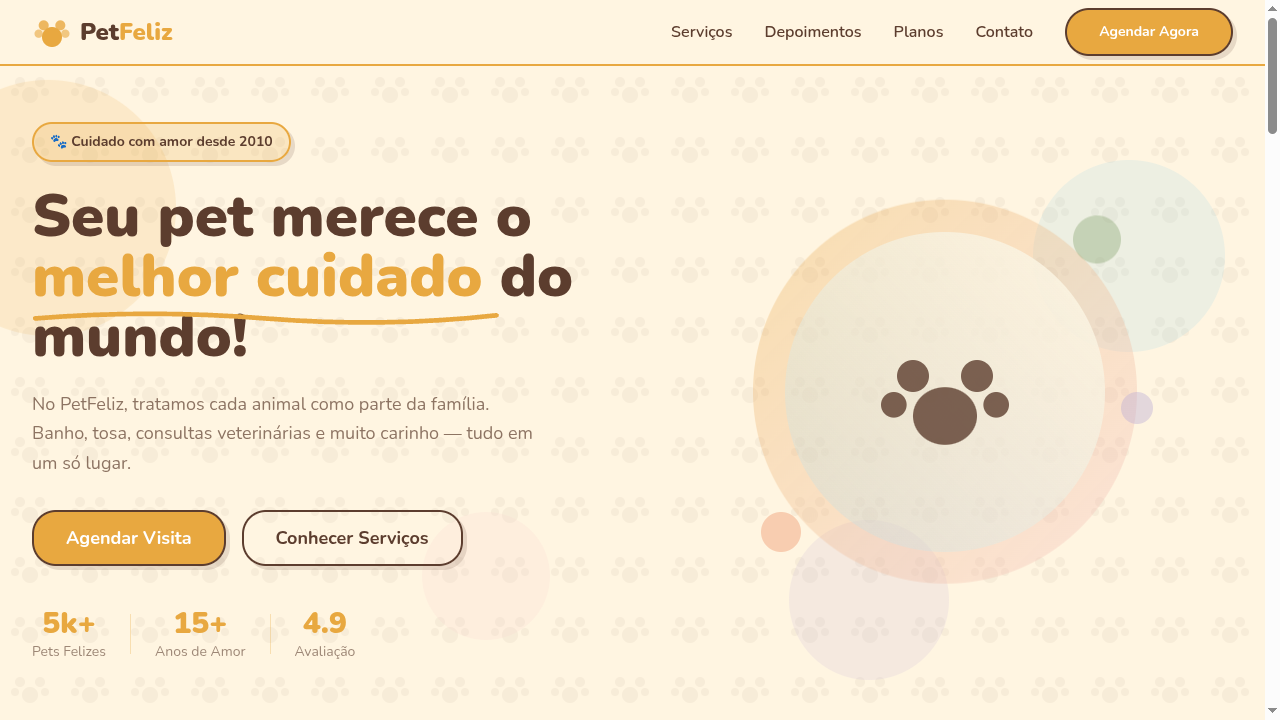
Whimsical anthropomorphic-themed landing page with playful character-driven aesthetics. Ideal for livros infantis, mascotes de marcas, campanhas lúdicas, embalagens de produtos vintage. AI-ready template.
Use case: Children's books, Brand mascots, Playful campaigns, Vintage product packaging
Historical Context
Anthropomorphic illustration didn't start with Disney — it started with Aesop, with Egyptian gods, with every culture that looked at animals and projected human drama onto them. The reason is obvious: animals are archetypes without baggage. A fox is cunning before you even draw it. A bear is gentle strength. You get narrative shorthand for free. The modern commercial lineage runs through Beatrix Potter, through Hanna-Barbera, through the explosion of Japanese mascot culture (yuru-chara) in the 1980s that proved a regional rice brand could become a national obsession if you gave it a bear with a belly. Silicon Valley caught on late — Twitter's bird, Duolingo's owl, Discord's Wumpus — but the principle is ancient: give your brand a face that isn't human, and people project themselves onto it without the uncanny valley of a real portrait. What changed recently is fidelity range. You can now deploy the same character from a 16×16 favicon to a fully rigged 3D model in a game lobby, and audiences expect that coherence. The craft shifted from 'can you draw a cute animal' to 'can you build a character system that scales across every touchpoint without losing its soul.'
When to Use
When your brand needs personality but a human spokesperson feels limiting or risky. When your audience skews young or playful and you need emotional connection without demographic specificity. When you want a mascot that can express error states, celebrations, and empty states inside a product without feeling corporate. When you're building a world — games, children's media, social platforms — where characters ARE the content. Skip it if your brand needs gravitas or operates in regulated industries where whimsy reads as unserious.
Design Principles
- Silhouette first — your character must be recognizable as a filled black shape at 32px. If it needs color or detail to read, the design is weak.
- Constrain the anatomy. Pick 2-3 human traits max (bipedal stance, expressive hands, facial expressions) and leave the rest animal. Over-humanizing kills the archetype.
- Design for the expression sheet, not the hero pose. A mascot that only works smiling is useless — you need confused, frustrated, celebrating, idle. Build the face geometry for range.
- Scale intentionally. Define the character at three fidelity tiers — icon/avatar, spot illustration, full scene — and ensure proportions shift gracefully between them rather than just shrinking the detailed version.
- Give it a flaw or quirk. Perfect mascots are forgettable. Duolingo's owl is passive-aggressive. Clippy was annoying. The imperfection is what makes people form opinions, and opinions are engagement.
DESIGN.md
---
version: "alpha"
name: "Anthropomorphic"
description: "Whimsical anthropomorphic-themed landing page with playful character-driven aesthetics. Ideal for livros infantis, mascotes de marcas, campanhas lúdicas, embalagens de produtos vintage. AI-ready template."
colors:
  primary: "#E8A840"
  secondary: "#FFF5E1"
  tertiary: "#5C3D2E"
  neutral: "#87CEEB"
  surface: "#F5C6C6"
  accent: "#6B8E4E"
typography:
  h1:
    fontFamily: Nunito
    fontSize: 2.5rem
    fontWeight: 700
  body-md:
    fontFamily: Nunito
    fontSize: 1rem
    fontWeight: 400
rounded:
  sm: 24px
  md: 48px
  lg: 72px
spacing:
  sm: 1.5rem
  md: 3.0rem
  lg: 6.0rem
components:
  button-primary:
    backgroundColor: "{colors.primary}"
    textColor: "{colors.neutral}"
    rounded: "{rounded.sm}"
    padding: 12px
---

## Overview

Whimsical anthropomorphic-themed landing page with playful character-driven aesthetics. Ideal for livros infantis, mascotes de marcas, campanhas lúdicas, embalagens de produtos vintage. AI-ready template. Anthropomorphic illustration didn't start with Disney — it started with Aesop, with Egyptian gods, with every culture that looked at animals and projected human drama onto them. The reason is obvious: animals are archetypes without baggage. A fox is cunning before you even draw it. A bear is gentle strength. You get narrative shorthand for free.

The modern commercial lineage runs through Beatrix Potter, through Hanna-Barbera, through the explosion of Japanese mascot culture (yuru-chara) in the 1980s that proved a regional rice brand could become a national obsession if you gave it a bear with a belly. Silicon Valley caught on late — Twitter's bird, Duolingo's owl, Discord's Wumpus — but the principle is ancient: give your brand a face that isn't human, and people project themselves onto it without the uncanny valley of a real portrait.

What changed recently is fidelity range. You can now deploy the same character from a 16×16 favicon to a fully rigged 3D model in a game lobby, and audiences expect that coherence. The craft shifted from 'can you draw a cute animal' to 'can you build a character system that scales across every touchpoint without losing its soul.'

- Density: 5/10 — Balanced
- Variance: 4/10 — Moderate
- Motion: 6/10 — Expressive

- **Style:** Whimsical, Character-Driven, Playful, Vintage
- **Keywords:** Anthropomorphic, animal characters, human traits, whimsical, playful, vintage, mascot, storybook, charming, relatable
- **Era:** Victorian Illustration to Modern Character Design
- **Light/Dark:** ✓ Full / ◐ Partial

## Colors

- **Warm Honey** (#E8A840) — Primary surface or dominant color
- **Soft Cream** (#FFF5E1) — Light surface, card backgrounds
- **Forest Brown** (#5C3D2E) — Supporting palette color
- **Sky Blue** (#87CEEB) — Accent highlight, links and focus states
- **Blush Pink** (#F5C6C6) — Primary text color
- **Leaf Green** (#6B8E4E) — Success states, positive indicators
- **Sunset Orange** (#E87040) — Warm accent, call-to-action secondary
- **Lavender** (#B8A9D4) — Extended palette, decorative use


## Typography

- **Display / Hero:** Nunito — Weight 700, tight tracking, used for headline impact
- **Body:** Nunito — Weight 400, 16px/1.6 line-height, max 72ch per line
- **UI Labels / Captions:** Nunito — 0.875rem, weight 500, slight letter-spacing
- **Monospace:** JetBrains Mono — Used for code, metadata, and technical values

Scale:
- Hero: clamp(2.5rem, 5vw, 4rem)
- H1: 2.25rem
- H2: 1.5rem
- Body: 1rem / 1.6
- Small: 0.875rem


## Layout

- **Grid:** CSS Grid primary. Max-width containment: 1280px centered with 1.5rem side padding.
- **Spacing rhythm:** Balanced. Base unit: 0.5rem (8px).
- **Section vertical gaps:** clamp(4rem, 8vw, 8rem).
- **Hero layout:** Split-screen (text left, visual right).
- **Feature sections:** Zig-zag alternating text+image rows. No 3-equal-columns.
- **Mobile collapse:** All multi-column layouts collapse below 768px. No horizontal overflow.
- **z-index contract:** base (0) / sticky-nav (100) / overlay (200) / modal (300) / toast (500).


## Elevation & Depth

Hand-drawn illustration style borders, rounded playful shapes (20-30px radius), bouncy hover animations (cubic-bezier), soft drop shadows, storybook-style section transitions, warm gradient backgrounds

- **Physics:** Spring — stiffness 120, damping 20. Confident, weighted transitions.
- **Entry animations:** Fade + translate-Y (16px → 0) over 480ms ease-out. Staggered cascades for lists: 100ms between items.
- **Hover states:** Scale(1.03) + shadow lift over 200ms.
- **Page transitions:** Fade + slide (300ms).
- **Performance:** Only transform and opacity animated. No layout-triggering properties.


## Shapes

Base corner radius: 24px. See rounded tokens in front matter for the full scale.


## Components

- **Primary Button:** Generously rounded (1.5rem) shape. Accent color fill. Hover: 8% darken + subtle lift shadow. Active: -1px translate tactile press. Font weight 600. No outer glows.
- **Secondary / Ghost Button:** Outline variant. 1.5px border in muted color. Text in primary color. Hover: subtle background fill.
- **Cards:** Generously rounded (1.5rem) corners. Surface background. Subtle shadow (0 2px 12px rgba(0,0,0,0.06)). 1px border stroke.
- **Inputs:** Label above input. 1px border stroke. Focus ring: 2px accent color offset 2px. Error text below in semantic red. No floating labels.
- **Navigation:** Primary surface background. Active item: accent color indicator. Font weight 500 when active.
- **Skeletons:** Shimmer animation matching component dimensions. No circular spinners.
- **Empty States:** Icon-based composition with descriptive text and action button.


## Do's and Don'ts

- No emojis in UI — use icon system only (Lucide, Heroicons)
- No pure black (#000000) — use off-black or charcoal variants
- No oversaturated accent colors (saturation cap: 80%)
- No 3-column equal-width feature layouts — use zig-zag or asymmetric grid
- No `h-screen` — use `min-h-[100dvh]`
- No AI copywriting clichés: "Elevate", "Seamless", "Unleash", "Next-Gen"
- No broken external image links — use picsum.photos or inline SVG
- No generic lorem ipsum in demos

- Do Warm playful color palette
- Do Rounded shapes throughout (20-30px)
- Do Hand-drawn style decorative elements
- Do Bouncy hover animations
- Do Friendly rounded typography
- Do Storybook-like section layouts
- Do Responsive with maintained charm


## Use Case

Children's books, Brand mascots, Playful campaigns, Vintage product packaging
Technical Specs
CSS
font-family: 'Nunito', sans-serif, border-radius: 24px, background: #FFF5E1, color: #5C3D2E, border: 2px solid #E8A840, box-shadow: 4px 4px 0 rgba(92,61,46,0.15), transition: transform 300ms cubic-bezier(0.34,1.56,0.64,1), animation: bounce
Variables
--color-honey: #E8A840, --color-cream: #FFF5E1, --color-brown: #5C3D2E, --font-primary: 'Nunito', --border-radius: 24px, --shadow-playful: 4px 4px 0 rgba(92,61,46,0.15), --bounce: cubic-bezier(0.34,1.56,0.64,1), --spacing: 1.5rem
Checklist
☐ Warm playful color palette, ☐ Rounded shapes throughout (20-30px), ☐ Hand-drawn style decorative elements, ☐ Bouncy hover animations, ☐ Friendly rounded typography, ☐ Storybook-like section layouts, ☐ Responsive with maintained charm
Colors
Primary
Secondary
Effects
Hand-drawn illustration style borders, rounded playful shapes (20-30px radius), bouncy hover animations (cubic-bezier), soft drop shadows, storybook-style section transitions, warm gradient backgrounds
Light/Dark
✓ Full / ◐ Partial
AI Prompt
Act as a Senior Frontend Engineer and Expert UI Designer.
Your task is to code a complete Landing Page on the first attempt.
- Landing Page Theme: <INSERT THEME>
- Sections to add: <INSERT SECTIONS>

Generate the final code immediately following these definitions:

## Style

- **Name:** Anthropomorphic
- **Type:** Whimsical, Character-Driven, Playful, Vintage
- **Keywords:** Anthropomorphic, animal characters, human traits, whimsical, playful, vintage, mascot, storybook, charming, relatable
- **Era:** Victorian Illustration to Modern Character Design
- **Light/Dark:** ✓ Full / ◐ Partial

## Color Palette

- **Primary:** Warm Honey #E8A840, Soft Cream #FFF5E1, Forest Brown #5C3D2E, Sky Blue #87CEEB
- **Secondary:** Blush Pink #F5C6C6, Leaf Green #6B8E4E, Sunset Orange #E87040, Lavender #B8A9D4

## Visual Effects

Hand-drawn illustration style borders, rounded playful shapes (20-30px radius), bouncy hover animations (cubic-bezier), soft drop shadows, storybook-style section transitions, warm gradient backgrounds

## AI Visual Direction

Design a whimsical anthropomorphic-themed landing page with playful character-driven aesthetics. Use warm honey, cream and forest brown palette. Apply hand-drawn style borders, rounded shapes (20-30px), bouncy animations, storybook-like section layouts. Typography should be friendly and rounded. Create a charming, vintage-meets-modern atmosphere suitable for character brands.

## CSS Technical

```css
font-family: 'Nunito', sans-serif, border-radius: 24px, background: #FFF5E1, color: #5C3D2E, border: 2px solid #E8A840, box-shadow: 4px 4px 0 rgba(92,61,46,0.15), transition: transform 300ms cubic-bezier(0.34,1.56,0.64,1), animation: bounce
```

## Design System Variables

```css
--color-honey: #E8A840, --color-cream: #FFF5E1, --color-brown: #5C3D2E, --font-primary: 'Nunito', --border-radius: 24px, --shadow-playful: 4px 4px 0 rgba(92,61,46,0.15), --bounce: cubic-bezier(0.34,1.56,0.64,1), --spacing: 1.5rem
```

## Implementation Checklist

- ☐ Warm playful color palette
- ☐ Rounded shapes throughout (20-30px)
- ☐ Hand-drawn style decorative elements
- ☐ Bouncy hover animations
- ☐ Friendly rounded typography
- ☐ Storybook-like section layouts
- ☐ Responsive with maintained charm

## Execution Rules

1. Strictly follow the defined visual style.
2. Use high-quality inline SVG icons (Heroicons or Lucide style) — NEVER use emojis as icons.
3. Add `cursor-pointer` and smooth `hover` states (transition-all) on all interactive elements.
4. Required Page Structure:
   - Navbar (Logo + Links + CTA)
   - Hero Section (Impactful Headline + Subtitle + 2 buttons + 3D/Abstract visual element via CSS)
   - Features (3 cards with icons)
   - Testimonials (3 cards)
   - Pricing (3 tiers, highlight the middle one)
   - Final CTA
   - Full Footer with social links, privacy policy, terms of use, contact and SEO links.
5. All text content must be in English.
6. The visual must be CLEARLY distinct — do not create a "default Bootstrap" design. Force the use of the provided design system variables.
7. Use `<style>` tags in the head for custom classes (especially for complex backdrop-filter effects and animations) that Tailwind CDN doesn't cover.
8. Full Responsiveness: Layout must adapt perfectly to Mobile, Tablet and Desktop (vertical stack on mobile).
9. Include basic SEO, Viewport and Open Graph meta tags in `<head>`.
10. Footer must contain: Copyright 2026, Secondary navigation links and Social media icons.
11. Make the creative decisions needed to deliver the complete, functional result now.
Related
Last synced: 4/1/2026