3x3 Grid Design
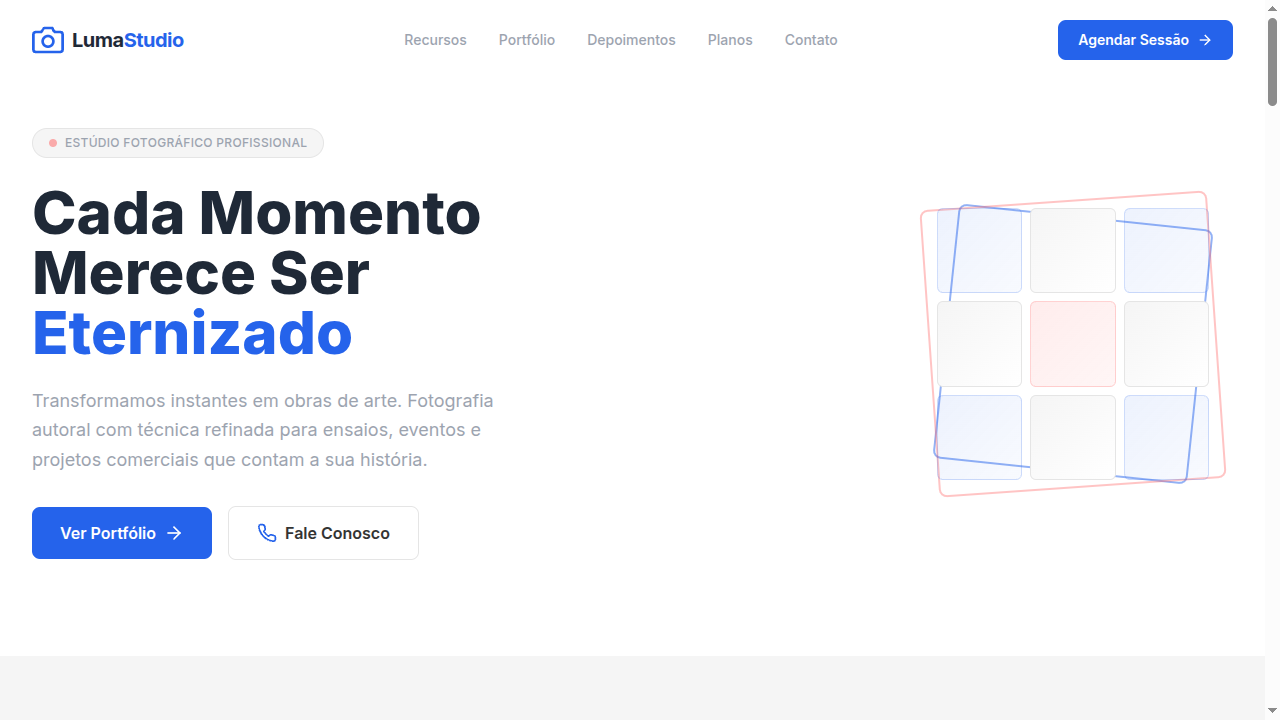
3x3 grid-based landing page where content is organized in nine uniform boxes. Ideal for feeds de instagram, moodboards, portfólios, design de vestuário/boutiques. AI-ready template.
Use case: Instagram feeds, Moodboards, Portfolios, Boutique/clothing design
Historical Context
The 3x3 grid is one of those layouts that feels inevitable — like someone discovered it rather than invented it. Its roots trace back to the Rule of Thirds in classical painting and photography, where dividing a canvas into nine equal zones created natural focal points. But in graphic design, the nine-box grid became a workhorse of Swiss modernism. Müller-Brockmann and his contemporaries used modular grids obsessively, and the 3x3 was the simplest expression of that philosophy: enough cells to create rhythm, few enough to maintain clarity. What makes it endure in digital design isn't nostalgia — it's math. Nine is the sweet spot where content density meets scannability. Two columns feel sparse, four feel like a spreadsheet. Three columns, three rows: the eye knows exactly where to go. The grid imposes democracy on content — every box gets equal weight, equal breathing room. No hierarchy games, no visual shouting. Just nine honest containers doing their job. The web didn't invent this layout, but CSS Grid finally made it trivial to implement properly. Before that, we were faking it with floats and clearfixes — a crime against semantics that lasted a decade too long.
When to Use
Deploy the 3x3 when you have exactly nine items of equal importance — or when you can edit ruthlessly to get there. Feature showcases where no single feature outranks another. Comparison matrices where parity matters. Portfolio grids where the work speaks uniformly. Product catalogs at category level. Kill it immediately if your content count is seven or eleven — a grid with orphan cells looks broken, not intentional. The 3x3 demands content discipline. If you can't commit to nine, pick a different layout.
Design Principles
- Uniform spacing is non-negotiable — the gap between cells must be identical horizontally and vertically, or the entire modular logic collapses into visual noise
- Each cell must carry equal visual weight through consistent padding, type size, and media dimensions — one oversized thumbnail destroys the democratic contract of the grid
- Responsive collapse should follow a 3→2→1 column sequence, never 3→1 directly — the intermediate step preserves rhythm on tablets where most grids fall apart
- Content within cells needs a strict internal hierarchy: one media element, one heading, one descriptor maximum — the grid provides structure, not permission to overload
- Outer margins must equal or exceed the inter-cell gap — cramming a 3x3 edge-to-edge against viewport boundaries makes the grid feel trapped rather than composed
DESIGN.md
---
version: "alpha"
name: "3x3 Grid Design"
description: "3x3 grid-based landing page where content is organized in nine uniform boxes. Ideal for feeds de instagram, moodboards, portfólios, design de vestuário/boutiques. AI-ready template."
colors:
  primary: "#FFFFFF"
  secondary: "#F5F5F5"
  tertiary: "#333333"
  neutral: "#2563EB"
  surface: "#E5E5E5"
  accent: "#9CA3AF"
typography:
  h1:
    fontFamily: System UI stack
    fontSize: 2.25rem
    fontWeight: 700
  body-md:
    fontFamily: System UI stack
    fontSize: 1rem
    fontWeight: 400
  label-caps:
    fontFamily: System UI stack
    fontSize: 0.75rem
    fontWeight: 500
rounded:
  sm: 8px
  md: 16px
  lg: 24px
spacing:
  sm: 16.0px
  md: 32.0px
  lg: 64.0px
components:
  button-primary:
    backgroundColor: "{colors.primary}"
    textColor: "{colors.neutral}"
    rounded: "{rounded.sm}"
    padding: 12px
---

## Overview

3x3 grid-based landing page where content is organized in nine uniform boxes. Ideal for feeds de instagram, moodboards, portfólios, design de vestuário/boutiques. AI-ready template. The 3x3 grid is one of those layouts that feels inevitable — like someone discovered it rather than invented it. Its roots trace back to the Rule of Thirds in classical painting and photography, where dividing a canvas into nine equal zones created natural focal points. But in graphic design, the nine-box grid became a workhorse of Swiss modernism. Müller-Brockmann and his contemporaries used modular grids obsessively, and the 3x3 was the simplest expression of that philosophy: enough cells to create rhythm, few enough to maintain clarity.

What makes it endure in digital design isn't nostalgia — it's math. Nine is the sweet spot where content density meets scannability. Two columns feel sparse, four feel like a spreadsheet. Three columns, three rows: the eye knows exactly where to go. The grid imposes democracy on content — every box gets equal weight, equal breathing room. No hierarchy games, no visual shouting. Just nine honest containers doing their job.

The web didn't invent this layout, but CSS Grid finally made it trivial to implement properly. Before that, we were faking it with floats and clearfixes — a crime against semantics that lasted a decade too long.

- Density: 5/10 — Balanced
- Variance: 2/10 — Structured
- Motion: 4/10 — Subtle

- **Style:** Structured, Modular, Uniform, Grid-Based
- **Keywords:** 3x3 grid, nine boxes, uniform spacing, modular, structured, Instagram feed, moodboard, portfolio, rigid grid system
- **Era:** Modern Digital Layout
- **Light/Dark:** ✓ Full / ✓ Full

## Colors

- **Pure White** (#FFFFFF) — Light surface, card backgrounds
- **Soft Grey** (#F5F5F5) — Secondary text, borders, muted elements
- **Charcoal** (#333333) — Dark surface, primary background
- **Accent Blue** (#2563EB) — Primary accent, CTAs and interactive elements
- **Light Grey** (#E5E5E5) — Secondary text, borders, muted elements
- **Medium Grey** (#9CA3AF) — Secondary text, borders, muted elements
- **Dark Grey** (#1F2937) — Deep contrast surface
- **Accent Coral** (#FF6B6B) — Primary accent, CTAs and interactive elements


## Typography

- **Display / Hero:** System UI stack (-apple-system, sans-serif) — Weight 700, tight tracking, used for headline impact
- **Body:** System UI stack (-apple-system, sans-serif) — Weight 400, 16px/1.6 line-height, max 72ch per line
- **UI Labels / Captions:** System UI stack (-apple-system, sans-serif) — 0.875rem, weight 500, slight letter-spacing
- **Monospace:** JetBrains Mono — Used for code, metadata, and technical values

Scale:
- Hero: clamp(2.5rem, 5vw, 4rem)
- H1: 2.25rem
- H2: 1.5rem
- Body: 1rem / 1.6
- Small: 0.875rem


## Layout

- **Grid:** CSS Grid primary. Max-width containment: 1280px centered with 1.5rem side padding.
- **Spacing rhythm:** Balanced. Base unit: 0.5rem (8px).
- **Section vertical gaps:** clamp(4rem, 8vw, 8rem).
- **Hero layout:** Split-screen (text left, visual right).
- **Feature sections:** Zig-zag alternating text+image rows. No 3-equal-columns.
- **Mobile collapse:** All multi-column layouts collapse below 768px. No horizontal overflow.
- **z-index contract:** base (0) / sticky-nav (100) / overlay (200) / modal (300) / toast (500).


## Elevation & Depth

Strict 3x3 CSS grid layout, uniform gap spacing (16px), subtle hover scale (1.02) on grid items, clean thin borders between cells, smooth fade-in on scroll for each cell, minimal shadow on hover

- **Physics:** Ease-out curves, 200-300ms duration. Smooth and predictable.
- **Entry animations:** Fade + translate-Y (16px → 0) over 420ms ease-out. Staggered cascades for lists: 80ms between items.
- **Hover states:** Subtle color shift + shadow adjustment over 200ms.
- **Page transitions:** Fade only (200ms).
- **Performance:** Only transform and opacity animated. No layout-triggering properties.


## Shapes

Base corner radius: 8px. See rounded tokens in front matter for the full scale.


## Components

- **Primary Button:** Rounded (8px) shape. Accent color fill. Hover: 8% darken + subtle lift shadow. Active: -1px translate tactile press. Font weight 600. No outer glows.
- **Secondary / Ghost Button:** Outline variant. 1.5px border in muted color. Text in primary color. Hover: subtle background fill.
- **Cards:** Rounded (8px) corners. Surface background. Subtle shadow (0 2px 12px rgba(0,0,0,0.06)). 1px border stroke.
- **Inputs:** Label above input. 1px border stroke. Focus ring: 2px accent color offset 2px. Error text below in semantic red. No floating labels.
- **Navigation:** Primary surface background. Active item: accent color indicator. Font weight 500 when active.
- **Skeletons:** Shimmer animation matching component dimensions. No circular spinners.
- **Empty States:** Icon-based composition with descriptive text and action button.


## Do's and Don'ts

- No emojis in UI — use icon system only (Lucide, Heroicons)
- No pure black (#000000) — use off-black or charcoal variants
- No oversaturated accent colors (saturation cap: 80%)
- No 3-column equal-width feature layouts — use zig-zag or asymmetric grid
- No `h-screen` — use `min-h-[100dvh]`
- No AI copywriting clichés: "Elevate", "Seamless", "Unleash", "Next-Gen"
- No broken external image links — use picsum.photos or inline SVG
- No generic lorem ipsum in demos

- Do Strict 3x3 grid layout
- Do Uniform gap spacing
- Do Clean thin borders between cells
- Do Subtle hover scale effect
- Do Each cell with dedicated content
- Do Single accent color
- Do Responsive: 3→2→1 columns on breakpoints


## Use Case

Instagram feeds, Moodboards, Portfolios, Boutique/clothing design
Technical Specs
CSS
display: grid, grid-template-columns: repeat(3, 1fr), gap: 16px, background: #FFFFFF, color: #333333, border: 1px solid #E5E5E5, border-radius: 8px, box-shadow: 0 1px 3px rgba(0,0,0,0.05) on hover, transition: transform 200ms, transform: scale(1.02) on hover
Variables
--grid-columns: 3, --gap: 16px, --color-white: #FFFFFF, --color-grey: #F5F5F5, --color-charcoal: #333333, --color-accent: #2563EB, --border: 1px solid #E5E5E5, --border-radius: 8px, --hover-scale: 1.02
Checklist
☐ Strict 3x3 grid layout, ☐ Uniform gap spacing, ☐ Clean thin borders between cells, ☐ Subtle hover scale effect, ☐ Each cell with dedicated content, ☐ Single accent color, ☐ Responsive: 3→2→1 columns on breakpoints
Colors
Primary
Secondary
Effects
Strict 3x3 CSS grid layout, uniform gap spacing (16px), subtle hover scale (1.02) on grid items, clean thin borders between cells, smooth fade-in on scroll for each cell, minimal shadow on hover
Light/Dark
✓ Full / ✓ Full
AI Prompt
Act as a Senior Frontend Engineer and Expert UI Designer.
Your task is to code a complete Landing Page on the first attempt.
- Landing Page Theme: <INSERT THEME>
- Sections to add: <INSERT SECTIONS>

Generate the final code immediately following these definitions:

## Style

- **Name:** 3x3 Grid Design
- **Type:** Structured, Modular, Uniform, Grid-Based
- **Keywords:** 3x3 grid, nine boxes, uniform spacing, modular, structured, Instagram feed, moodboard, portfolio, rigid grid system
- **Era:** Modern Digital Layout
- **Light/Dark:** ✓ Full / ✓ Full

## Color Palette

- **Primary:** Pure White #FFFFFF, Soft Grey #F5F5F5, Charcoal #333333, Accent Blue #2563EB
- **Secondary:** Light Grey #E5E5E5, Medium Grey #9CA3AF, Dark Grey #1F2937, Accent Coral #FF6B6B

## Visual Effects

Strict 3x3 CSS grid layout, uniform gap spacing (16px), subtle hover scale (1.02) on grid items, clean thin borders between cells, smooth fade-in on scroll for each cell, minimal shadow on hover

## AI Visual Direction

Design a 3x3 grid-based landing page where content is organized in nine uniform boxes. Use strict CSS grid (3 columns, 3 rows), uniform gap spacing, clean thin borders between cells. White, grey and single accent color palette. Each cell should have its own dedicated content. Subtle hover effects on grid items. Clean, structured, modular aesthetic perfect for portfolios and moodboards.

## CSS Technical

```css
display: grid, grid-template-columns: repeat(3, 1fr), gap: 16px, background: #FFFFFF, color: #333333, border: 1px solid #E5E5E5, border-radius: 8px, box-shadow: 0 1px 3px rgba(0,0,0,0.05) on hover, transition: transform 200ms, transform: scale(1.02) on hover
```

## Design System Variables

```css
--grid-columns: 3, --gap: 16px, --color-white: #FFFFFF, --color-grey: #F5F5F5, --color-charcoal: #333333, --color-accent: #2563EB, --border: 1px solid #E5E5E5, --border-radius: 8px, --hover-scale: 1.02
```

## Implementation Checklist

- ☐ Strict 3x3 grid layout
- ☐ Uniform gap spacing
- ☐ Clean thin borders between cells
- ☐ Subtle hover scale effect
- ☐ Each cell with dedicated content
- ☐ Single accent color
- ☐ Responsive: 3→2→1 columns on breakpoints

## Execution Rules

1. Strictly follow the defined visual style.
2. Use high-quality inline SVG icons (Heroicons or Lucide style) — NEVER use emojis as icons.
3. Add `cursor-pointer` and smooth `hover` states (transition-all) on all interactive elements.
4. Required Page Structure:
   - Navbar (Logo + Links + CTA)
   - Hero Section (Impactful Headline + Subtitle + 2 buttons + 3D/Abstract visual element via CSS)
   - Features (3 cards with icons)
   - Testimonials (3 cards)
   - Pricing (3 tiers, highlight the middle one)
   - Final CTA
   - Full Footer with social links, privacy policy, terms of use, contact and SEO links.
5. All text content must be in English.
6. The visual must be CLEARLY distinct — do not create a "default Bootstrap" design. Force the use of the provided design system variables.
7. Use `<style>` tags in the head for custom classes (especially for complex backdrop-filter effects and animations) that Tailwind CDN doesn't cover.
8. Full Responsiveness: Layout must adapt perfectly to Mobile, Tablet and Desktop (vertical stack on mobile).
9. Include basic SEO, Viewport and Open Graph meta tags in `<head>`.
10. Footer must contain: Copyright 2026, Secondary navigation links and Social media icons.
11. Make the creative decisions needed to deliver the complete, functional result now.
Related
Last synced: 4/1/2026