Wise Lime Bold
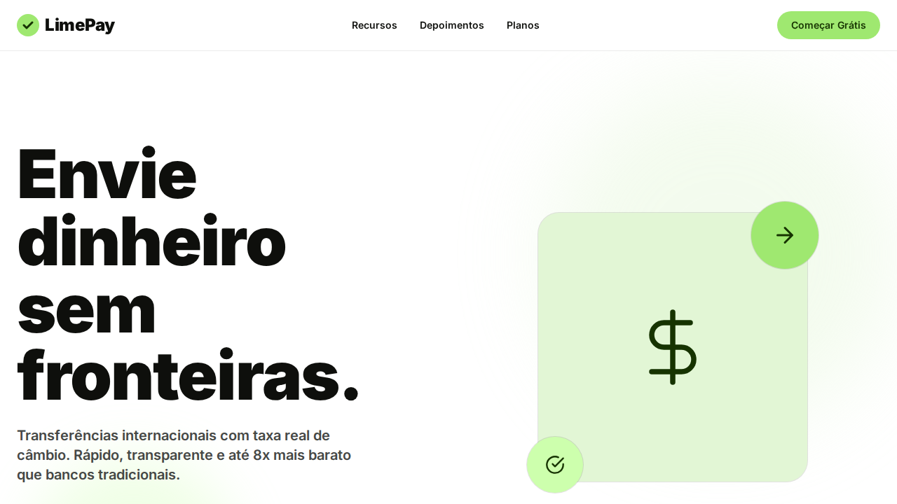
Wise-inspired bold fintech landing page. Ideal for transferências internacionais, fintechs, plataformas de pagamento, câmbio. AI-ready template.
Use case: Transferências internacionais, Fintechs, Platforms de pagamento, Câmbio
Historical Context
The intersection of fintech and bold visual identity didn't happen overnight. For decades, financial services hid behind navy blues and conservative serifs — a visual language that screamed "trust us because we look boring." Then Wise (formerly TransferWise) walked in and flipped the table. Their lime green wasn't just a brand color; it was a middle finger to the banking establishment. It said: we're transparent, we're fast, and we don't need your grandfather's color palette to move money across borders. This palette lives in that lineage. The lime carries the energy of disruption — the same disruptive confidence that made people trust a startup over HSBC for sending money to Lagos or São Paulo. Bold weight choices reinforce the message: this isn't tentative, this isn't asking permission. International money movement is complex enough without your interface whispering. The futuristic tech angle here isn't about chrome gradients or sci-fi nonsense. It's about the optimism embedded in lime — the belief that cross-border finance can be instant, cheap, and accessible. That's a future worth designing for.
When to Use
Reach for this when you're designing interfaces where money crosses borders and confidence matters. Remittance dashboards, transfer confirmation screens, exchange rate displays — anywhere the user needs to feel that their $400 to Manila is handled, not lost in bureaucracy. It works for fintech products targeting diaspora communities, freelancer payment platforms, and multi-currency wallets. Avoid it for conservative institutional banking contexts where the boldness reads as reckless rather than confident.
Design Principles
- Confidence over caution — bold weights and saturated lime signal competence, not recklessness. Every element should feel decisive.
- Transparency made visible — lime green historically signals openness. Use it to highlight fees, rates, and status. Never let critical financial information recede into the background.
- Motion with purpose — futuristic doesn't mean animated for fun. Reserve transitions for state changes that matter: money sent, rate locked, transfer complete.
- Hierarchy through contrast — pair lime accents against dark surfaces. The eye should land on the action, the amount, the confirmation. Everything else supports.
- Internationalism without cliché — avoid flags, globes, and dotted flight paths. Let typography, currency formatting, and spatial rhythm communicate global reach.
DESIGN.md
---
version: "alpha"
name: "Wise Lime Bold"
description: "Wise-inspired bold fintech landing page. Ideal for transferências internacionais, fintechs, plataformas de pagamento, câmbio. AI-ready template."
colors:
  primary: "#0e0f0c"
  secondary: "#ffffff"
  tertiary: "#9fe870"
  neutral: "#163300"
  surface: "#e2f6d5"
  accent: "#cdffad"
typography:
  h1:
    fontFamily: system-ui for display
    fontSize: 2.25rem
    fontWeight: 700
  body-md:
    fontFamily: system-ui for display
    fontSize: 1rem
    fontWeight: 400
  label-caps:
    fontFamily: system-ui for display
    fontSize: 0.75rem
    fontWeight: 500
rounded:
  sm: 9999px
  md: 19998px
  lg: 29997px
components:
  button-primary:
    backgroundColor: "{colors.primary}"
    textColor: "{colors.neutral}"
    rounded: "{rounded.sm}"
    padding: 12px
---

## Overview

Wise-inspired bold fintech landing page. Ideal for transferências internacionais, fintechs, plataformas de pagamento, câmbio. AI-ready template. The intersection of fintech and bold visual identity didn't happen overnight. For decades, financial services hid behind navy blues and conservative serifs — a visual language that screamed "trust us because we look boring." Then Wise (formerly TransferWise) walked in and flipped the table. Their lime green wasn't just a brand color; it was a middle finger to the banking establishment. It said: we're transparent, we're fast, and we don't need your grandfather's color palette to move money across borders.

This palette lives in that lineage. The lime carries the energy of disruption — the same disruptive confidence that made people trust a startup over HSBC for sending money to Lagos or São Paulo. Bold weight choices reinforce the message: this isn't tentative, this isn't asking permission. International money movement is complex enough without your interface whispering.

The futuristic tech angle here isn't about chrome gradients or sci-fi nonsense. It's about the optimism embedded in lime — the belief that cross-border finance can be instant, cheap, and accessible. That's a future worth designing for.

- Density: 5/10 — Balanced
- Variance: 4/10 — Moderate
- Motion: 4/10 — Subtle

- **Style:** Weight 900 Billboard, Lime Green CTA, Scale Hover Animations, Ultra-Tight 0.85 Line-Height, calt OpenType
- **Keywords:** wise, lime, bold, weight 900, Wise Sans, lime green, scale hover, 0.85 line-height, calt, Inter 600, fintech, money transfer
- **Era:** 2024-2026 International Money Transfer
- **Light/Dark:** ✓ Full / ✗ Not Recommended

## Colors

- **Near Black** (#0e0f0c) — Dark surface, primary background
- **Branco** (#ffffff) — Light surface, card backgrounds
- **Verde Lima** (#9fe870) — Supporting palette color
- **Verde Escuro** (#163300) — Dark surface, primary background
- **Mint Claro** (#e2f6d5) — Extended palette, decorative use
- **Pastel Verde** (#cdffad) — Success states, positive indicators
- **Cinza Quente** (#454745) — Secondary text, borders, muted elements
- **Cinza** (#868685) — Secondary text, borders, muted elements


## Typography

- **Display / Hero:** system-ui for display — Weight 700, tight tracking, used for headline impact
- **Body:** system-ui for display — Weight 400, 16px/1.6 line-height, max 72ch per line
- **UI Labels / Captions:** system-ui for display — 0.875rem, weight 500, slight letter-spacing
- **Monospace:** JetBrains Mono — Used for code, metadata, and technical values

Scale:
- Hero: clamp(2.5rem, 5vw, 4rem)
- H1: 2.25rem
- H2: 1.5rem
- Body: 1rem / 1.6
- Small: 0.875rem


## Layout

- **Grid:** CSS Grid primary. Max-width containment: 1280px centered with 1.5rem side padding.
- **Spacing rhythm:** Balanced. Base unit: 0.5rem (8px).
- **Section vertical gaps:** clamp(4rem, 8vw, 8rem).
- **Hero layout:** Split-screen (text left, visual right).
- **Feature sections:** Zig-zag alternating text+image rows. No 3-equal-columns.
- **Mobile collapse:** All multi-column layouts collapse below 768px. No horizontal overflow.
- **z-index contract:** base (0) / sticky-nav (100) / overlay (200) / modal (300) / toast (500).


## Elevation & Depth

Wise Sans weight 900 (Black) — o peso mais extremo de qualquer design system. Line-height 0.85 ultra-tight onde letras quase se sobrepõem verticalmente. Verde lima (#9fe870) para CTAs com texto verde escuro (#163300) — natureza encontra fintech. Hover com scale(1.05) — botões crescem fisicamente. Active com scale(0.95) — botões comprimem. OpenType 'calt' em TODO texto. Inter weight 600 como padrão de body — confiante, não leve. Pill buttons (9999px). Cards com radius generoso (30-40px).

- **Physics:** Ease-out curves, 200-300ms duration. Smooth and predictable.
- **Entry animations:** Fade + translate-Y (16px → 0) over 420ms ease-out. Staggered cascades for lists: 80ms between items.
- **Hover states:** Subtle color shift + shadow adjustment over 200ms.
- **Page transitions:** Fade only (200ms).
- **Performance:** Only transform and opacity animated. No layout-triggering properties.


## Shapes

Base corner radius: 9999px. See rounded tokens in front matter for the full scale.


## Components

- **Primary Button:** Pill-shaped (9999px) shape. Accent color fill. Hover: 8% darken + subtle lift shadow. Active: -1px translate tactile press. Font weight 600. No outer glows.
- **Secondary / Ghost Button:** Outline variant. 1.5px border in muted color. Text in primary color. Hover: subtle background fill.
- **Cards:** Pill-shaped (9999px) corners. Surface background. Subtle shadow (0 2px 12px rgba(0,0,0,0.06)). 1px border stroke.
- **Inputs:** Label above input. 1px border stroke. Focus ring: 2px accent color offset 2px. Error text below in semantic red. No floating labels.
- **Navigation:** Primary surface background. Active item: accent color indicator. Font weight 500 when active.
- **Skeletons:** Shimmer animation matching component dimensions. No circular spinners.
- **Empty States:** Icon-based composition with descriptive text and action button.


## Do's and Don'ts

- No emojis in UI — use icon system only (Lucide, Heroicons)
- No pure black (#000000) — use off-black or charcoal variants
- No oversaturated accent colors (saturation cap: 80%)
- No 3-column equal-width feature layouts — use zig-zag or asymmetric grid
- No `h-screen` — use `min-h-[100dvh]`
- No AI copywriting clichés: "Elevate", "Seamless", "Unleash", "Next-Gen"
- No broken external image links — use picsum.photos or inline SVG
- No generic lorem ipsum in demos

- Do Weight 900 display
- Do Line-height 0.85 ultra-tight
- Do Verde lima #9fe870 CTAs
- Do Scale(1.05) hover
- Do OpenType calt em tudo
- Do Inter weight 600 body
- Do Pill buttons 9999px
- Do Cards 30-40px radius
- Do Responsivo


## Use Case

Transferências internacionais, Fintechs, Platforms de pagamento, Câmbio
Technical Specs
CSS
background:#ffffff;color:#0e0f0c;accent:#9fe870;button-text:#163300;border-radius:9999px pills,30px cards;font-family:system-ui for display,Inter for body;font-weight:900 display,600 body;line-height:0.85 display;font-feature-settings:'calt';transform:scale(1.05) hover
Variables
--bg:#ffffff;--text:#0e0f0c;--lime:#9fe870;--green-dark:#163300;--mint:#e2f6d5;--pastel:#cdffad;--gray:#868685;--border:rgba(14,15,12,0.12);--radius-pill:9999px;--radius-card:30px
Checklist
☐ Weight 900 display, ☐ Line-height 0.85 ultra-tight, ☐ Verde lima #9fe870 CTAs, ☐ Scale(1.05) hover, ☐ OpenType calt em tudo, ☐ Inter weight 600 body, ☐ Pill buttons 9999px, ☐ Cards 30-40px radius, ☐ Responsivo
Colors
Primary
Secondary
Effects
Wise Sans weight 900 (Black) — o peso mais extremo de qualquer design system. Line-height 0.85 ultra-tight onde letras quase se sobrepõem verticalmente. Verde lima (#9fe870) para CTAs com texto verde escuro (#163300) — natureza encontra fintech. Hover com scale(1.05) — botões crescem fisicamente. Active com scale(0.95) — botões comprimem. OpenType 'calt' em TODO texto. Inter weight 600 como padrão de body — confiante, não leve. Pill buttons (9999px). Cards com radius generoso (30-40px).
Light/Dark
✓ Full / ✗ Not Recommended
AI Prompt
Act as a Senior Frontend Engineer and Expert UI Designer.
Your task is to code a complete Landing Page on the first attempt.
- Landing Page Theme: <INSERT THEME>
- Sections to add: <INSERT SECTIONS>

Generate the final code immediately following these definitions:

## Style

- **Name:** Wise Lime Bold
- **Type:** Weight 900 Billboard, Lime Green CTA, Scale Hover Animations, Ultra-Tight 0.85 Line-Height, calt OpenType
- **Keywords:** wise, lime, bold, weight 900, Wise Sans, lime green, scale hover, 0.85 line-height, calt, Inter 600, fintech, money transfer
- **Era:** 2024-2026 International Money Transfer
- **Light/Dark:** ✓ Full / ✗ Not Recommended

## Color Palette

- **Primary:** Near Black #0e0f0c, Branco #ffffff, Verde Lima #9fe870, Verde Escuro #163300
- **Secondary:** Mint Claro #e2f6d5, Pastel Verde #cdffad, Cinza Quente #454745, Cinza #868685

## Visual Effects

Wise Sans weight 900 (Black) — o peso mais extremo de qualquer design system. Line-height 0.85 ultra-tight onde letras quase se sobrepõem verticalmente. Verde lima (#9fe870) para CTAs com texto verde escuro (#163300) — natureza encontra fintech. Hover com scale(1.05) — botões crescem fisicamente. Active com scale(0.95) — botões comprimem. OpenType 'calt' em TODO texto. Inter weight 600 como padrão de body — confiante, não leve. Pill buttons (9999px). Cards com radius generoso (30-40px).

## AI Visual Direction

Design a Wise-inspired bold fintech landing page. Wise Sans at weight 900 (Black) for display at 96px, line-height 0.85 — ultra-tight, billboard-dense. Lime Green (#9fe870) CTA buttons with Dark Green (#163300) text. Scale(1.05) hover animation — buttons physically grow. Scale(0.95) active state. OpenType 'calt' on all text. Inter weight 600 as body default. Pill buttons (9999px radius). Cards at 30-40px radius. Near-black (#0e0f0c) text with warm green undertone. Ring shadows only (rgba(14,15,12,0.12) 0px 0px 0px 1px).

## CSS Technical

```css
background:#ffffff;color:#0e0f0c;accent:#9fe870;button-text:#163300;border-radius:9999px pills,30px cards;font-family:system-ui for display,Inter for body;font-weight:900 display,600 body;line-height:0.85 display;font-feature-settings:'calt';transform:scale(1.05) hover
```

## Design System Variables

```css
--bg:#ffffff;--text:#0e0f0c;--lime:#9fe870;--green-dark:#163300;--mint:#e2f6d5;--pastel:#cdffad;--gray:#868685;--border:rgba(14,15,12,0.12);--radius-pill:9999px;--radius-card:30px
```

## Implementation Checklist

- ☐ Weight 900 display
- ☐ Line-height 0.85 ultra-tight
- ☐ Verde lima #9fe870 CTAs
- ☐ Scale(1.05) hover
- ☐ OpenType calt em tudo
- ☐ Inter weight 600 body
- ☐ Pill buttons 9999px
- ☐ Cards 30-40px radius
- ☐ Responsivo

## Execution Rules

1. Strictly follow the defined visual style.
2. Use high-quality inline SVG icons (Heroicons or Lucide style) — NEVER use emojis as icons.
3. Add `cursor-pointer` and smooth `hover` states (transition-all) on all interactive elements.
4. Required Page Structure:
   - Navbar (Logo + Links + CTA)
   - Hero Section (Impactful Headline + Subtitle + 2 buttons + 3D/Abstract visual element via CSS)
   - Features (3 cards with icons)
   - Testimonials (3 cards)
   - Pricing (3 tiers, highlight the middle one)
   - Final CTA
   - Full Footer with social links, privacy policy, terms of use, contact and SEO links.
5. All text content must be in English.
6. The visual must be CLEARLY distinct — do not create a "default Bootstrap" design. Force the use of the provided design system variables.
7. Use `<style>` tags in the head for custom classes (especially for complex backdrop-filter effects and animations) that Tailwind CDN doesn't cover.
8. Full Responsiveness: Layout must adapt perfectly to Mobile, Tablet and Desktop (vertical stack on mobile).
9. Include basic SEO, Viewport and Open Graph meta tags in `<head>`.
10. Footer must contain: Copyright 2026, Secondary navigation links and Social media icons.
11. Make the creative decisions needed to deliver the complete, functional result now.
Related
Last synced: 4/1/2026