Stripe Fintech Elegance
Estilo Stripe Fintech Elegance com headlines light-weight, sombras blue-tinted e acento roxo premium. Ideal para fintechs, pagamentos e plataformas financeiras.
Uso: Fintechs, Plataformas de pagamento, Infraestrutura financeira, SaaS enterprise
Contexto Histórico
Inspirado no design system do Stripe, gold standard de design fintech com tipografia weight-300 e sombras cromáticas blue-tinted.
Especificações Técnicas
Cores
Primárias
Secundárias
Efeitos
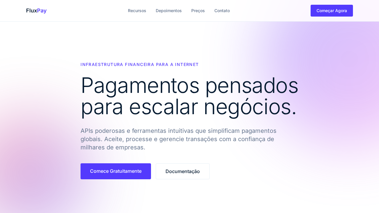
Headlines weight 300 (light) — autoridade através da leveza tipográfica. Sombras blue-tinted com rgba(50,50,93,0.25) criando profundidade com atmosfera de marca. Acento roxo (#533afd) para CTAs e links. Navy profundo (#061b31) para headings em vez de preto. Border-radius conservador (4-8px). OpenType ss01 em todo texto. Seções alternando branco e navy escuro (#1c1e54).
Light/Dark
✓ Full / ✓ Full
CSS
font-family: system-ui, sans-serif; font-weight: 300 headlines, 400 body; color: #061b31; accent: #533afd; box-shadow: rgba(50,50,93,0.25) 0px 30px 45px -30px, rgba(0,0,0,0.1) 0px 18px 36px -18px; border-radius: 4px; letter-spacing: -1.4px at 56px
Variáveis
--color-purple: #533afd; --color-navy: #061b31; --color-ruby: #ea2261; --color-magenta: #f96bee; --border: #e5edf5; --body-text: #64748d; --shadow-blue: rgba(50,50,93,0.25); --shadow-black: rgba(0,0,0,0.1); --brand-dark: #1c1e54; --radius: 4px
Checklist
☐ Headlines weight 300, ☐ Navy headings #061b31, ☐ Acento roxo #533afd, ☐ Sombras blue-tinted, ☐ Border-radius 4-8px, ☐ Seções alternando branco/navy, ☐ Letter-spacing negativo, ☐ Responsivo
DESIGN.md
Design System: Stripe Fintech Elegance
1. Visual Theme & Atmosphere
Estilo Stripe Fintech Elegance com headlines light-weight, sombras blue-tinted e acento roxo premium. Ideal para fintechs, pagamentos e plataformas financeiras. Inspirado no design system do Stripe, gold standard de design fintech com tipografia weight-300 e sombras cromáticas blue-tinted.
- Density: 5/10 — Balanced
- Variance: 4/10 — Moderate
- Motion: 4/10 — Subtle
2. Color Palette & Roles
- Roxo Stripe (#533afd) — Accent color, emphasis elements
- Navy Profundo (#061b31) — Primary background surface
- Branco (#ffffff) — Light surface, card backgrounds
- Ruby (#ea2261) — Supporting palette color
- Magenta (#f96bee) — Decorative accent, highlight elements
- Borda (#e5edf5) — Extended palette, decorative use
- Body (#64748d) — Primary text color
- Navy Escuro (#0d253d) — Deep contrast surface
3. Typography Rules
- Display / Hero: system-ui — Weight 700, tight tracking, used for headline impact
- Body: system-ui — Weight 400, 16px/1.6 line-height, max 72ch per line
- UI Labels / Captions: system-ui — 0.875rem, weight 500, slight letter-spacing
- Monospace: JetBrains Mono — Used for code, metadata, and technical values
Scale:
- Hero: clamp(2.5rem, 5vw, 4rem)
- H1: 2.25rem
- H2: 1.5rem
- Body: 1rem / 1.6
- Small: 0.875rem
4. Component Stylings
- Primary Button: Rounded (4px) shape. Accent color fill. Hover: 8% darken + subtle lift shadow. Active: -1px translate tactile press. Font weight 600. No outer glows.
- Secondary / Ghost Button: Outline variant. 1.5px border in muted color. Text in primary color. Hover: subtle background fill.
- Cards: Rounded (4px) corners. Surface background. Subtle shadow (0 2px 12px rgba(0,0,0,0.06)). 1px border stroke.
- Inputs: Label above input. 1px border stroke. Focus ring: 2px accent color offset 2px. Error text below in semantic red. No floating labels.
- Navigation: Primary surface background. Active item: accent color indicator. Font weight 500 when active.
- Skeletons: Shimmer animation matching component dimensions. No circular spinners.
- Empty States: Icon-based composition with descriptive text and action button.
5. Layout Principles
- Grid: CSS Grid primary. Max-width containment: 1280px centered with 1.5rem side padding.
- Spacing rhythm: Balanced. Base unit: 0.5rem (8px).
- Section vertical gaps: clamp(4rem, 8vw, 8rem).
- Hero layout: Split-screen (text left, visual right).
- Feature sections: Zig-zag alternating text+image rows. No 3-equal-columns.
- Mobile collapse: All multi-column layouts collapse below 768px. No horizontal overflow.
- z-index contract: base (0) / sticky-nav (100) / overlay (200) / modal (300) / toast (500).
6. Motion & Interaction
- Physics: Ease-out curves, 200-300ms duration. Smooth and predictable.
- Entry animations: Fade + translate-Y (16px → 0) over 420ms ease-out. Staggered cascades for lists: 80ms between items.
- Hover states: Subtle color shift + shadow adjustment over 200ms.
- Page transitions: Fade only (200ms).
- Performance: Only transform and opacity animated. No layout-triggering properties.
7. Anti-Patterns (Banned)
- No emojis in UI — use icon system only (Lucide, Heroicons)
- No pure black (#000000) — use off-black or charcoal variants
- No oversaturated accent colors (saturation cap: 80%)
- No 3-column equal-width feature layouts — use zig-zag or asymmetric grid
- No
h-screen— usemin-h-[100dvh] - No AI copywriting clichés: "Elevate", "Seamless", "Unleash", "Next-Gen"
- No broken external image links — use picsum.photos or inline SVG
- No generic lorem ipsum in demos
Prompt para AI
Design a Stripe-inspired fintech landing page. Headlines at weight 300 (light) — authority through typographic lightness. Deep navy (#061b31) headings instead of black. Stripe Purple (#533afd) as primary accent for CTAs. Blue-tinted multi-layer shadows using rgba(50,50,93,0.25). Conservative border-radius (4-8px). Ruby (#ea2261) and magenta (#f96bee) for gradient decorations. White canvas alternating with dark brand sections (#1c1e54). Negative letter-spacing at display sizes (-1.4px at 56px).
Relacionados
Última sincronização: 01/04/2026