Wealth Video Hero
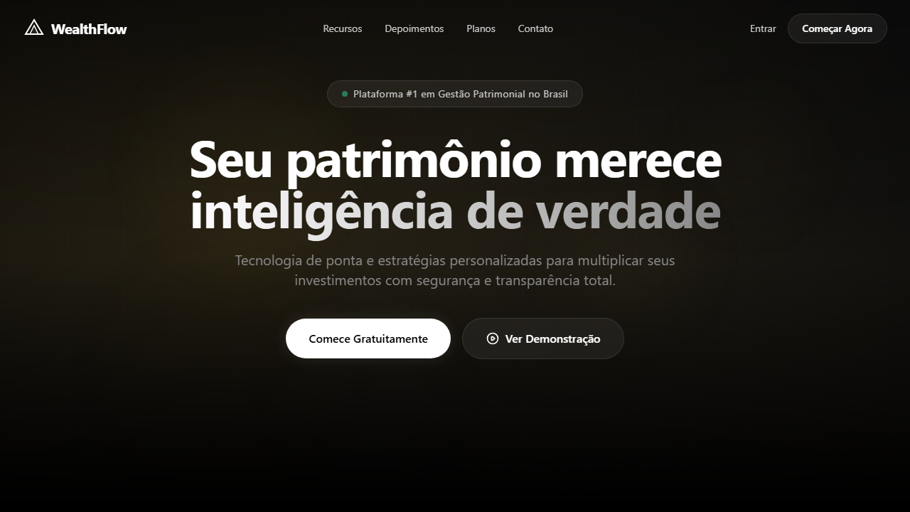
Premium fintech hero with full-screen looping background video scaled 150% with top-left focal point. Ideal for fintechs, plataformas de investimento, gestão patrimonial, landing pages financeiras premium. AI-ready template.
Use case: Fintechs, Platforms de investimento, Gestão patrimonial, Landing pages financeiras premium
Historical Context
The video hero in fintech didn't emerge from aesthetic ambition — it came from a trust problem. Early digital wealth platforms looked like spreadsheets wearing suits. Users with serious capital weren't convinced by static gradients and stock photography of handshakes. The first wave of video backgrounds in finance (circa 2018-2019) was clumsy: autoplay loops of city skylines, generic particle animations, the visual equivalent of hold music. Nobody was persuaded. The shift happened when firms like Wealthsimple and Revolut started treating their marketing pages like editorial film. Slow, deliberate cinematography. Abstract macro footage that suggested precision without showing a single chart. Glassmorphism entered the conversation around 2020 as the interface layer that could float above motion without competing with it — frosted panels that said 'premium' without saying 'opaque.' The combination worked because it solved a real tension: how do you communicate technological sophistication and human calm simultaneously? Today's wealth video heroes inherit that lineage but push further into spatial design. The glass panels aren't decorative anymore — they're functional containers that organize hierarchy while the background establishes emotional tone. It's architecture, not decoration.
When to Use
Deploy this pattern when your product handles real money and your audience expects the interface to reflect that gravity. Wealth management dashboards, premium fintech onboarding, investment platform landing pages — anywhere the user needs to feel both technologically empowered and emotionally secure before they hand over account credentials. Skip it for consumer banking or budget apps. This pattern carries weight; lightweight products buckle under it. If your value prop is simplicity, a video hero will contradict your message.
Design Principles
- Video content must be atmospheric, never informational — the moment footage tries to 'explain' something, the hero becomes a commercial and trust collapses
- Glassmorphism layers exist to establish depth hierarchy, not to look cool — every frosted panel must contain actionable content or primary messaging
- Motion pacing should mirror breathing rhythm (4-6 second loops) — fintech users are already anxious about money, don't accelerate their heart rate
- Contrast ratios on glass panels are non-negotiable — WCAG AA minimum, but aim for AAA because your users include 55-year-old portfolio managers on dim laptop screens
- The video should degrade gracefully to a single high-quality frame — 40% of premium fintech traffic comes from corporate networks that block autoplay
DESIGN.md
---
version: "alpha"
name: "Wealth Video Hero"
description: "Premium fintech hero with full-screen looping background video scaled 150% with top-left focal point. Ideal for fintechs, plataformas de investimento, gestão patrimonial, landing pages financeiras premium. AI-ready template."
colors:
  primary: "#000000"
  secondary: "#FFFFFF"
  tertiary: "#1A1A1A"
  neutral: "#888888"
  surface: "#CCCCCC"
  accent: "#111111"
typography:
  h1:
    fontFamily: System UI stack
    fontSize: 2.25rem
    fontWeight: 700
  body-md:
    fontFamily: System UI stack
    fontSize: 1rem
    fontWeight: 400
  label-caps:
    fontFamily: System UI stack
    fontSize: 0.75rem
    fontWeight: 500
rounded:
  sm: 9999px
  md: 19998px
  lg: 29997px
components:
  button-primary:
    backgroundColor: "{colors.primary}"
    textColor: "{colors.neutral}"
    rounded: "{rounded.sm}"
    padding: 12px
---

## Overview

Premium fintech hero with full-screen looping background video scaled 150% with top-left focal point. Ideal for fintechs, plataformas de investimento, gestão patrimonial, landing pages financeiras premium. AI-ready template. The video hero in fintech didn't emerge from aesthetic ambition — it came from a trust problem. Early digital wealth platforms looked like spreadsheets wearing suits. Users with serious capital weren't convinced by static gradients and stock photography of handshakes. The first wave of video backgrounds in finance (circa 2018-2019) was clumsy: autoplay loops of city skylines, generic particle animations, the visual equivalent of hold music. Nobody was persuaded.

The shift happened when firms like Wealthsimple and Revolut started treating their marketing pages like editorial film. Slow, deliberate cinematography. Abstract macro footage that suggested precision without showing a single chart. Glassmorphism entered the conversation around 2020 as the interface layer that could float above motion without competing with it — frosted panels that said 'premium' without saying 'opaque.' The combination worked because it solved a real tension: how do you communicate technological sophistication and human calm simultaneously?

Today's wealth video heroes inherit that lineage but push further into spatial design. The glass panels aren't decorative anymore — they're functional containers that organize hierarchy while the background establishes emotional tone. It's architecture, not decoration.

- Density: 5/10 — Balanced
- Variance: 2/10 — Structured
- Motion: 4/10 — Subtle

- **Style:** Fintech, Glassmorphism, Video Background, Premium
- **Keywords:** fintech, wealth, glassmorphism, vídeo de fundo, premium, dark mode, blur, grid de features, pill badge, investimento
- **Era:** 2024-2026 Fintech Premium
- **Light/Dark:** ✗ Not Recommended / ✓ Full

## Colors

- **Preto Profundo** (#000000) — Primary background surface
- **Branco Puro** (#FFFFFF) — Light surface, card backgrounds
- **Cinza Escuro** (#1A1A1A) — Dark surface, primary background
- **Cinza Médio** (#888888) — Secondary text, borders, muted elements
- **Cinza Claro** (#CCCCCC) — Secondary text, borders, muted elements
- **Preto Suave** (#111111) — Deep contrast surface
- **Vidro Translúcido** (rgba(0,0,0,0.7)) — Extended palette, decorative use
- **Borda Sutil** (rgba(255,255,255,0.1)) — Extended palette, decorative use


## Typography

- **Display / Hero:** System UI stack (-apple-system, sans-serif) — Weight 700, tight tracking, used for headline impact
- **Body:** System UI stack (-apple-system, sans-serif) — Weight 400, 16px/1.6 line-height, max 72ch per line
- **UI Labels / Captions:** System UI stack (-apple-system, sans-serif) — 0.875rem, weight 500, slight letter-spacing
- **Monospace:** JetBrains Mono — Used for code, metadata, and technical values

Scale:
- Hero: clamp(2.5rem, 5vw, 4rem)
- H1: 2.25rem
- H2: 1.5rem
- Body: 1rem / 1.6
- Small: 0.875rem


## Layout

- **Grid:** CSS Grid primary. Max-width containment: 1280px centered with 1.5rem side padding.
- **Spacing rhythm:** Balanced. Base unit: 0.5rem (8px).
- **Section vertical gaps:** clamp(4rem, 8vw, 8rem).
- **Hero layout:** Split-screen (text left, visual right).
- **Feature sections:** Zig-zag alternating text+image rows. No 3-equal-columns.
- **Mobile collapse:** All multi-column layouts collapse below 768px. No horizontal overflow.
- **z-index contract:** base (0) / sticky-nav (100) / overlay (200) / modal (300) / toast (500).


## Elevation & Depth

VÍDEO: Vídeo cinematográfico de ambiente financeiro/corporativo com tons escuros e dourados. Cenas abstratas de gráficos financeiros, moedas digitais ou skyline urbano noturno com luzes bokeh. Movimento lento e elegante transmitindo sofisticação e confiança. Escalado a 150% com foco no canto superior esquerdo para efeito de zoom imersivo. | EFEITOS CSS: Vídeo de fundo em tela cheia (autoplay, loop, muted) escalado a 150% com origin top-left, glassmorphism cards (bg-black/70, backdrop-blur-xl, borda branca sutil), pill badge translúcido no hero, hover com scale nos botões, grid de 4 colunas flutuante na parte inferior com efeito vidro

- **Physics:** Ease-out curves, 200-300ms duration. Smooth and predictable.
- **Entry animations:** Fade + translate-Y (16px → 0) over 420ms ease-out. Staggered cascades for lists: 80ms between items.
- **Hover states:** Subtle color shift + shadow adjustment over 200ms.
- **Page transitions:** Fade only (200ms).
- **Performance:** Only transform and opacity animated. No layout-triggering properties.


## Shapes

Base corner radius: 9999px. See rounded tokens in front matter for the full scale.


## Components

- **Primary Button:** Pill-shaped (9999px) shape. Accent color fill. Hover: 8% darken + subtle lift shadow. Active: -1px translate tactile press. Font weight 600. No outer glows.
- **Secondary / Ghost Button:** Outline variant. 1.5px border in muted color. Text in primary color. Hover: subtle background fill.
- **Cards:** Pill-shaped (9999px) corners. Surface background. Subtle shadow (0 2px 12px rgba(0,0,0,0.06)). 1px border stroke.
- **Inputs:** Label above input. 1px border stroke. Focus ring: 2px accent color offset 2px. Error text below in semantic red. No floating labels.
- **Navigation:** Primary surface background. Active item: accent color indicator. Font weight 500 when active.
- **Skeletons:** Shimmer animation matching component dimensions. No circular spinners.
- **Empty States:** Icon-based composition with descriptive text and action button.


## Do's and Don'ts

- No emojis in UI — use icon system only (Lucide, Heroicons)
- No pure white (#FFFFFF) backgrounds — use off-white or dark surfaces
- No oversaturated accent colors (saturation cap: 80%)
- No 3-column equal-width feature layouts — use zig-zag or asymmetric grid
- No `h-screen` — use `min-h-[100dvh]`
- No AI copywriting clichés: "Elevate", "Seamless", "Unleash", "Next-Gen"
- No broken external image links — use picsum.photos or inline SVG
- No generic lorem ipsum in demos

- Do Vídeo de fundo tela cheia (autoplay
- Do loop
- Do muted
- Do scale 150%)
- Do Navbar transparente
- Do Pill badge glassmórfico
- Do Headline grande branca centralizada
- Do CTA pill branco com hover scale
- Do Card inferior glassmorphism com grid 4 colunas
- Do Responsivo stack vertical mobile


## Use Case

Fintechs, Platforms de investimento, Gestão patrimonial, Landing pages financeiras premium
Technical Specs
CSS
background: #000000, video: object-cover scale-150 origin-top-left autoplay loop muted, backdrop-filter: blur(24px), background: rgba(0,0,0,0.7), border: 1px solid rgba(255,255,255,0.1), border-radius: 9999px for pills / 16px for cards, transition: transform 200ms, transform: scale(1.05) on hover
Variables
--bg-primary: #000000, --text-primary: #FFFFFF, --glass-bg: rgba(0,0,0,0.7), --glass-border: rgba(255,255,255,0.1), --blur: 24px, --radius-pill: 9999px, --radius-card: 16px, --video-scale: 1.5, --transition: 200ms ease
Checklist
☐ Vídeo de fundo tela cheia (autoplay, loop, muted, scale 150%), ☐ Navbar transparente, ☐ Pill badge glassmórfico, ☐ Headline grande branca centralizada, ☐ CTA pill branco com hover scale, ☐ Card inferior glassmorphism com grid 4 colunas, ☐ Responsivo stack vertical mobile
Colors
Primary
Secondary
Effects
VÍDEO: Vídeo cinematográfico de ambiente financeiro/corporativo com tons escuros e dourados. Cenas abstratas de gráficos financeiros, moedas digitais ou skyline urbano noturno com luzes bokeh. Movimento lento e elegante transmitindo sofisticação e confiança. Escalado a 150% com foco no canto superior esquerdo para efeito de zoom imersivo. | EFEITOS CSS: Vídeo de fundo em tela cheia (autoplay, loop, muted) escalado a 150% com origin top-left, glassmorphism cards (bg-black/70, backdrop-blur-xl, borda branca sutil), pill badge translúcido no hero, hover com scale nos botões, grid de 4 colunas flutuante na parte inferior com efeito vidro
Light/Dark
✗ Not Recommended / ✓ Full
AI Prompt
Act as a Senior Frontend Engineer and Expert UI Designer.
Your task is to code a complete Landing Page on the first attempt.
- Landing Page Theme: <INSERT THEME>
- Sections to add: <INSERT SECTIONS>

Generate the final code immediately following these definitions:

## Style

- **Name:** Wealth Video Hero
- **Type:** Fintech, Glassmorphism, Video Background, Premium
- **Keywords:** fintech, wealth, glassmorphism, vídeo de fundo, premium, dark mode, blur, grid de features, pill badge, investimento
- **Era:** 2024-2026 Fintech Premium
- **Light/Dark:** ✗ Not Recommended / ✓ Full

## Color Palette

- **Primary:** Preto Profundo #000000, Branco Puro #FFFFFF, Cinza Escuro #1A1A1A, Cinza Médio #888888
- **Secondary:** Vidro Translúcido rgba(0,0,0,0.7), Borda Sutil rgba(255,255,255,0.1), Cinza Claro #CCCCCC, Preto Suave #111111

## Visual Effects

VÍDEO: Vídeo cinematográfico de ambiente financeiro/corporativo com tons escuros e dourados. Cenas abstratas de gráficos financeiros, moedas digitais ou skyline urbano noturno com luzes bokeh. Movimento lento e elegante transmitindo sofisticação e confiança. Escalado a 150% com foco no canto superior esquerdo para efeito de zoom imersivo. | EFEITOS CSS: Vídeo de fundo em tela cheia (autoplay, loop, muted) escalado a 150% com origin top-left, glassmorphism cards (bg-black/70, backdrop-blur-xl, borda branca sutil), pill badge translúcido no hero, hover com scale nos botões, grid de 4 colunas flutuante na parte inferior com efeito vidro

## AI Visual Direction

Design a premium fintech hero with full-screen looping background video scaled 150% with top-left focal point. Black background, transparent navbar. Centered hero with glassmorphic pill badge, massive white headline, subtle subtitle, white pill CTA with hover scale. Bottom floating card with dark glassmorphism (bg-black/70, backdrop-blur-xl, white border) containing 4-column feature grid.

## CSS Technical

```css
background: #000000, video: object-cover scale-150 origin-top-left autoplay loop muted, backdrop-filter: blur(24px), background: rgba(0,0,0,0.7), border: 1px solid rgba(255,255,255,0.1), border-radius: 9999px for pills / 16px for cards, transition: transform 200ms, transform: scale(1.05) on hover
```

## Design System Variables

```css
--bg-primary: #000000, --text-primary: #FFFFFF, --glass-bg: rgba(0,0,0,0.7), --glass-border: rgba(255,255,255,0.1), --blur: 24px, --radius-pill: 9999px, --radius-card: 16px, --video-scale: 1.5, --transition: 200ms ease
```

## Implementation Checklist

- ☐ Vídeo de fundo tela cheia (autoplay
- loop
- muted
- scale 150%)
- ☐ Navbar transparente
- ☐ Pill badge glassmórfico
- ☐ Headline grande branca centralizada
- ☐ CTA pill branco com hover scale
- ☐ Card inferior glassmorphism com grid 4 colunas
- ☐ Responsivo stack vertical mobile

## Execution Rules

1. Strictly follow the defined visual style.
2. Use high-quality inline SVG icons (Heroicons or Lucide style) — NEVER use emojis as icons.
3. Add `cursor-pointer` and smooth `hover` states (transition-all) on all interactive elements.
4. Required Page Structure:
   - Navbar (Logo + Links + CTA)
   - Hero Section (Impactful Headline + Subtitle + 2 buttons + 3D/Abstract visual element via CSS)
   - Features (3 cards with icons)
   - Testimonials (3 cards)
   - Pricing (3 tiers, highlight the middle one)
   - Final CTA
   - Full Footer with social links, privacy policy, terms of use, contact and SEO links.
5. All text content must be in English.
6. The visual must be CLEARLY distinct — do not create a "default Bootstrap" design. Force the use of the provided design system variables.
7. Use `<style>` tags in the head for custom classes (especially for complex backdrop-filter effects and animations) that Tailwind CDN doesn't cover.
8. Full Responsiveness: Layout must adapt perfectly to Mobile, Tablet and Desktop (vertical stack on mobile).
9. Include basic SEO, Viewport and Open Graph meta tags in `<head>`.
10. Footer must contain: Copyright 2026, Secondary navigation links and Social media icons.
11. Make the creative decisions needed to deliver the complete, functional result now.
Related
Last synced: 4/1/2026