Voxel Gamified Isometric
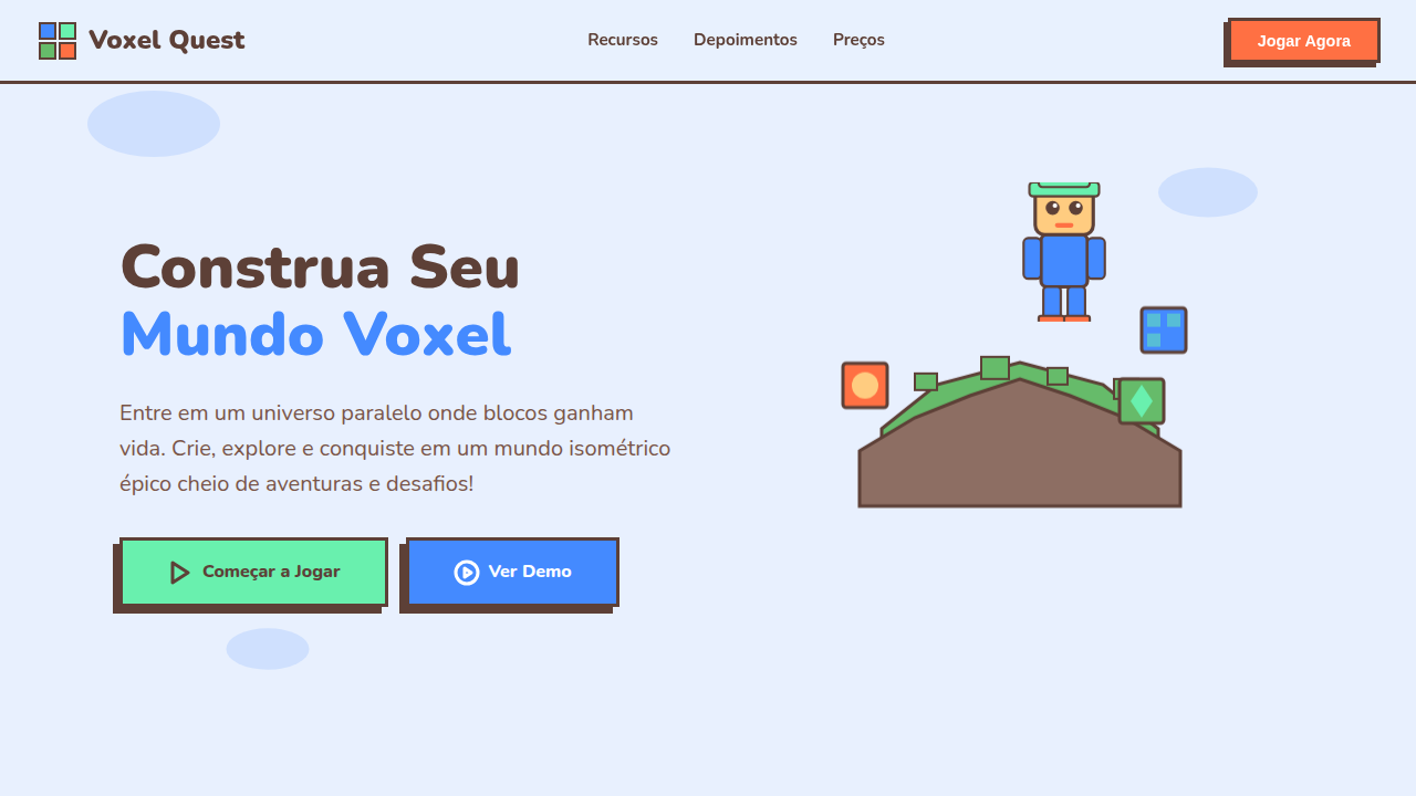
Voxel landing page, isometric 3d style, gamified design, floating islands, blocky characters, colorful and friendly. Ideal for landing pages, modern websites. AI-ready template.
Use case: Landing pages, Modern websites
Historical Context
Voxel aesthetics didn't start with Minecraft. But Minecraft made them universal. Before 2011, isometric pixel art lived in niche communities — modding forums, indie dev circles, demoscene archives. Then a generation grew up placing blocks, and suddenly chunky 3D geometry wasn't retro nostalgia anymore. It was native visual language. The crossover into UI happened gradually, then all at once. Gamification platforms needed visual systems that felt playful without being childish. Isometric voxel illustrations solved that tension perfectly — dimensional enough to feel substantial, stylized enough to avoid uncanny valley. Notion added game-like progress bars. Duolingo built entire worlds from flat isometric tiles. NFT projects in 2021-2022 leaned hard into voxel avatars because they rendered fast, looked distinctive at thumbnail scale, and carried instant community recognition. What's interesting now: voxel-gamified design has matured past novelty. It's a legitimate system choice for products that need to communicate complexity through spatial metaphor — dashboards as cityscapes, data as terrain, progress as construction.
When to Use
When your product needs to feel approachable and dimensional simultaneously. Perfect for onboarding flows that teach through exploration, metaverse interfaces where spatial hierarchy matters, education platforms competing for attention against actual games, and NFT/Web3 projects establishing visual identity fast. Works best when your audience already speaks game — they'll parse isometric depth intuitively. Avoid if your users expect clinical precision or if accessibility requirements demand flat, high-contrast layouts.
Design Principles
- Commit to the grid — isometric projection demands mathematical consistency; one misaligned block breaks the entire illusion
- Limit your palette brutally — voxel art gains charm from constraint, not from gradient excess; pick 8-12 colors maximum and let form do the work
- Design for thumbnail first — if your voxel scene doesn't read at 64px, it won't communicate at any scale; silhouette clarity beats interior detail
- Animate with purpose, not spectacle — a single block placing itself teaches more than a full camera flythrough; micro-interactions over cinematics
- Respect the z-axis hierarchy — depth isn't decoration, it's information architecture; foreground is primary action, midground is context, background is atmosphere
DESIGN.md
---
version: "alpha"
name: "Voxel Gamified Isometric"
description: "Voxel landing page, isometric 3d style, gamified design, floating islands, blocky characters, colorful and friendly. Ideal for landing pages, modern websites. AI-ready template."
colors:
  primary: "#E8F0FE"
  secondary: "#5D4037"
  tertiary: "#69F0AE"
  neutral: "#448AFF"
  surface: "#66BB6A"
  accent: "#FF7043"
typography:
  h1:
    fontFamily: Nunito
    fontSize: 2.5rem
    fontWeight: 700
  body-md:
    fontFamily: Nunito
    fontSize: 1rem
    fontWeight: 400
components:
  button-primary:
    backgroundColor: "{colors.primary}"
    textColor: "{colors.neutral}"
    padding: 12px
---

## Overview

Voxel landing page, isometric 3d style, gamified design, floating islands, blocky characters, colorful and friendly. Ideal for landing pages, modern websites. AI-ready template. Voxel aesthetics didn't start with Minecraft. But Minecraft made them universal. Before 2011, isometric pixel art lived in niche communities — modding forums, indie dev circles, demoscene archives. Then a generation grew up placing blocks, and suddenly chunky 3D geometry wasn't retro nostalgia anymore. It was native visual language.

The crossover into UI happened gradually, then all at once. Gamification platforms needed visual systems that felt playful without being childish. Isometric voxel illustrations solved that tension perfectly — dimensional enough to feel substantial, stylized enough to avoid uncanny valley. Notion added game-like progress bars. Duolingo built entire worlds from flat isometric tiles. NFT projects in 2021-2022 leaned hard into voxel avatars because they rendered fast, looked distinctive at thumbnail scale, and carried instant community recognition.

What's interesting now: voxel-gamified design has matured past novelty. It's a legitimate system choice for products that need to communicate complexity through spatial metaphor — dashboards as cityscapes, data as terrain, progress as construction.

- Density: 5/10 — Balanced
- Variance: 7/10 — Dynamic
- Motion: 8/10 — Cinematic

- **Style:** Playful, Structured, Friendly
- **Keywords:** voxel, isometric, 3d, game, block, pixel, colorful, floating
- **Era:** Modern Gaming
- **Light/Dark:** ✓ Full / ✗ No

## Colors

- **Background** (#E8F0FE) — Primary background surface
- **Text** (#5D4037) — Primary text color
- **Accent** (#69F0AE) — Primary accent, CTAs and interactive elements
- **Cube Blue** (#448AFF) — Secondary accent
- **Grass Block** (#66BB6A) — Extended palette, decorative use
- **Lava Orange** (#FF7043) — Warm accent, call-to-action secondary


## Typography

- **Display / Hero:** Nunito — Weight 700, tight tracking, used for headline impact
- **Body:** Nunito — Weight 400, 16px/1.6 line-height, max 72ch per line
- **UI Labels / Captions:** Nunito — 0.875rem, weight 500, slight letter-spacing
- **Monospace:** JetBrains Mono — Used for code, metadata, and technical values

Scale:
- Hero: clamp(2.5rem, 5vw, 4rem)
- H1: 2.25rem
- H2: 1.5rem
- Body: 1rem / 1.6
- Small: 0.875rem


## Layout

- **Grid:** CSS Grid primary. Max-width containment: 1280px centered with 1.5rem side padding.
- **Spacing rhythm:** Balanced. Base unit: 0.5rem (8px).
- **Section vertical gaps:** clamp(4rem, 8vw, 8rem).
- **Hero layout:** Asymmetric composition.
- **Feature sections:** Asymmetric grid with varied card sizes. No 3-equal-columns.
- **Mobile collapse:** All multi-column layouts collapse below 768px. No horizontal overflow.
- **z-index contract:** base (0) / sticky-nav (100) / overlay (200) / modal (300) / toast (500).


## Elevation & Depth

Isometric projection, voxel-style block characters, floating island platforms, smooth vector gradients, edge lighting.

- **Physics:** Spring — stiffness 120, damping 20. Confident, weighted transitions.
- **Entry animations:** Fade + translate-Y (16px → 0) over 540ms ease-out. Staggered cascades for lists: 120ms between items.
- **Hover states:** Scale(1.03) + shadow lift over 200ms.
- **Page transitions:** Fade + slide (300ms).
- **Performance:** Only transform and opacity animated. No layout-triggering properties.


## Shapes

Base corner radius: 8px. See rounded tokens in front matter for the full scale.


## Components

- **Primary Button:** Subtly rounded (0.5rem) shape. Accent color fill. Hover: 8% darken + subtle lift shadow. Active: -1px translate tactile press. Font weight 600. No outer glows.
- **Secondary / Ghost Button:** Outline variant. 1.5px border in muted color. Text in primary color. Hover: subtle background fill.
- **Cards:** Subtly rounded (0.5rem) corners. Surface background. Subtle shadow (0 2px 12px rgba(0,0,0,0.06)). 1px border stroke.
- **Inputs:** Label above input. 1px border stroke. Focus ring: 2px accent color offset 2px. Error text below in semantic red. No floating labels.
- **Navigation:** Primary surface background. Active item: accent color indicator. Font weight 500 when active.
- **Skeletons:** Shimmer animation matching component dimensions. No circular spinners.
- **Empty States:** Icon-based composition with descriptive text and action button.


## Do's and Don'ts

- No emojis in UI — use icon system only (Lucide, Heroicons)
- No pure black (#000000) — use off-black or charcoal variants
- No oversaturated accent colors (saturation cap: 80%)
- No 3-column equal-width feature layouts — use zig-zag or asymmetric grid
- No `h-screen` — use `min-h-[100dvh]`
- No AI copywriting clichés: "Elevate", "Seamless", "Unleash", "Next-Gen"
- No broken external image links — use picsum.photos or inline SVG
- No generic lorem ipsum in demos

- Do Isometric layout/illustration
- Do Blocky 'Minecraft' style elements
- Do Bright cheerful colors
- Do Floating containers (shadows underneath)
- Do Gamified UI elements


## Use Case

Landing pages, Modern websites
Technical Specs
CSS
background-color: #E8F0FE; color: #5D4037; font-family: 'Nunito', sans-serif; transform: rotateX(60deg) rotateY(0deg) rotateZ(-45deg); box-shadow: -10px 10px 0 #ddd;
Variables
--bg-sky: #E8F0FE, --text-earth: #5D4037, --accent-green: #69F0AE, --font-round: 'Nunito', sans-serif, --iso-angle: rotateX(60deg) rotateZ(-45deg)
Checklist
☐ Isometric layout/illustration, ☐ Blocky 'Minecraft' style elements, ☐ Bright cheerful colors, ☐ Floating containers (shadows underneath), ☐ Gamified UI elements
Colors
Primary
Secondary
Effects
Isometric projection, voxel-style block characters, floating island platforms, smooth vector gradients, edge lighting.
Light/Dark
✓ Full / ✗ No
AI Prompt
Act as a Senior Frontend Engineer and Expert UI Designer.
Your task is to code a complete Landing Page on the first attempt.
- Landing Page Theme: <INSERT THEME>
- Sections to add: <INSERT SECTIONS>

Generate the final code immediately following these definitions:

## Style

- **Name:** Voxel Gamified Isometric
- **Type:** Playful, Structured, Friendly
- **Keywords:** voxel, isometric, 3d, game, block, pixel, colorful, floating
- **Era:** Modern Gaming
- **Light/Dark:** ✓ Full / ✗ No

## Color Palette

- **Primary:** Background #E8F0FE, Text #5D4037, Accent #69F0AE
- **Secondary:** Cube Blue #448AFF, Grass Block #66BB6A, Lava Orange #FF7043

## Visual Effects

Isometric projection, voxel-style block characters, floating island platforms, smooth vector gradients, edge lighting.

## AI Visual Direction

voxel landing page, isometric 3d style, gamified design, floating islands, blocky characters, colorful and friendly.

## CSS Technical

```css
background-color: #E8F0FE; color: #5D4037; font-family: 'Nunito', sans-serif; transform: rotateX(60deg) rotateY(0deg) rotateZ(-45deg); box-shadow: -10px 10px 0 #ddd;
```

## Design System Variables

```css
--bg-sky: #E8F0FE, --text-earth: #5D4037, --accent-green: #69F0AE, --font-round: 'Nunito', sans-serif, --iso-angle: rotateX(60deg) rotateZ(-45deg)
```

## Implementation Checklist

- ☐ Isometric layout/illustration
- ☐ Blocky 'Minecraft' style elements
- ☐ Bright cheerful colors
- ☐ Floating containers (shadows underneath)
- ☐ Gamified UI elements

## Execution Rules

1. Strictly follow the defined visual style.
2. Use high-quality inline SVG icons (Heroicons or Lucide style) — NEVER use emojis as icons.
3. Add `cursor-pointer` and smooth `hover` states (transition-all) on all interactive elements.
4. Required Page Structure:
   - Navbar (Logo + Links + CTA)
   - Hero Section (Impactful Headline + Subtitle + 2 buttons + 3D/Abstract visual element via CSS)
   - Features (3 cards with icons)
   - Testimonials (3 cards)
   - Pricing (3 tiers, highlight the middle one)
   - Final CTA
   - Full Footer with social links, privacy policy, terms of use, contact and SEO links.
5. All text content must be in English.
6. The visual must be CLEARLY distinct — do not create a "default Bootstrap" design. Force the use of the provided design system variables.
7. Use `<style>` tags in the head for custom classes (especially for complex backdrop-filter effects and animations) that Tailwind CDN doesn't cover.
8. Full Responsiveness: Layout must adapt perfectly to Mobile, Tablet and Desktop (vertical stack on mobile).
9. Include basic SEO, Viewport and Open Graph meta tags in `<head>`.
10. Footer must contain: Copyright 2026, Secondary navigation links and Social media icons.
11. Make the creative decisions needed to deliver the complete, functional result now.
Related
Last synced: 4/1/2026