70s Psychedelic Flower Power
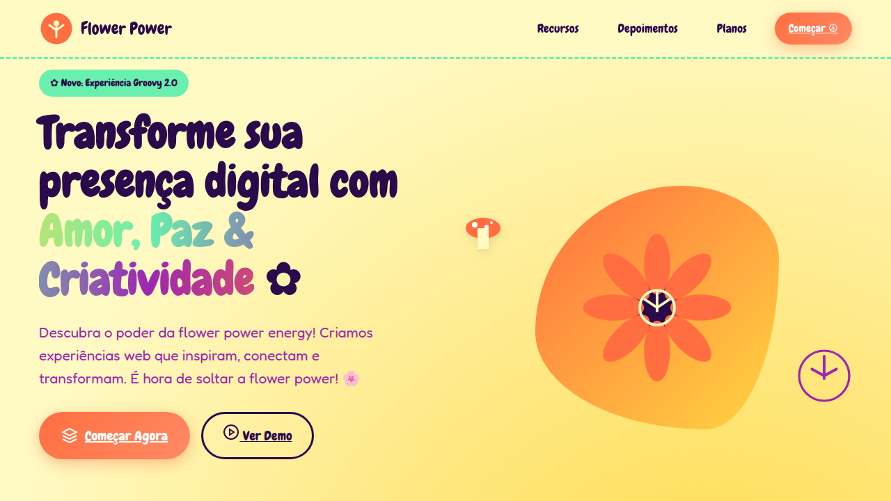
70s landing page, psychedelic style, flower power, groovy font, wavy lines, bright retro colors, hippie aesthetic. Ideal for landing pages, modern websites. AI-ready template.
Use case: Landing pages, Modern websites
Historical Context
The 60s gave us acid-drenched visuals — warped letterforms, optical illusions, electric color on black. Victor Moscoso and Wes Wilson made posters you had to squint at. Deliberately illegible. Deliberately confrontational. By the early 70s, that aggression softened. The counterculture had won enough battles to relax. Flower power aesthetics traded the 60s' visual violence for something rounder, warmer, more decorative. Daisies replaced fractals. Earth tones crept in alongside the expected oranges and magentas. Typography went from melting to blooming — fat, bubbly letterforms inspired by Art Nouveau rather than Op Art. The palette shifted from neon-on-black to saturated warmth: burnt orange, avocado, mustard, deep purple against cream or tan. This wasn't dilution — it was domestication. Psychedelia moved from head shops to department stores, from concert posters to wallpaper. The visual language became accessible, reproducible, commercial. And honestly? That's what makes it useful now. The 70s version already solved the problem of making counterculture aesthetics function at scale.
When to Use
Reach for this when the brief says "retro" but means "warm and inviting," not "ironic." Cannabis brands that want heritage without stoner clichés. Festival posters that need to feel handmade at billboard scale. Vintage-inspired music packaging. Any project where you need psychedelic energy without the 60s' visual hostility. Works beautifully for brands targeting nostalgia-curious millennials who romanticize an era they never lived through. Avoid for anything requiring corporate trust or clinical precision.
Design Principles
- Curves over angles, always — let every element bloom outward from organic center points rather than snapping to rigid grids
- Layer saturated warm tones (burnt orange, magenta, gold) against muted earth backgrounds — the contrast should feel like sunset, not like a screen test
- Typography should be fat, rounded, and slightly irregular — reference Cooper Black, Bookmania, or custom hand-drawn lettering before reaching for geometric sans
- Embrace decorative density — fill negative space with botanical motifs, radiating lines, or pattern work, but maintain one clear focal point so the composition breathes
- Texture is non-negotiable — grain, halftone dots, slight registration misalignment, ink bleed — the aesthetic lives in analog imperfection
DESIGN.md
---
version: "alpha"
name: "70s Psychedelic Flower Power"
description: "70s landing page, psychedelic style, flower power, groovy font, wavy lines, bright retro colors, hippie aesthetic. Ideal for landing pages, modern websites. AI-ready template."
colors:
  primary: "#FFF9C4"
  secondary: "#2A0A4A"
  tertiary: "#FF6E40"
  neutral: "#69F0AE"
  surface: "#9C27B0"
  accent: "#FFD740"
typography:
  h1:
    fontFamily: Chewy
    fontSize: 2.5rem
    fontWeight: 700
  body-md:
    fontFamily: Chewy
    fontSize: 1rem
    fontWeight: 400
components:
  button-primary:
    backgroundColor: "{colors.primary}"
    textColor: "{colors.neutral}"
    padding: 12px
---

## Overview

70s landing page, psychedelic style, flower power, groovy font, wavy lines, bright retro colors, hippie aesthetic. Ideal for landing pages, modern websites. AI-ready template. The 60s gave us acid-drenched visuals — warped letterforms, optical illusions, electric color on black. Victor Moscoso and Wes Wilson made posters you had to squint at. Deliberately illegible. Deliberately confrontational. By the early 70s, that aggression softened. The counterculture had won enough battles to relax.

Flower power aesthetics traded the 60s' visual violence for something rounder, warmer, more decorative. Daisies replaced fractals. Earth tones crept in alongside the expected oranges and magentas. Typography went from melting to blooming — fat, bubbly letterforms inspired by Art Nouveau rather than Op Art. The palette shifted from neon-on-black to saturated warmth: burnt orange, avocado, mustard, deep purple against cream or tan.

This wasn't dilution — it was domestication. Psychedelia moved from head shops to department stores, from concert posters to wallpaper. The visual language became accessible, reproducible, commercial. And honestly? That's what makes it useful now. The 70s version already solved the problem of making counterculture aesthetics function at scale.

- Density: 5/10 — Balanced
- Variance: 7/10 — Dynamic
- Motion: 4/10 — Subtle

- **Style:** Playful, Whimsical, Educational
- **Keywords:** 70s, psychedelic, retro, flower, groovy, wavy, colorful, hippie
- **Era:** 1970s Retro
- **Light/Dark:** ✓ Full / ✗ No

## Colors

- **Background** (#FFF9C4) — Primary background surface
- **Text** (#2A0A4A) — Primary text color
- **Accent** (#FF6E40) — Primary accent, CTAs and interactive elements
- **Groovy Green** (#69F0AE) — Success states, positive indicators
- **Purple Haze** (#9C27B0) — Accent color, emphasis elements
- **Sunshine Yellow** (#FFD740) — Warning states, attention indicators


## Typography

- **Display / Hero:** Chewy — Weight 700, tight tracking, used for headline impact
- **Body:** Chewy — Weight 400, 16px/1.6 line-height, max 72ch per line
- **UI Labels / Captions:** Chewy — 0.875rem, weight 500, slight letter-spacing
- **Monospace:** JetBrains Mono — Used for code, metadata, and technical values

Scale:
- Hero: clamp(2.5rem, 5vw, 4rem)
- H1: 2.25rem
- H2: 1.5rem
- Body: 1rem / 1.6
- Small: 0.875rem


## Layout

- **Grid:** CSS Grid primary. Max-width containment: 1280px centered with 1.5rem side padding.
- **Spacing rhythm:** Balanced. Base unit: 0.5rem (8px).
- **Section vertical gaps:** clamp(4rem, 8vw, 8rem).
- **Hero layout:** Asymmetric composition.
- **Feature sections:** Asymmetric grid with varied card sizes. No 3-equal-columns.
- **Mobile collapse:** All multi-column layouts collapse below 768px. No horizontal overflow.
- **z-index contract:** base (0) / sticky-nav (100) / overlay (200) / modal (300) / toast (500).


## Elevation & Depth

Wavy rainbow borders, peace signs, mushrooms, daisies, organic fluid shapes, flat vector illustration.

- **Physics:** Ease-out curves, 200-300ms duration. Smooth and predictable.
- **Entry animations:** Fade + translate-Y (16px → 0) over 420ms ease-out. Staggered cascades for lists: 80ms between items.
- **Hover states:** Subtle color shift + shadow adjustment over 200ms.
- **Page transitions:** Fade only (200ms).
- **Performance:** Only transform and opacity animated. No layout-triggering properties.


## Shapes

Base corner radius: 9999px. See rounded tokens in front matter for the full scale.


## Components

- **Primary Button:** Rounded (50% 20% / 10% 40%) shape. Accent color fill. Hover: 8% darken + subtle lift shadow. Active: -1px translate tactile press. Font weight 600. No outer glows.
- **Secondary / Ghost Button:** Outline variant. 1.5px border in muted color. Text in primary color. Hover: subtle background fill.
- **Cards:** Rounded (50% 20% / 10% 40%) corners. Surface background. Subtle shadow (0 2px 12px rgba(0,0,0,0.06)). 1px border stroke.
- **Inputs:** Label above input. 1px border stroke. Focus ring: 2px accent color offset 2px. Error text below in semantic red. No floating labels.
- **Navigation:** Primary surface background. Active item: accent color indicator. Font weight 500 when active.
- **Skeletons:** Shimmer animation matching component dimensions. No circular spinners.
- **Empty States:** Icon-based composition with descriptive text and action button.


## Do's and Don'ts

- No emojis in UI — use icon system only (Lucide, Heroicons)
- No pure black (#000000) — use off-black or charcoal variants
- No oversaturated accent colors (saturation cap: 80%)
- No 3-column equal-width feature layouts — use zig-zag or asymmetric grid
- No `h-screen` — use `min-h-[100dvh]`
- No AI copywriting clichés: "Elevate", "Seamless", "Unleash", "Next-Gen"
- No broken external image links — use picsum.photos or inline SVG
- No generic lorem ipsum in demos

- Do Yellow/Cream background
- Do Bubba/Groovy typography
- Do Wavy lines and borders
- Do Flower/Peace icons
- Do Bright saturated retro colors


## Use Case

Landing pages, Modern websites
Technical Specs
CSS
background-color: #FFF9C4; color: #2A0A4A; font-family: 'Chewy', cursive; border-radius: 50% 20% / 10% 40%; border: 5px solid #FF6E40;
Variables
--navajo-white: #FFF9C4, --groovy-purple: #2A0A4A, --flower-orange: #FF6E40, --font-fun: 'Chewy', cursive, --border-wavy: 5px solid
Checklist
☐ Yellow/Cream background, ☐ Bubba/Groovy typography, ☐ Wavy lines and borders, ☐ Flower/Peace icons, ☐ Bright saturated retro colors
Colors
Primary
Secondary
Effects
Wavy rainbow borders, peace signs, mushrooms, daisies, organic fluid shapes, flat vector illustration.
Light/Dark
✓ Full / ✗ No
AI Prompt
Act as a Senior Frontend Engineer and Expert UI Designer.
Your task is to code a complete Landing Page on the first attempt.
- Landing Page Theme: <INSERT THEME>
- Sections to add: <INSERT SECTIONS>

Generate the final code immediately following these definitions:

## Style

- **Name:** 70s Psychedelic Flower Power
- **Type:** Playful, Whimsical, Educational
- **Keywords:** 70s, psychedelic, retro, flower, groovy, wavy, colorful, hippie
- **Era:** 1970s Retro
- **Light/Dark:** ✓ Full / ✗ No

## Color Palette

- **Primary:** Background #FFF9C4, Text #2A0A4A, Accent #FF6E40
- **Secondary:** Groovy Green #69F0AE, Purple Haze #9C27B0, Sunshine Yellow #FFD740

## Visual Effects

Wavy rainbow borders, peace signs, mushrooms, daisies, organic fluid shapes, flat vector illustration.

## AI Visual Direction

70s landing page, psychedelic style, flower power, groovy font, wavy lines, bright retro colors, hippie aesthetic.

## CSS Technical

```css
background-color: #FFF9C4; color: #2A0A4A; font-family: 'Chewy', cursive; border-radius: 50% 20% / 10% 40%; border: 5px solid #FF6E40;
```

## Design System Variables

```css
--navajo-white: #FFF9C4, --groovy-purple: #2A0A4A, --flower-orange: #FF6E40, --font-fun: 'Chewy', cursive, --border-wavy: 5px solid
```

## Implementation Checklist

- ☐ Yellow/Cream background
- ☐ Bubba/Groovy typography
- ☐ Wavy lines and borders
- ☐ Flower/Peace icons
- ☐ Bright saturated retro colors

## Execution Rules

1. Strictly follow the defined visual style.
2. Use high-quality inline SVG icons (Heroicons or Lucide style) — NEVER use emojis as icons.
3. Add `cursor-pointer` and smooth `hover` states (transition-all) on all interactive elements.
4. Required Page Structure:
   - Navbar (Logo + Links + CTA)
   - Hero Section (Impactful Headline + Subtitle + 2 buttons + 3D/Abstract visual element via CSS)
   - Features (3 cards with icons)
   - Testimonials (3 cards)
   - Pricing (3 tiers, highlight the middle one)
   - Final CTA
   - Full Footer with social links, privacy policy, terms of use, contact and SEO links.
5. All text content must be in English.
6. The visual must be CLEARLY distinct — do not create a "default Bootstrap" design. Force the use of the provided design system variables.
7. Use `<style>` tags in the head for custom classes (especially for complex backdrop-filter effects and animations) that Tailwind CDN doesn't cover.
8. Full Responsiveness: Layout must adapt perfectly to Mobile, Tablet and Desktop (vertical stack on mobile).
9. Include basic SEO, Viewport and Open Graph meta tags in `<head>`.
10. Footer must contain: Copyright 2026, Secondary navigation links and Social media icons.
11. Make the creative decisions needed to deliver the complete, functional result now.
Related
Last synced: 4/1/2026