Uber Bold Transit
Design an Uber-inspired bold landing page. Ideal for mobilidade urbana, logistics, delivery, plataformas de transporte. AI-ready template.
Use case: Mobilidade urbana, Logistics, Delivery, Platforms de transporte
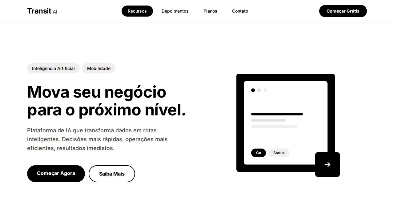
Historical Context
Uber's typographic identity went through a radical shift when they commissioned their custom typeface, Uber Move, in 2018 — replacing the generic Brand Bold approach that had carried them through their scrappy growth years. The move was deliberate: as Uber expanded beyond ride-hailing into freight, eats, and autonomous vehicles, they needed a type system that could flex across wildly different contexts while maintaining unmistakable brand coherence. Uber Move's bold weights are where the system really earns its keep. The transit-oriented cuts were designed to be legible at speed — on phone screens in bright sunlight, on vehicle dashboards, on wayfinding signage in airports. The letterforms carry a mechanical confidence that feels engineered rather than drawn. There's no calligraphic warmth here, and that's the point. This is typography that respects the user's time. What makes the bold transit style culturally significant is how it redefined what mobility brands could look like. Before Uber committed to this direction, transportation design was stuck between sterile government signage and overwrought tech aesthetics. Uber Move Bold carved a third path — utilitarian but branded, systematic but not soulless.
When to Use
Deploy Uber Bold Transit when your product moves people or things and needs to communicate reliability at a glance. It works for mobility platforms, logistics dashboards, fleet management interfaces, and urban service apps where information density is high and reading time is low. Ideal for headers and UI labels that need to punch through visual noise — map overlays, ETA displays, route confirmations. Avoid it for editorial longform or anything requiring warmth. This is a workhorse weight, not a storytelling voice.
Design Principles
- Legibility at speed — every glyph must resolve instantly at arm's length, in motion, under variable lighting conditions
- Mechanical confidence over organic warmth — letterforms should feel engineered, precise, and intentionally constructed
- Density without claustrophobia — bold weight carries authority but generous spacing prevents the heaviness from collapsing
- Context-agnostic scaling — the same typographic voice must hold from 12px mobile labels to 200px transit signage
- Brand through restraint — identity comes from consistent application of a tight system, not from decorative flourishes
DESIGN.md
---
version: "alpha"
name: "Uber Bold Transit"
description: "Design an Uber-inspired bold landing page. Ideal for mobilidade urbana, logistics, delivery, plataformas de transporte. AI-ready template."
colors:
  primary: "#000000"
  secondary: "#ffffff"
  tertiary: "#e2e2e2"
  neutral: "#efefef"
  surface: "#4b4b4b"
  accent: "#afafaf"
typography:
  h1:
    fontFamily: system-ui
    fontSize: 2.25rem
    fontWeight: 700
  body-md:
    fontFamily: system-ui
    fontSize: 1rem
    fontWeight: 400
  label-caps:
    fontFamily: system-ui
    fontSize: 0.75rem
    fontWeight: 500
rounded:
  sm: 999px
  md: 1998px
  lg: 2997px
components:
  button-primary:
    backgroundColor: "{colors.primary}"
    textColor: "{colors.neutral}"
    rounded: "{rounded.sm}"
    padding: 12px
---

## Overview

Design an Uber-inspired bold landing page. Ideal for mobilidade urbana, logistics, delivery, plataformas de transporte. AI-ready template. Uber's typographic identity went through a radical shift when they commissioned their custom typeface, Uber Move, in 2018 — replacing the generic Brand Bold approach that had carried them through their scrappy growth years. The move was deliberate: as Uber expanded beyond ride-hailing into freight, eats, and autonomous vehicles, they needed a type system that could flex across wildly different contexts while maintaining unmistakable brand coherence.

Uber Move's bold weights are where the system really earns its keep. The transit-oriented cuts were designed to be legible at speed — on phone screens in bright sunlight, on vehicle dashboards, on wayfinding signage in airports. The letterforms carry a mechanical confidence that feels engineered rather than drawn. There's no calligraphic warmth here, and that's the point. This is typography that respects the user's time.

What makes the bold transit style culturally significant is how it redefined what mobility brands could look like. Before Uber committed to this direction, transportation design was stuck between sterile government signage and overwrought tech aesthetics. Uber Move Bold carved a third path — utilitarian but branded, systematic but not soulless.

- Density: 3/10 — Airy
- Variance: 3/10 — Restrained
- Motion: 4/10 — Subtle

- **Style:** Bold Minimalism, Black-White Duality, Pill Navigation, Transit Map Typography
- **Keywords:** uber, bold, transit, black-white, pill navigation, UberMove, billboard headlines, warm illustrations, whisper shadows
- **Era:** 2024-2026 Urban Mobility
- **Light/Dark:** ✓ Full / ✗ Not Recommended

## Colors

- **Preto Uber** (#000000) — Dark surface, primary background
- **Branco** (#ffffff) — Light surface, card backgrounds
- **Cinza Hover** (#e2e2e2) — Secondary text, borders, muted elements
- **Cinza Chip** (#efefef) — Secondary text, borders, muted elements
- **Cinza Body** (#4b4b4b) — Primary text color
- **Cinza Muted** (#afafaf) — Secondary text, borders, muted elements
- **Sombra** (rgba(0,0,0,0.12)) — Extended palette, decorative use
- **Sombra Média** (rgba(0,0,0,0.16)) — Extended palette, decorative use


## Typography

- **Display / Hero:** system-ui — Weight 700, tight tracking, used for headline impact
- **Body:** system-ui — Weight 400, 16px/1.6 line-height, max 72ch per line
- **UI Labels / Captions:** system-ui — 0.875rem, weight 500, slight letter-spacing
- **Monospace:** JetBrains Mono — Used for code, metadata, and technical values

Scale:
- Hero: clamp(2.5rem, 5vw, 4rem)
- H1: 2.25rem
- H2: 1.5rem
- Body: 1rem / 1.6
- Small: 0.875rem


## Layout

- **Grid:** CSS Grid primary. Max-width containment: 1280px centered with 1.5rem side padding.
- **Spacing rhythm:** Balanced. Base unit: 0.5rem (8px).
- **Section vertical gaps:** clamp(4rem, 8vw, 8rem).
- **Hero layout:** Split-screen (text left, visual right).
- **Feature sections:** Zig-zag alternating text+image rows. No 3-equal-columns.
- **Mobile collapse:** All multi-column layouts collapse below 768px. No horizontal overflow.
- **z-index contract:** base (0) / sticky-nav (100) / overlay (200) / modal (300) / toast (500).


## Elevation & Depth

Dualidade preto-branco stark sem cinzas intermediários no chrome. Headlines bold (700) em geometric sans-serif com presença de billboard. Pill-shaped (999px) em TUDO interativo — botões, chips, nav, seletores. Ilustrações quentes e humanas contrastando com interface monocromática. Sombras whisper-soft (0.12-0.16 opacity). Layout denso e eficiente como mapa de trânsito. Footer preto full-width.

- **Physics:** Ease-out curves, 200-300ms duration. Smooth and predictable.
- **Entry animations:** Fade + translate-Y (16px → 0) over 420ms ease-out. Staggered cascades for lists: 80ms between items.
- **Hover states:** Subtle color shift + shadow adjustment over 200ms.
- **Page transitions:** Fade only (200ms).
- **Performance:** Only transform and opacity animated. No layout-triggering properties.


## Shapes

Base corner radius: 999px. See rounded tokens in front matter for the full scale.


## Components

- **Primary Button:** Pill-shaped (9999px) shape. Accent color fill. Hover: 8% darken + subtle lift shadow. Active: -1px translate tactile press. Font weight 600. No outer glows.
- **Secondary / Ghost Button:** Outline variant. 1.5px border in muted color. Text in primary color. Hover: subtle background fill.
- **Cards:** Pill-shaped (9999px) corners. Surface background. Subtle shadow (0 2px 12px rgba(0,0,0,0.06)). 1px border stroke.
- **Inputs:** Label above input. 1px border stroke. Focus ring: 2px accent color offset 2px. Error text below in semantic red. No floating labels.
- **Navigation:** Primary surface background. Active item: accent color indicator. Font weight 500 when active.
- **Skeletons:** Shimmer animation matching component dimensions. No circular spinners.
- **Empty States:** Icon-based composition with descriptive text and action button.


## Do's and Don'ts

- No emojis in UI — use icon system only (Lucide, Heroicons)
- No pure black (#000000) — use off-black or charcoal variants
- No oversaturated accent colors (saturation cap: 80%)
- No 3-column equal-width feature layouts — use zig-zag or asymmetric grid
- No `h-screen` — use `min-h-[100dvh]`
- No AI copywriting clichés: "Elevate", "Seamless", "Unleash", "Next-Gen"
- No broken external image links — use picsum.photos or inline SVG
- No generic lorem ipsum in demos

- Do Dualidade preto/branco stark
- Do Headlines bold 700 billboard
- Do Pill 999px em tudo interativo
- Do Ilustrações quentes humanas
- Do Sombras whisper 0.12-0.16
- Do Layout denso eficiente
- Do Footer preto
- Do Responsivo


## Use Case

Mobilidade urbana, Logistics, Delivery, Platforms de transporte
Technical Specs
CSS
background: #ffffff; color: #000000; border-radius: 999px interactive, 8px cards, 12px featured; box-shadow: rgba(0,0,0,0.12) 0px 4px 16px; font-family: system-ui, sans-serif; font-weight: 700 headlines, 500 body
Variables
--bg: #ffffff; --text: #000000; --hover: #e2e2e2; --chip: #efefef; --body-text: #4b4b4b; --shadow-light: rgba(0,0,0,0.12); --shadow-medium: rgba(0,0,0,0.16); --radius-pill: 999px; --radius-card: 8px
Checklist
☐ Dualidade preto/branco stark, ☐ Headlines bold 700 billboard, ☐ Pill 999px em tudo interativo, ☐ Ilustrações quentes humanas, ☐ Sombras whisper 0.12-0.16, ☐ Layout denso eficiente, ☐ Footer preto, ☐ Responsivo
Colors
Primary
Secondary
Effects
Dualidade preto-branco stark sem cinzas intermediários no chrome. Headlines bold (700) em geometric sans-serif com presença de billboard. Pill-shaped (999px) em TUDO interativo — botões, chips, nav, seletores. Ilustrações quentes e humanas contrastando com interface monocromática. Sombras whisper-soft (0.12-0.16 opacity). Layout denso e eficiente como mapa de trânsito. Footer preto full-width.
Light/Dark
✓ Full / ✗ Not Recommended
AI Prompt
Act as a Senior Frontend Engineer and Expert UI Designer.
Your task is to code a complete Landing Page on the first attempt.
- Landing Page Theme: <INSERT THEME>
- Sections to add: <INSERT SECTIONS>

Generate the final code immediately following these definitions:

## Style

- **Name:** Uber Bold Transit
- **Type:** Bold Minimalism, Black-White Duality, Pill Navigation, Transit Map Typography
- **Keywords:** uber, bold, transit, black-white, pill navigation, UberMove, billboard headlines, warm illustrations, whisper shadows
- **Era:** 2024-2026 Urban Mobility
- **Light/Dark:** ✓ Full / ✗ Not Recommended

## Color Palette

- **Primary:** Preto Uber #000000, Branco #ffffff, Cinza Hover #e2e2e2, Cinza Chip #efefef
- **Secondary:** Cinza Body #4b4b4b, Cinza Muted #afafaf, Sombra rgba(0,0,0,0.12), Sombra Média rgba(0,0,0,0.16)

## Visual Effects

Dualidade preto-branco stark sem cinzas intermediários no chrome. Headlines bold (700) em geometric sans-serif com presença de billboard. Pill-shaped (999px) em TUDO interativo — botões, chips, nav, seletores. Ilustrações quentes e humanas contrastando com interface monocromática. Sombras whisper-soft (0.12-0.16 opacity). Layout denso e eficiente como mapa de trânsito. Footer preto full-width.

## AI Visual Direction

Design an Uber-inspired bold landing page. Stark black (#000000) and white (#ffffff) duality with virtually no mid-tone grays. Geometric sans-serif headlines at 52px weight 700 with billboard presence. Pill-shaped (999px) everything interactive — buttons, chips, nav items. Warm human illustrations contrasting monochrome interface. Whisper-soft shadows (0.12-0.16 opacity). Dense, information-efficient layout. Black footer anchoring the page. Category pill navigation with active state inversion.

## CSS Technical

```css
background: #ffffff; color: #000000; border-radius: 999px interactive, 8px cards, 12px featured; box-shadow: rgba(0,0,0,0.12) 0px 4px 16px; font-family: system-ui, sans-serif; font-weight: 700 headlines, 500 body
```

## Design System Variables

```css
--bg: #ffffff; --text: #000000; --hover: #e2e2e2; --chip: #efefef; --body-text: #4b4b4b; --shadow-light: rgba(0,0,0,0.12); --shadow-medium: rgba(0,0,0,0.16); --radius-pill: 999px; --radius-card: 8px
```

## Implementation Checklist

- ☐ Dualidade preto/branco stark
- ☐ Headlines bold 700 billboard
- ☐ Pill 999px em tudo interativo
- ☐ Ilustrações quentes humanas
- ☐ Sombras whisper 0.12-0.16
- ☐ Layout denso eficiente
- ☐ Footer preto
- ☐ Responsivo

## Execution Rules

1. Strictly follow the defined visual style.
2. Use high-quality inline SVG icons (Heroicons or Lucide style) — NEVER use emojis as icons.
3. Add `cursor-pointer` and smooth `hover` states (transition-all) on all interactive elements.
4. Required Page Structure:
   - Navbar (Logo + Links + CTA)
   - Hero Section (Impactful Headline + Subtitle + 2 buttons + 3D/Abstract visual element via CSS)
   - Features (3 cards with icons)
   - Testimonials (3 cards)
   - Pricing (3 tiers, highlight the middle one)
   - Final CTA
   - Full Footer with social links, privacy policy, terms of use, contact and SEO links.
5. All text content must be in English.
6. The visual must be CLEARLY distinct — do not create a "default Bootstrap" design. Force the use of the provided design system variables.
7. Use `<style>` tags in the head for custom classes (especially for complex backdrop-filter effects and animations) that Tailwind CDN doesn't cover.
8. Full Responsiveness: Layout must adapt perfectly to Mobile, Tablet and Desktop (vertical stack on mobile).
9. Include basic SEO, Viewport and Open Graph meta tags in `<head>`.
10. Footer must contain: Copyright 2026, Secondary navigation links and Social media icons.
11. Make the creative decisions needed to deliver the complete, functional result now.
Related
Last synced: 4/1/2026