Spaceship Instruction Manual
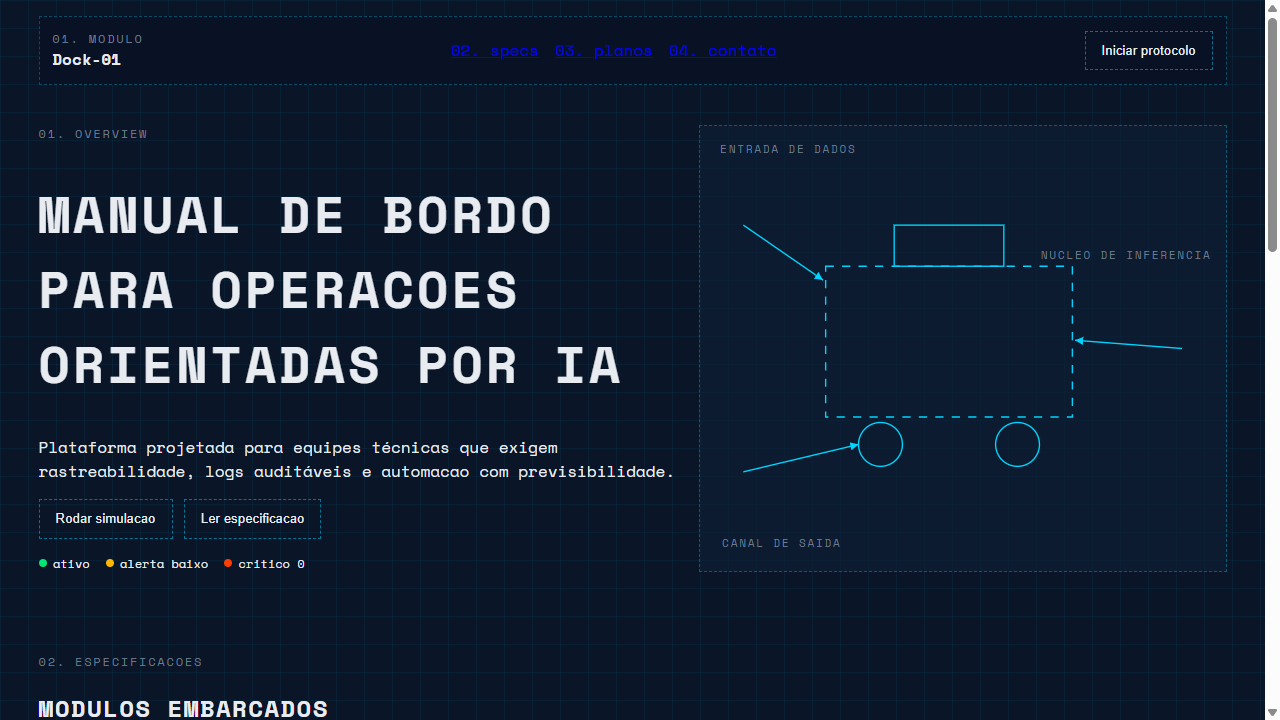
Landing page that looks like a spaceship instruction manual or engineering blueprint. Ideal for produtos de hardware, startups deep-tech, apis e ferramentas dev, plataformas de engenharia, documentacao tecnica, cybersecurity. AI-ready template.
Use case: Hardware products, Deep-tech startups, APIs and dev tools, Engineering platforms, Technical documentation, Cybersecurity
Historical Context
The spaceship manual aesthetic didn't start as a design trend — it started as necessity. NASA's technical documentation from the 1960s and 70s had to communicate life-or-death procedures through dense diagrams, monospace type, and ruthlessly structured layouts. Every page was a blueprint for survival. There was no room for decoration, only clarity. Then Hollywood got hold of it. Prop designers for Alien, 2001, and later Blade Runner built fictional interfaces that borrowed heavily from real aerospace documentation. They added grid overlays, section numbering systems, and that unmistakable combination of technical illustration with sparse, uppercase labeling. The fictional manuals looked more compelling than the real ones because they were designed to be seen, not just read. What we have now is the convergence: designers pulling from both the authentic NASA lineage and the cinematic interpretation. The result is a UI language that feels simultaneously functional and aspirational — like you're operating something that matters.
When to Use
Reach for this when your product needs to feel engineered rather than designed. It works for anything where precision is the brand: space tech companies, technical documentation platforms, sci-fi game interfaces, developer tools that want personality beyond the usual dark theme. It's particularly effective when you need dense information to feel navigable rather than overwhelming. Avoid it for anything warm, personal, or consumer-friendly — this aesthetic is deliberately cold and procedural.
Design Principles
- Monospace is structural, not decorative — use it for labels, codes, and data. Pair with a clean sans-serif for body text so the page doesn't become unreadable.
- Grid lines and section markers should be visible infrastructure. Show the skeleton. Numbered sections, coordinate markers, and alignment guides are content, not chrome.
- Technical diagrams earn their space by being functional. Every illustration should explain something — if it's purely decorative, it breaks the contract with the user.
- Color is signal, not style. Reserve it for status indicators, warnings, and interactive elements. The baseline palette is monochrome with one or two accent frequencies.
- Density is a feature. Don't fear tight spacing and small type — the aesthetic assumes a competent operator. But maintain strict hierarchy so scanning remains effortless.
DESIGN.md
---
version: "alpha"
name: "Spaceship Instruction Manual"
description: "Landing page that looks like a spaceship instruction manual or engineering blueprint. Ideal for produtos de hardware, startups deep-tech, apis e ferramentas dev, plataformas de engenharia, documentacao tecnica, cybersecurity. AI-ready template."
colors:
  primary: "#0A1628"
  secondary: "#E8ECF1"
  tertiary: "#00D4FF"
  neutral: "#6B7B8D"
  surface: "#FFB800"
  accent: "#00E676"
typography:
  h1:
    fontFamily: JetBrains Mono
    fontSize: 2.5rem
    fontWeight: 700
  body-md:
    fontFamily: JetBrains Mono
    fontSize: 1rem
    fontWeight: 400
spacing:
  sm: 0.5rem
  md: 1.0rem
  lg: 2.0rem
components:
  button-primary:
    backgroundColor: "{colors.primary}"
    textColor: "{colors.neutral}"
    padding: 12px
---

## Overview

Landing page that looks like a spaceship instruction manual or engineering blueprint. Ideal for produtos de hardware, startups deep-tech, apis e ferramentas dev, plataformas de engenharia, documentacao tecnica, cybersecurity. AI-ready template. The spaceship manual aesthetic didn't start as a design trend — it started as necessity. NASA's technical documentation from the 1960s and 70s had to communicate life-or-death procedures through dense diagrams, monospace type, and ruthlessly structured layouts. Every page was a blueprint for survival. There was no room for decoration, only clarity.

Then Hollywood got hold of it. Prop designers for Alien, 2001, and later Blade Runner built fictional interfaces that borrowed heavily from real aerospace documentation. They added grid overlays, section numbering systems, and that unmistakable combination of technical illustration with sparse, uppercase labeling. The fictional manuals looked more compelling than the real ones because they were designed to be seen, not just read.

What we have now is the convergence: designers pulling from both the authentic NASA lineage and the cinematic interpretation. The result is a UI language that feels simultaneously functional and aspirational — like you're operating something that matters.

- Density: 7/10 — Compact
- Variance: 4/10 — Moderate
- Motion: 1/10 — Static

- **Style:** Technical Blueprint, Monospace, Sci-Fi Engineering, Deconstructed, Callout Lines
- **Keywords:** spaceship manual, blueprint, monospace, technical drawing, callout lines, engineering labels, exploded view, sci-fi technical, low-fi schematic, deconstructed, technical credibility, specification sheet
- **Era:** 2025-2026 Sci-Fi Technical
- **Light/Dark:** ✗ None / ✓ Full

## Colors

- **Azul Blueprint** (#0A1628) — Accent highlight, links and focus states
- **Branco Tecnico** (#E8ECF1) — Light surface, card backgrounds
- **Ciano Linha** (#00D4FF) — Supporting palette color
- **Cinza Anotacao** (#6B7B8D) — Secondary text, borders, muted elements
- **Amarelo Alerta** (#FFB800) — Error states, destructive actions
- **Verde Status** (#00E676) — Success states, positive indicators
- **Vermelho Critico** (#FF3D00) — Error states, destructive actions


## Typography

- **Display / Hero:** JetBrains Mono — Weight 700, tight tracking, used for headline impact
- **Accent:** Fira Code — Used for decorative or emphasis text
- **Body:** JetBrains Mono — Weight 400, 16px/1.6 line-height, max 72ch per line
- **UI Labels / Captions:** JetBrains Mono — 0.875rem, weight 500, slight letter-spacing
- **Monospace:** JetBrains Mono — Used for code, metadata, and technical values

Scale:
- Hero: clamp(2.5rem, 5vw, 4rem)
- H1: 2.25rem
- H2: 1.5rem
- Body: 1rem / 1.6
- Small: 0.875rem


## Layout

- **Grid:** CSS Grid primary. Max-width containment: 1280px centered with 1.5rem side padding.
- **Spacing rhythm:** Balanced. Base unit: 0.5rem (8px).
- **Section vertical gaps:** clamp(4rem, 8vw, 8rem).
- **Hero layout:** Split-screen (text left, visual right).
- **Feature sections:** Zig-zag alternating text+image rows. No 3-equal-columns.
- **Mobile collapse:** All multi-column layouts collapse below 768px. No horizontal overflow.
- **z-index contract:** base (0) / sticky-nav (100) / overlay (200) / modal (300) / toast (500).


## Elevation & Depth

Fontes monoespaçadas transmitindo rigor tecnico, linhas finas conectoras (callouts) ligando dados a imagens com SVG paths, rotulos e legendas tecnicas decorativas em uppercase com letter-spacing largo, ilustracoes esquematicas low-fi imitando vistas em explosao de pecas internas, grid com linhas visiveis tipo blueprint, numeracao de secoes estilo manual tecnico (01. 02. 03.), bordas tracejadas finas

- Minimal motion design. Hover states use color transitions only (150ms).
- No entry animations. No page transitions. Instant, utilitarian feedback.
- Performance: No animation overhead. Static-first approach.


## Shapes

Base corner radius: 8px. See rounded tokens in front matter for the full scale.


## Components

- **Primary Button:** Subtly rounded (0.5rem) shape. Accent color fill. Hover: 8% darken + subtle lift shadow. Active: -1px translate tactile press. Font weight 600. No outer glows.
- **Secondary / Ghost Button:** Outline variant. 1.5px border in muted color. Text in primary color. Hover: subtle background fill.
- **Cards:** Subtly rounded (0.5rem) corners. Surface background. Subtle shadow (0 2px 12px rgba(0,0,0,0.06)). 1px border stroke.
- **Inputs:** Label above input. 1px border stroke. Focus ring: 2px accent color offset 2px. Error text below in semantic red. No floating labels.
- **Navigation:** Primary surface background. Active item: accent color indicator. Font weight 500 when active.
- **Skeletons:** Shimmer animation matching component dimensions. No circular spinners.
- **Empty States:** Icon-based composition with descriptive text and action button.


## Do's and Don'ts

- No emojis in UI — use icon system only (Lucide, Heroicons)
- No pure black (#000000) — use off-black or charcoal variants
- No oversaturated accent colors (saturation cap: 80%)
- No 3-column equal-width feature layouts — use zig-zag or asymmetric grid
- No `h-screen` — use `min-h-[100dvh]`
- No AI copywriting clichés: "Elevate", "Seamless", "Unleash", "Next-Gen"
- No broken external image links — use picsum.photos or inline SVG
- No generic lorem ipsum in demos

- Do Fonte monoespaçada em TODO o texto
- Do Fundo azul blueprint escuro
- Do Linhas conectoras SVG (callouts) com setas
- Do Rotulos tecnicos uppercase com letter-spacing largo
- Do Grid de fundo visivel sutil
- Do Numeracao de secoes estilo manual (01. 02.)
- Do Bordas tracejadas finas
- Do Indicadores de status coloridos
- Do Estetica de engenharia profunda


## Use Case

Hardware products, Deep-tech startups, APIs and dev tools, Engineering platforms, Technical documentation, Cybersecurity
Technical Specs
CSS
font-family: 'JetBrains Mono', 'Fira Code', 'Space Mono', monospace; background: #0A1628; color: #E8ECF1; letter-spacing: 0.15em on labels; text-transform: uppercase on labels; border: 1px dashed rgba(0,212,255,0.3); SVG line/path for callouts with stroke: #00D4FF; background-image: linear-gradient(rgba(0,212,255,0.05) 1px, transparent 1px) for grid; font-size: 0.75rem for annotations; gap: 0.5rem tight spacing
Variables
--bg-blueprint: #0A1628; --bg-surface: #0D1F35; --color-text: #E8ECF1; --color-cyan: #00D4FF; --color-annotation: #6B7B8D; --color-warning: #FFB800; --color-success: #00E676; --color-critical: #FF3D00; --font-mono: 'JetBrains Mono', monospace; --letter-spacing-label: 0.15em; --border-dashed: 1px dashed rgba(0,212,255,0.3); --grid-line: rgba(0,212,255,0.05); --callout-stroke: #00D4FF
Checklist
☐ Fonte monoespaçada em TODO o texto, ☐ Fundo azul blueprint escuro, ☐ Linhas conectoras SVG (callouts) com setas, ☐ Rotulos tecnicos uppercase com letter-spacing largo, ☐ Grid de fundo visivel sutil, ☐ Numeracao de secoes estilo manual (01. 02.), ☐ Bordas tracejadas finas, ☐ Indicadores de status coloridos, ☐ Estetica de engenharia profunda
Colors
Primary
Secondary
Effects
Fontes monoespaçadas transmitindo rigor tecnico, linhas finas conectoras (callouts) ligando dados a imagens com SVG paths, rotulos e legendas tecnicas decorativas em uppercase com letter-spacing largo, ilustracoes esquematicas low-fi imitando vistas em explosao de pecas internas, grid com linhas visiveis tipo blueprint, numeracao de secoes estilo manual tecnico (01. 02. 03.), bordas tracejadas finas
Light/Dark
✗ None / ✓ Full
AI Prompt
Act as a Senior Frontend Engineer and Expert UI Designer.
Your task is to code a complete Landing Page on the first attempt.
- Landing Page Theme: <INSERT THEME>
- Sections to add: <INSERT SECTIONS>

Generate the final code immediately following these definitions:

## Style

- **Name:** Spaceship Instruction Manual
- **Type:** Technical Blueprint, Monospace, Sci-Fi Engineering, Deconstructed, Callout Lines
- **Keywords:** spaceship manual, blueprint, monospace, technical drawing, callout lines, engineering labels, exploded view, sci-fi technical, low-fi schematic, deconstructed, technical credibility, specification sheet
- **Era:** 2025-2026 Sci-Fi Technical
- **Light/Dark:** ✗ None / ✓ Full

## Color Palette

- **Primary:** Azul Blueprint #0A1628, Branco Tecnico #E8ECF1, Ciano Linha #00D4FF
- **Secondary:** Cinza Anotacao #6B7B8D, Amarelo Alerta #FFB800, Verde Status #00E676, Vermelho Critico #FF3D00

## Visual Effects

Fontes monoespaçadas transmitindo rigor tecnico, linhas finas conectoras (callouts) ligando dados a imagens com SVG paths, rotulos e legendas tecnicas decorativas em uppercase com letter-spacing largo, ilustracoes esquematicas low-fi imitando vistas em explosao de pecas internas, grid com linhas visiveis tipo blueprint, numeracao de secoes estilo manual tecnico (01. 02. 03.), bordas tracejadas finas

## AI Visual Direction

Design a landing page that looks like a spaceship instruction manual or engineering blueprint. Use MONOSPACE fonts exclusively (JetBrains Mono, Fira Code, or Space Mono) for all text to convey technical rigor. Dark blueprint background (#0A1628) with cyan (#00D4FF) thin connector lines (callouts) linking data points to visual elements using SVG paths with arrowheads. Small technical labels in UPPERCASE with wide letter-spacing (0.2em) scattered as decorative annotations — even if purely ornamental. Low-fi schematic illustrations mimicking exploded-view technical drawings using CSS borders, lines, and geometric shapes. Visible grid lines in the background (subtle, 5% opacity). Section numbering like a technical manual (01. OVERVIEW, 02. SPECIFICATIONS). Dashed thin borders on containers. Status indicators with colored dots (green=active, yellow=warning, red=critical). The overall aesthetic should scream 'deep engineering credibility'.

## CSS Technical

```css
font-family: 'JetBrains Mono', 'Fira Code', 'Space Mono', monospace; background: #0A1628; color: #E8ECF1; letter-spacing: 0.15em on labels; text-transform: uppercase on labels; border: 1px dashed rgba(0,212,255,0.3); SVG line/path for callouts with stroke: #00D4FF; background-image: linear-gradient(rgba(0,212,255,0.05) 1px, transparent 1px) for grid; font-size: 0.75rem for annotations; gap: 0.5rem tight spacing
```

## Design System Variables

```css
--bg-blueprint: #0A1628; --bg-surface: #0D1F35; --color-text: #E8ECF1; --color-cyan: #00D4FF; --color-annotation: #6B7B8D; --color-warning: #FFB800; --color-success: #00E676; --color-critical: #FF3D00; --font-mono: 'JetBrains Mono', monospace; --letter-spacing-label: 0.15em; --border-dashed: 1px dashed rgba(0,212,255,0.3); --grid-line: rgba(0,212,255,0.05); --callout-stroke: #00D4FF
```

## Implementation Checklist

- ☐ Fonte monoespaçada em TODO o texto
- ☐ Fundo azul blueprint escuro
- ☐ Linhas conectoras SVG (callouts) com setas
- ☐ Rotulos tecnicos uppercase com letter-spacing largo
- ☐ Grid de fundo visivel sutil
- ☐ Numeracao de secoes estilo manual (01. 02.)
- ☐ Bordas tracejadas finas
- ☐ Indicadores de status coloridos
- ☐ Estetica de engenharia profunda

## Execution Rules

1. Strictly follow the defined visual style.
2. Use high-quality inline SVG icons (Heroicons or Lucide style) — NEVER use emojis as icons.
3. Add `cursor-pointer` and smooth `hover` states (transition-all) on all interactive elements.
4. Required Page Structure:
   - Navbar (Logo + Links + CTA)
   - Hero Section (Impactful Headline + Subtitle + 2 buttons + 3D/Abstract visual element via CSS)
   - Features (3 cards with icons)
   - Testimonials (3 cards)
   - Pricing (3 tiers, highlight the middle one)
   - Final CTA
   - Full Footer with social links, privacy policy, terms of use, contact and SEO links.
5. All text content must be in English.
6. The visual must be CLEARLY distinct — do not create a "default Bootstrap" design. Force the use of the provided design system variables.
7. Use `<style>` tags in the head for custom classes (especially for complex backdrop-filter effects and animations) that Tailwind CDN doesn't cover.
8. Full Responsiveness: Layout must adapt perfectly to Mobile, Tablet and Desktop (vertical stack on mobile).
9. Include basic SEO, Viewport and Open Graph meta tags in `<head>`.
10. Footer must contain: Copyright 2026, Secondary navigation links and Social media icons.
11. Make the creative decisions needed to deliver the complete, functional result now.
Related
Last synced: 4/1/2026