Sales Intelligence Dashboard
Sales intelligence dashboard. Ideal for landing pages, modern websites. AI-ready template.
Use case: Landing pages, Modern websites
Historical Context
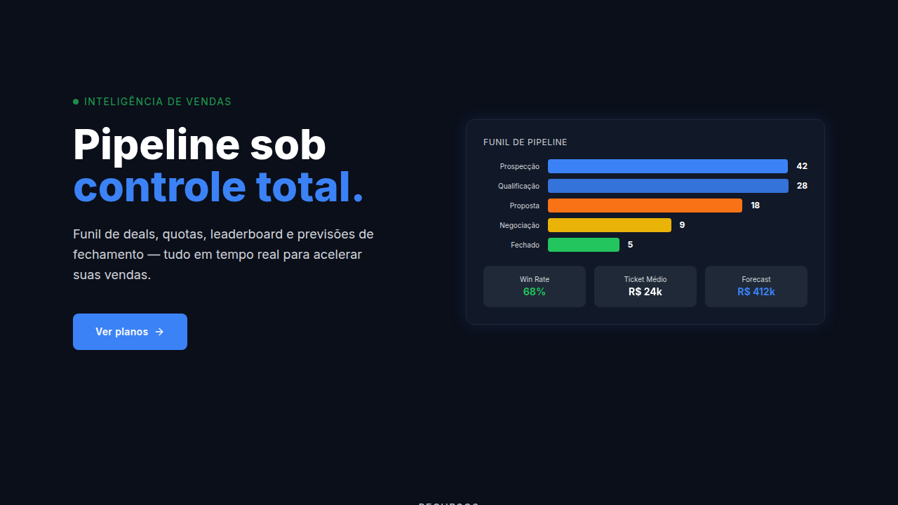
Salesforce didn't invent the CRM dashboard — but they made it everyone's problem. Before 2010, pipeline views were glorified spreadsheets with a coat of paint. Reps hated them. Managers lived in them. The disconnect was real. Then came the wave: HubSpot, Pipedrive, Close, Gong. Each one tried to answer the same question differently — where's the money, and when is it coming? Pipeline visualization shifted from static bar charts to kanban-style deal flows, weighted forecasts, and territory heat maps. The design language borrowed heavily from project management tools. Drag. Drop. Close. Here's what most dashboard redesigns miss: sales teams don't sit and analyze. They glance between calls. They need the number, the trend, the outlier — in that order. The best sales dashboards aren't beautiful. They're fast. They surface the one thing that's off so someone can fix it before the quarter ends.
When to Use
When your users need to track revenue in motion — not static reports, but living data. Pipeline dashboards work for CRM interfaces where reps manage deals, sales ops teams monitoring conversion rates across stages, territory performance comparisons, and quarterly forecasting views. Use this pattern when the audience makes decisions under time pressure and needs hierarchy that screams 'look here first.' Not ideal for deep analytical exploration — that's a different tool entirely.
Design Principles
- Hierarchy by urgency — surface at-risk deals and anomalies before totals. The number that needs action comes first.
- Scannable in 3 seconds — if a rep can't get the gist between calls, the layout failed. Dense but not cluttered.
- Pipeline as spatial metaphor — stages flow left to right, value scales vertically. Respect the mental model salespeople already carry.
- Color with intent — red means behind, green means closed. Don't get creative with status colors in sales contexts. Convention wins.
- Forecast confidence as a first-class element — weighted pipeline, commit vs. best-case, and historical accuracy should be visible, not buried in a dropdown.
DESIGN.md
---
version: "alpha"
name: "Sales Intelligence Dashboard"
description: "Sales intelligence dashboard. Ideal for landing pages, modern websites. AI-ready template."
colors:
  primary: "#1A1A1A"
  secondary: "#4A4A4A"
  tertiary: "#0066FF"
  neutral: "#FFFFFF"
typography:
  h1:
    fontFamily: System UI stack
    fontSize: 2.25rem
    fontWeight: 700
  body-md:
    fontFamily: System UI stack
    fontSize: 1rem
    fontWeight: 400
  label-caps:
    fontFamily: System UI stack
    fontSize: 0.75rem
    fontWeight: 500
---

## Overview

Sales intelligence dashboard. Ideal for landing pages, modern websites. AI-ready template. Salesforce didn't invent the CRM dashboard — but they made it everyone's problem. Before 2010, pipeline views were glorified spreadsheets with a coat of paint. Reps hated them. Managers lived in them. The disconnect was real.

Then came the wave: HubSpot, Pipedrive, Close, Gong. Each one tried to answer the same question differently — where's the money, and when is it coming? Pipeline visualization shifted from static bar charts to kanban-style deal flows, weighted forecasts, and territory heat maps. The design language borrowed heavily from project management tools. Drag. Drop. Close.

Here's what most dashboard redesigns miss: sales teams don't sit and analyze. They glance between calls. They need the number, the trend, the outlier — in that order. The best sales dashboards aren't beautiful. They're fast. They surface the one thing that's off so someone can fix it before the quarter ends.

- Density: 8/10 — Dense
- Variance: 4/10 — Moderate
- Motion: 6/10 — Expressive

- **Style:** BI/Analytics
- **Keywords:** Deal pipeline, sales metrics, territory performance, sales rep leaderboard, win-loss analysis, quota tracking, forecast accuracy
- **Era:** 2020s Modern
- **Light/Dark:** ✓ Full / ✓ Full

## Colors

- Palette derived from style keywords and era context


## Typography

- **Display / Hero:** System UI stack (-apple-system, sans-serif) — Weight 700, tight tracking, used for headline impact
- **Body:** System UI stack (-apple-system, sans-serif) — Weight 400, 16px/1.6 line-height, max 72ch per line
- **UI Labels / Captions:** System UI stack (-apple-system, sans-serif) — 0.875rem, weight 500, slight letter-spacing
- **Monospace:** JetBrains Mono — Used for code, metadata, and technical values

Scale:
- Hero: clamp(2.5rem, 5vw, 4rem)
- H1: 2.25rem
- H2: 1.5rem
- Body: 1rem / 1.6
- Small: 0.875rem


## Layout

- **Grid:** CSS Grid primary. Max-width containment: 1280px centered with 1.5rem side padding.
- **Spacing rhythm:** Balanced. Base unit: 0.5rem (8px).
- **Section vertical gaps:** clamp(4rem, 8vw, 8rem).
- **Hero layout:** Split-screen (text left, visual right).
- **Feature sections:** Zig-zag alternating text+image rows. No 3-equal-columns.
- **Mobile collapse:** All multi-column layouts collapse below 768px. No horizontal overflow.
- **z-index contract:** base (0) / sticky-nav (100) / overlay (200) / modal (300) / toast (500).


## Elevation & Depth

Deal movement animations, metric updates, leaderboard ranking changes, gauge needle movements, status change highlights

- **Physics:** Spring — stiffness 120, damping 20. Confident, weighted transitions.
- **Entry animations:** Fade + translate-Y (16px → 0) over 480ms ease-out. Staggered cascades for lists: 100ms between items.
- **Hover states:** Scale(1.03) + shadow lift over 200ms.
- **Page transitions:** Fade + slide (300ms).
- **Performance:** Only transform and opacity animated. No layout-triggering properties.


## Shapes

Base corner radius: 8px. See rounded tokens in front matter for the full scale.


## Components

- **Primary Button:** Subtly rounded (0.5rem) shape. Accent color fill. Hover: 8% darken + subtle lift shadow. Active: -1px translate tactile press. Font weight 600. No outer glows.
- **Secondary / Ghost Button:** Outline variant. 1.5px border in muted color. Text in primary color. Hover: subtle background fill.
- **Cards:** Subtly rounded (0.5rem) corners. Surface background. Subtle shadow (0 2px 12px rgba(0,0,0,0.06)). 1px border stroke.
- **Inputs:** Label above input. 1px border stroke. Focus ring: 2px accent color offset 2px. Error text below in semantic red. No floating labels.
- **Navigation:** Primary surface background. Active item: accent color indicator. Font weight 500 when active.
- **Skeletons:** Shimmer animation matching component dimensions. No circular spinners.
- **Empty States:** Icon-based composition with descriptive text and action button.


## Do's and Don'ts

- No emojis in UI — use icon system only (Lucide, Heroicons)
- No pure black (#000000) — use off-black or charcoal variants
- No oversaturated accent colors (saturation cap: 80%)
- No 3-column equal-width feature layouts — use zig-zag or asymmetric grid
- No `h-screen` — use `min-h-[100dvh]`
- No AI copywriting clichés: "Elevate", "Seamless", "Unleash", "Next-Gen"
- No broken external image links — use picsum.photos or inline SVG
- No generic lorem ipsum in demos

- Do Pipeline stages shown
- Do Deals draggable
- Do Quotas visualized
- Do Rankings updated
- Do Territory clickable
- Do CRM integration


## Use Case

Landing pages, Modern websites
Technical Specs
CSS
kanban columns (flex), gauge chart (SVG arc), leaderboard ranking styles, map integration (Mapbox/Google), timeline vertical, deal card with status border
Variables
--pipeline-colors: stage gradient, --gauge-track: #E5E7EB, --gauge-fill: primary, --rank-1-color: #FFD700, --rank-2-color: #C0C0C0, --rank-3-color: #CD7F32
Checklist
☐ Pipeline stages shown, ☐ Deals draggable, ☐ Quotas visualized, ☐ Rankings updated, ☐ Territory clickable, ☐ CRM integration
Colors
Effects
Deal movement animations, metric updates, leaderboard ranking changes, gauge needle movements, status change highlights
Light/Dark
✓ Full / ✓ Full
AI Prompt
Act as a Senior Frontend Engineer and Expert UI Designer.
Your task is to code a complete Landing Page on the first attempt.
- Landing Page Theme: <INSERT THEME>
- Sections to add: <INSERT SECTIONS>

Generate the final code immediately following these definitions:

## Style

- **Name:** Sales Intelligence Dashboard
- **Type:** BI/Analytics
- **Keywords:** Deal pipeline, sales metrics, territory performance, sales rep leaderboard, win-loss analysis, quota tracking, forecast accuracy
- **Era:** 2020s Modern
- **Light/Dark:** ✓ Full / ✓ Full

## Color Palette

- **Primary:** Sales colors: won (green), lost (red), in-progress (blue), blocked (orange), quota met (gold), quota missed (grey)
- **Secondary:** Pipeline stage colors, rep performance colors, quota achievement colors, forecast accuracy colors

## Visual Effects

Deal movement animations, metric updates, leaderboard ranking changes, gauge needle movements, status change highlights

## AI Visual Direction

Design a sales intelligence dashboard. Use: pipeline funnel, deal cards (kanban), quota gauges, leaderboard table, territory map, win/loss ratios, forecast accuracy, activity timeline.

## CSS Technical

```css
kanban columns (flex), gauge chart (SVG arc), leaderboard ranking styles, map integration (Mapbox/Google), timeline vertical, deal card with status border
```

## Design System Variables

```css
--pipeline-colors: stage gradient, --gauge-track: #E5E7EB, --gauge-fill: primary, --rank-1-color: #FFD700, --rank-2-color: #C0C0C0, --rank-3-color: #CD7F32
```

## Implementation Checklist

- ☐ Pipeline stages shown
- ☐ Deals draggable
- ☐ Quotas visualized
- ☐ Rankings updated
- ☐ Territory clickable
- ☐ CRM integration

## Execution Rules

1. Strictly follow the defined visual style.
2. Use high-quality inline SVG icons (Heroicons or Lucide style) — NEVER use emojis as icons.
3. Add `cursor-pointer` and smooth `hover` states (transition-all) on all interactive elements.
4. Required Page Structure:
   - Navbar (Logo + Links + CTA)
   - Hero Section (Impactful Headline + Subtitle + 2 buttons + 3D/Abstract visual element via CSS)
   - Features (3 cards with icons)
   - Testimonials (3 cards)
   - Pricing (3 tiers, highlight the middle one)
   - Final CTA
   - Full Footer with social links, privacy policy, terms of use, contact and SEO links.
5. All text content must be in English.
6. The visual must be CLEARLY distinct — do not create a "default Bootstrap" design. Force the use of the provided design system variables.
7. Use `<style>` tags in the head for custom classes (especially for complex backdrop-filter effects and animations) that Tailwind CDN doesn't cover.
8. Full Responsiveness: Layout must adapt perfectly to Mobile, Tablet and Desktop (vertical stack on mobile).
9. Include basic SEO, Viewport and Open Graph meta tags in `<head>`.
10. Footer must contain: Copyright 2026, Secondary navigation links and Social media icons.
11. Make the creative decisions needed to deliver the complete, functional result now.
Related
Last synced: 4/1/2026